
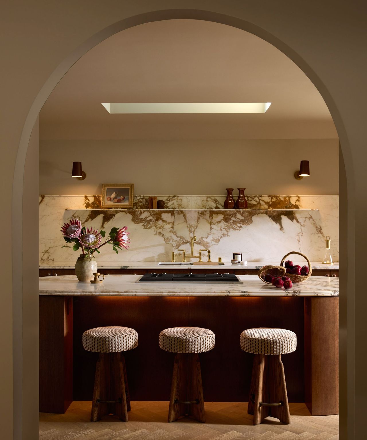
For years I decorated in a very narrow register. Stone, linen, plaster, wood. Warm whites and warm neutrals and the occasional black. I told myself it was about longevity. About letting the architecture speak. About not chasing trends.
Some of that was true. But some of it was fear.
The fear is specific. It's the fear of being wrong. Color commits you to something. A sage green kitchen is a decision you will live with for a decade. An ochre wall in a dining room announces a point of view. Beige doesn't do that. Beige is safe in exactly the way that makes a room forgettable.
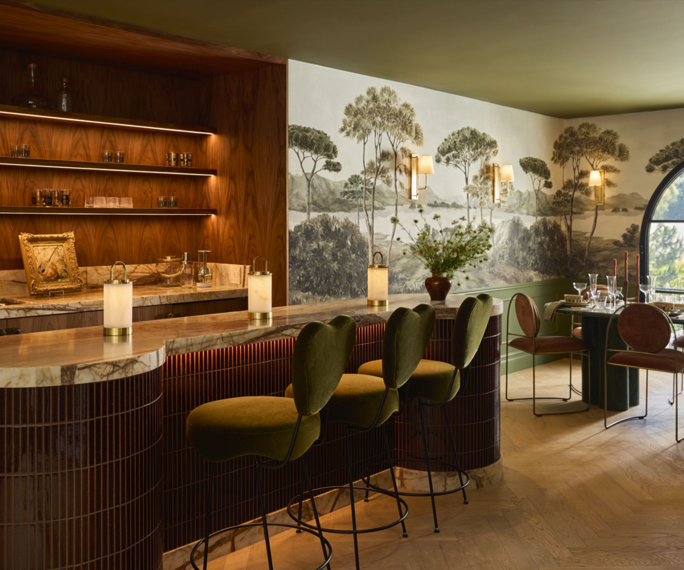
Growing up between Tehran and Beverly Hills, then spending years in France, I moved through places that each had a distinct and confident visual language.
Persian interiors don't treat colour as decoration. They treat it as structure. The tile, the carpet, the wall all participate in the same argument. Color isn't an accent. It's the logic of the room.
Then I entered the world of interiors as a profession, where the dominant aesthetic for most of my career has been a studied neutrality. White walls. Objects placed with intention. The assumption that the quieter a room, the more sophisticated the eye behind it.
I absorbed all of it. For a long time, I reproduced it faithfully.
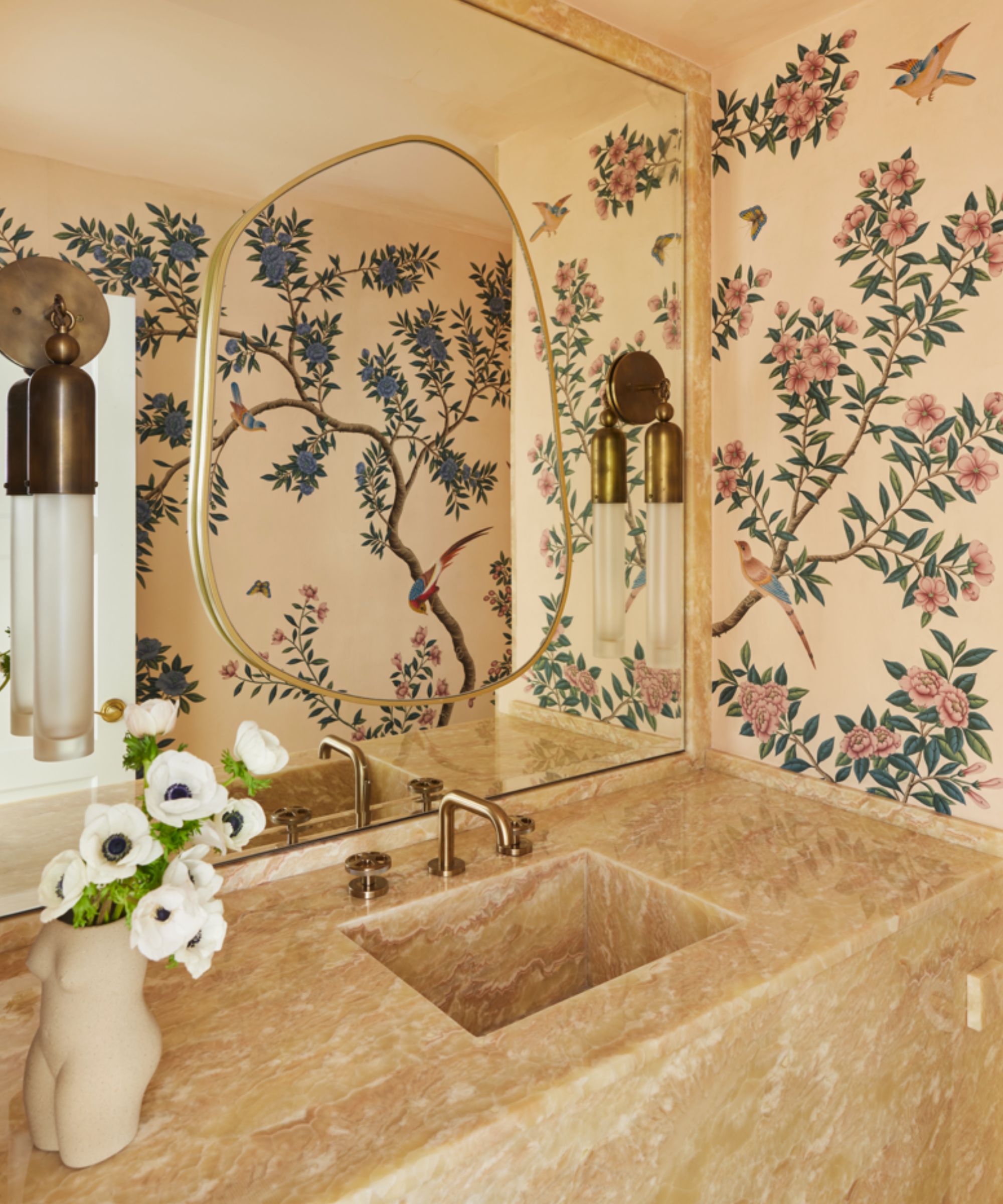
The shift happened slowly. I started noticing that the rooms I found most interesting, the ones I kept coming back to in my own references, were not the quiet ones. They were the rooms that had made a decision and committed to it. A deep terracotta that ran from floor to ceiling. A library lacquered in forest green. A bedroom where the entire scheme came from a single textile that someone had loved enough to build a room around. Those rooms had something the beige rooms didn't. They had a position.
I also started noticing it in my own decisions. Every time there were two directions, I chose the quieter one, not because it was better, but because it was safer.
The honest version of that is: I was protecting myself. A room that commits to nothing can't be wrong. A room with a strong point of view can be disagreed with. I was choosing rooms that couldn't be argued with over rooms that said something.
That's not design. That's hedging.
"Every time there were two directions, I chose the quieter one, not because it was better, but because it was safer."
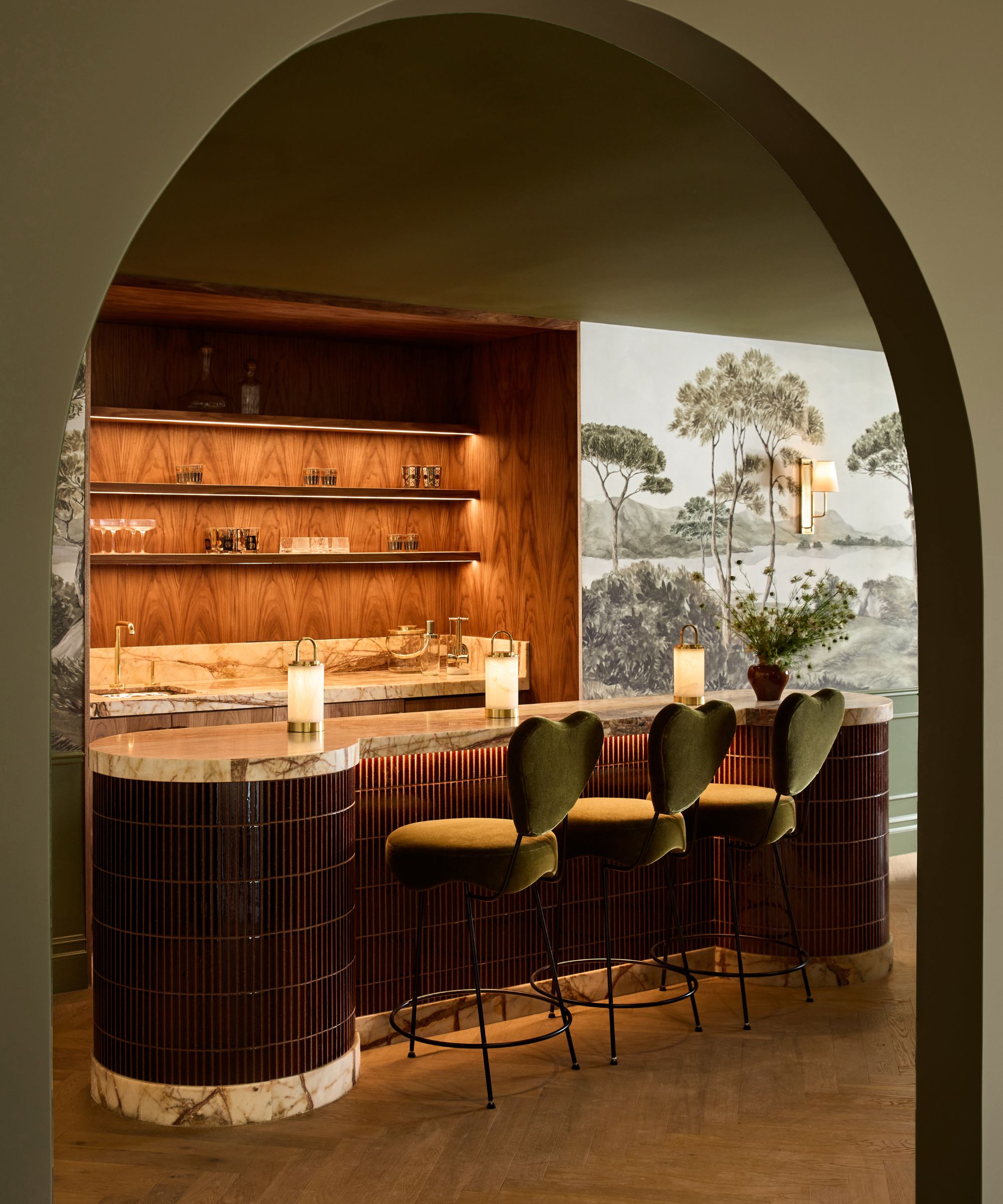
What changed practically was that I started treating colour the way I treat proportion. As a structural decision, not a decorative one. Color doesn't sit on top of a room. It determines how the room reads, how large or intimate it feels, what time of day it belongs to, what it asks of the furniture placed inside it. Restraint where restraint is correct. Commitment where commitment is required.
Where decorating is heading, I think, is back toward that. The appetite for beige and linen and quiet luxury has been enormous for the last decade. It's not over. But I'm seeing a tiredness with it in the projects coming to me now. Clients who come in saying they want something calm and end up choosing the boldest direction we put in front of them, because calm and interesting are not the same thing and they know it.
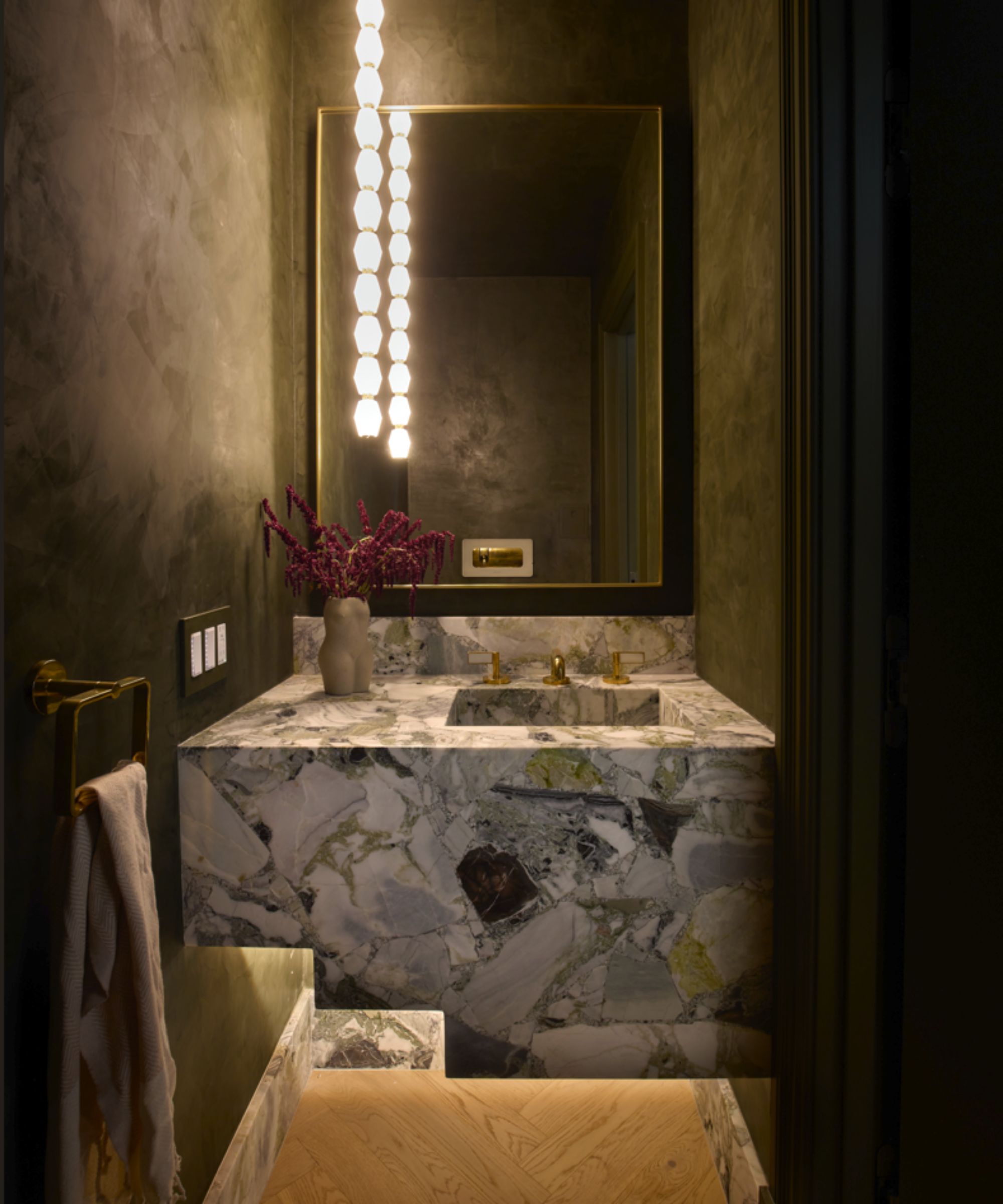
Colour is the braver choice. Not because it's difficult to execute, but because it requires you to have a position and defend it. You have to know what you want the room to feel like and commit to producing that feeling even when the safer version is right there.
I still use restraint. I still believe most rooms benefit from discipline and that the quieter something is, the more carefully it needs to be considered. But I no longer confuse discipline with avoidance.
The projects I'm most proud of are the ones where the safer direction was available, and we didn't take it.
Interior designer Nina Takesh is one of Homes & Gardens' Editors-At-Large for By Design, sharing her thoughts on decor. See the rest of her articles here.
Love beautiful design ideas, expert advice, and inspiring decor trends? Sign up for our newsletter and get the latest features delivered straight to your inbox.