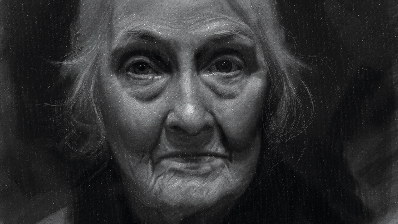
For this digital art tutorial, I’ll be creating a monochromatic study of Jaece using ArtRage Vitae – one of top apps in our best digital art software guide – on the iPad Pro, approaching it just as I would a basic oil study from life in my studio.
Read our guide on the best iPads for drawing for more insights into which Apple tablet is best for you, but these days there's more choice, such as the XPPen Magic Drawing Pad. Our best drawing tablets guide has more choice.
Unlike many digital painters, I treat the canvas – whether real or virtual – as a physical object. I work almost entirely on a single layer, and I rarely rely on the Undo button. In my traditional paintings, I love when the history of a piece shows through – small missteps, corrections and built-up layers add a sense of energy and story to the final image.
I aim to bring that same quality into my digital work. I paint tightly toward the end of a piece, but early marks and rough edges help keep the finished painting alive and dynamic.
In this tutorial, we’ll focus on foundational principles that are just as relevant in digital painting as they are in oils or charcoal. I’ll walk you through accurate shape blocking – seeing the relationships between facial features and their proportions – as well as value grouping in the context of the whole composition. These are core concepts in life drawing that every artist, regardless of experience level, can always refine. They're also the backbone of my own practice.
So grab your iPad, tablet or even a laptop and drawing tablet, and follow along as we blend traditional art sensibilities with modern tools.
01. Set the canvas
I always start out with a mid value canvas, usually grey. This is what I use in real paint, as well as for my charcoal drawings. Note, the image above isn't broken, click on it and colour pick to get the same canvas colour as I use.
This colour canvas gives us our mid tone right away and makes our lights and darks easy to see right off because we already have something to judge them against. I have also slightly textured the canvas in ArtRage to make it look like a real canvas. This is the strong point of ArtRage.
02. Brush settings
I start off with my brushes set to Full Thinners, Full Loading, and Full Pressure, this is what I pretty much use throughout the entire painting. I'm using a tablet that isn't pressure sensitive, so I start with a super light brush and build up the values through an overlapping of strokes.
In the beginning I block in the large light and shadow shapes, keeping this stage really loose. I want to be as expressive in the beginning as possible. I get super tight towards the end, and I want this expressiveness to carry through so the image doesn’t get static or stiff.
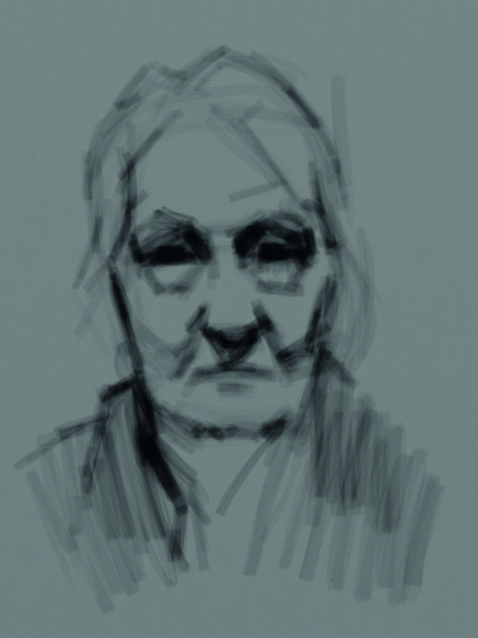
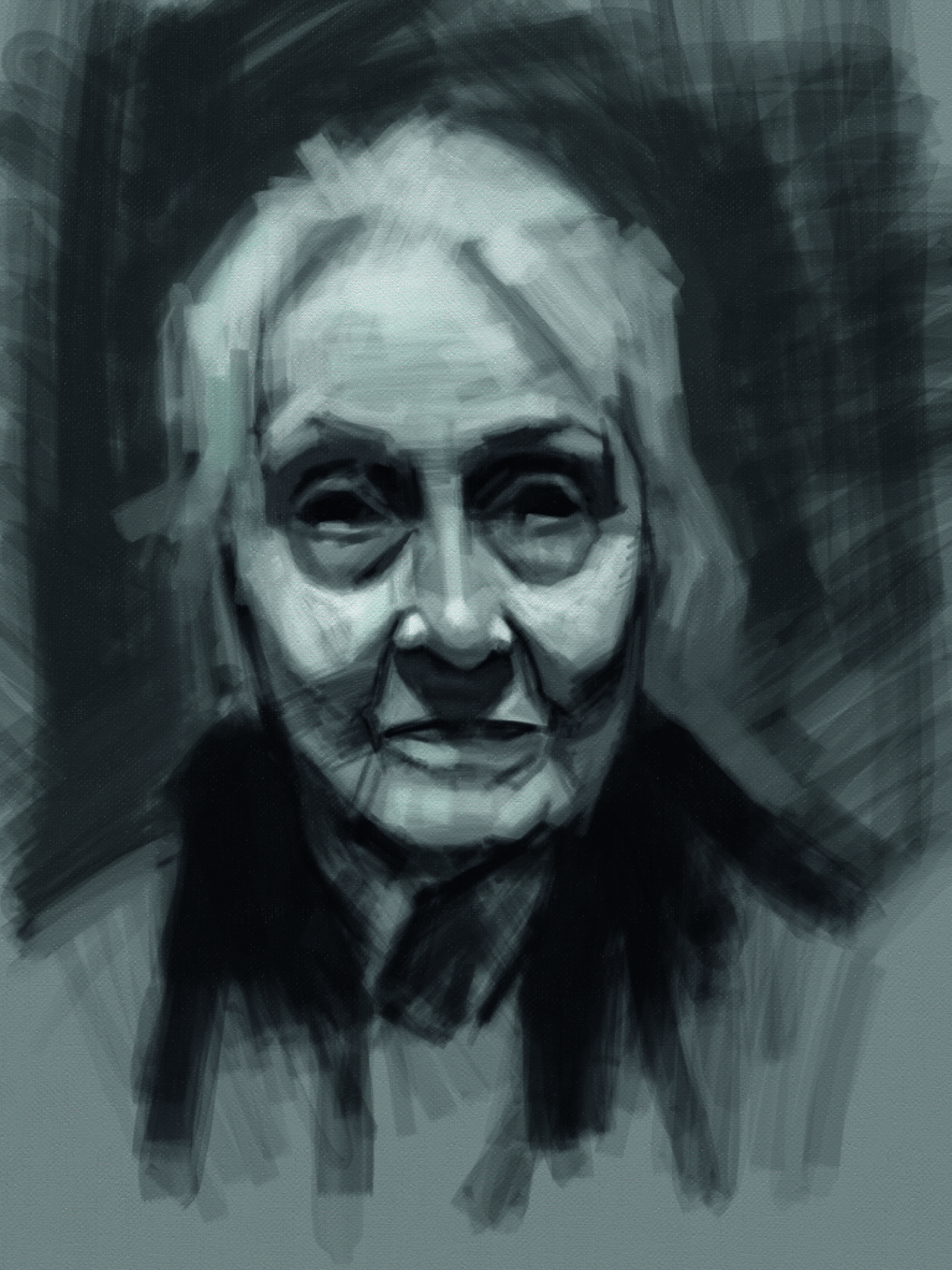
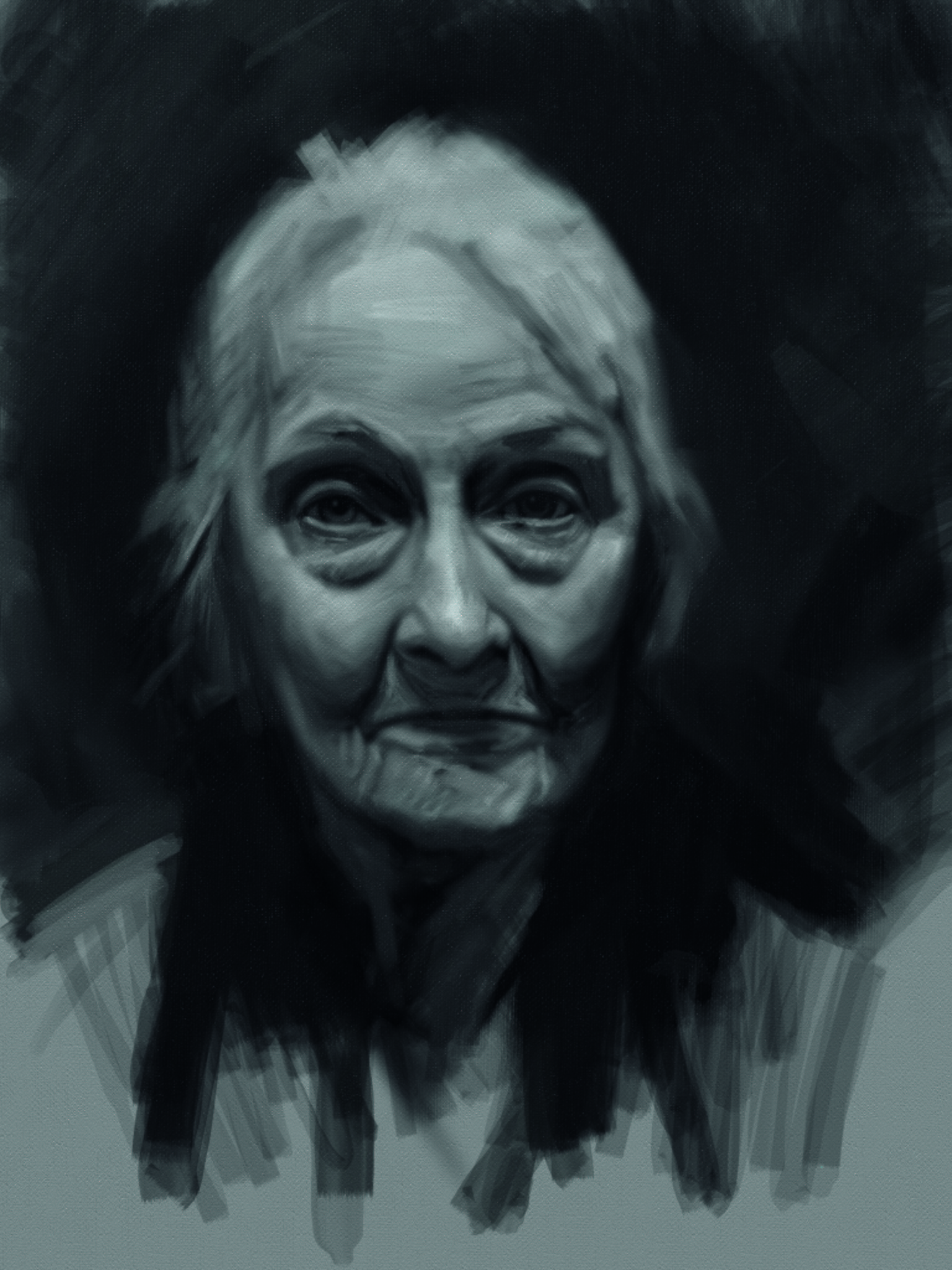
03. Blocking in
I start in with the block in from the light side. I usually switch between shadow and light, because it switches up the shapes on me. This forces me to look at the same shape from two different perspectives, which helps me to get them more accurate.
At this stage I’m using pretty large sized brushes and still concerned with the overall shapes. You want to build everything together and not render one eye separate from the other, as they will be disconnected if you do that. She has white hair so I throw in a dark background so that her head will emerge from the painting.
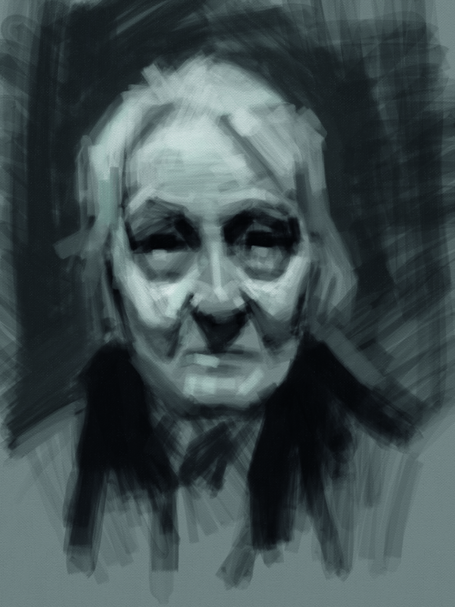
04. Find the form
In this stage I’m starting to get things a little bit more definite. I’m starting to see the shapes and how their edges relate to one another. I’m not concerned with form or edge condition (soft or hard) at this point. Just trying to build up my understanding of everything’s relationship to the whole face.
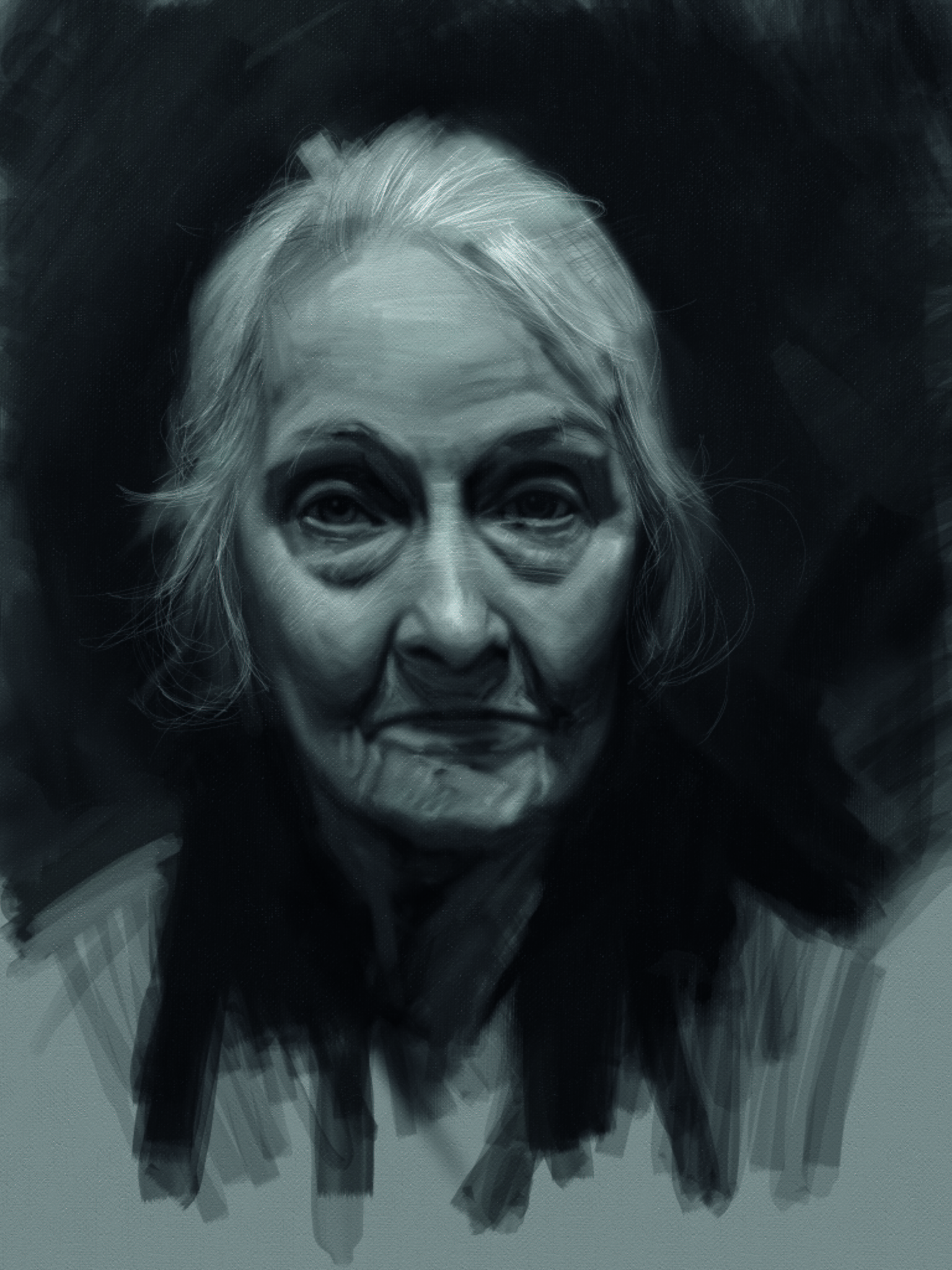
05: Consider the details
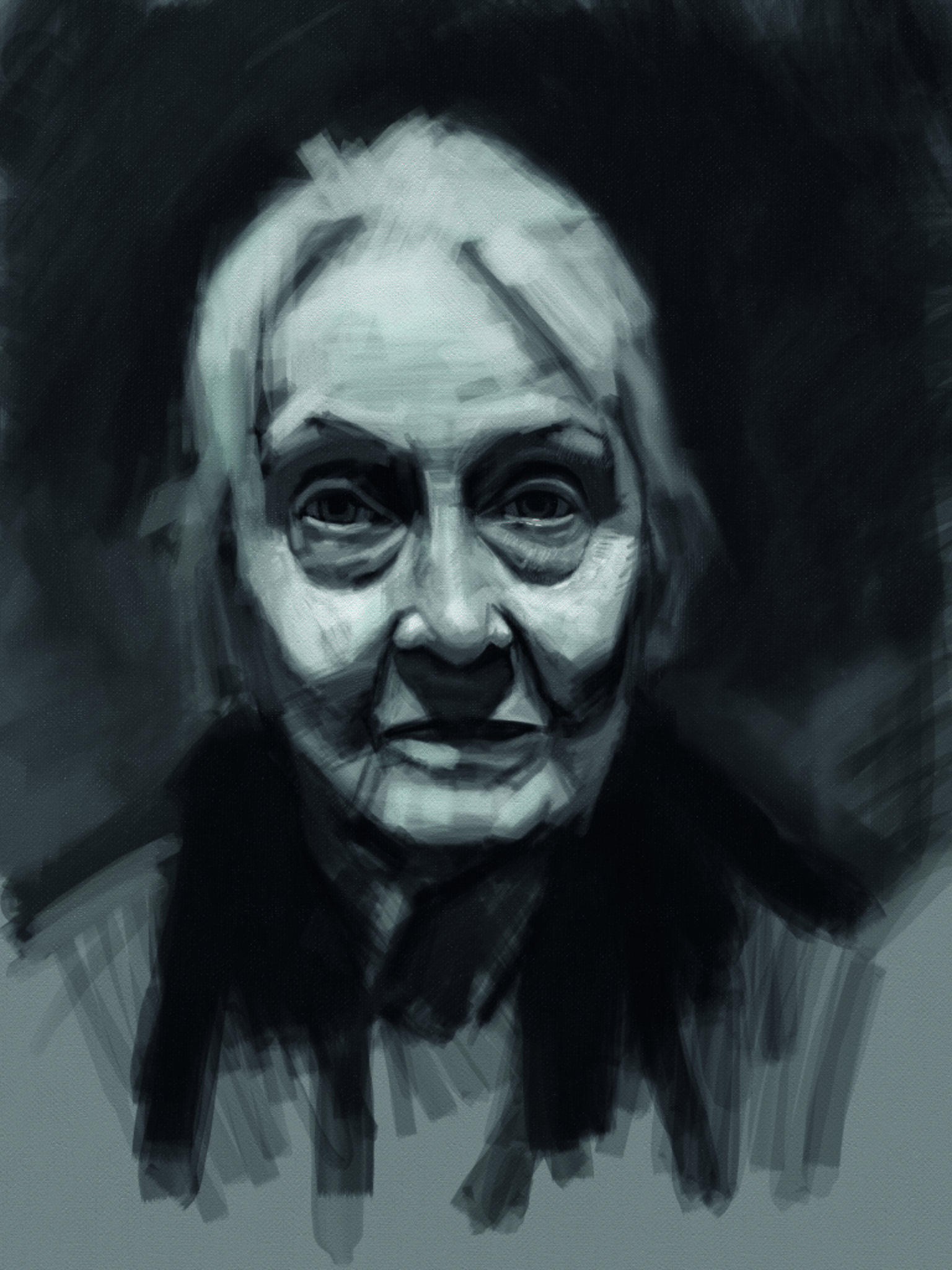
Now I’m starting to break down the large shapes into smaller more fractured shapes, as well as darkening the background. By establishing the background values it makes it easier for us to judge the values of the face. Plus, it helps us to think about the atmosphere in which our portrait lives.
I’m also starting to develop the structure of the eyes within the orbital cavities. Again, I make sure I develop both eyes at the same time. We want a connectedness to all of the features of the face.
06: Utilise the values
I use the Airbrush tool in ArtRage Vitae to knock back the values in the lights and halftones. I do this same thing when working traditionally, when I’ll use charcoal on paper – I use a paper towel to run down the whole drawing to knock down and unite the hierarchy of values, as well as softening the transitions from light to dark.
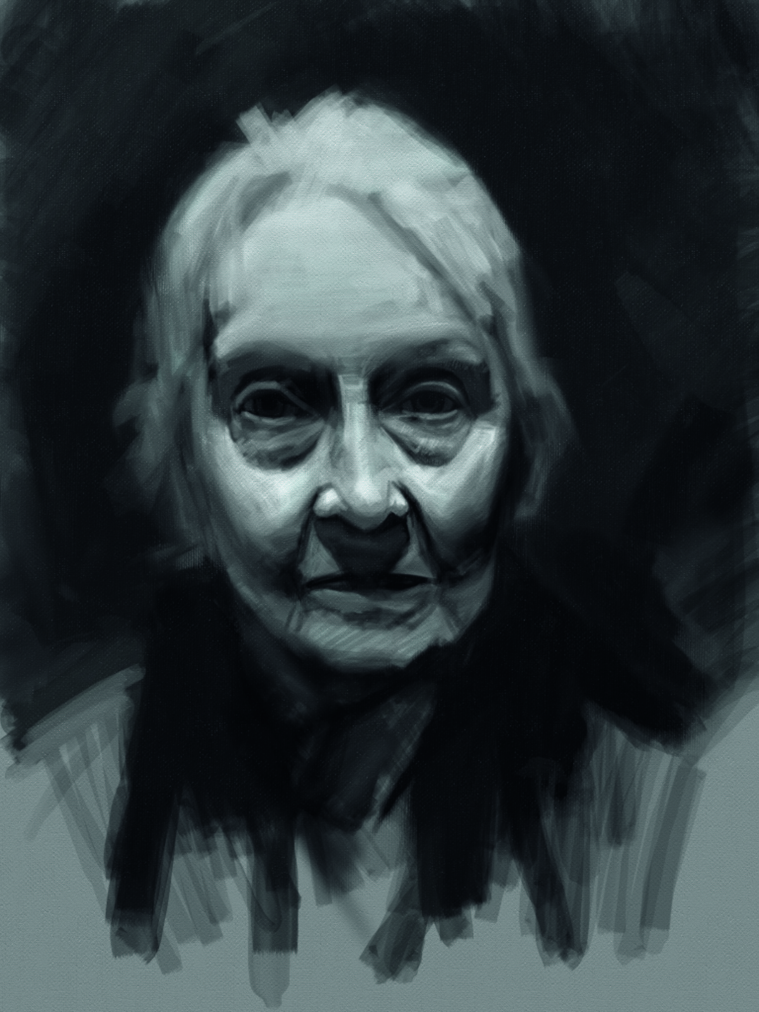
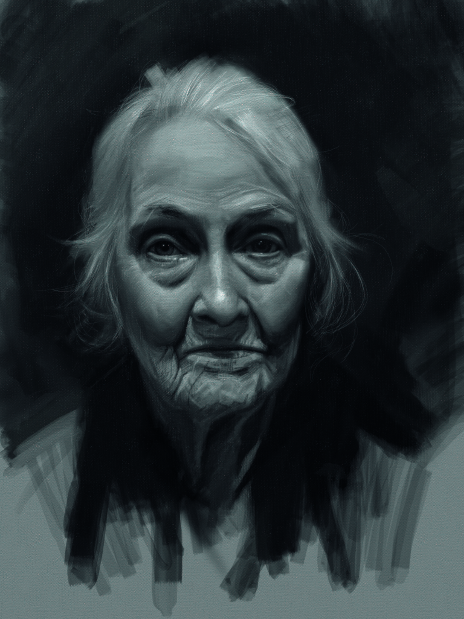
07: Work on the eyes
The main anchor for my drawings is the eyes. I want to connect everything to them and I use them to measure out from. I constantly move either north or south of them for the vertical proportions.
Since I’m always returning to the eyes, they tend to be the most developed aspect of my paintings and drawings, which I find is a good thing. Usually within a painting of a person, it is the eyes that the viewer is going to connect with. So in this step, I start developing out from the eyes again.
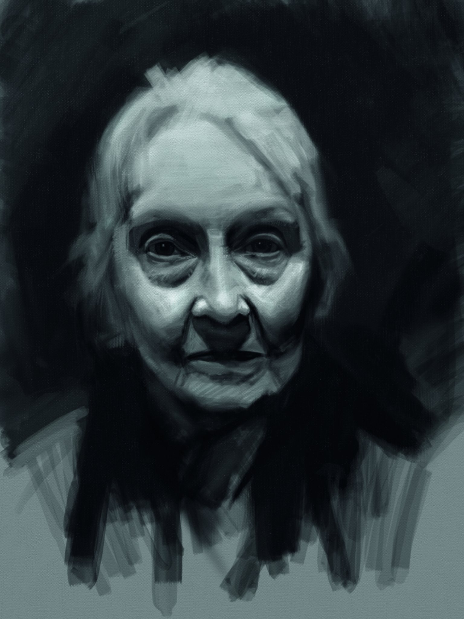
08: Start blending
I feel like the painting is getting too ‘edgy’, so I use the Blur Palette Knife tool to blend out the edges. I also want to get a better understanding of the directional form so I start going over the forehead and cheeks and pull out the rhythms of these different volumes. Nothing is precious. I’m constantly losing and finding shapes of areas.
The more I look at something as I work and the more I refine it, the more understood it gets and the closer to who the model is. This method also means there is ‘movement’ in the painting. I never lock my drawing down – the forms and shapes are constantly in a state of flux, like a human being, even when they are standing still posing.
09: Painting hair
In my traditional paintings, I use a small brush to describe form and how it turns. I work in the direction in which the light would fall on the subject. Light hits form perpendicularly. So I break out the 1px little brush to start developing this sort of approach.
I also start to think of the direction of the hair with this small brush. Hair is just like any other form. Imagine that the groupings of hair were connected. They would act like a satin ribbon, moving in and out of the shadows and lights.
Now imagine that you paint that ribbon and its form – all you have to do is to slice it into a thousand lengthwise strips. Along with these groupings are stray hairs, which are the most fun to paint in. They are a mess of complete randomness and you can really be expressive with them, yet still basing them on the information that you are receiving from the model.
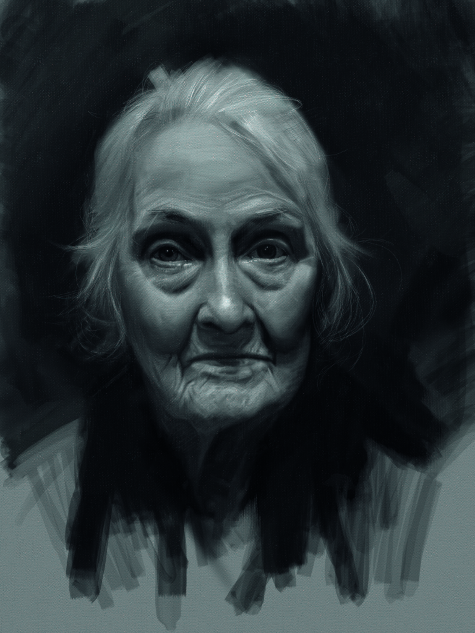
10: Add highlights
I start to bring out the lights again and to meld them into the form. Highlights on skin are always built upon the forms, and almost never separate islands. Also when we have a glassy surface like the eye, the highlights will be reflections of the lights in the room, and are usually the highest value in a painting.
So here I define the eyes a little more to put the lights and moisture in, and to really liven up the portrait. I also redraw the mouth and chin areas, getting a better sense of the form and folds.
11: Final touches
In my mind a painting is never finished, only abandoned. Painting is my understanding of the individual in front of me, so the more time I have with them the more the painting will have of their essence, character and emotion.
So to ‘finish’ this piece, I want to unify everything as well as bring up the highlights. If you look at Rembrandt paintings in real life you will notice that the highlights are always the thickest paint that is applied.
So in this same approach, I soften the features slightly and attack those highlights. But even at this point in the painting, I’m still redrawing the chin area and softening it with the Palette Knife tool.
12: Final thought
One thing I believe digital painting has over traditional painting is that the sense of luminosity is much easier to conceptualise. A digital painting is already lit from behind. Luminosity is always something that I strive for in my traditional painting, and I feel that by doing the digital work as studies for my traditional work, the benefits of both will really inform what it is that I strive to create.
Inspired? Read our 4 pro tips for achieving a trad painted look with digital software, as well as our guide to the best artist drawing pencils for working traditionally.