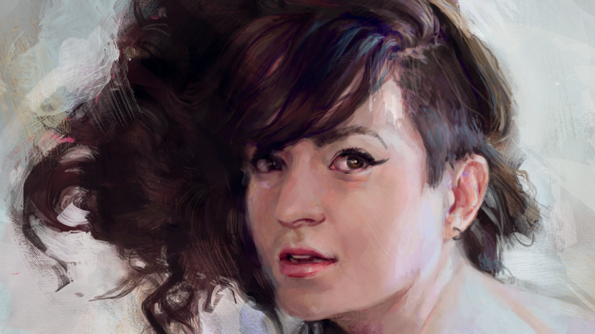
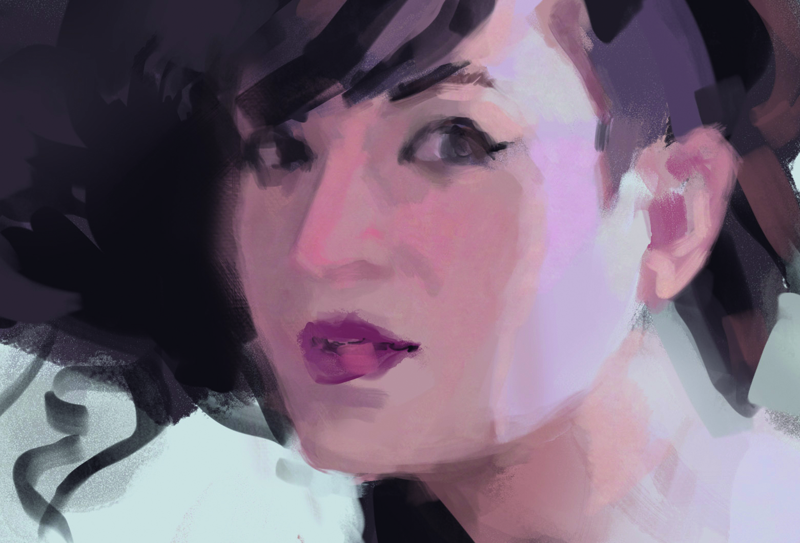
In this tutorial, I'll show you how to paint a portrait in Photoshop that captures the viewer's attention. I'm working from a reference of Cassandra, whose striking dark hair contrasts beautifully with the muted tones of her skin.
I was drawn to the subtle mix of warm and cool light on her face and the warm glow set against a cool background. Her pose of looking back over her shoulder, adds a candid, natural feel that gives the image quiet emotion.
Before I start painting, I identify what stands out to me: the lighting, colour and expression. This helps guide my decisions as I work. While digital painting can be very controlled, I intentionally invite “happy accidents”, lost edges, unexpected textures and colour surprises, to keep the image lively and full of personality.
I like working in Photoshop, but you could use another program from our pick of the best digital art software. You might also want to see our guide to the best drawing tablets.
01. The subject
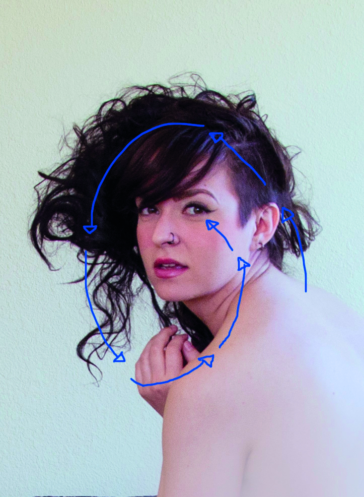
Good reference is the foundation for your painting. I set up a photoshoot with Cassandra at a time when lots of natural light comes in through the windows. This creates a beautiful soft contrast between the indoor warm lights and a bright bleached daylight. In the photo that I chose for this portrait, her back and hair provide framing for the face, which leads the eye in a spiral around the portrait.
02. Colour palette
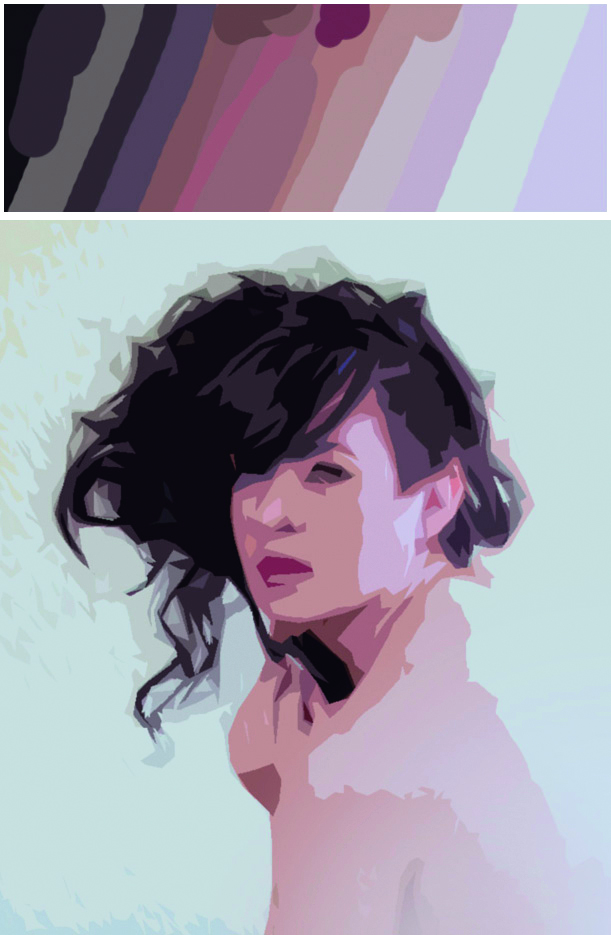
In order to get the basic shapes down quickly, I prepare a palette to colour pick from. In this case, I am enchanted with the lighting and I want to stay close to it. If I colour pick right from the photo, the grain and noise get in the way, so I use a little digital cheat: applying Photoshop’s cutout filter to simplify the photo into flat colours (Filter>Artistic>Cutout). This basic palette is a good jumping off point, and I can add more colours later.
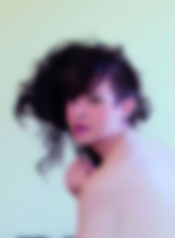
03: Squint
It is tempting to get caught up in the nuances of the eyes, or the texture of It is tempting to get caught up in the nuances of the eyes, or the texture of the hair, but these are best reserved for later. Build from simple to complex. To see the basic shapes squint at the photo so the details are fuzzy. This shows the most important information – if you can’t see it, it’s not essential for initial structure.
You could try this exercise to see how our eyes work: Without refocusing your eyes try to notice details about your arm. It’s actually quite blurry! Our eyes can only focus completely on a small area of vision close by. By choosing a focal point for your portrait and gradually losing detail away from it, you help the illusion that the subject is right there in front of the viewer. If you are painting from life, focus on your focal point and use peripheral vision to see the rest of the scene. Working from a photograph, everything is in focus, so you have to invent this effect.
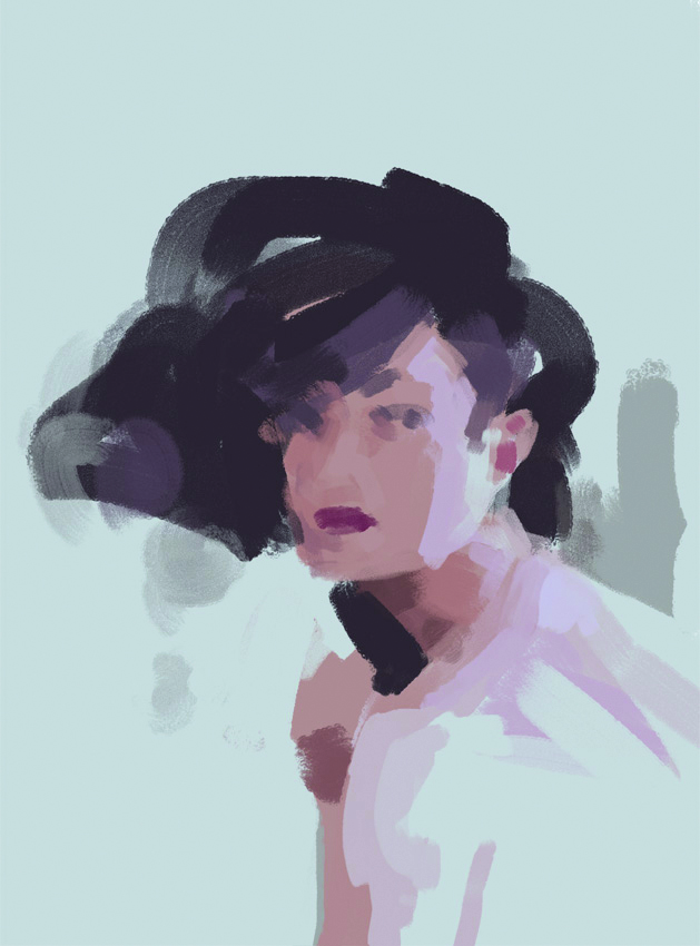
04: Basic shapes
This Blocking in the basic shapes is the most important part of the painting. This lays the foundation for everything to come – the proportions, likeness, light and form are all set up here in the first simple strokes. I use a large brush for my first pass, which prevents me from getting caught up in the details.
05: Facial features
After I am satisfied that the basic shapes are in place, I begin to work on smaller areas of the painting. The temptation is to use hard lines to define the edges of each feature, but most of the edges should be soft to show that the volumes turn gradually in space. As I add the features, I am careful not to be too dark or defined too quickly. I zoom out often so I can see the relationship between the features.
06: Focal point
When deciding a composition there should be one focal point designed to attract the viewer’s attention. For portraits, it’s often a single eye. Satisfied with the basic placement of my features, I add more refinement in my focal point – the right eye. By starting my rendering with the focal point, I can always compare against it and be sure that the rest of the painting is not competing for attention.
07. Work outwards from the focal point
Now that I’ve added details to the focal point of the painting, I can start refining the rest of the portrait. I begin to work outwards from the eye. As I work further away from this point, I use softer edges and less contrast.
I have planned that the large area of her back will be mostly lost into bright light, so I don’t need to add any details there. As I move around the canvas adding refinement, I do it on several new layers so, if I need to, I can always get back to the basic structure I was satisfied with.
08. Defining planes
While rendering details, I imagine each area as a simple construction of planes – like it’s chiselled out of wood. Volume or depth is light falling on three-dimensional form. Where the form turns to face away from the light source, it becomes shaded. Keeping the structure in mind helps me to understand how the shading works, rather than just copying its placement.
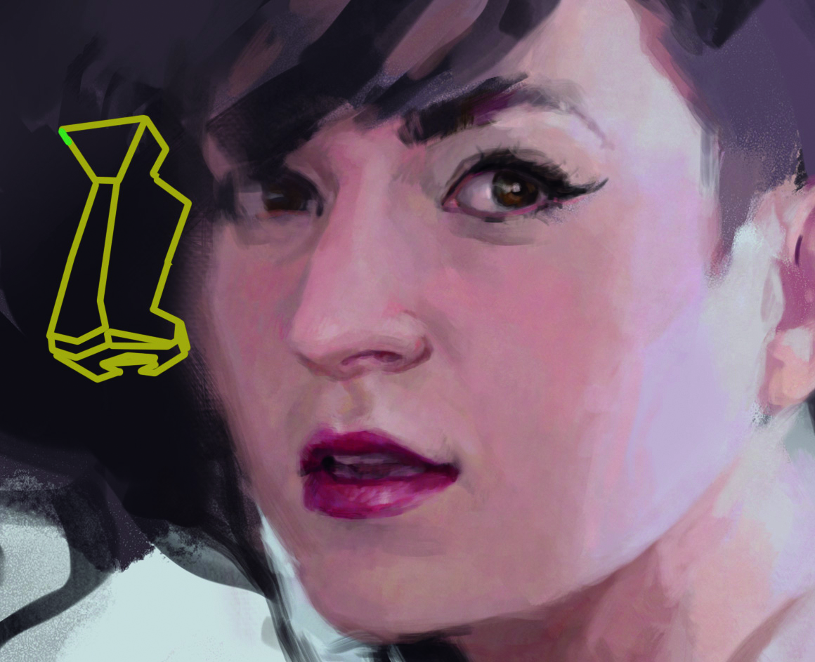
09. Painting in the hand detail
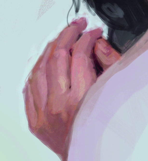
Hands are almost as personal as faces, and the gesture of this one really adds to the candid feeling of the piece. I don’t want to emphasize it too much, however. The hand is a supporting element in the painting.
I paint from joint to joint, looking for the bends in the fingers and separating them with values, again following the plane changes. The outside edges can be left a little fuzzy so that the hand doesn’t stand out or feel stuck on to the background.
10: Bring life to the background
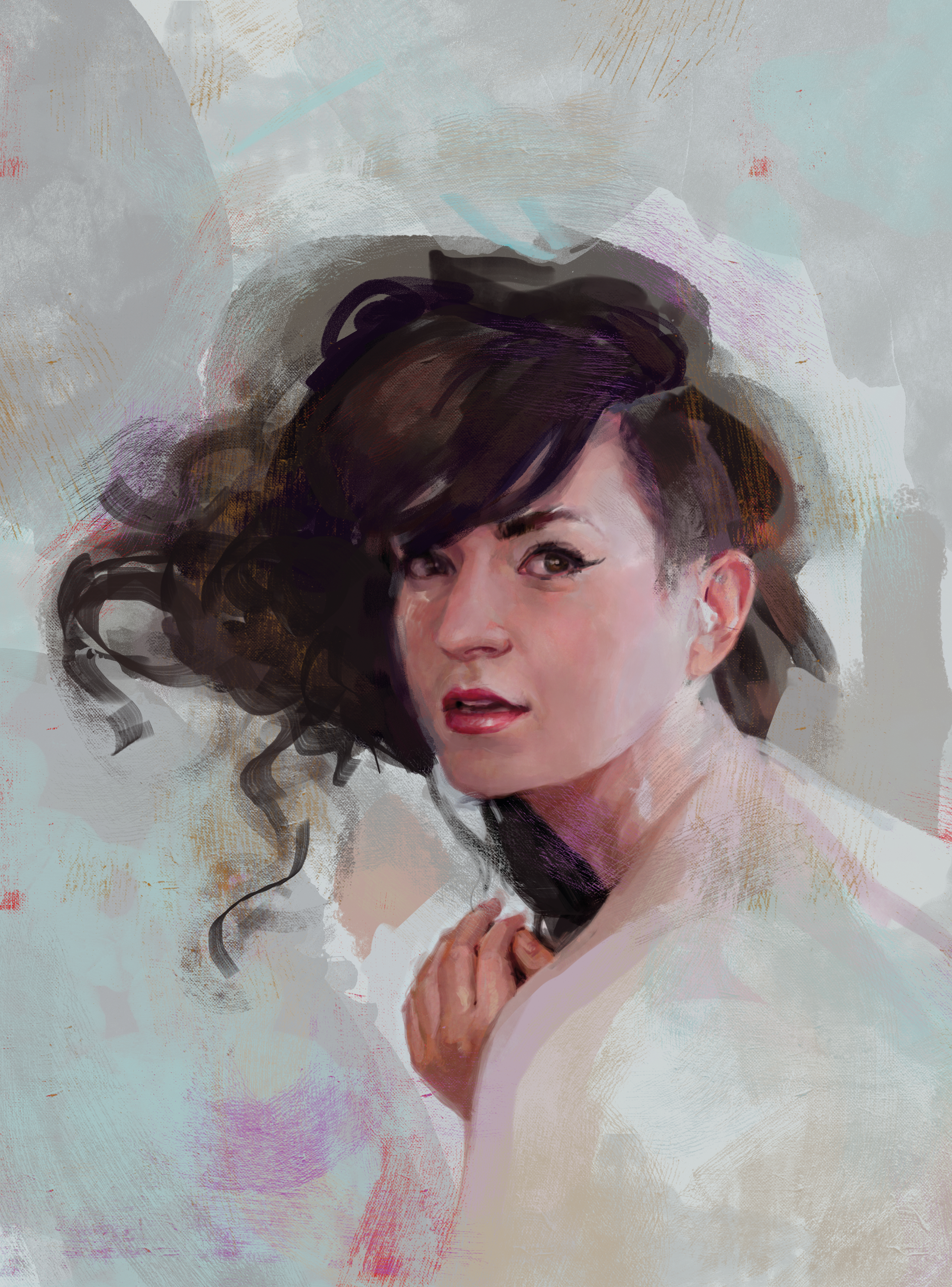
The background needs activity, and some touches of colour to bring it together with the figure. For this, I use high-res paint texture brushes to quickly fill in the space with abstract details. I select colours from the painting and layer them under the texture, keeping in mind that the overall tone should be cool and the value a bit darker than the brightest light on her skin so she will pop out.
11. Tweak layers
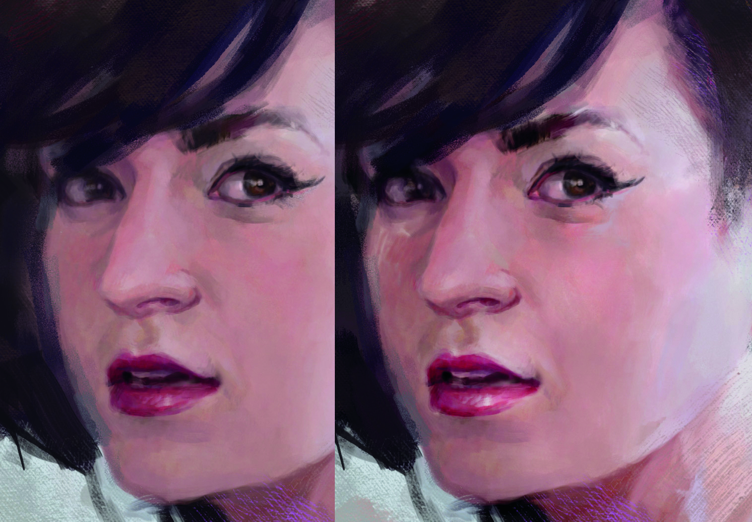
Even with all the colour and texture in the background, I feel it is a bit sterile. I take a snapshot and start experimenting – hiding it under painting layers, and trying out various blending modes. Changing earlier layers can lead to interesting, unexpected effects, with the details painted later still intact. I adjust levels on a few of the layers to give more contrast to the skin tones.
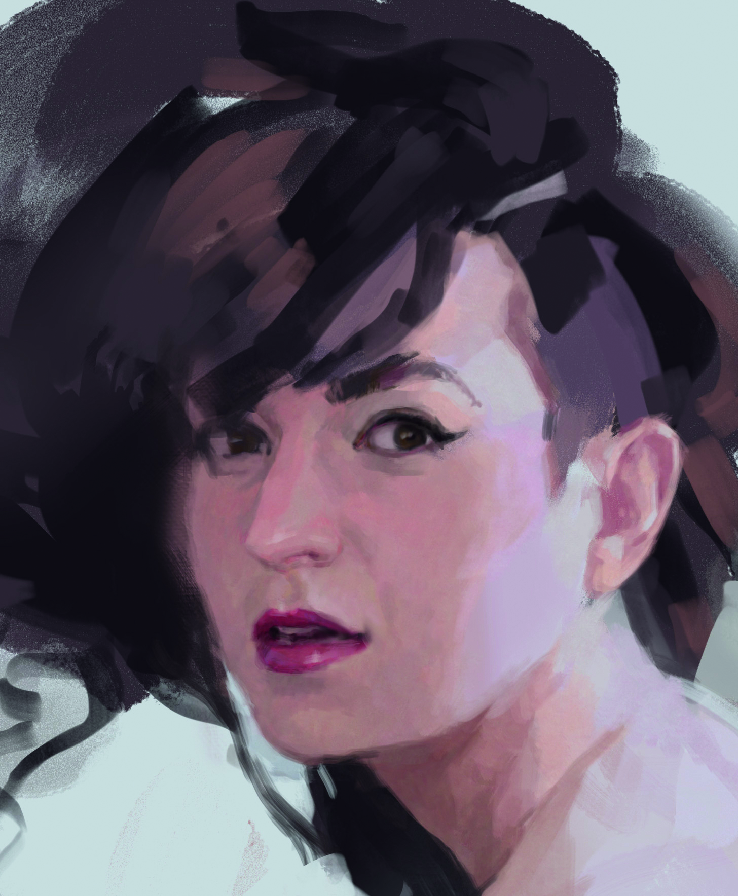
12. Soft shapes for hair
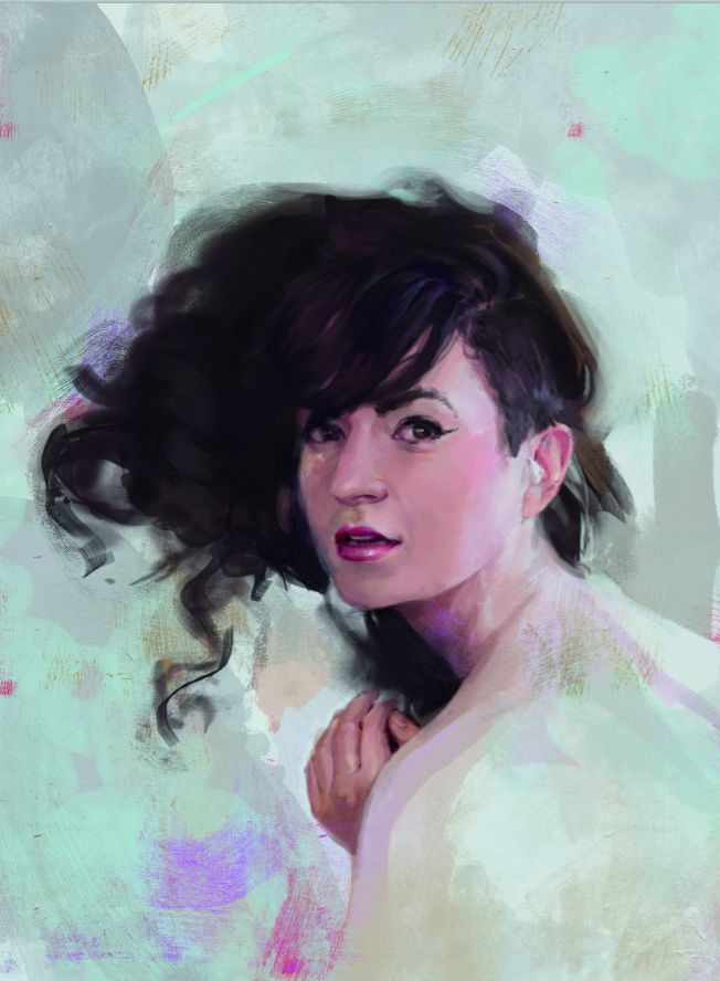
Satisfied with the happy accidents from experimenting with the layers, it is time to work on the hair. For a big mess of textured hair like this, the key is to build from soft edges. I use a soft round airbrush, especially focusing on the outside edge of the hair shape where I want to show that the strands become less dense than in the centre.
13: Strands
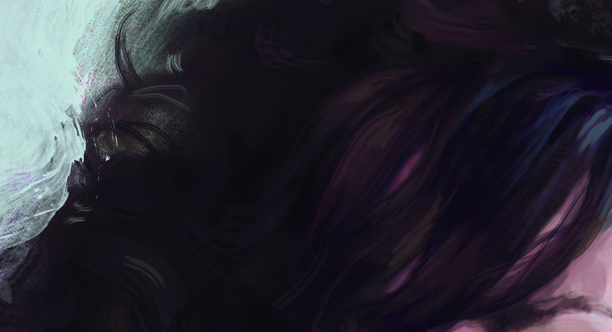
Once the main shape of the hair is in, I add texture and lighting. The texture of this dark hair mostly shows up in the highlight areas, so I focus on those. It’s impossible to paint every strand of hair, so I squint again to see the big changes in value and colour and paint those in first. A few very fine strokes added last give the sense of strands.
14: Layer options
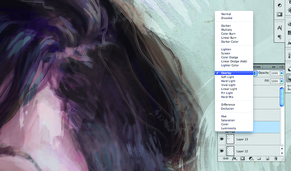
One of my favourite digital tricks is to use a texture in combination with a low opacity or one of the layer blend modes, so that the image shows through. It adds a sense of detail without actually painting in details.
For this, I use paint texture brushes again. I am not too careful with where they fall – letting some of the background spill over the figure makes her feel integrated in the space. This layer gets set to Overlay, a layer mode that makes darks darker and lights lighter.
15: Playing around
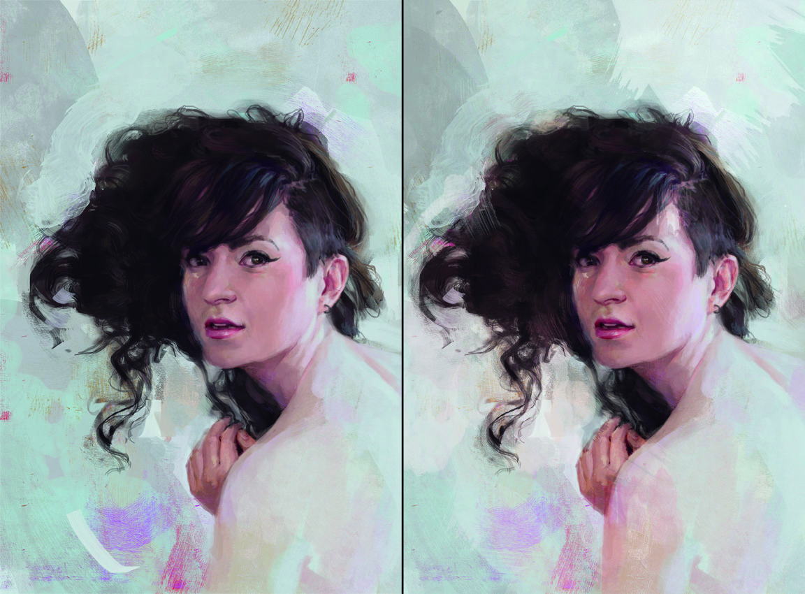
If it were a pastel painting I would stop now. Instead I save and decide to keep tweaking levels and Hue/Saturation for the various layers, and messing with the shapes in the background.
This is an advantage of digital: I can always go back, so there is no reason not to experiment. Now I close the reference so I can focus on the painting and stop thinking about capturing the photo.
16: New file
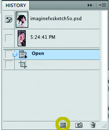
Now that I’ve done everything I can tweak the layered image. I use the duplicate file button in the history menu to make a copy, and merge down all of the layers in that copy. I am always careful not to merge the layers on the original. Duplicating first allows you to go back and make changes in the layered image if needed.
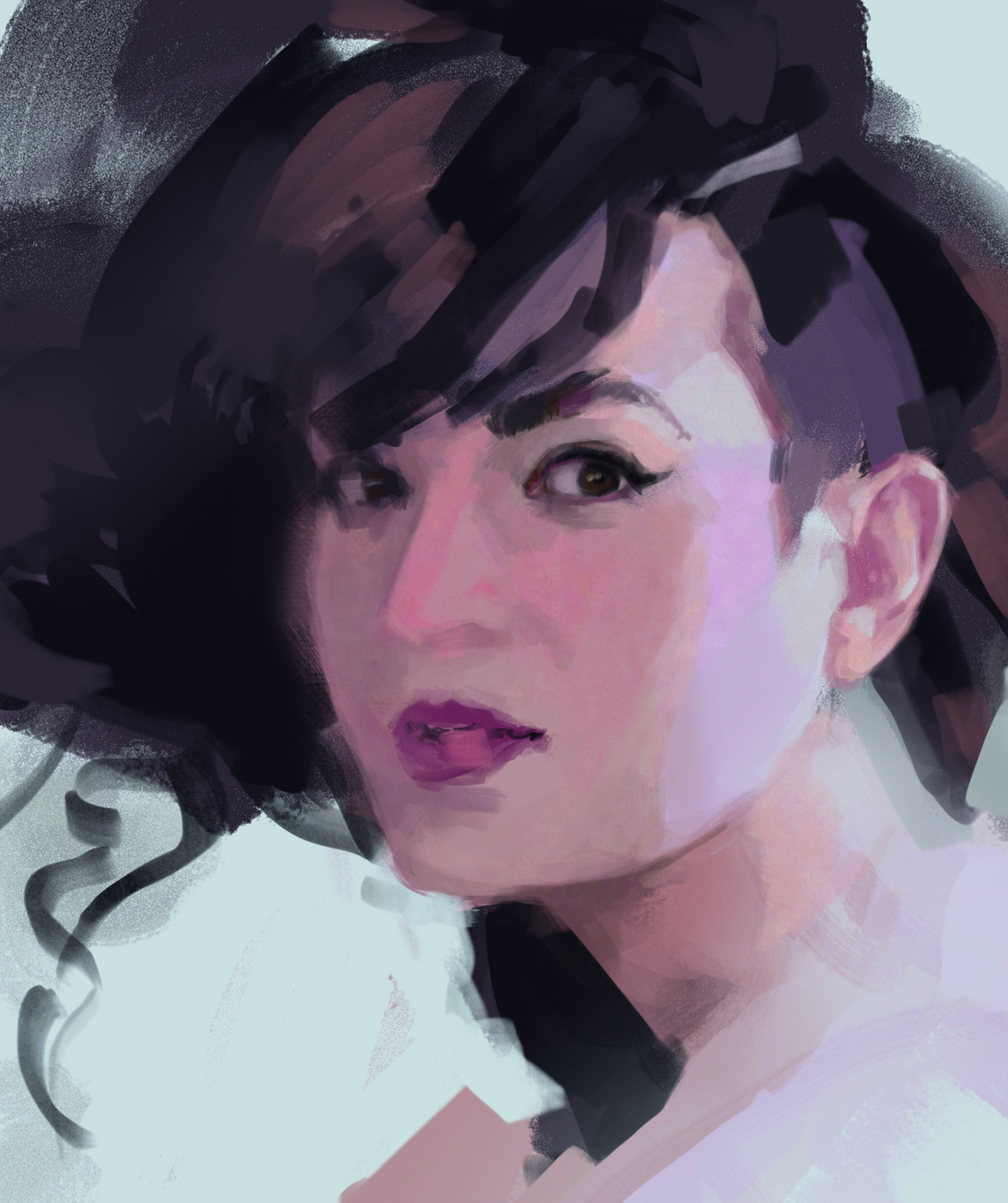
17: Final touches

On the newly merged file, I darken and lighten the values a bit further in selected areas using Dodge and Burn. These tools can get really garish, so I set them to a low exposure and only do one pass. The background is missing some flow.
I want it to help lead your eye around the piece. For the final pass I use the texture brushes again to tweak those shapes so they wrap around the model. With that, I call it done!
For more tips, see our piece on life drawing on an iPad. Also see one writer's experience using a drawing tablet for photo editing.
Do you have a digital art tip? Share your advice in the comments section below.