Sometimes making fantasy art for video games can feel like alchemy, starting with a blank canvas and creating gold, of sorts. I’m not sure that’s quite what the alchemist in my scene is doing, but stick with me and I’ll break down my process for creating this image. Hopefully, it may provide you with some ideas for how to approach your own game art (see our guides to the best digital art software and the best drawing tablets if you need new tools).
I split my workflow into four main parts. The first is to establish the overall direction I want for the painting, which will require finding references that match up with the style I have in mind. Next, comes sketching out the initial line drawing. In order to see the structural relationship between the characters and the scene, I like to keep everything as relaxed as possible at this stage, which helps me stay open to new possibilities.
The third step is to shape the light and shadow within the scene. This is where the authenticity of the space is important; it’s where the characters and elements are placed, and where we achieve an accurate relationship between them all.
Lastly comes making final adjustments and adding more details to improve the believability, all without changing the important relationships that were developed during the previous step. Out of everything, I find the most important aspect is to have realistic references to make sure I’m creating a world that people can believe is real.
01. Find references and start sketching
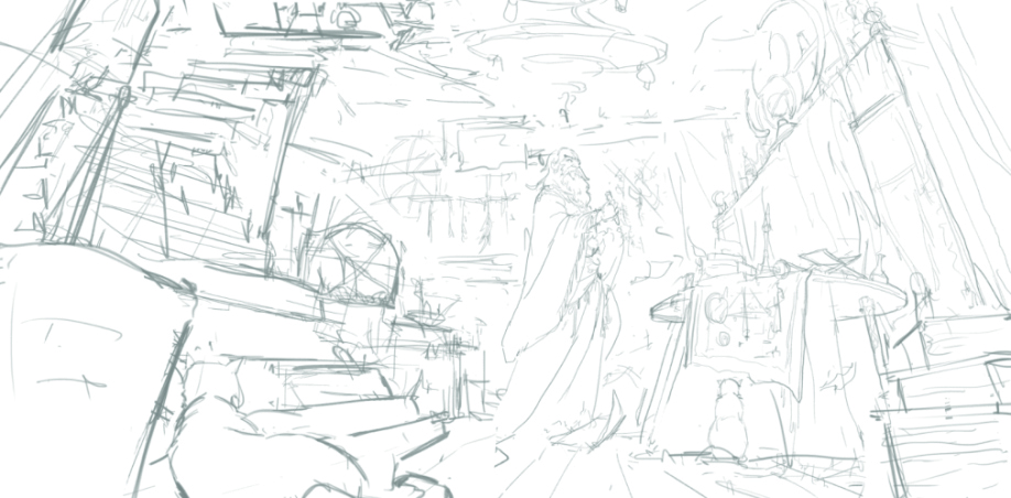
Find references and start sketching First of all, have a long look for some good movie stills and other references that match with your design direction. Find images to inspire your composition, the light and shadow, colour and objects, all within indoor environments similar to ours.
Determine how the light and shadow will appear, most likely from a source outside a window. Use this on the protagonist and to guide the audience’s attention within the composition. With the help of your references, develop the elements within the composition. Don’t worry too much about size, rhythm and density at this point.
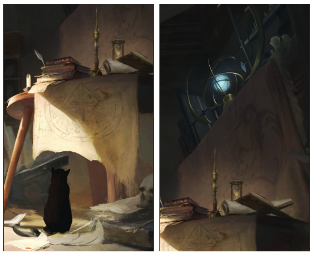
02. Create your hierarchy in black and white
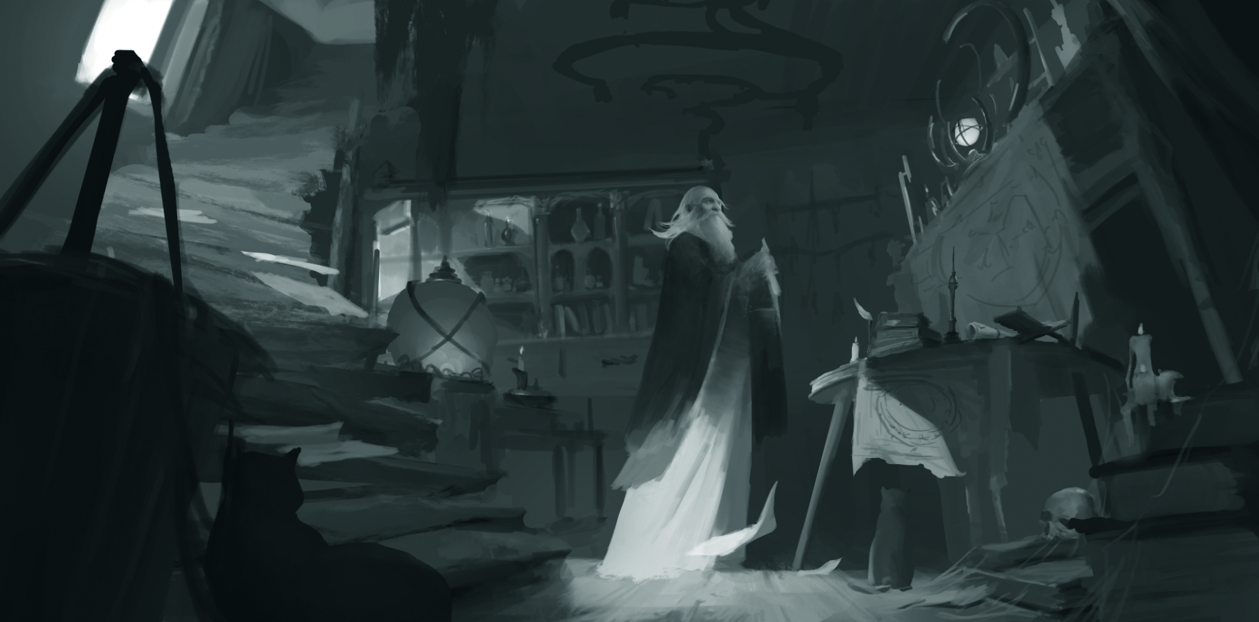
The space, light and shadow are marked out by the simple relationship between black, white and grey. This means the contrast on the protagonist can be weak in the early stages and remain fairly close to the rest of the scene.
The foreground can be dark, as at this stage the contrast isn’t particularly important; instead, we’re mainly relying on the space and using each object to separate everything. We can make some elements clearer however, such as the medicine bottles and pieces of flying paper.’
03. Overlay colours
Let’s start adding colour to the image, taking our lead from the existing shades of black, white and grey. First decide the basic colour of each object while maintaining a unified tone; I’ve gone for a slightly dark, warm colour system, as the main scene takes place in a wooden building.
The primary light source is a strong light coming through the window, with a colder, weaker light above the table on the right. Be careful not to destroy the previous black and white relationship previously developed, as it risks damaging the overall contrast.
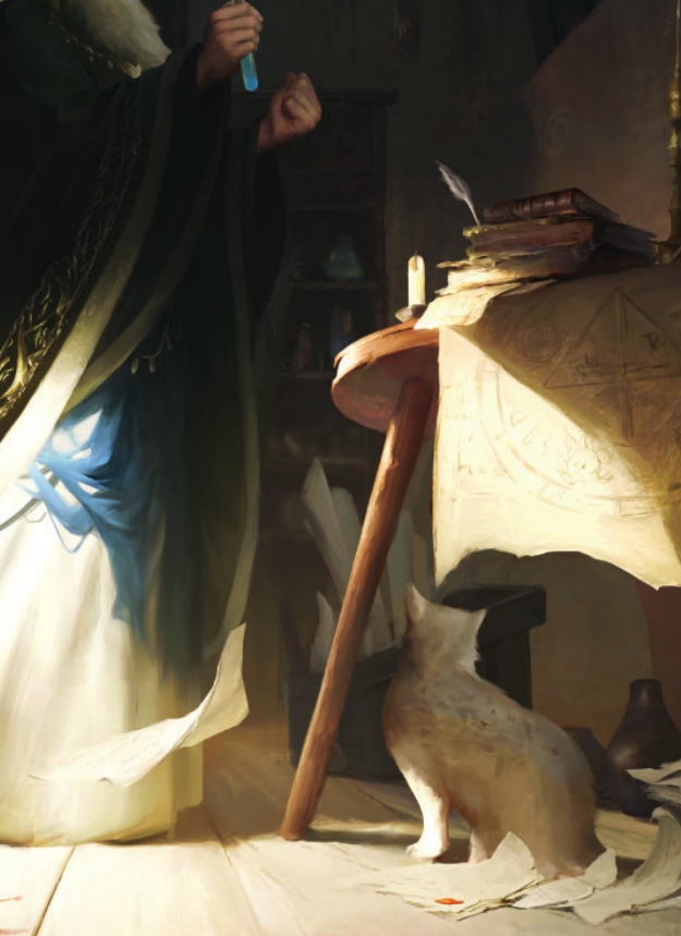
04. Add complementary elements
Because the basic colour contrast has been decided, now’s the time to check whether the overall picture is lacking some elements, or if any shapes need adjusting. Here, the table behind the character has been changed, while the floating cloth above is larger and the medicinal materials are being hung on the wall.’
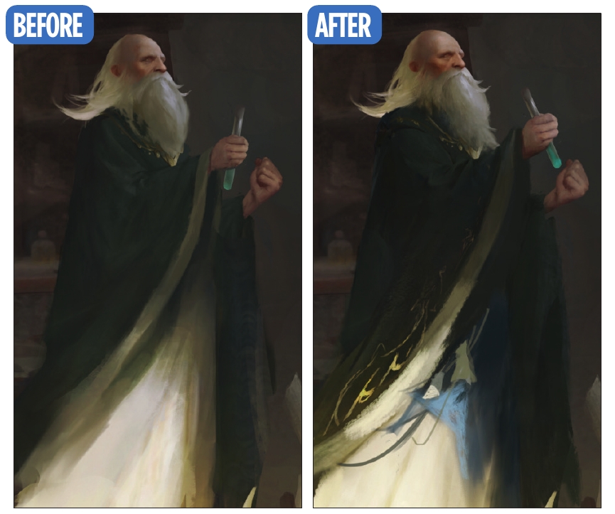
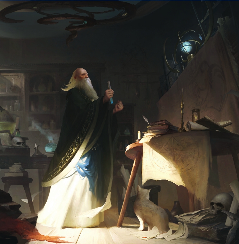
05. Tweak the character
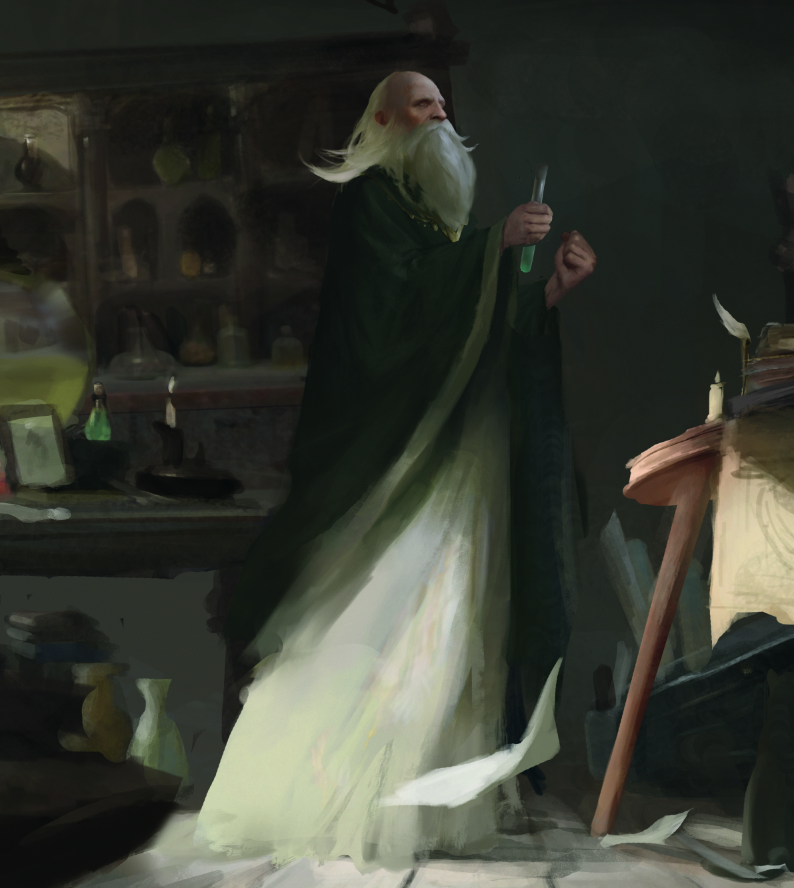
Before I started working on the details again, I wanted to adjust the dynamics of the character so that he looks more nervous and expectant, which helps to make the image’s overarching story clearer.’
06. Enhance the light and shadow
To draw the audience’s eye, we’ll push the lighting further. For my scene, the light shining through the window and onto the floor is warm and strong, which helps to make the cold-warm temperature contrast more powerful.’
07. Develop the character
Continue to adjust and improve on the protagonist. Work on facial details, saturation and contrast, and push the lighting and design of the focal point.’
08. Highlight important objects
Pump up the visual interest within the whole scene, not just the key areas. I made tweaks to the space between the objects on the table and the fabric behind, while adding some cabinets also made the area richer.
09. Make the background more interesting
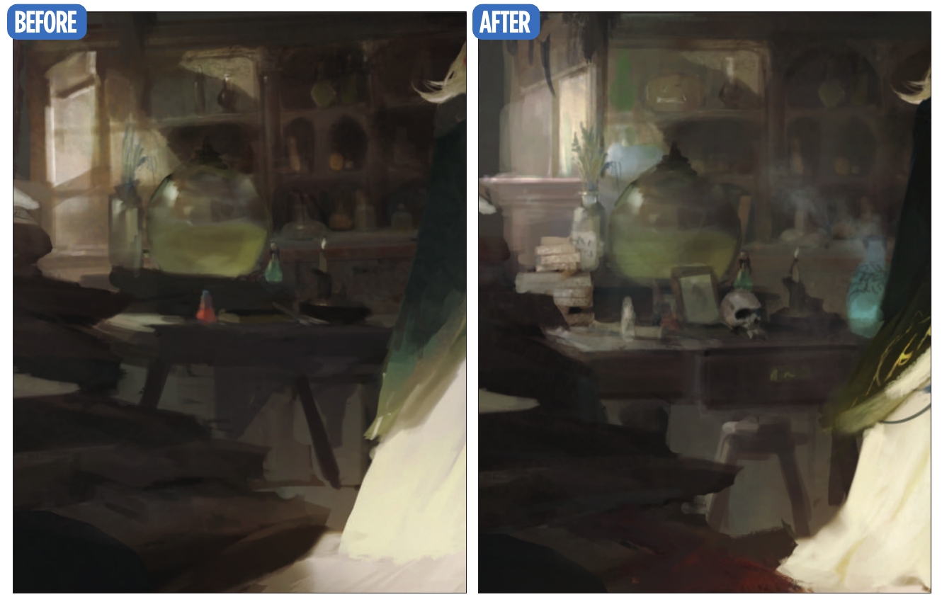
Next we want to bring in some extra details and objects to visually enrich our background. For example, I decided to place a brighter blue medicine bottle on the right of the table behind the character, in order to make the space around them feel more alive.’
10. Perfect the piece
We’re now getting to the point where our image is almost complete. I adjusted the perspective of the table behind and added more items to the table, as well as the flying paper and chair. The stairs were also painted, while the contrast relationship was given an adjustment.’
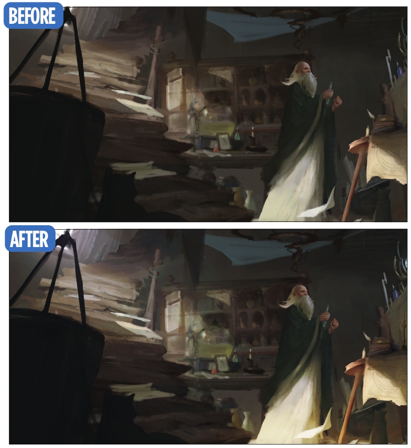
11. Work on the contrast
Continue developing the scene by strengthening the contrast of light and shadow on your details, and perhaps make some tweaks that help to focus the viewer’s vision on the image’s key elements.’
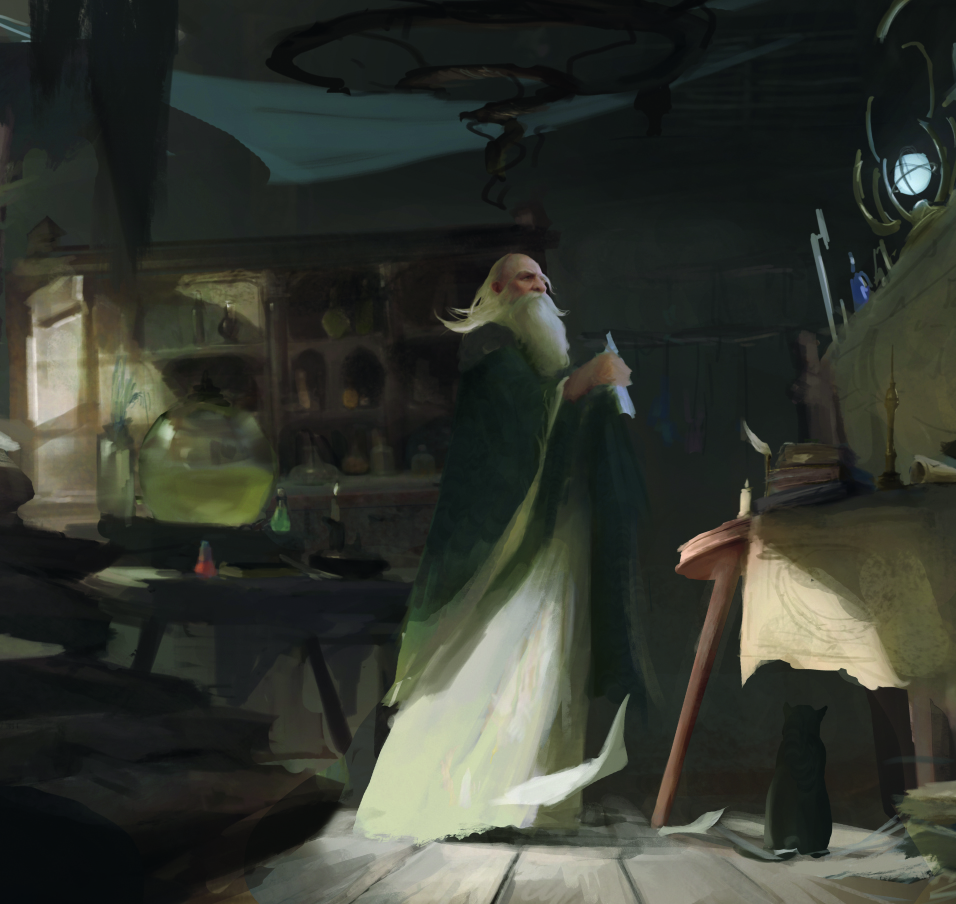
12. More small changes
Other areas that could be worked on include the outline of the protagonist, the colour, and the spacing of the composition. I played with the outline of the table behind, opened up the spacing around the characters, and adjusted the appearance and dynamics of the alchemist’s furry feline companion.
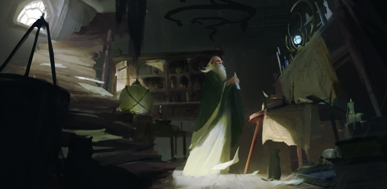
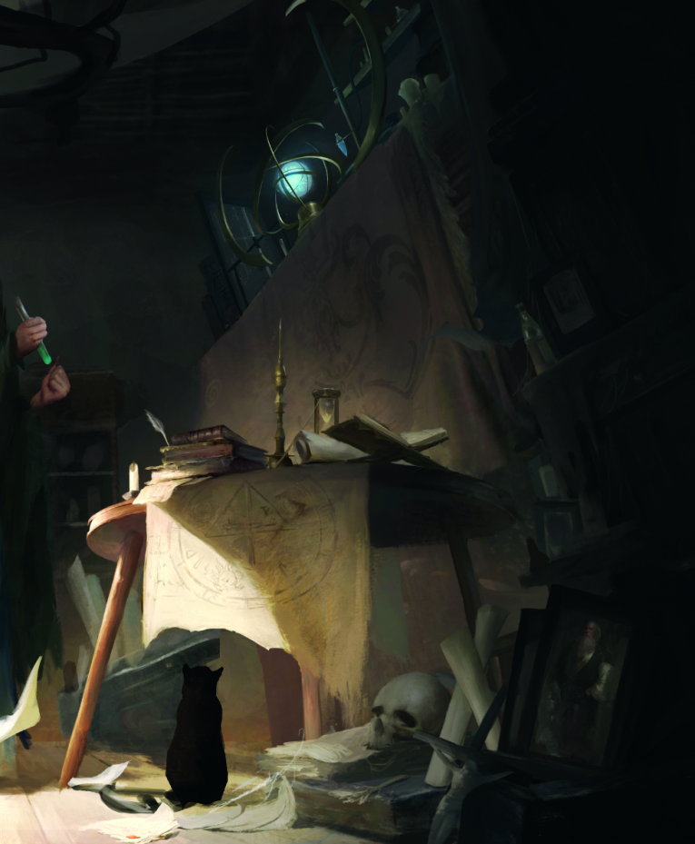
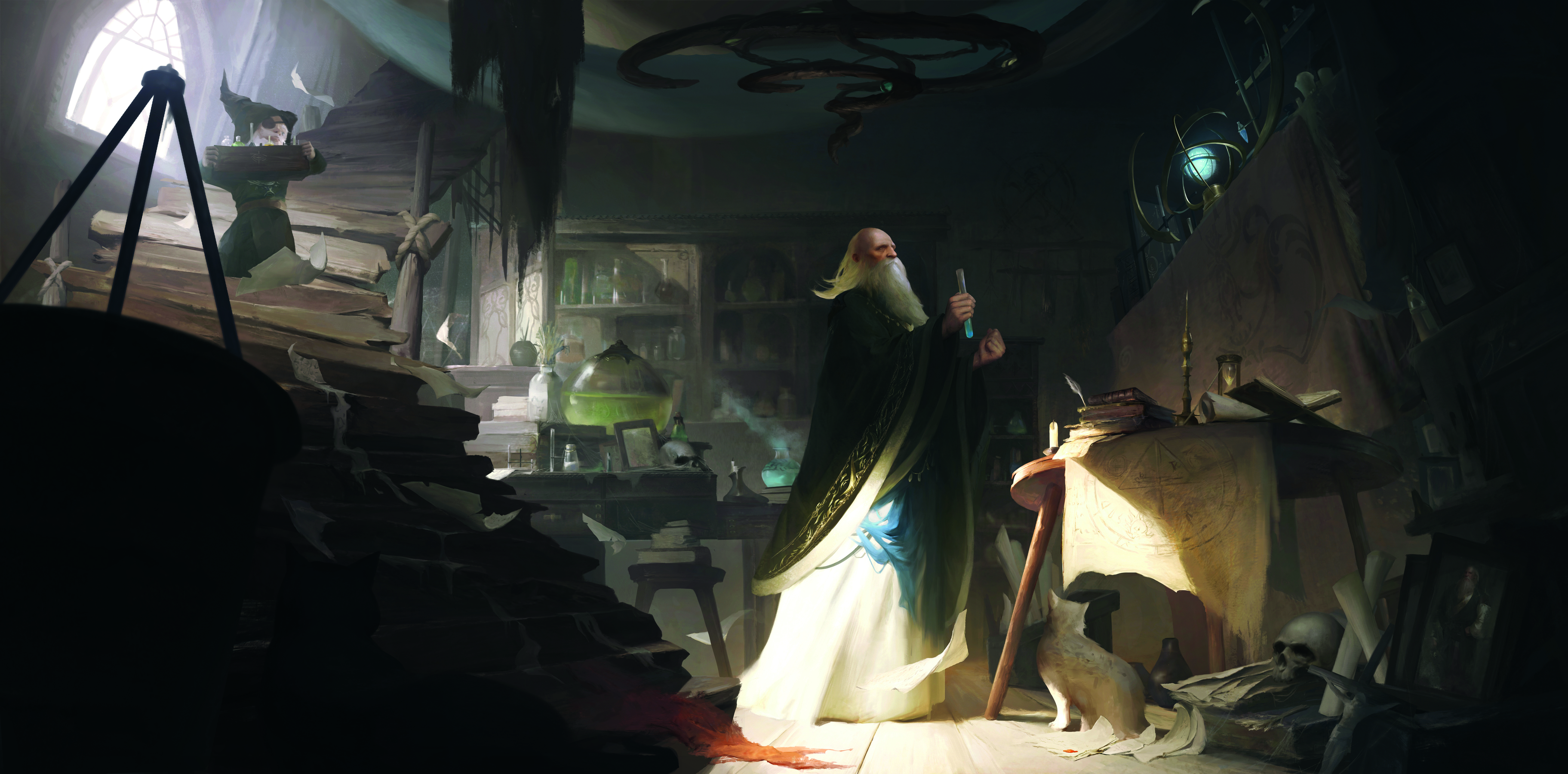
13. Making a late addition
I felt the staircase was a little empty, so added a new character with a potion who’s looking towards the protagonist to further guide the visual direction. At the same time, the overall contrast was adjusted before I focused on the protagonist, and then weakened the background with some cold light to finish.
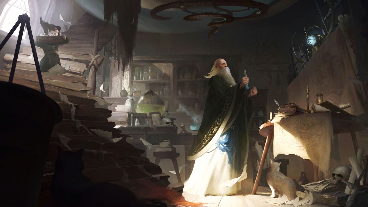
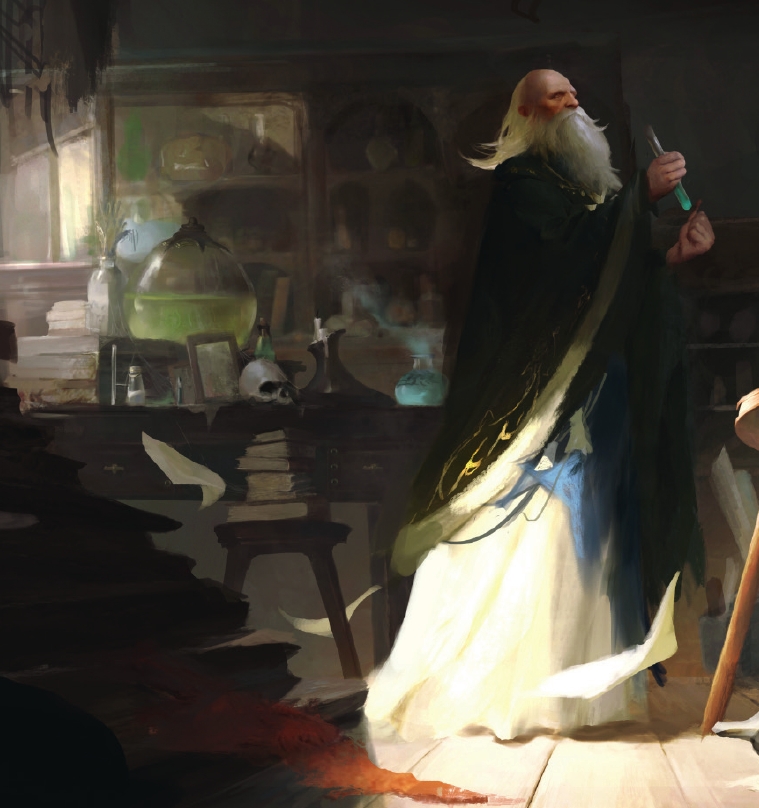
Final Image
See our pick of the best indie game developers for more game art inspiration. We also have a guide to the best tools for game art and textures.
This content originally appeared in ImagineFX magazine, the world's leading digital art and fantasy art magazine. ImagineFX is on sale in the UK, Europe, United States, Canada, Australia and more. Limited numbers of ImagineFX print editions are available for delivery from our online store (the shipping costs are included in all prices).