Decorating with color is about so much more than decoration. It’s what gives our spaces character, what fills interiors with vibrancy and life, and what brings buzz and energy that simply can’t be captured in monochrome. It shapes mood, creates atmosphere, and sets the tone for how we live.
Now, I get it. Decorating with color — especially if your default is gray, white, or taupe — can be daunting. Bright shades shout. Deep tones demand confidence. What if you get something wrong? The truth is, it doesn’t have to be loud to make itself heard. It doesn’t even have to be bold. It just has to be considered — and intentional.
So let’s start slow. Decorating with color isn’t a one-size-fits-all situation. From accents and accessories to contrast and cohesion, there are endless ways to bring it indoors in a way that suits you. What does it mean to decorate with color today? How do we use it in a way that’s contemporary, personal, and liveable? Should we follow rules like color theory? Let’s find out.
1. EXPLORE THE TRUE NATURE OF COLOR
Color. The small word summons visions of streaming rainbows, paint-daubed artist’s palettes, blooming flower gardens, dazzling sunsets, streets alight with glowing neon signage, vibrant dancing carnivals, and so much more. Color is all around us, woven into the fabric of life, and to leave it out of the home feels… odd.
Let’s clear something up. When I’m talking about ‘color’, I don't necessarily mean vivid cherry reds, emerald greens, cobalt blues, or magenta pinks (although they are very welcome). The word is all-encompassing — from the palest pastel lemon to the brightest sunshine yellow, it’s all included.
But white/gray/black are out, and let’s decide not to count any of the gentle neutral tones, such as beige, either, as decoratively they’re often leaned on as a bit of a colorless crutch. We’re by no means banning them (and they come in very useful alongside more colorful hues), but let’s focus on a bit more of a rainbow-influenced pigment as ‘color’ for now.
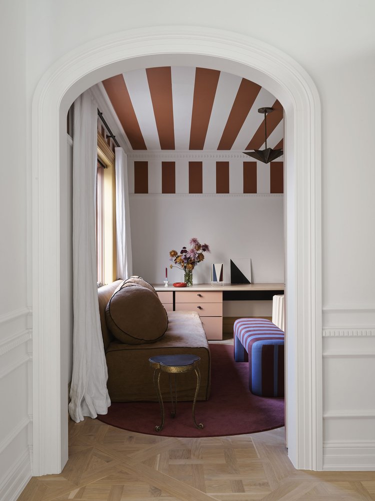
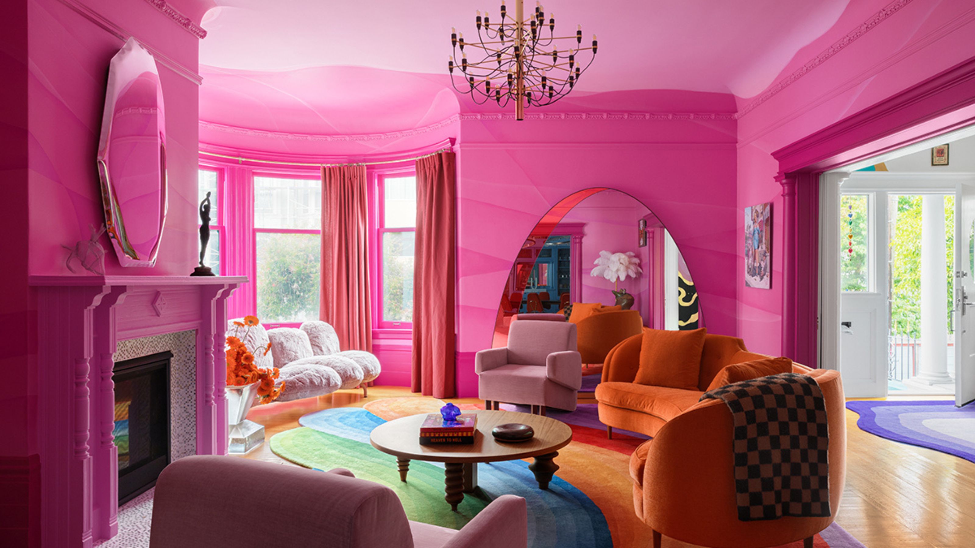
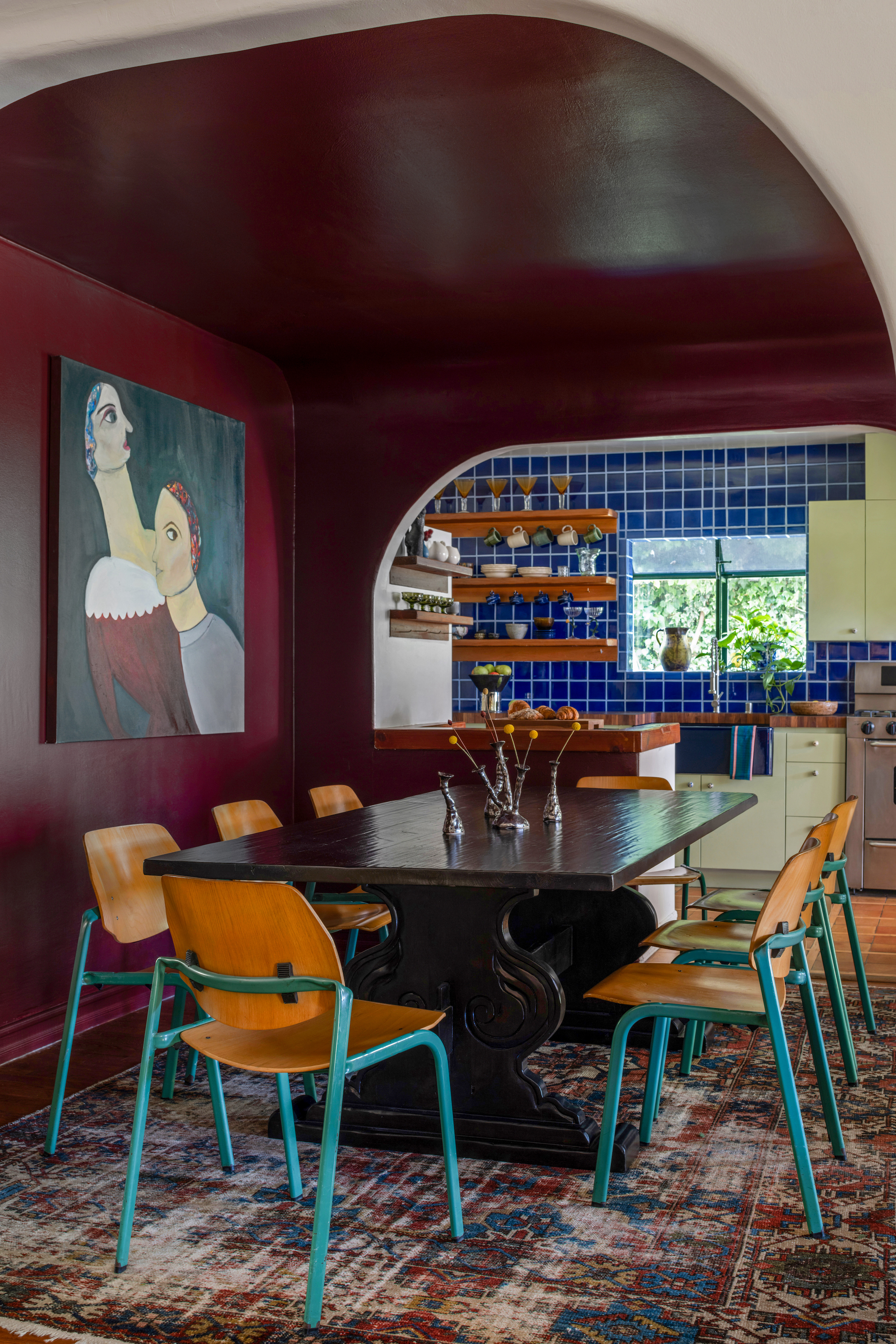
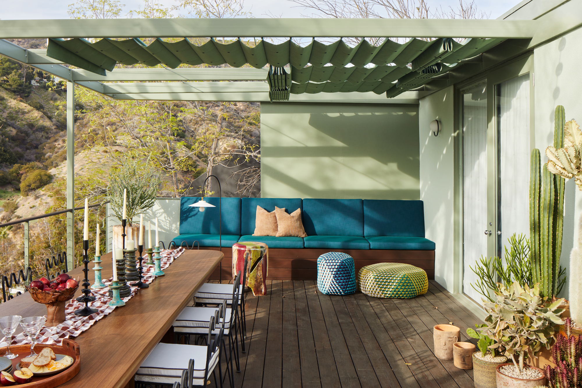
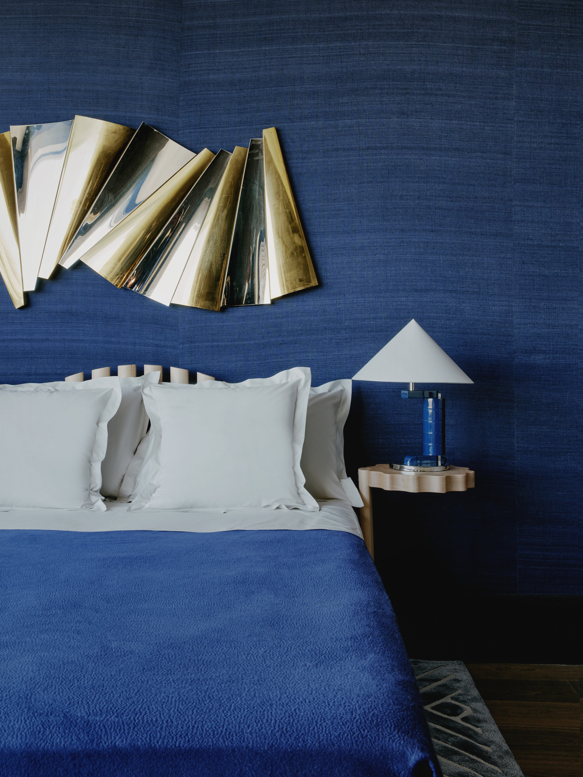
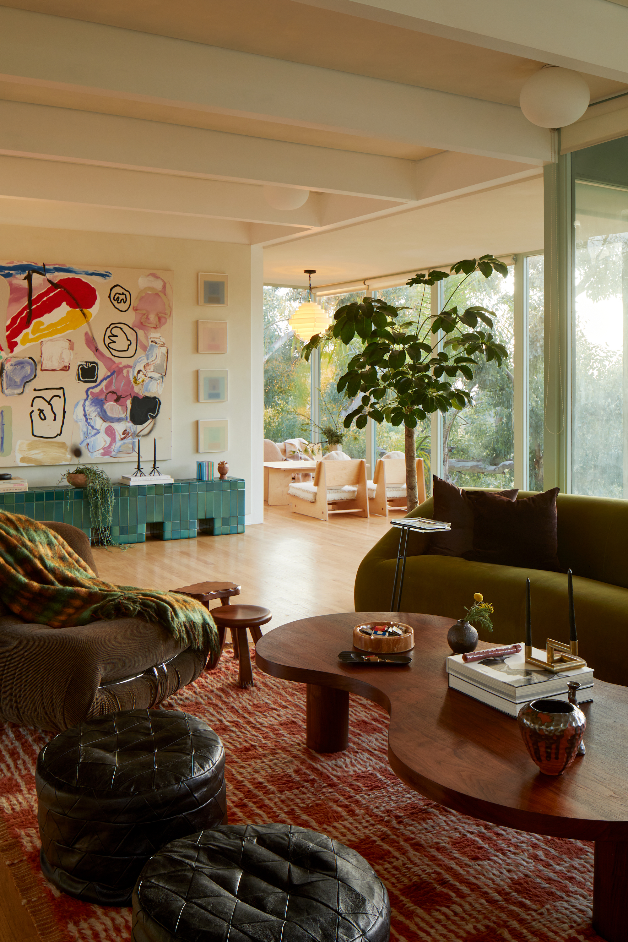
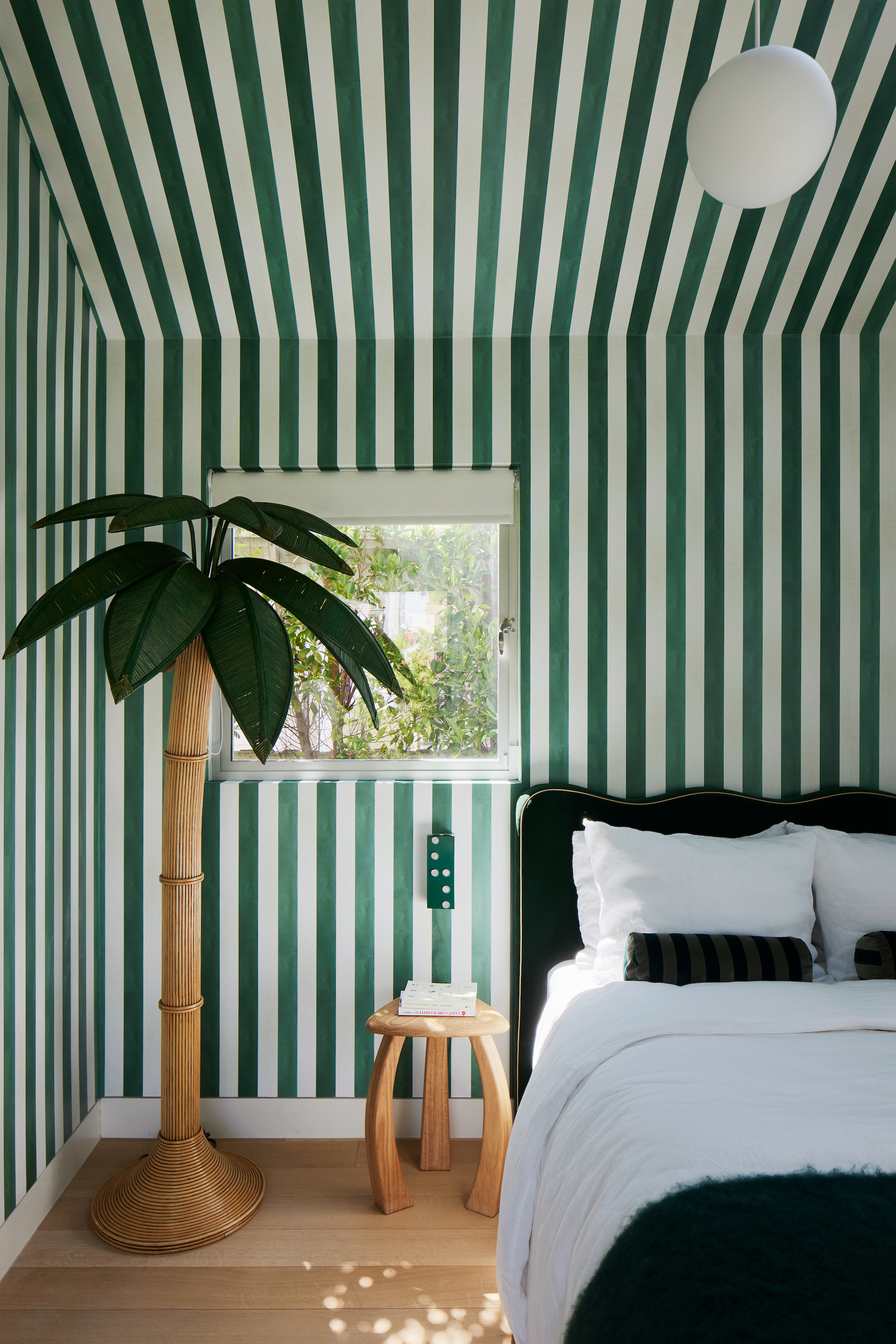
A colorful interior — whether that's a colorful living room or bathroom, or wherever — can be a quiet sanctuary in gentle greens, soft lilacs, or muted blues. It can be impactful yet understated in mellow mustards, dusky teals, brick red, or olive green, it can be fresh and uplifting in rose, sky blue, spring green, or warm apricot, or it can be zingy and zesty in fuchsia, coral, turquoise, or poppy.
“Color doesn’t always mean bright — sometimes the most beautiful schemes are built from subtle shifts in shade and texture,” agrees Roslyn Keet, design director at David Collins Studio. “Above all, a palette should feel personal — every color tells a story. Be considered but courageous.”
2. LET COLOR SHAPE YOUR MOOD
A room decorated with color in any tone or shade feels dynamic. Be it the zen of faded mint, the vibrant punch of burnt orange, or anything in between, color (in small and large portions) shapes the ambiance of each room. It's known as color psychology in interior design.
“Color has the power to influence the entirety of a space — evoke emotion, impact mood, drive reaction, spark conversation, even stimulate nostalgia,” says Kristina Khersonsky, principal of Studio Keeta. “Color, used with intentionality, can create desired atmospheres — from relaxed to harmonious to energetic.”
It’s the difference between feeling welcome and wanting to leave, between feeling energic and needing a nap, between feeling at home, or a little lost.
3. UNDERSTAND THE ART OF COLOR PAIRING
But even something as abstract as decorating with color comes with rules. I’m talking, of course, about the color wheel in interior design. Knowing how to use it is delightfully simple, and its guiding principles, which divide hues into groups and point to those that complement one another, make rock-solid visual sense (it has been successfully used since its invention by Sir Isaac Newton in 1666).
But — that's not saying you have to follow it. There are times when it's best not to use color theory. There’s nothing like going with your gut and what feels right.
“I do love unexpected color combinations that are not exactly trend colors,” says Nicole Dohmen, CEO and founder of Atelier ND Interior. “Mossy green and mustard create a perfect moody room, ice blue with burgundy and chocolate browns feel sophisticated and rich, light salmon with purple, peachy pinks and dark chocolate…”
“An underrated color pairing I am loving at the moment is blue and green,” adds Kristina Khersonsky. “Because they are adjacent on the color wheel, the pairing creates a visual sense of balance and calm. However, depending on the hue of the pairing, there can still be an element of surprise to the combination”.
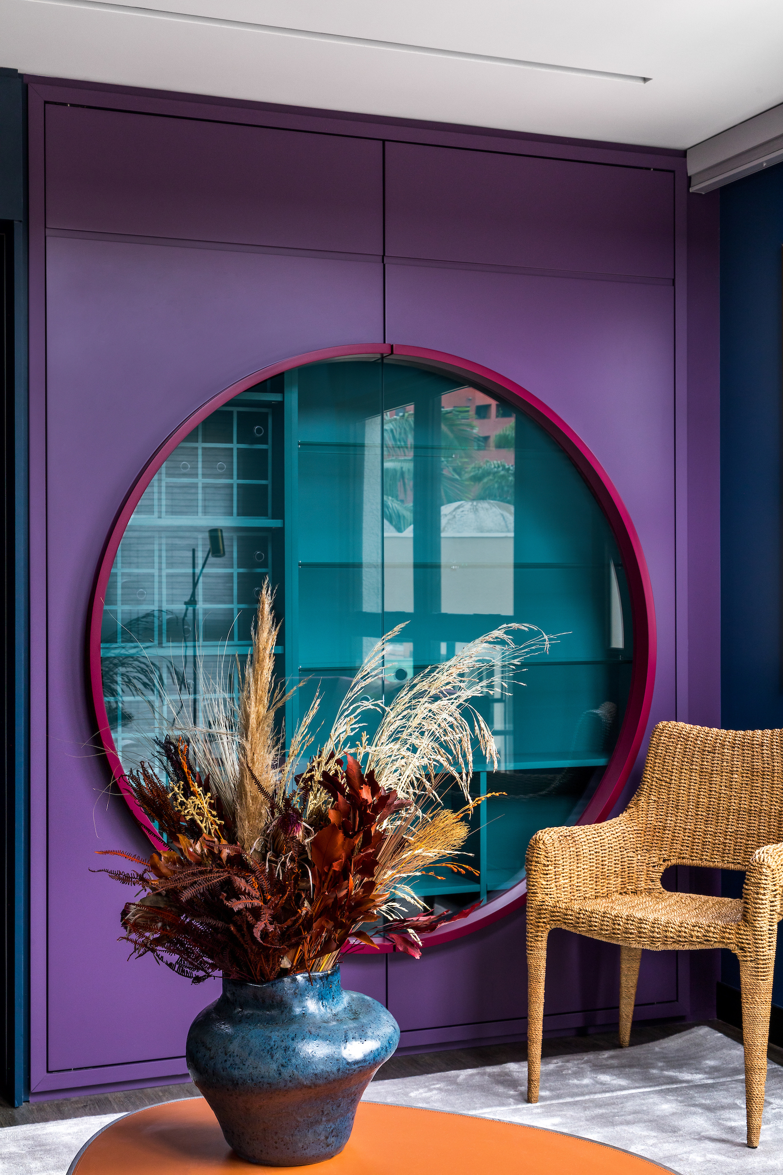
“We tend to favor combinations that feel both refined and unexpected,” Roslyn Keet adds. “Lavender with ochre, sage with celadon, or navy with burnished gold. These pairings bring character while remaining timeless and memorable.”
We don’t need trends or rules — just curiosity. Embrace experimentation, mix and match shades that speak to you, and trust your instincts when decorating with color.
4. EASE COLOR IN
Where does decorating with colour work best in the home? Well, the truth is there is no simple answer. It depends so much on the surroundings, the room, the measurements, the light, the hue, the tone, the undertones, your feelings towards that particular shade. But there are a few pieces of advice that can help you along the way.
Ask yourself: What is the area actually for? The coloring of a space for winding down, sleeping, or bathing will be very different from one for cooking, hosting, or chatting in.
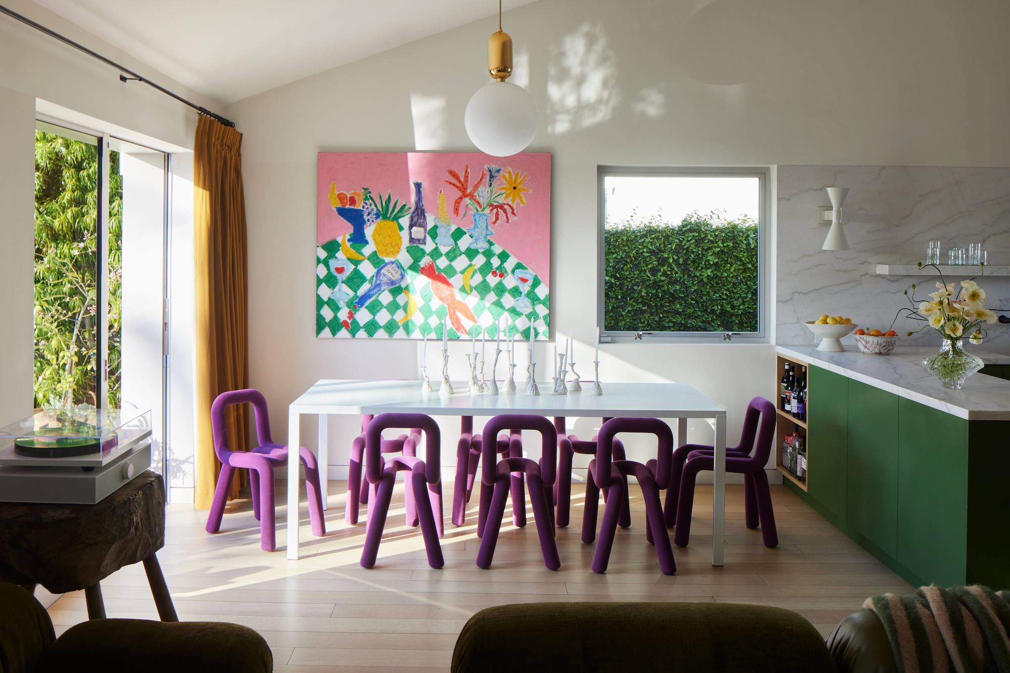
“The only thing I really take into consideration is the function,” says Nicole Dohmen. “I like to make busier rooms more colorful because they are livelier, such as kitchens and dining areas. Bedrooms and bathrooms, I like to give softer tones (still always colorful and almost never white), as I love having one room in the house as a calming sanctuary”.
Lighting and intention are good places to start. Once you’ve taken a step back and looked, really looked, at the space you want to add color to, think about the mood you want to create and how you — and others — should react to it.
“Depending on the space we’re working with, our studio first considers the conditions of the existing natural light and then the goal of the room and what feeling we are looking to evoke,” explains Kristina Khersonsky.
“It's important to think about what kind of ambience we want to create in the room as this will have a huge influence on our everyday mood, as well as impacting our guests invited into our home,’ adds Roslyn Keet. “Embrace how a room presents itself. If it’s a small space with limited light, don’t be afraid to go dark and bold to create an unexpected jewel box. If it’s flooded with light, bring in reflective or glossy pale colors so it dazzles, feeling fresh, and energized.”
Then consider how color flows and leads the eye from one area to the next. “To create an element of surprise or a ‘pop’, we bring a single color into the room once,” Kristina says. “For the color to be interesting but more harmonious, we touch on that hue at least twice within the space.”
If this is all new to you, decorate with color in smaller accessories first to get a feel for it all. This can be anything. Glassware. Cushions. Pieces of art. A duvet cover. Anything. Just a few considered pieces will create a subtle shift in the room, and you’ll know if you’re going in the right direction, shade-wise. Then you can think about rugs. Upholstery. Curtains. Walls. Ceilings…
Once you get a sense of what feels right, it’s time to think about how different hues sit together and how much of each one you want in the mix. “A good place to start is selecting a predominant color and then adding an accent or secondary color used in a smaller ratio,” explains Roslyn Keet. “The colors can be brought together through cushions, rugs, or carpets and artwork to tie everything together, and you can add further accents or pops if you want to achieve more depth to the scheme.”
5. LEAN INTO YOUR COLOR FAVOURITES
We’ll always have colors we fall back on, those tones we are drawn to. Mine are dirty blush pinks. I have to force myself not to surround myself with them; they seem like me, like home somehow. Such shades can be more of a feeling, more than a set favorite — but they always find their way back in (perhaps morphing over time into something different). There’s comfort in them, which is sometimes difficult to explain. But our instincts often lead to the most timeless, satisfying results. So just embrace them.
Favouritism in color may sound limiting, but it’s often what the most personal, expressive work arises from. Many designers return to a certain palette again and again — not out of habit, but because it feels right.
“I am totally in love with warm colors, which I always use in any house. I am drawn to terracotta, peach, and blushy pinks. And faded yellows — I always use a variation of a sandy tones to keep it light and fresh,” enthuses Nicole Dohmen. “I’m always drawn to yellow undertones, they make colors a bit dirty and different. I love how they blend in with sunshine. My son’s bedroom is entirely painted in Indian Yellow by Farrow & Ball, and it’s so warm and sunny. It really embraces and soothes you”.
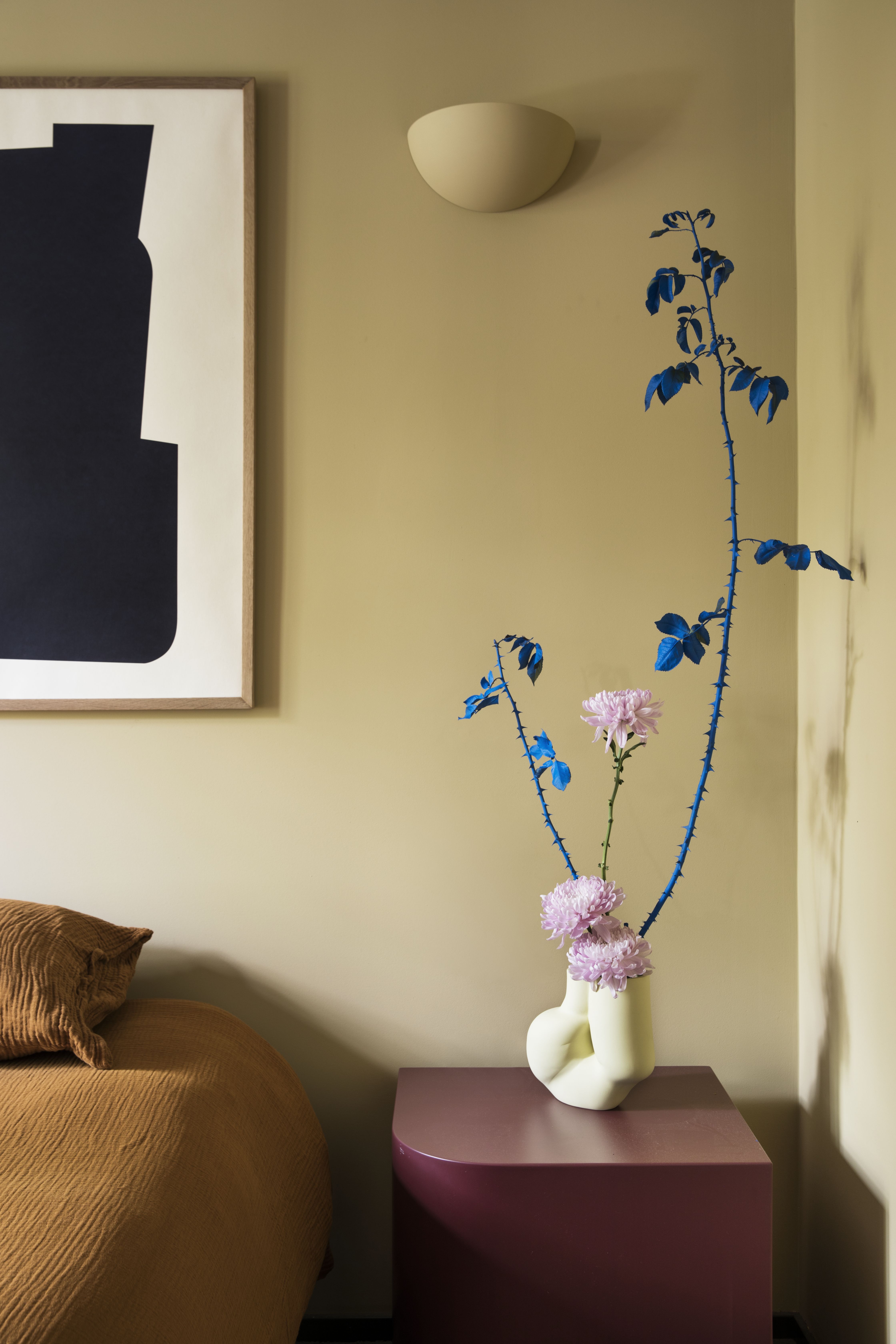
“Soft greens, warm grays, and powdery blues are enduring favourites — they’re versatile, elegant, and quietly atmospheric,” says Roslyn Keet. “And we often favor warm undertones to keep even cooler palettes feeling rich and comfortable”.
I’m not saying I’m going to paint my entire house blush pink, but pieces of it scattered here and there are like friends smiling at me. Don’t shy away from go-to hues — but don’t be afraid to experiment, while they’re there holding your hand, too.
6. TAKE THE RISK — IT’S WORTH IT
Decorating with color is often seen as a risk, something that requires boldness and confidence. But that risk is exactly what makes it so powerful. Embracing color in the home can transform it, adding character, atmosphere, and vitality. It's a chance to curate an environment that’s a genuine expression of who you are.
“I find that homeowners are hesitant to commit to colors in their spaces as they fear getting tired of them. In my time as an interior designer, I have not had any previous clients complain about getting sick of or bored of the colors we brought into their home — instead, they tell me how much joy the color pairings give them, and how much of a reflection of their personality it feels to them,” notes Kristina Khersonsky.
Decorating with color is like unlocking the space’s full potential. It’s all about being open to experimenting. Sometimes the bravest choices create the most interesting and individual rooms, and the rewards can be far greater than playing it safe. If you’re nervous, put some time in and discover what you like and what works before money or paint brushes get involved.
“It’s so refreshing and personal. Be bold and just use color! The only way to make impact is to use it,” urges Nicole Dohmen.