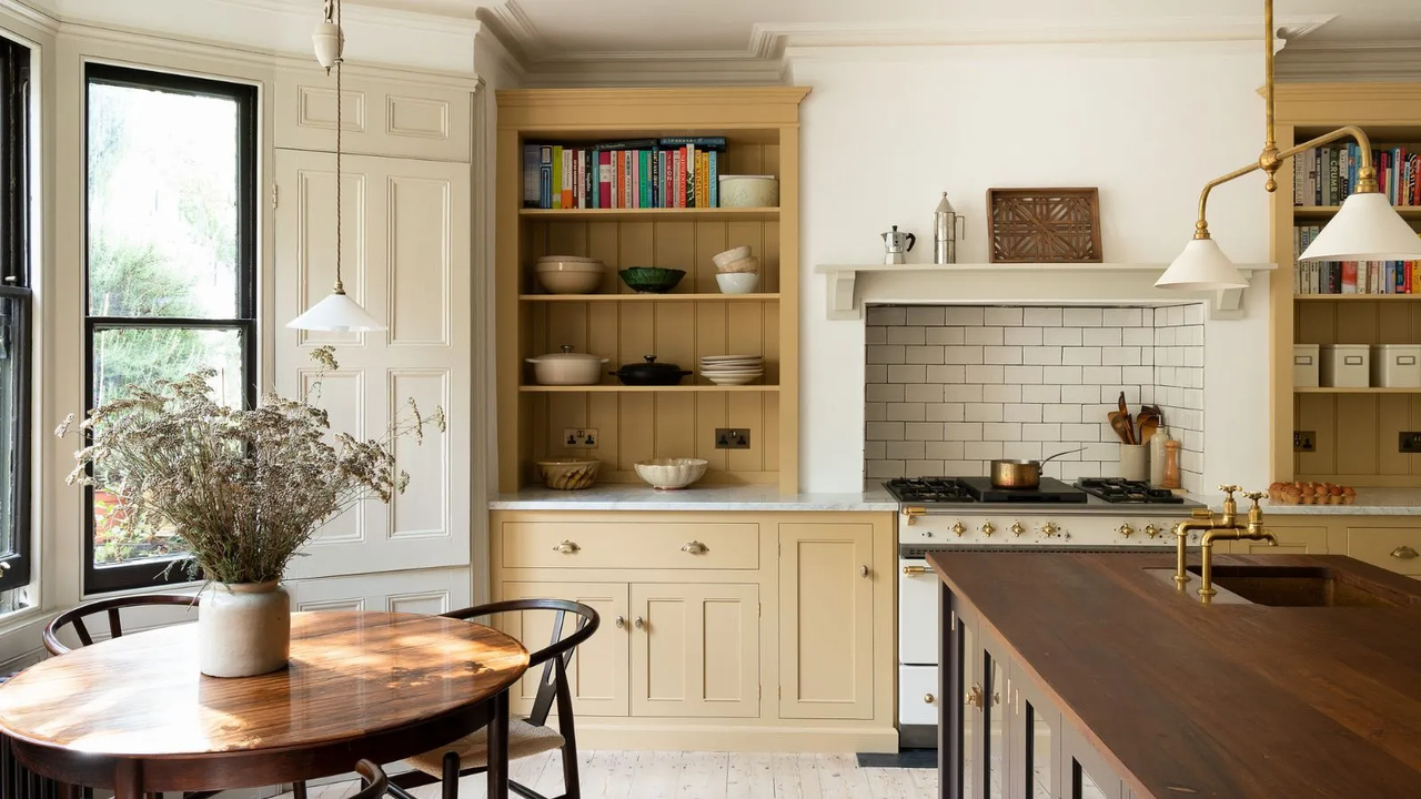
If there is one color that's defined 2025 so far, it's butter yellow. Butter yellow has been everywhere, from clothing and accessories to paint colors and home decor. But with great popularity comes the risk of a downfall, and that has me wondering – is butter yellow past its peak, and if so, what colors are replacing it?
Of course, decorating with yellow has always been popular, so that certainly won't be going anywhere. However, the status of the butter yellow color trend has designers divided. Some, like designer Elizabeth Vergara, say butter yellow had its moment. 'Like most trending colors, butter yellow started showing up everywhere, which made it feel a little overdone,' she says.
On the other hand, some think butter yellow has solidified itself as a legitimate color trend, and is now evolving into something more mature. 'Butter yellow isn’t over,' designer Lauren Saab asserts. 'It’s just now being used in smarter, more layered ways. Butter yellow is still very current. It’s evolved from playful and nostalgic to something more refined.'
Despite the division on butter yellow's status as a timeless or fleeting trend, designers can agree that there are a few up-and-coming colors that might take the spotlight from butter yellow over the next few months. What are they? Keep reading to find out.
But wait... is butter yellow officially over?
Before we get into the colors that have the potential to replace butter yellow, it's important to make it known that butter yellow is not over. Sure, it might be overdone, but according to Elizabeth, 'there’s nothing wrong with loving something that’s a little overdone.'
In fact, lots of designers gravitate towards butter yellow when they need an uplifting neutral since yellow is inherently a mood-boosting color and butter yellow softens it in an attractive way. Similarly, lots of celebrities decorate with butter yellow in their own homes.
'When used thoughtfully, butter yellow brings softness and warmth without tipping into overly sweet,' Lauren explains. 'It works best as a supporting note, not the lead. When it dominates a space, it can lose its sophistication. When it’s woven in with balance, it holds up.'
So if you've already bought tons of butter yellow decor – don't panic. This color isn't suddenly tacky or outdated, and it certainly isn't going anywhere. It'll just take a backseat to these five colors that are eagerly awaiting their moment of fame.
1. Sun-soaked colors
Although butter yellow is a pleasant and attractive shade, it can sometimes feel very one-dimensional in interior design. Because of that, deeper, sun-soaked shades have the potential to replace it. According to Lauren, colors like ochre and muted clay 'carry the same warmth [as butter yellow] with more depth. These colors feel less nostalgic and more architectural. They offer a similar softness but with stronger structure.'
Elizabeth thinks similarly, saying these shades feel a bit more timeless than butter yellow. 'If someone still loves yellow but wants to take it to the next level, I recommend leaning into richer, deeper shades like ochre or mustard. They feel a bit more classic and work well with natural textures like oak and linen,' she tells me.
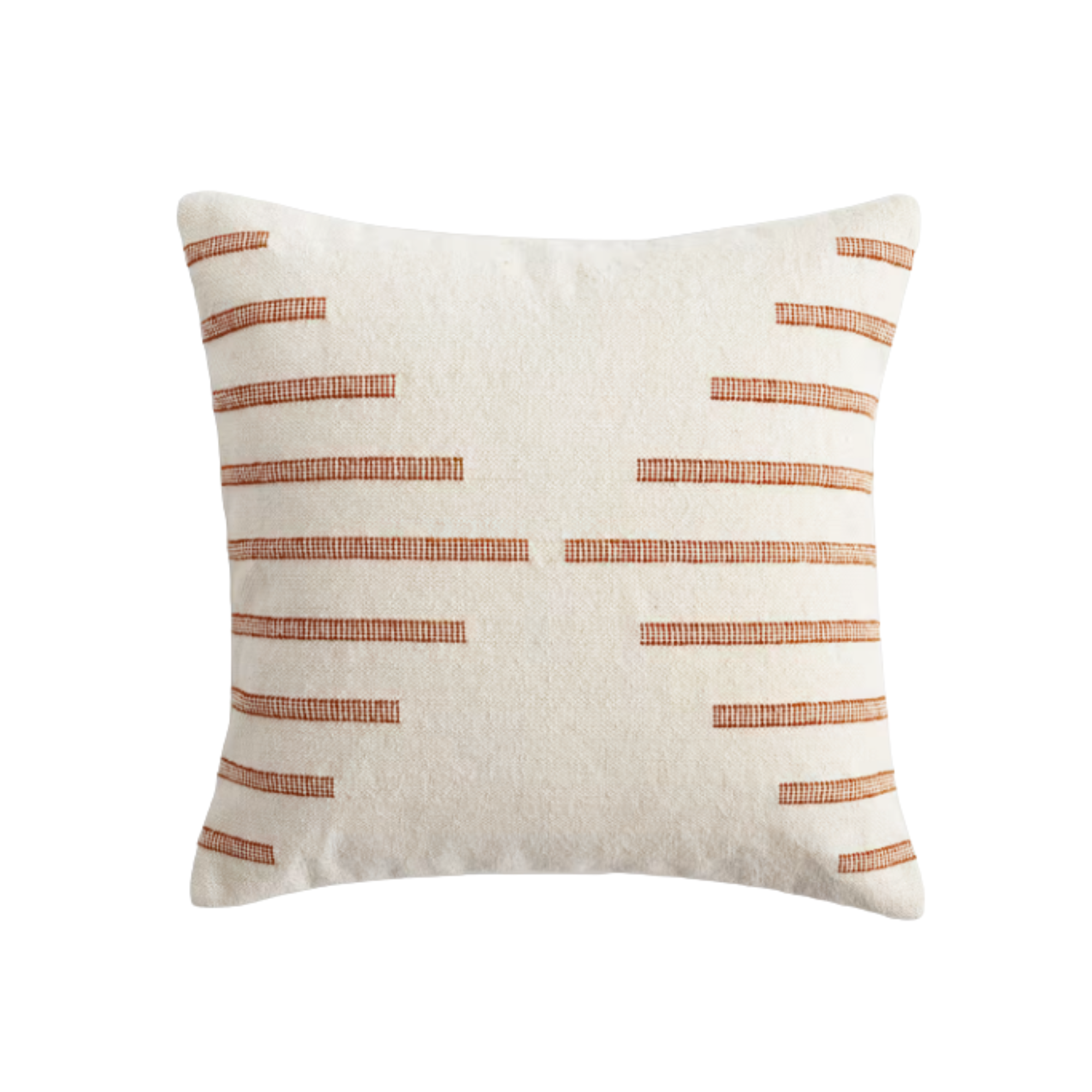
With its stripe pattern in muted terra cotta, this pillow cover brings sun-soaked colors into the home in a subtle, refined manner. Plus, its linen and cotton fabrication will ensure comfort.
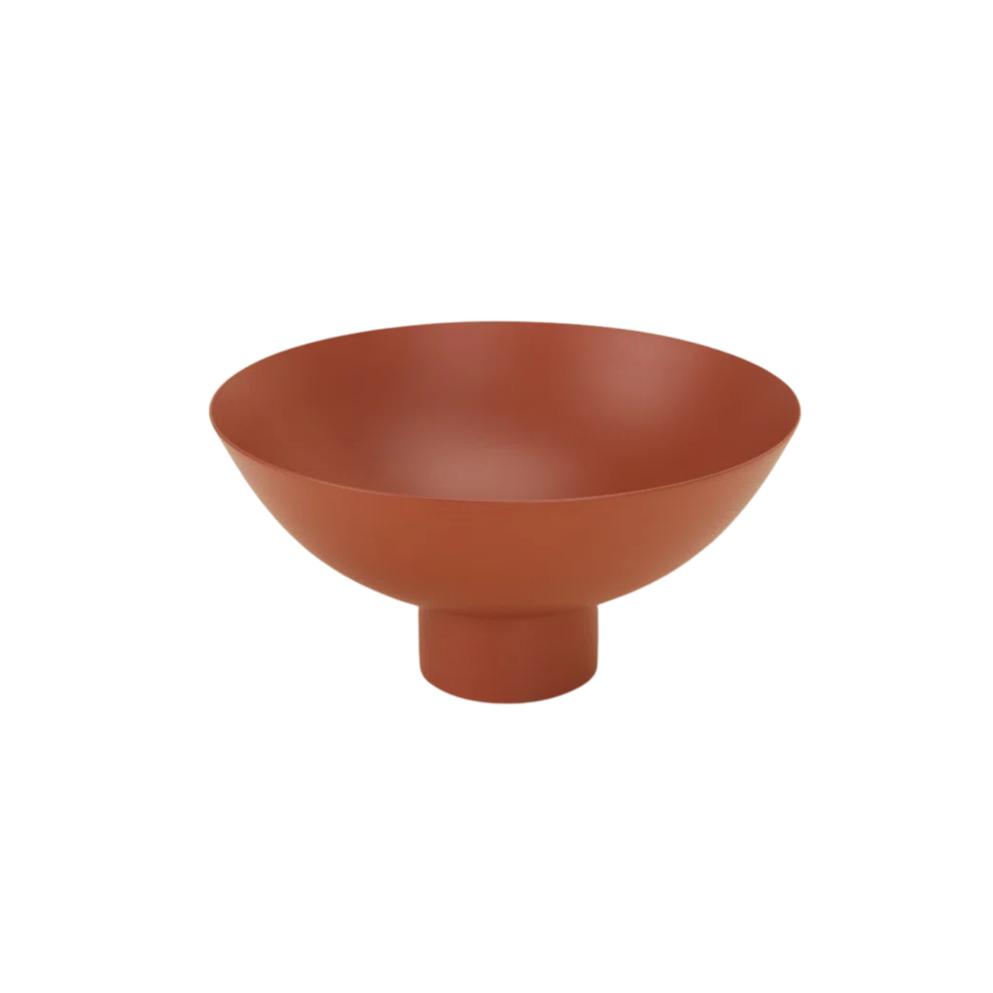
Whether you use this as a coffee table bowl or an entryway catchall, this clay-colored bowl demonstrates the richness of sun-soaked colors. It's a stylish dish for any spot in your home.
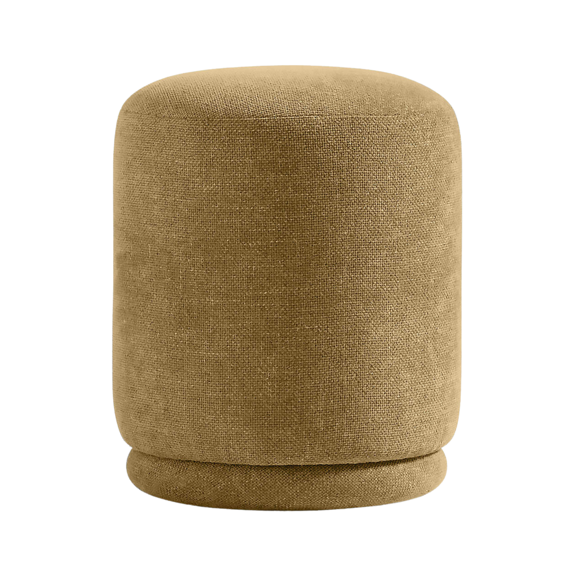
With its ochre fabrication, this ottoman can ground a room with a tasteful elegance. Use it as extra seating or a simple accent detail. Either way, it'll look stylish.
2. Cobalt Blue
As a soft neutral with a hint of excitement, butter yellow was a key color of the quiet luxury trend. But as we gravitate towards interiors that feel more personal and tell a story, bold colors become prominent. And according to designer Jessica Brooks, the vivid shade of cobalt blue has the potential to dethrone butter yellow.
'We see cobalt blue dominating in fashion (from Bottega Veneta to Loewe), which trickles into interior design,' she tells me. 'This color, as well as other rich, sapphire-inspired shades, reads as a jewel tone but with more edge – perfect for designers and clients who want to feel ahead of the curve.'
It's a color that makes a statement, but doesn't feel overwhelming, Jessica says. Cobalt blue infuses a space with just the right amount of sophistication and fun.
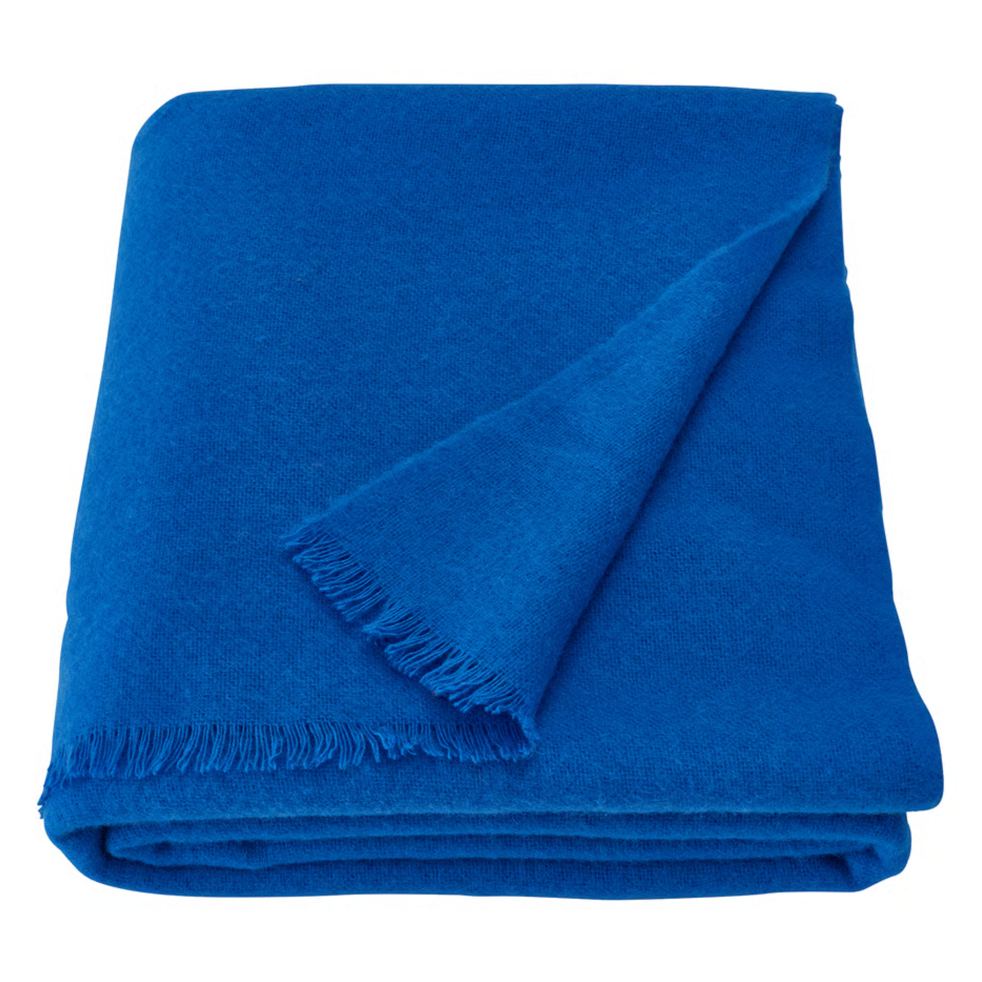
For chilly nights, curl up in this cozy merino wool throw blanket. Complete in a bright shade of blue, it'll act as a fun pop of color that you can leave out on your couch or tuck away when not needed.
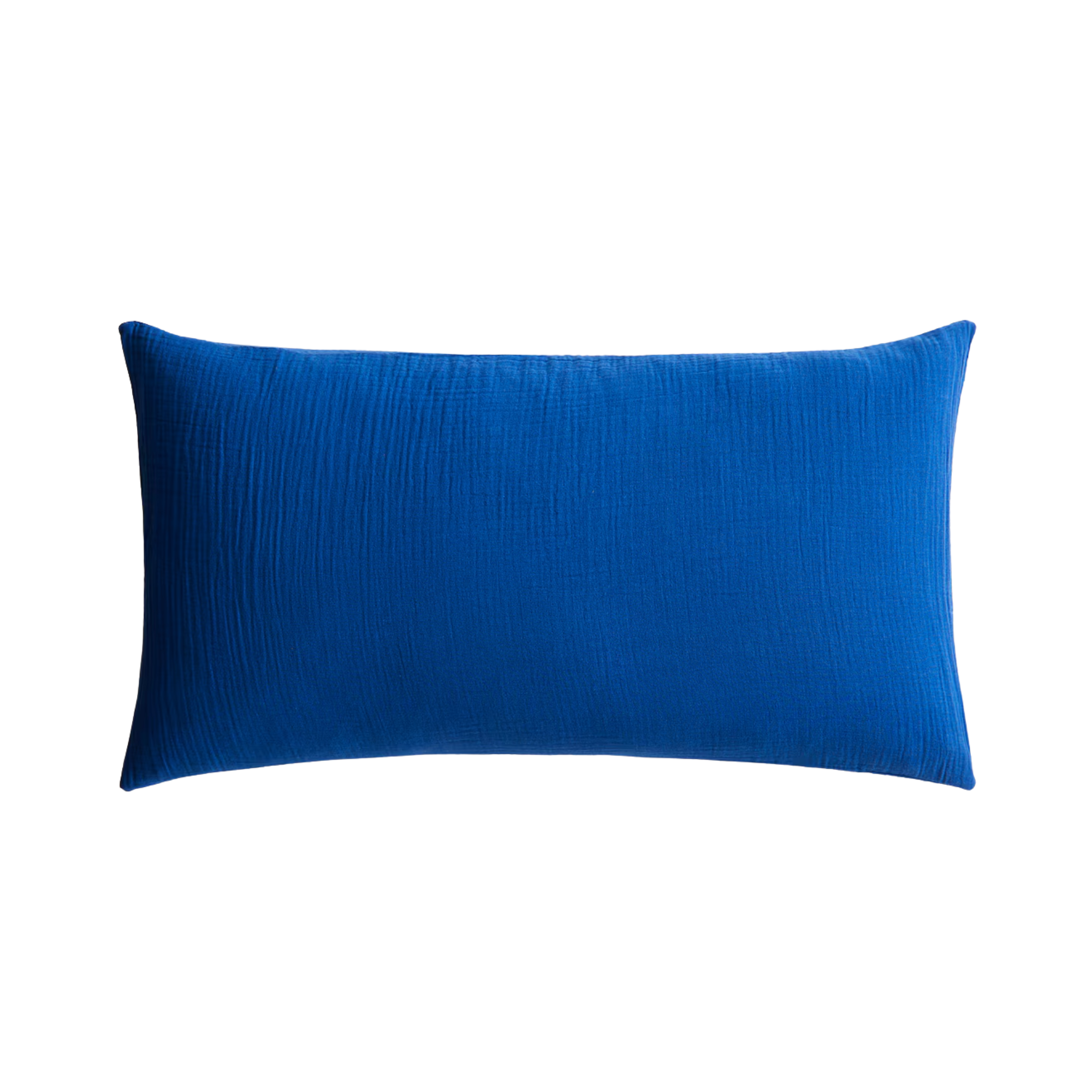
Is your home missing a fun pop of color? Here's the solution – add a few cobalt blue throw pillows here and there, like this lumbar style. Despite its small size, its bold color can dramatically enhance a room's design.
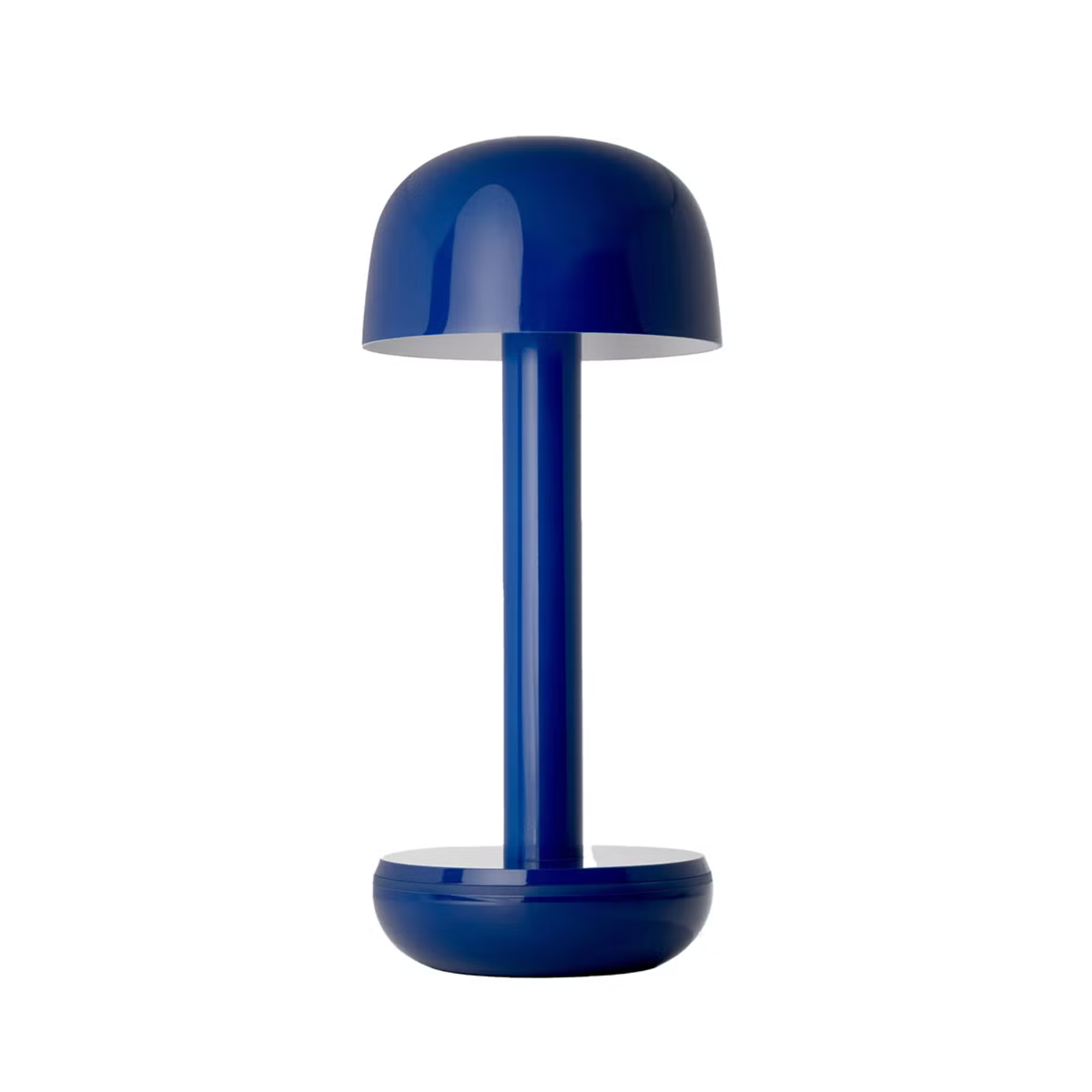
Don't forget to decorate with portable lamps for your next outdoor party. This model, complete in a stunning shade of blue, promises up to 96 hours of light from one charge. It'll keep the table lit and look good while doing so.
3. Light Periwinkle
One of the things people love most about butter yellow is its softness. It invites color into a space, but does so in a calm, soft, and refined way. That's probably one of the reasons why it's so popular and has stayed trendy for so long.
But lots of colors have that capability, including light periwinkle – the color that interior designer Amy Konarzycki thinks will replace butter yellow. 'It evokes a memory of the sky at dusk and dawn,' Amy says of light periwinkle, 'and goes well with shades of white and grey and bleached woods. It's a color that's often seen in iridescent objects such as the inside of shells.'
Benjamin Moore's Windmill Wings is a perfect example of the elegance of light periwinkle. Just like butter yellow, it's a calming color that sits right in between boldness and softness. It certainly has the potential to be highly desired.
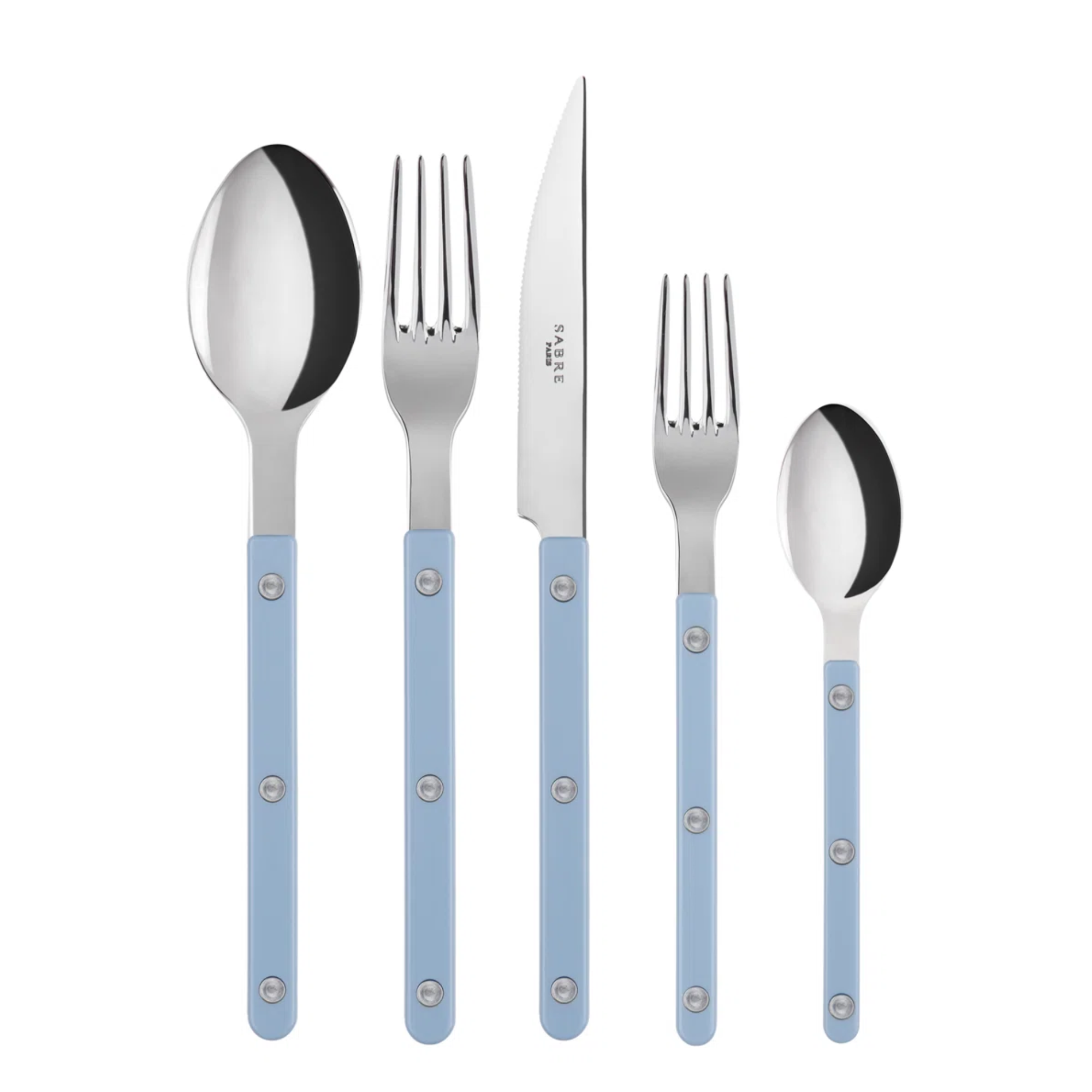
Incorporate the elegance of light periwinkle into your kitchen with these utensils. Their classic look is inspired by restaurant flatware, but with their colorful handles, they'll add some liveliness to your kitchen.
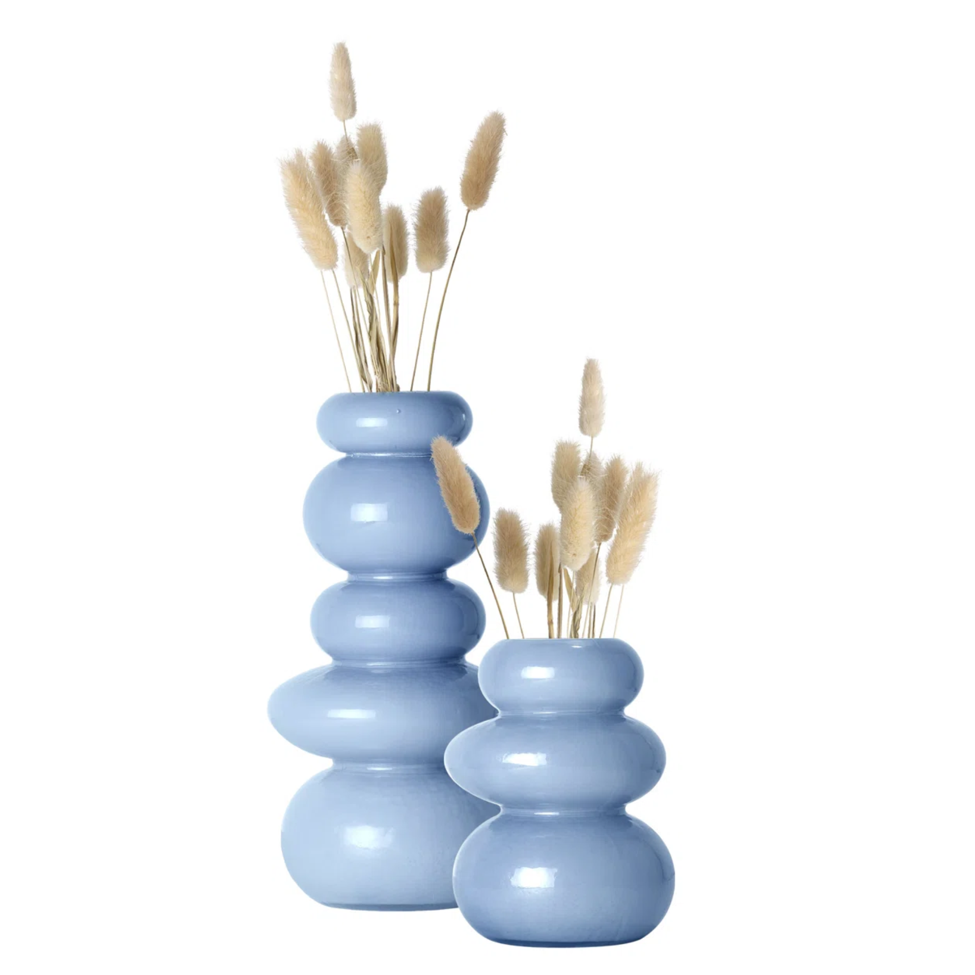
Meant to resemble stacked rocks, this set of two vases exudes a charming quality. And finished in light periwinkle, they could certainly become an elegant table centerpiece.
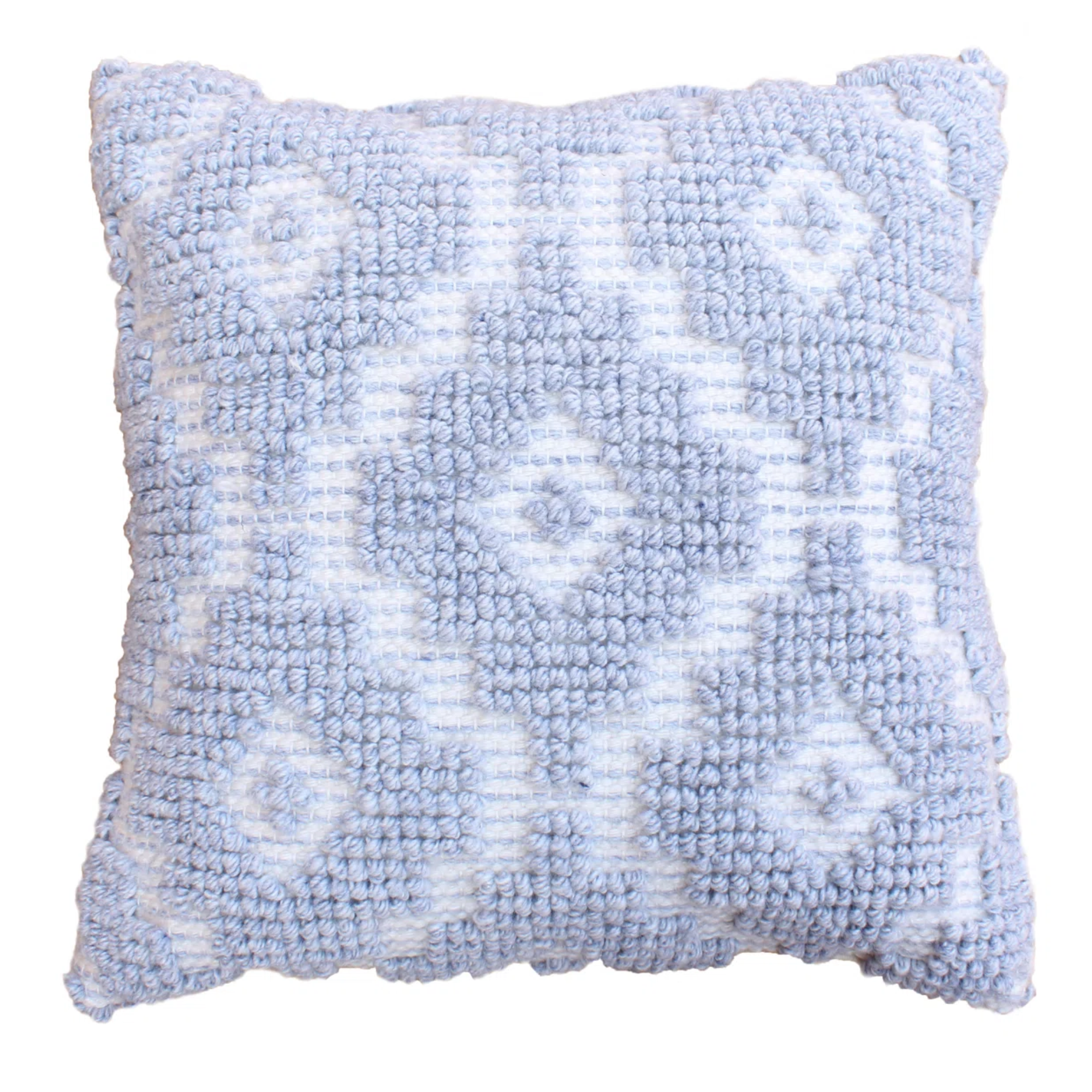
With its tufted design, soft fabrication, and stylish light periwinkle color, this throw pillow is bound to enhance the look of your couch in more ways than one.
4. Warm neutrals
Because of butter yellow's trendy nature, it's debatable whether or not it's a color that can truly go the distance. Because of that, those who love the muted nature of butter yellow might consider reverting back to a timeless color scheme: warm neutrals.
'While we love a soft yellow to brighten a space and bring freshness in the short term, yellow tones often lose their appeal quickly and can begin to feel dated. In contrast, neutral tones remain a cornerstone of timeless interior design, offering enduring style no matter the season,' designer Sarah Trop explains. Decorating with neutrals never goes out of style, and warm shades like light beige, taupe, or cream are prime examples.
'Buttery yellows, though part of the 'warm' category, may not have the lasting power and versatility to maintain their current fame,' Sarah explains. 'Instead, consider embracing warmer neutrals with a pink undertone. These colors offer greater versatility and pair beautifully with a wider range of palettes, making them a smart and stylish choice.'
Some of Sarah's choices include Benjamin Moore's Baby Fawn and Featherstone – two colors that are warm, muted, and elegant alternatives to butter yellow.
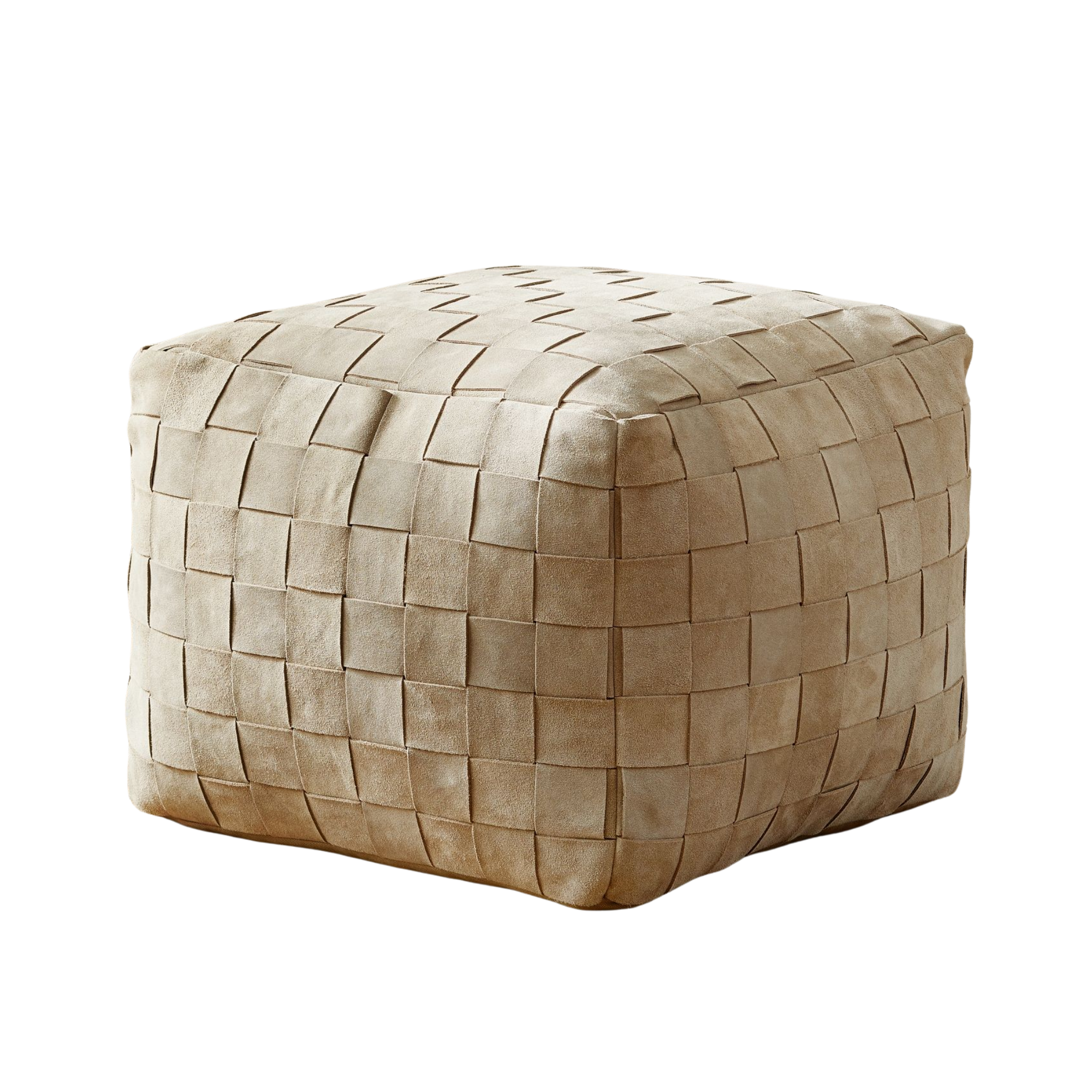
Aside from its sumptuous suede texture and trendy basketweave design, the light tan finish of this pouf make it an ideal choice for living room furniture. Use it as an extra seat or to enhance the look of your space.
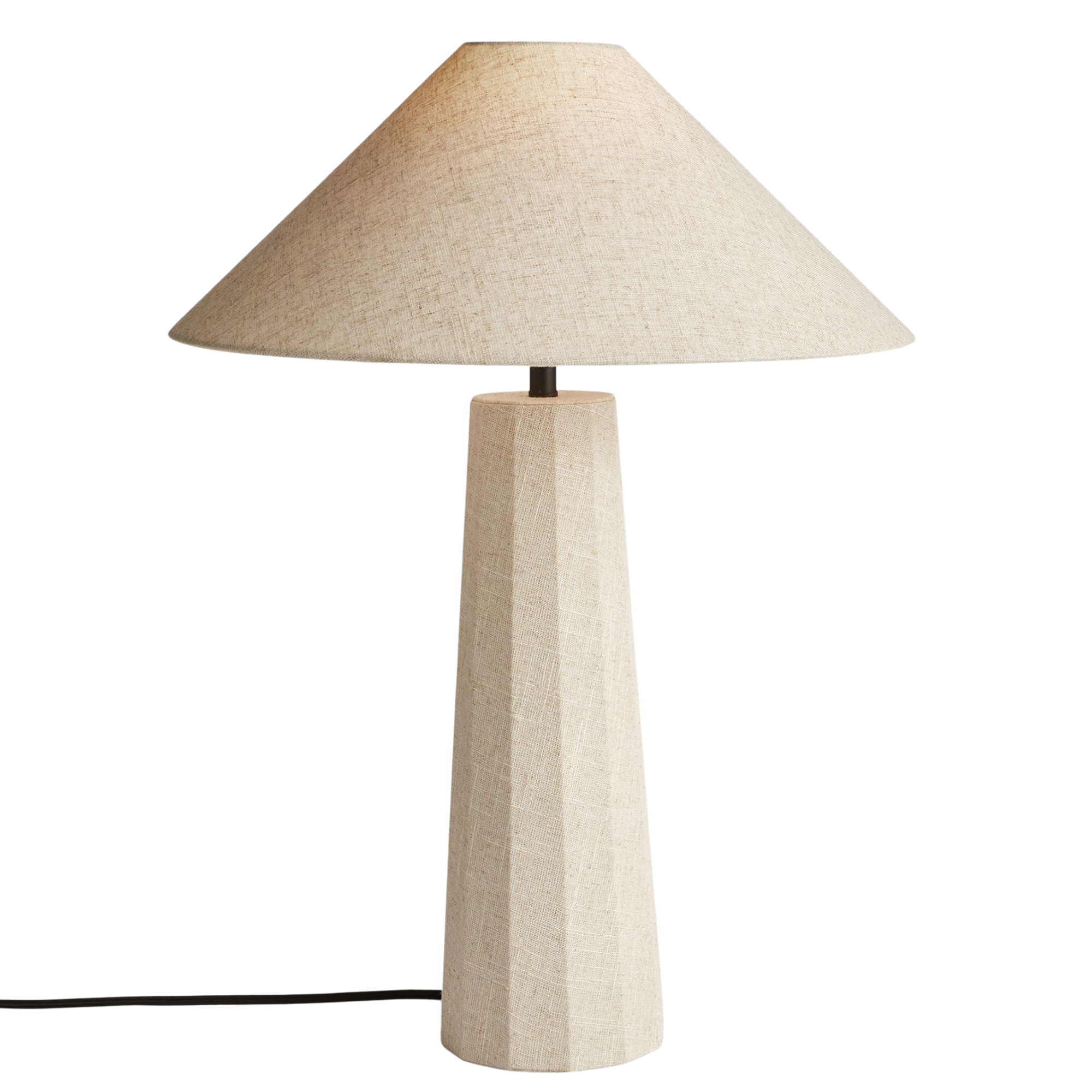
With its linen-wrapped base and shade, this lamp feels naturally elegant. Plus, its muted color can act as a soft yet charming addition to any room.
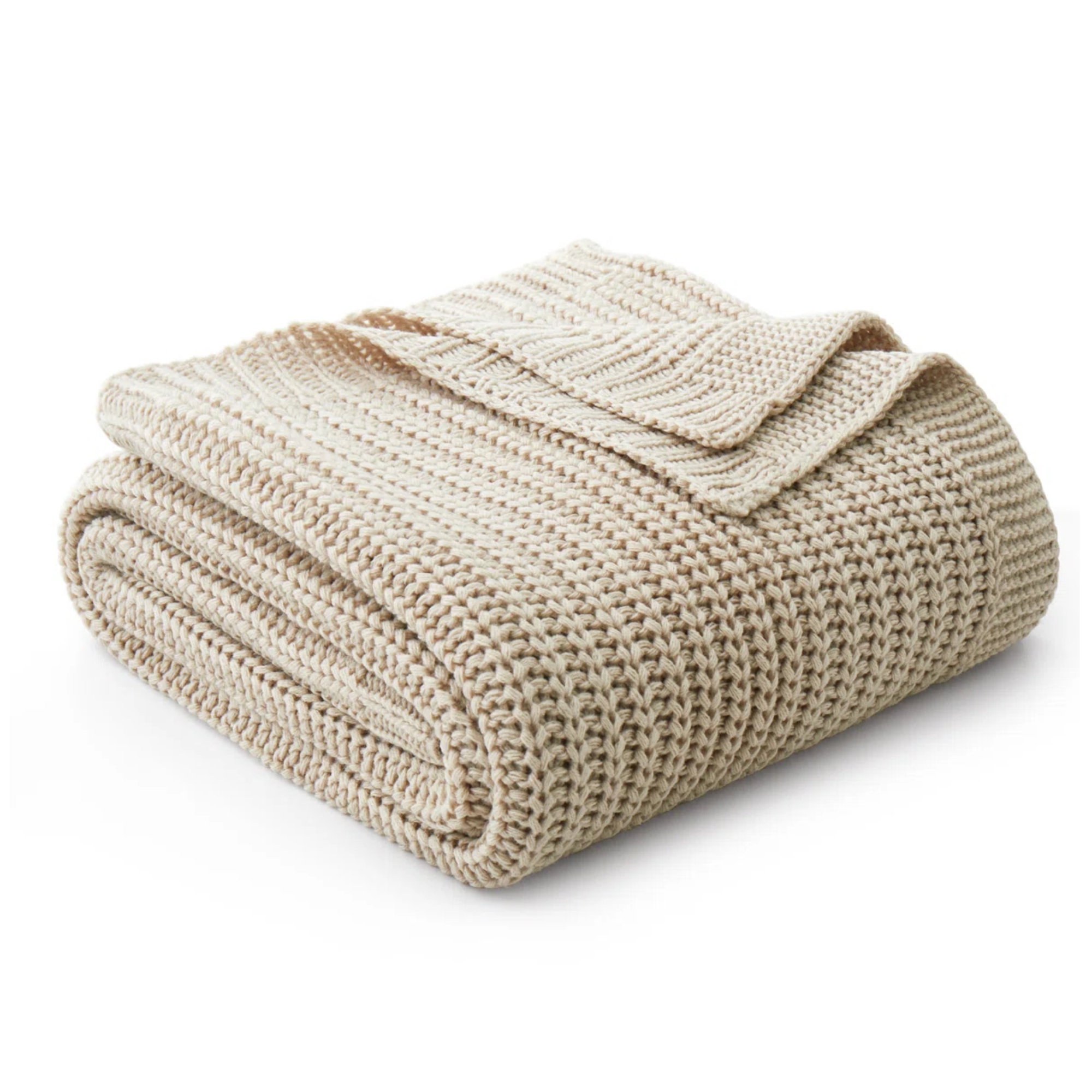
With its knitted design, this blanket is soft, breathable, and an ideal choice for the home. Plus, it's finished in a light tan color that can tastefully complement existing decor.
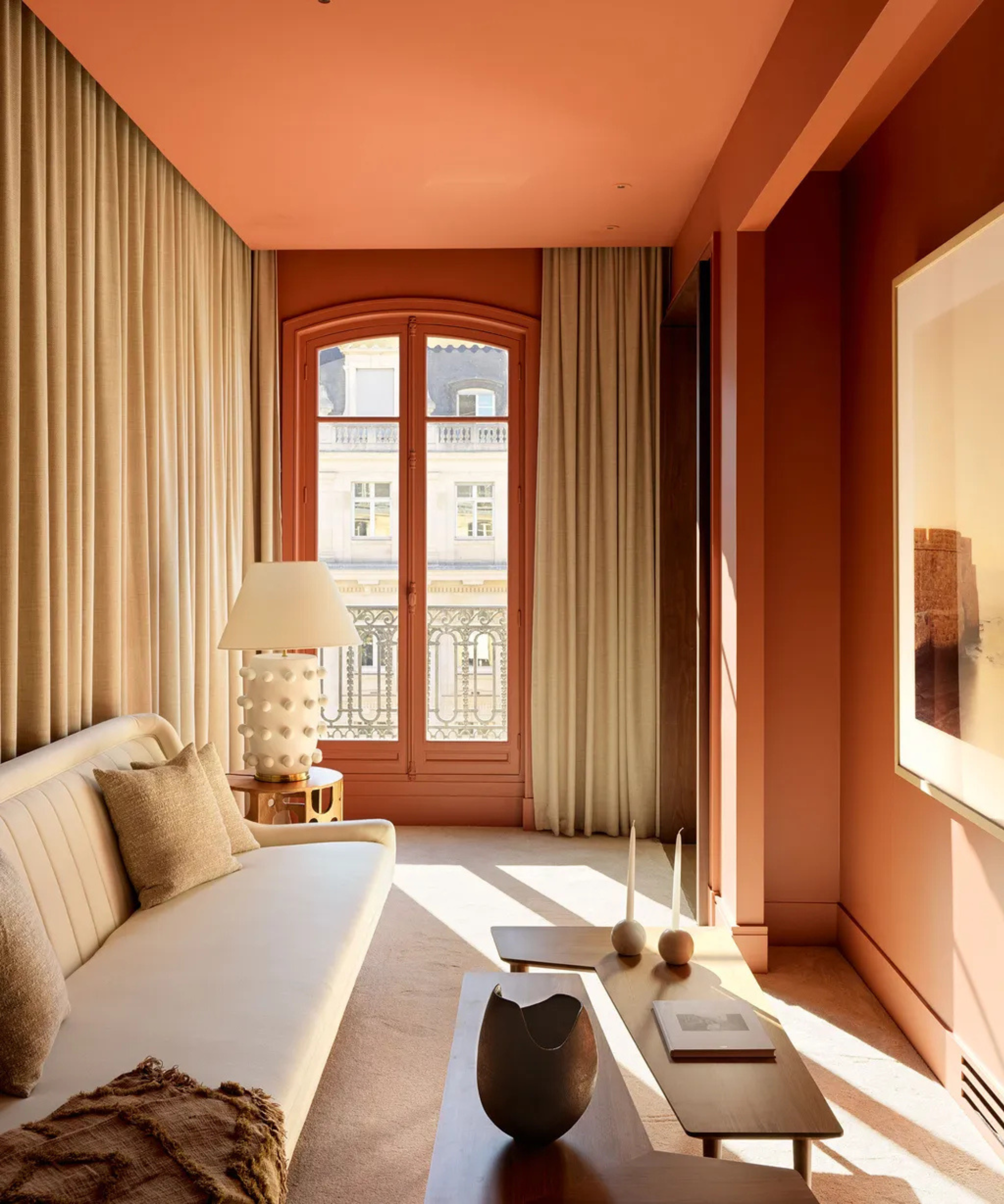
5. Rich Burgundy
Because of its light, airy, and soft nature, butter yellow pairs well with the summer season, according to designer Ashley Stark. But as we head into the colder months of the year, Ashley thinks deeper shades like maroon or burgundy will steal the spotlight.
'They're rich, grounded colors that pair well with neutrals – bold enough to make a statement, but not too overpowering. Maroon and burgundy are also a great alternative to brighter reds. They add a sense of warmth that feels perfect for the colder months,' Ashley says.
Decorating with burgundy or maroon can establish a cocooning feeling in a room – something that butter yellow can't do. Farrow & Ball's Eating Room Red is a prime example. Although a rich color, it's just as inviting as our beloved butter yellow.
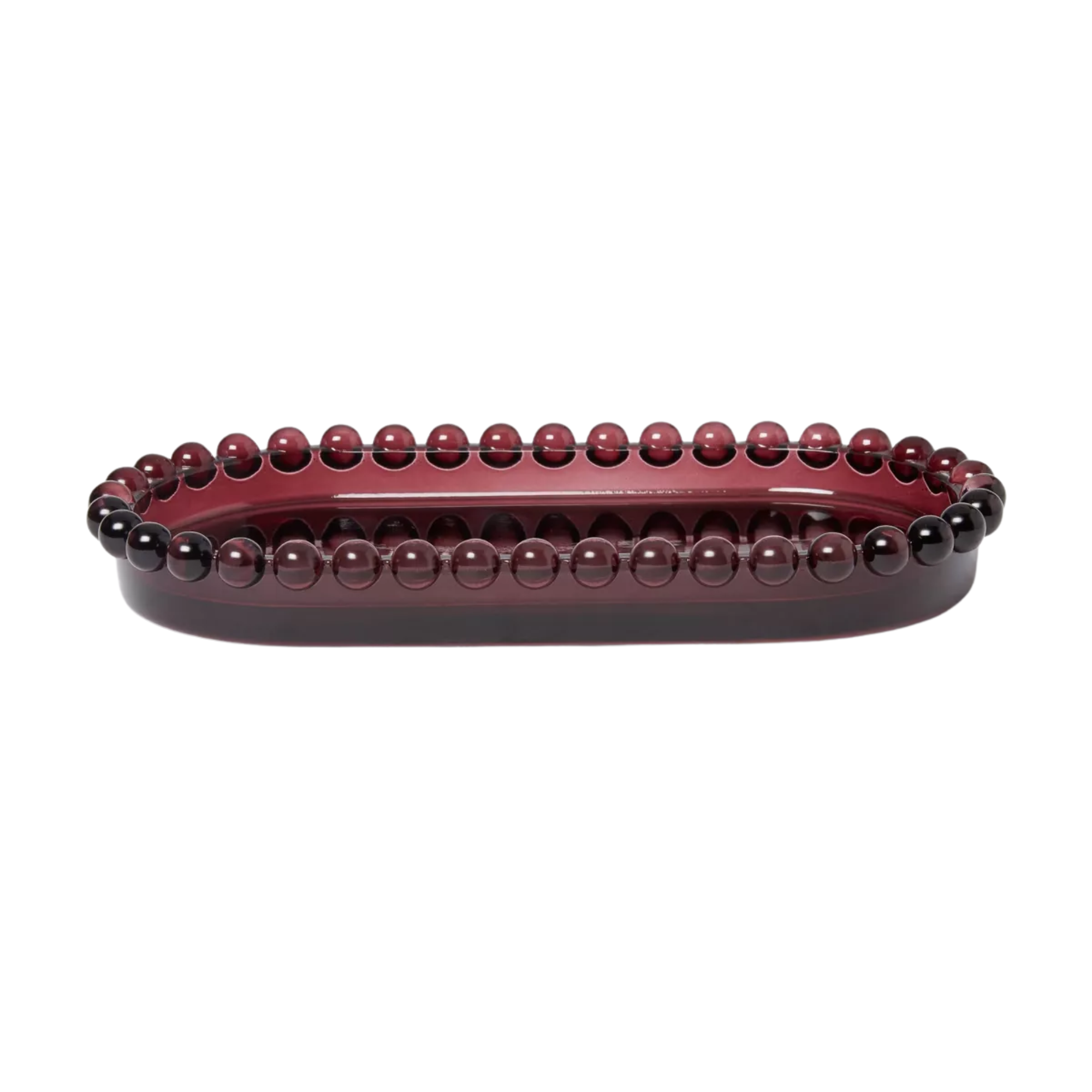
Looking for a trinket dish to display on your bedroom dresser? Here's the perfect pick. This glass tray in deep burgundy is elegant and sophisticated, but its textured rim adds the slightest playful touch.
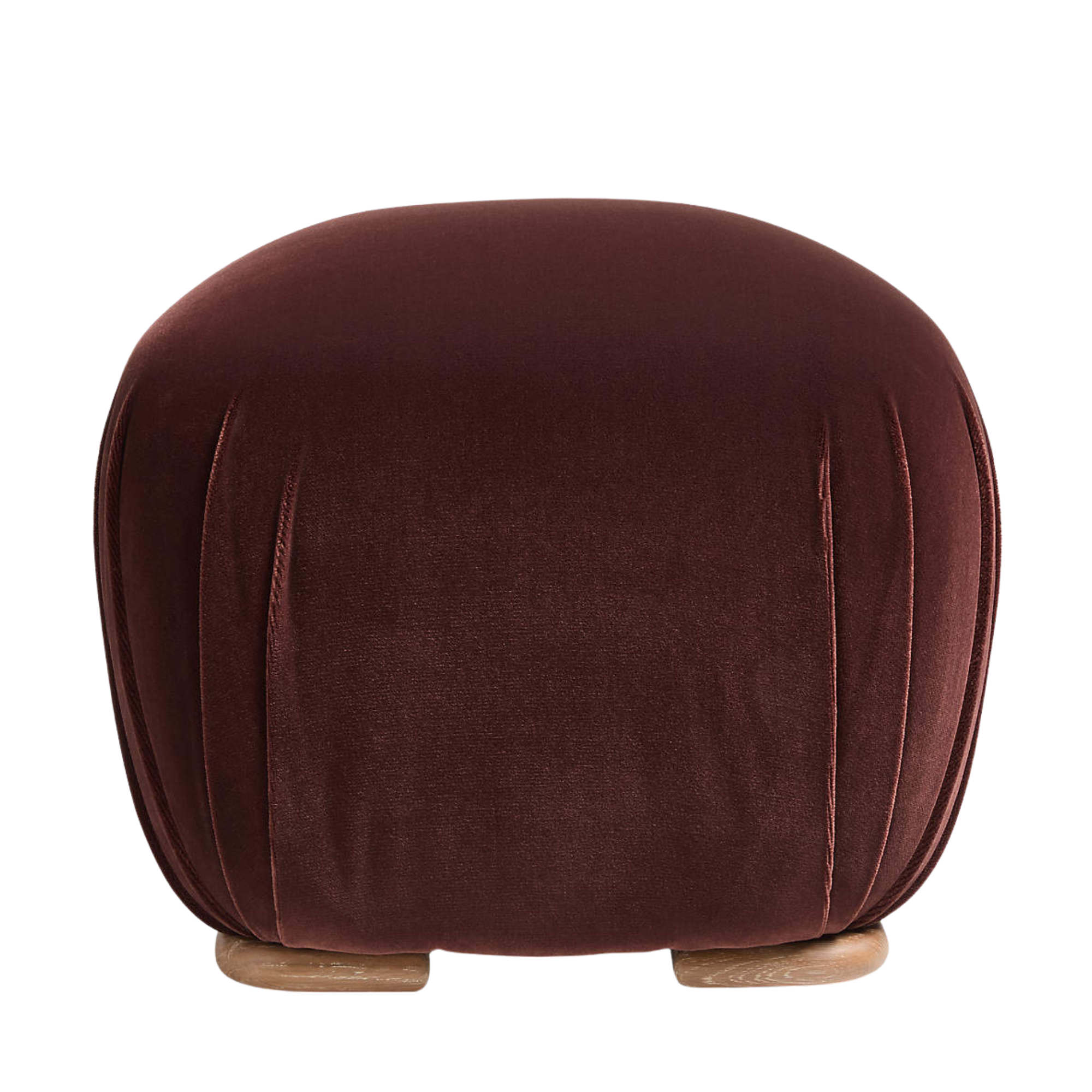
As part of Brigette Romanek's collection for Crate & Barrel, this ottoman is a designer-approved style. It has a plush seat and elegant wooden feet. Its curved shape feels organic and natural, while its deep red color is captivatingly stylish.
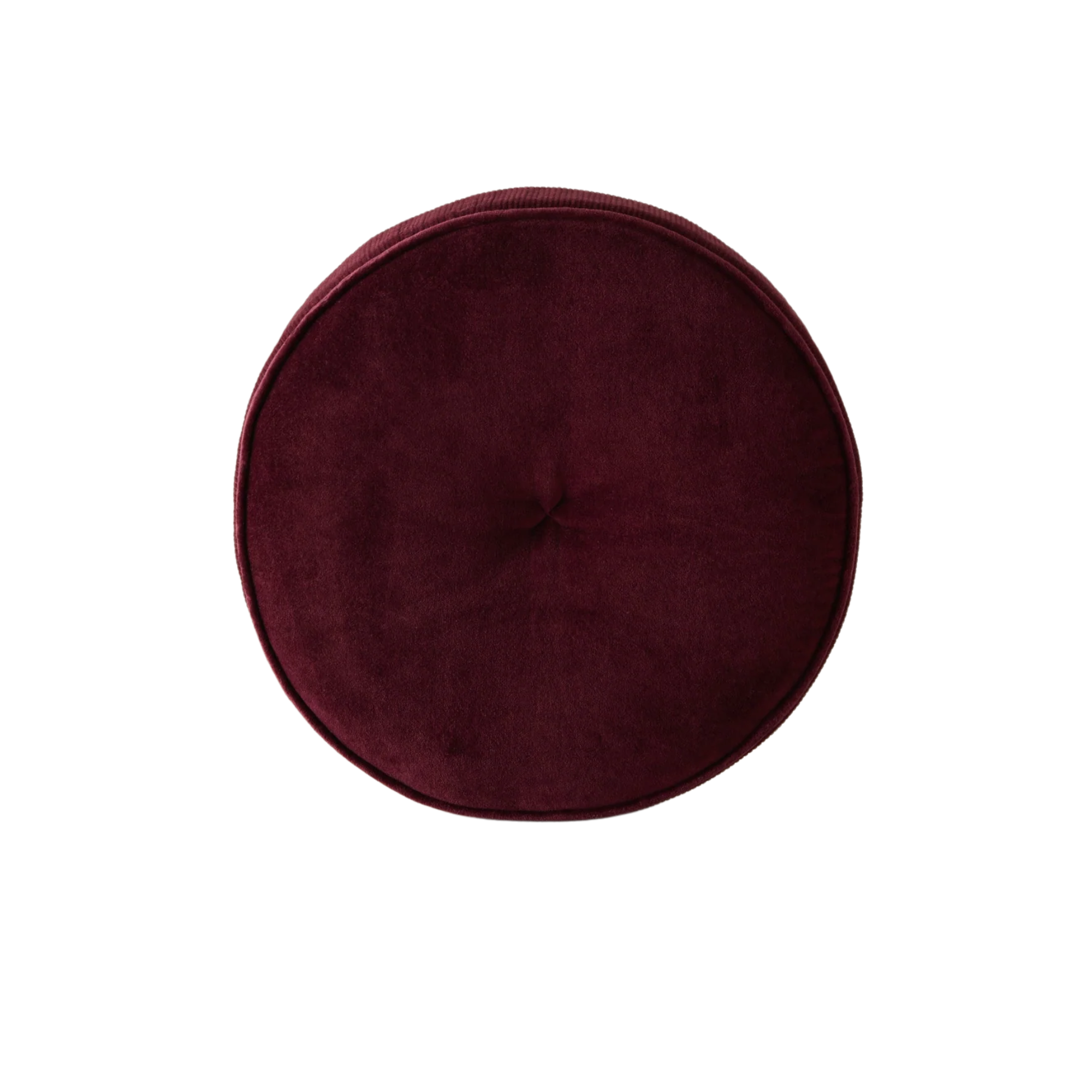
Round pillows are always a good idea. When styled on a couch, they break up the monotony of traditional square and rectangular pillows. This one is made from velvet and is finished in a deep red shade. It can easily enhance the look of your couch.
While butter yellow remains a popular color in interior design, it's time for a new trend, and these five colors are ready for their spot at the top of room color ideas.