Apple's know for its attention to design details (we'll forget about the Magic Mouse for now). But sometimes it focuses on details so subtle that barely anybody notices them.
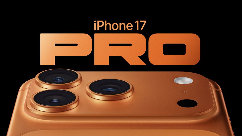
We have several doubts about the new iPhone lineup. What's the point of the iPhone Air? Do we really want a cross-body iPhone strap? And why isn't there a black iPhone Pro? But if there's one thing that Apple got right, it's the perfect shape of the 'O' in the iPhone 17 Pro typography.
The "O" in iPhone 17 Pro perfectly matches the phone's plateau pic.twitter.com/BFRwm9BspRSeptember 14, 2025
As pointed out by one keen-eyed Apple fan in the post on X above, the typography used for the iPhone 17 Pro logo appears to have been chosen based on the product design. The 'O' in 'Pro' has the same shape as the new phone's elongated plateau.
Was the typography choice intentional or are people backwards rationalising the design like with those claims that the bite in the Apple logo was inspired by the golden ratio? Opinion is divided.
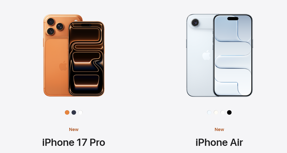
Apple likes little design Easter eggs. It's known for hinting at the news to come in the designs of its event invites. And back with the launch of the M4 iPad Pro and M3 iPad Air last year, it began to feature clever 'optical illusions' on the tablets' wallpaper to form the product name. That's now been confirmed as a new tradition with the iPhone 17 Pro and Air, with the respective wallpapers in the product shots showing 'Pro' and 'Air' written in abstract forms.
This is “the kind of attention to detail that still makes Apple stand out after all these years,” one person suggests on X.
But others aren't so sure. “Bro i stared at the 'o' in iPhone for like 5 min before I realized it was the 'o' in Pro,” one doubter jests.
”I'm pretty sure nobody will be buying the iPhone 17 for how the 'O' looks,” someone else reckons, but I don't know. That slightly retro-futuristic typeface does make the 'cosmic orange' colour look more appealing than it might do otherwise.
What do you think? Intentional typography Easter egg or happy design accident?