What you need to know
- Google Clock 8.3 drops the messy wallpaper-based alarm screen for a solid background that makes time and controls clearly visible again.
- The update reverses the confusing Material 3 Expressive design that made alarm text hard to see against certain wallpapers.
- A new pulsing clock animation is in the works too.
Enjoy our content? Make sure to set Android Central as a preferred source in Google Search, and find out why you should so that you can stay up-to-date on the latest news, reviews, features, and more.
Google Clock has been refreshed with version 8.3, and while it’s not a huge overhaul, it makes some small but very welcome changes that fix one of the app’s most annoying design missteps.
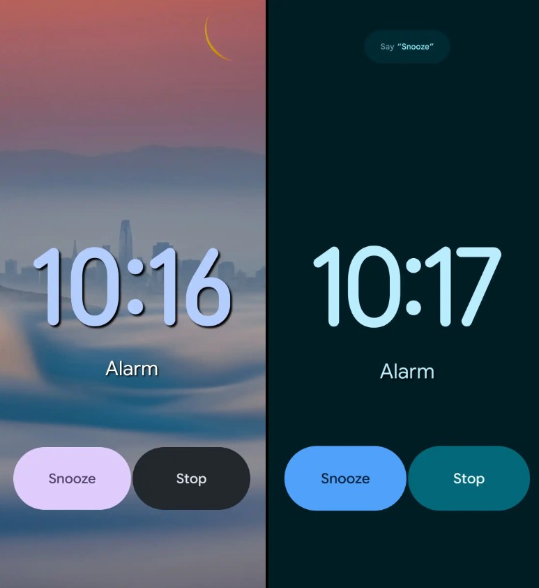
If you’ve been squinting at your alarm screen recently, you’re not alone. A recent Material 3 Expressive update tried to get fancy by replacing the alarm's solid background with your phone's wallpaper. It sounded cool, but in practice, it was a design mess.
Users quickly found their alarm time rendered in unreadable text over a background with similar color, which is exactly what you don't need when you're half-asleep and trying to stop a blaring noise.
Google heard the complaints. 9to5Google reports that the new update walks back that change, and it’s a massive improvement for daily usability. The alarm screen now returns to a solid background, so your time, buttons, and stop/snooze controls are much easier to see. This tweak brings the interface closer to how it looked before the M3 Expressive redesign.
Google Assistant is fading
The update also includes a subtle branding shift that says a lot about Google’s current direction. The Assistant label that used to appear under the alarm’s optional post-wake actions has been replaced with just “Routines.” Functionally, nothing has changed, but this move quietly detaches the feature from Google Assistant’s branding.
Furthermore, the folks at Android Authority looked into the app’s code and found signs of a new “pulsing” clock animation coming soon. The digits will gently thicken and fade in a rhythmic way.
It’s not active yet, but the groundwork is there, suggesting Google’s planning more subtle motion effects to make the interface feel alive without being distracting.
Google Clock 8.3 is now rolling out via the Play Store, though it might take a few days to reach everyone. If you rely on the app to wake you up or manage your timers, it’s definitely worth grabbing once it hits your device.


.jpg?w=600)

