FIFA World Cup 2026 kicks off today as the world's biggest sporting spectacle commences in Canada, Mexico and the US. We're placing no bets on who will lift the trophy in just under six weeks' time, but as specialists in art and design, we can help settle a more immediate question. Which team has the best World Cup kit design in 2026?
This year's best World Cup kit designs range from retro aesthetics to unusual looks that break the mould by taking inspiration from the respective nations' art and design heritage, with some countries getting particularly creative with their away kits. Of course, there have been a couple of controversies along the way, as we'll see.
For more on creativity and branding around this year's tournament, see our pick of the best World Cup ads and the controversy around the World Cup halftime show. In the meantime, here are the best and worst World Cup kit designs of 2026.
The best World Cup kit designs of 2026
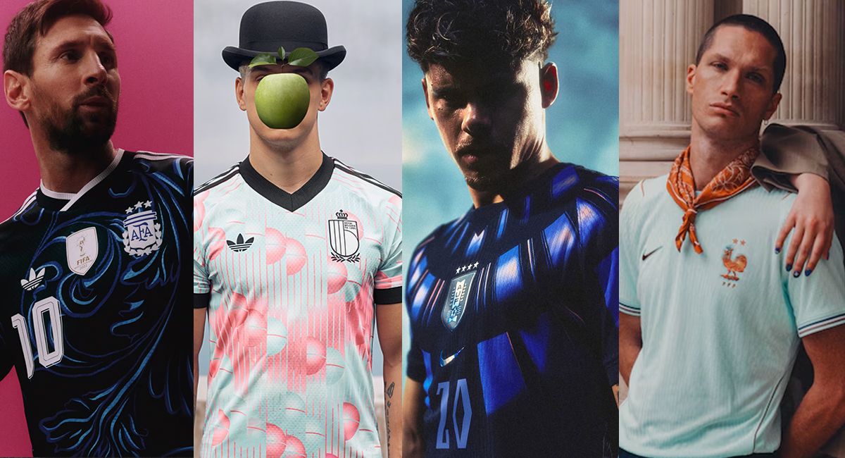
Japan away kit (Adidas)
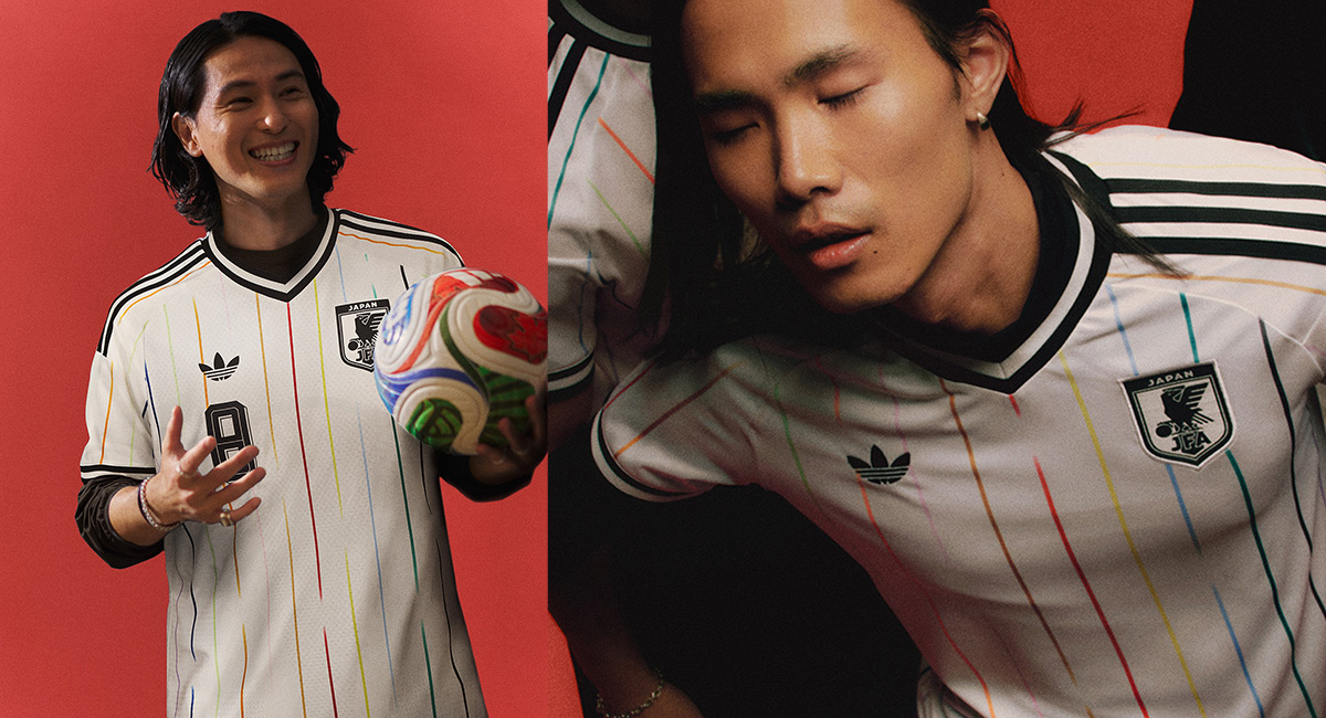
Japan's away kit strikes the perfect balance between classic minimalism and bold design statement. It's simple and complex at the same time with the thin broken coloured stripes creating a vibrant contrast against the white base.
There are 12 stripes, one for each player on the pitch plus one for the fans, and the placement of the red line in the centre echoes the red sun of the Japanese flag. It doesn't surprise me that this design topped a vote by fans at Footy Headlines.
Belgium away kit (Adidas)
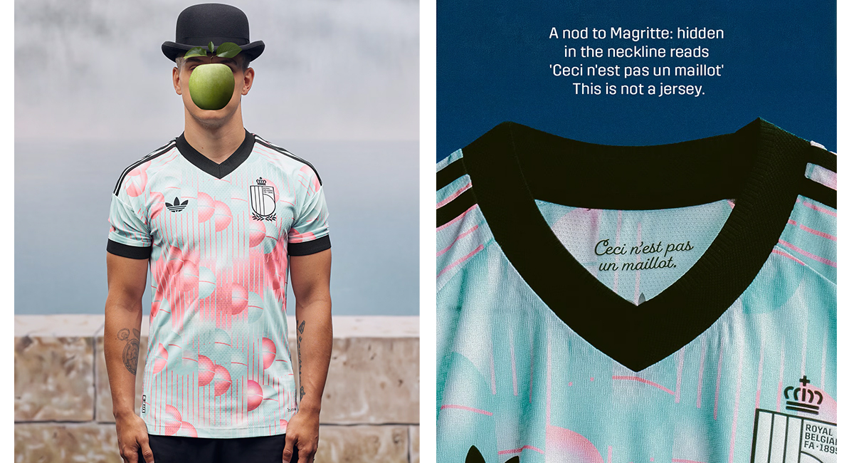
Belgium set the bar high for conceptual football kit design when they took to the field dressed as Tintin at Euro 2024. This time the Adidas-designed kit goes for a more high-brow artistic reference. It's inspired by the great Belgian surrealist René Magritte.
The pastel plue and pink abstract design on the shirt merges the "B" of Belgium's crest with the giant spherical bells from Magritte's 1928 artwork La Voix des Airs. There's even an Easter egg inside the neck of jersey. “Ceci n’est pas un maillot”, the phrase reads – “This is not a jersey”. That's even more surreal than Magritte, whose pipe genuinely wasn't a pipe... or is the team actually going to wear paintings of the shirt?
France away kit (Nike)
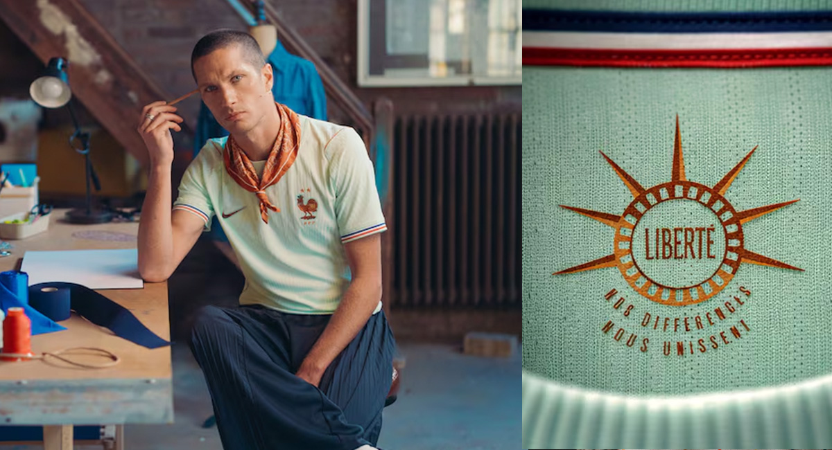
The French couldn't not be among the best dressed at the World Cup. They also want to remind us who gave the US one of its most famous landmarks back in 1884.
The away kit's green and copper palette was inspired by the Statue of Liberty, whose current hue is due to the oxidisation of its thick copper exterior. The message inside feels like it could be directed at the current US administration: "Liberty: Our differences unite us". It should be obligatory to style the jersey with that neckerchief.
Curaçao away kit (Adidas)
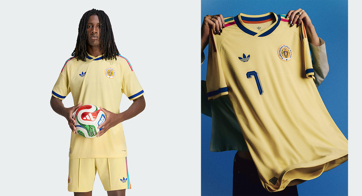
Curaçao's lemon yellow World Cup away kit is the most exquisite of the more classic-looking World Cup kit designs this year. It feels bright and sunny and perfectly retro, making it a huge hit among collectors – it's currently the highest rated World Cup kit design among fans on the Football Kit Archive.
The streaks of colour were inspired by the Caribbean island's capital Willemstad and colourful painted buildings along waterways in the Punda and Otrobanda districts.
Uruguay away kit (Nike)
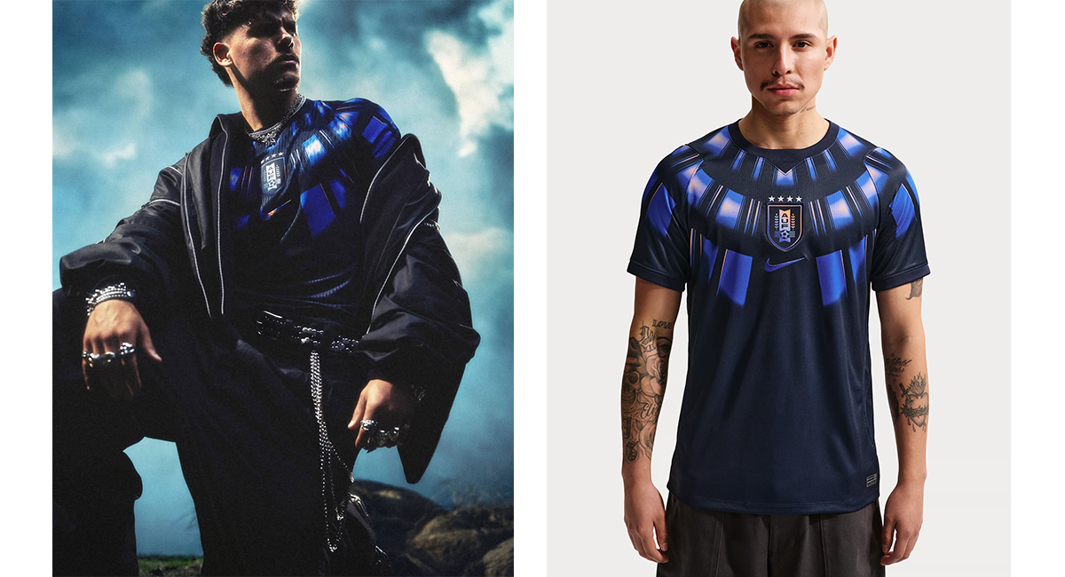
Uruguay deserves applause for the striking fantasy feel of its World Cup away kit. The design is giving me superhero suit vibes, but it wasn't inspired by the Spiderverse.
Instead, the shimmering mantle around the neck is a reference to indigenous armor. This is apparently intended as a visual metaphor for the team's desire to guard its ancestral throne (Uruguay won the first World Cup in 1930).
Ghana home kit (Puma)
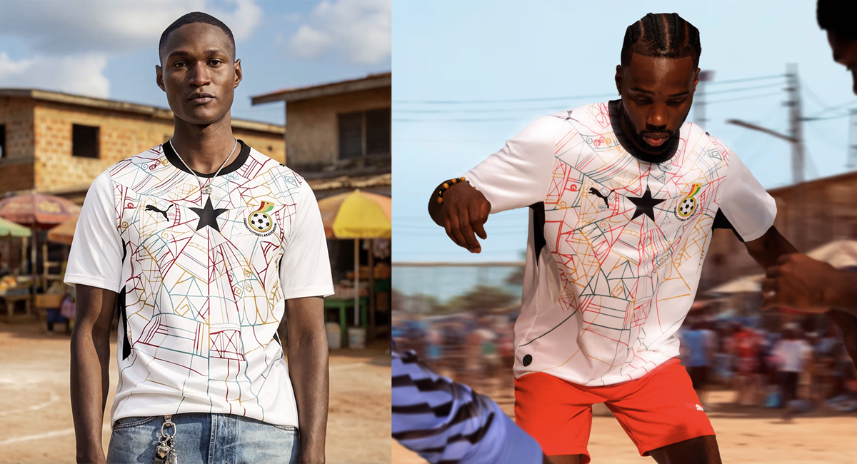
Speaking of the Spiderverse, the pencil sketch-like cobweb graphic on Ghana's home shirt is a reference to Kwaku Ananse, the legendary spider figure in West African folklore.
Most teams play it safe with their design of their home kits, consigning the more creative or conceptual ideas to the away strip, so kudos to Ghana for leading with this piece of abstract art.
Morocco home kit (Puma)
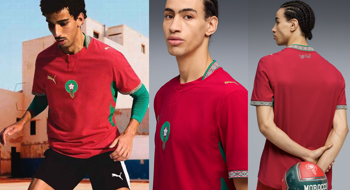
Morocco has this year's most creative World Cup kit design in terms of the physical shape and cut of of the shirt. At first, it looks understated with its subtle texture and central crest, but then the details start to emerge.
There's that unsual buttoned granddad shirt neck, the green highlights, and, most surprisingly, the finishing touch of traditional embroidered taping around the collar and cuffs, blurring the line between sportswear and dresswear.
Norway – home kit (Nike)
A post shared by Herrelandslaget (@herrelandslaget)
A photo posted by on
Celebrating a return to the World Cup after 28 years, Norway's not exactly doing anything new with its 2026 kit, but it's showing that a straight-taking flag-based design with big blocks of colour can really stand out at a time when most teams use an underlying pattern. Plus the symmetry of the team photo is very aesthetically pleasing (the one where they're not dressed as vikings).
A post shared by Herrelandslaget (@herrelandslaget)
A photo posted by on
The worst World Cup 2026 kit designs
Switzerland away kit (Puma)
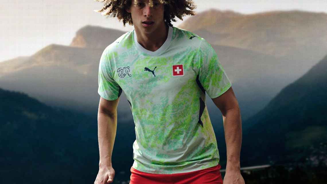
I'm all here for conceptual World Cup kits, but a design inspired by biometric passports might be taking things too far, particularly when the abstract water-map patterns are such a shocking variation on brat green. It feels like Switzerland is bringing the anti-design movement to the World Cup stage with this toxic algae bloom of a shirt.
Football fans seem to be equally unimpressed. It's one of the lowest-ranked World Cup kit designs on the Football Kit Archive, with just 2.27 stars out of 5.
Qatar away kit (Adidas)
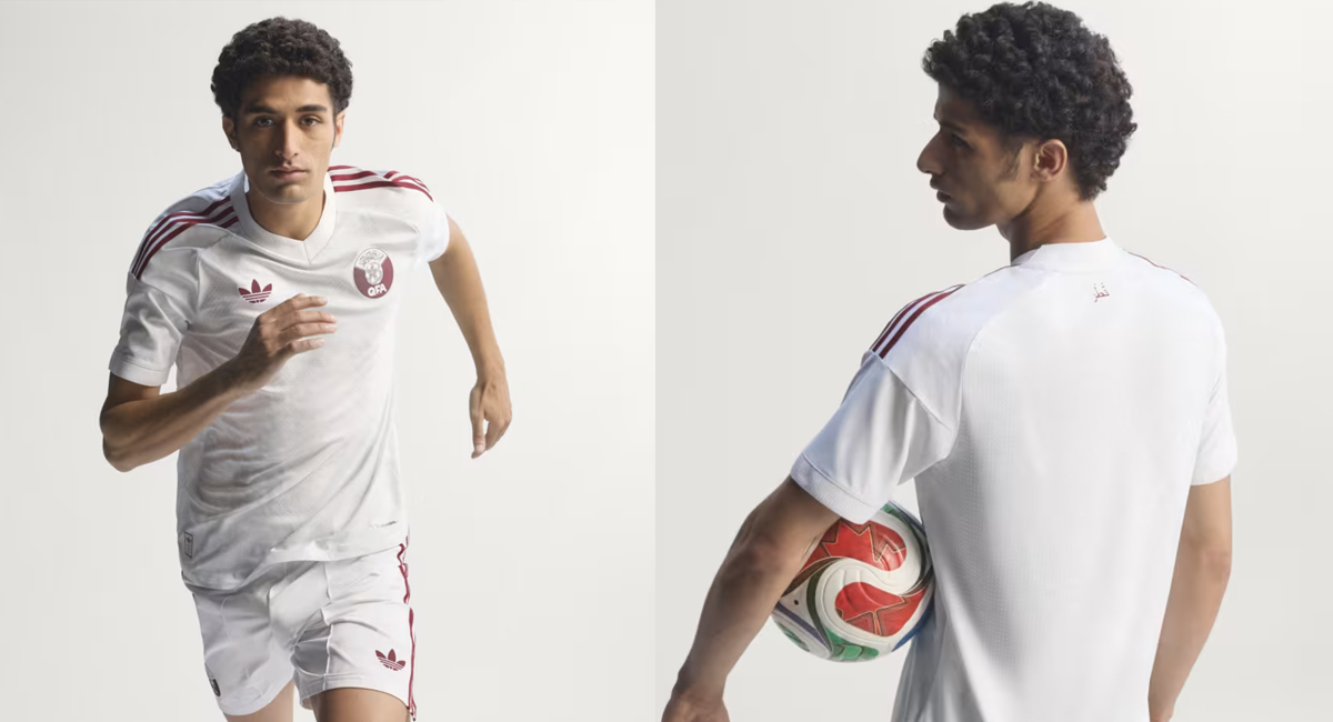
Minimalism has its place, and I understand that traditional Qatari dress is understated, as the Qatar World Cup mascot taught us, but Qatar's kit is so unremarkable with its maroon trim on white that it looks like an old school training kit.
The Arabic name for Qatar on the back of the neck is the only detail of note.
The most controversial World Cup kit designs
Brazil away kit (Jordan)
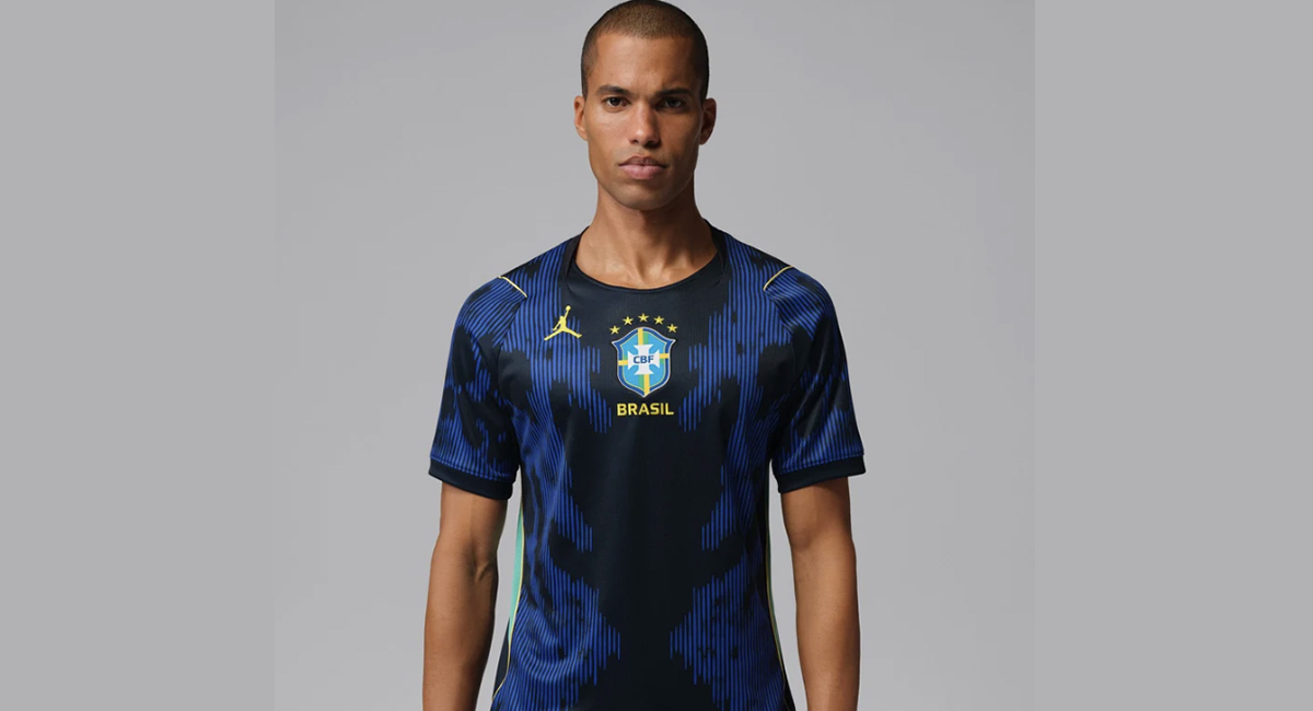
Finally, it wouldn't be the World Cup without some kit design controversies.
Apparently, Brazil's away shirt was originally going to be red. Nike pivoted back to traditional blue after a public outcry, but for some reason it still insisted on slapping the Jordan logo on it. Some fans see that as demotion, and they're not exactly thrilled that their team will compete in the US wearing the silhouette of a US athlete from a different sport.
Argentina away kit (Adidas)
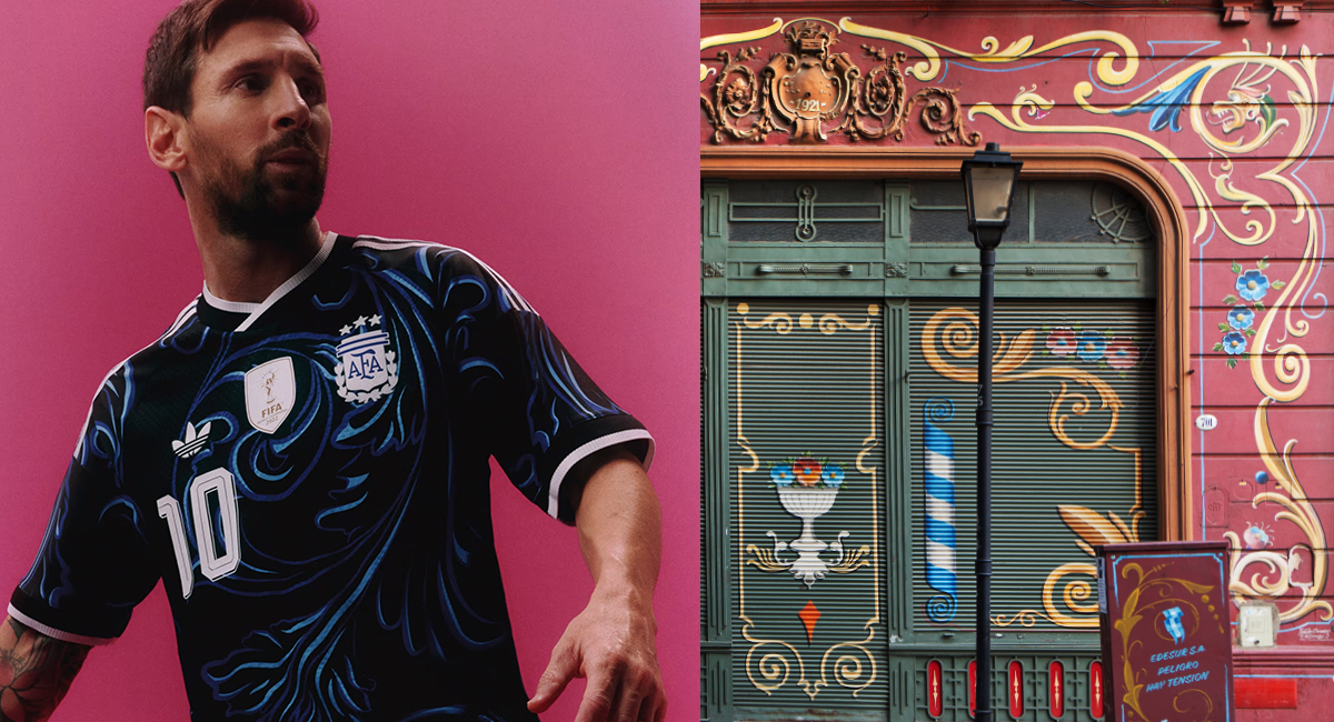
There's a fantastic concept behind the defending champions' away kit. The fluid swirling floral motifs were inspired by fileteado porteño, an ornate style of decorative folk art that was first used on carts in Buenos Aires in the early 1900s and later on buses, trucks and shop fronts.
It's a lovely cultural reference that's not too obvious to feel cliched, but the execution hasn't been popular, with fans lamenting the use of a black base instead of the usual dark blue. Meanwhile, some artists have questioned how faithfully the design reflects the traditional lines of fileteado. In the video below, Alfredo Genovese shows Adidas how to do it properly.
A post shared by alfredo genovese (@fileteado)
A photo posted by on