Grey is a living, breathing colour, full of personality that changes vastly according to the light in the room and the time of day. It can be bold and adventurous, reminiscent of a craggy hillside. It can be dark and stormy, and it can also be peaceful and homely, whispering of cosy days spent curled up on the sofa. Grey can feel a little intimidating but there are myriad different ways to work with it, and almost certainly the right shade for you. A grey base colour has the added benefit of acting as a springboard for almost any other colour and texture, and it’s also a fabulous backdrop for art.
Gentle grey
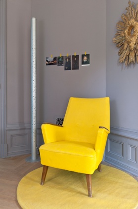
If used in the right way, grey can be a gentle, placid and calm palette to work with – a neutral background to compliment soft whites and warm tactile textures, or sunny yellows. If grey is used in the same way as white is often used in a room, it has the same qualities. So remember, if it would look good in an all white scheme, it would look great in an all grey one too. If you’re sold on the idea of a gentle grey scheme, then opt for a light shade with either a bright white or blue pigment mixed into it which will produce an ever-so-slightly cool feel to a room; a subtle sea breeze, if you will.
Dark grey accents in stoneware, soft furnishings and decorative objects, like a dark grey linen wing back chair or curtains, tie in well with a gentle grey scheme, playing a subtle but important role by varying the depths of the grey and adding interesting textures. Pops of bright yellow on a door frame, a deep mustard cushion or a vase of sweetly scented yellow blooms will always look stunning in a light grey room.
Mossy grey
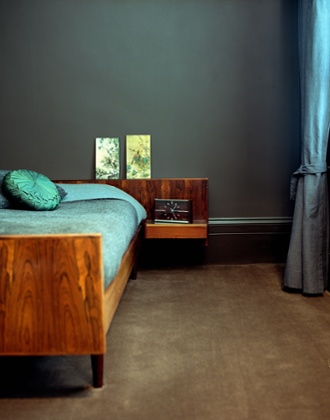
If you’re tempted to go a little darker with your shade of grey but still want to keep things warm then choose a grey with lots of brown or moss green mixed in to it.
Focus on warm, earthy tones in your choice of furnishings and accessories and incorporate lots of natural elements into your scheme. Plants, dried flower heads such as aliums, and branches displayed in vases or hung from a wall will talk to and enhance the earthy shades in the grey.
The right accessories and textures are key to a warm grey space. Wooden pieces like a gnarled chopping board, fruit bowl or some decorative geometric shapes, add wonderful texture to a mossy grey room. Soft Herringbone blankets and sheepskins enrich the warmth of the scheme, and are also essential for cosying up on the sofa. Jewel tones also look resplendent in a soft and moody grey setting, such as a plush ottoman upholstered in a rich emerald green. An earthy grey colour is also an ideal background for antique art or prints. A gallery wall of antique portraits, for example, or still lifes in mismatched vintage frames looks particularly charming on grey.
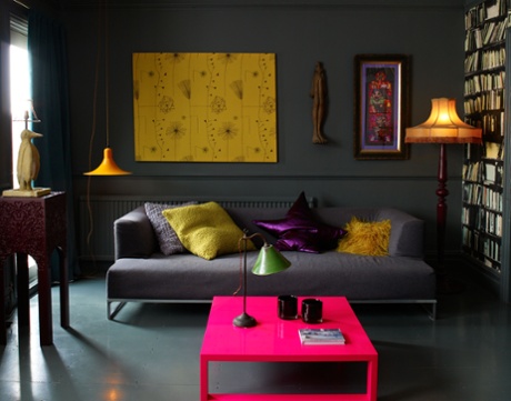
Bold grey
Embracing those black and graphite tones in a grey colour can have some extraordinary and beautiful results. A deep charcoal hue will feel strong and grounding, reassuring in its depth, yet cosy too.
You can choose to keep things simple with classic monochrome accessories, but dark grey is also a fantastic base palette from which to choose brighter punches of colour. A turquoise vase, cushion or dinner service will really sing in a dark grey room. Likewise, choosing a sofa, bed board or light fixture in a zingy pink or coral is another divine combination with dark, graphite grey. For the bold among you, dark grey goes particularly well with bright neon - a picture frame, rug or lampshade for example, and will really energise the room.
Introducing Valspar paint
Valspar can create as many colours as the eye can see – that’s 2.2 million shades, so if your heart is set on a colour, Valspar can match it. What’s more you can save your colour preferences on Valspar’s system, so whether it’s the ideal shade for Laura’s bathroom, or dad’s study, you’ll remember for future reference.
Available exclusively at B&Q, Valspar’s Premium paints feature a super scrub formula so paint won’t fade or chip off when cleaned and it comes in a range of wide range of high quality interior and exterior paints in a variety of finishes. Visit valsparpaint.co.uk to see how you can start colouring outside the lines, or see the range at B&Q.