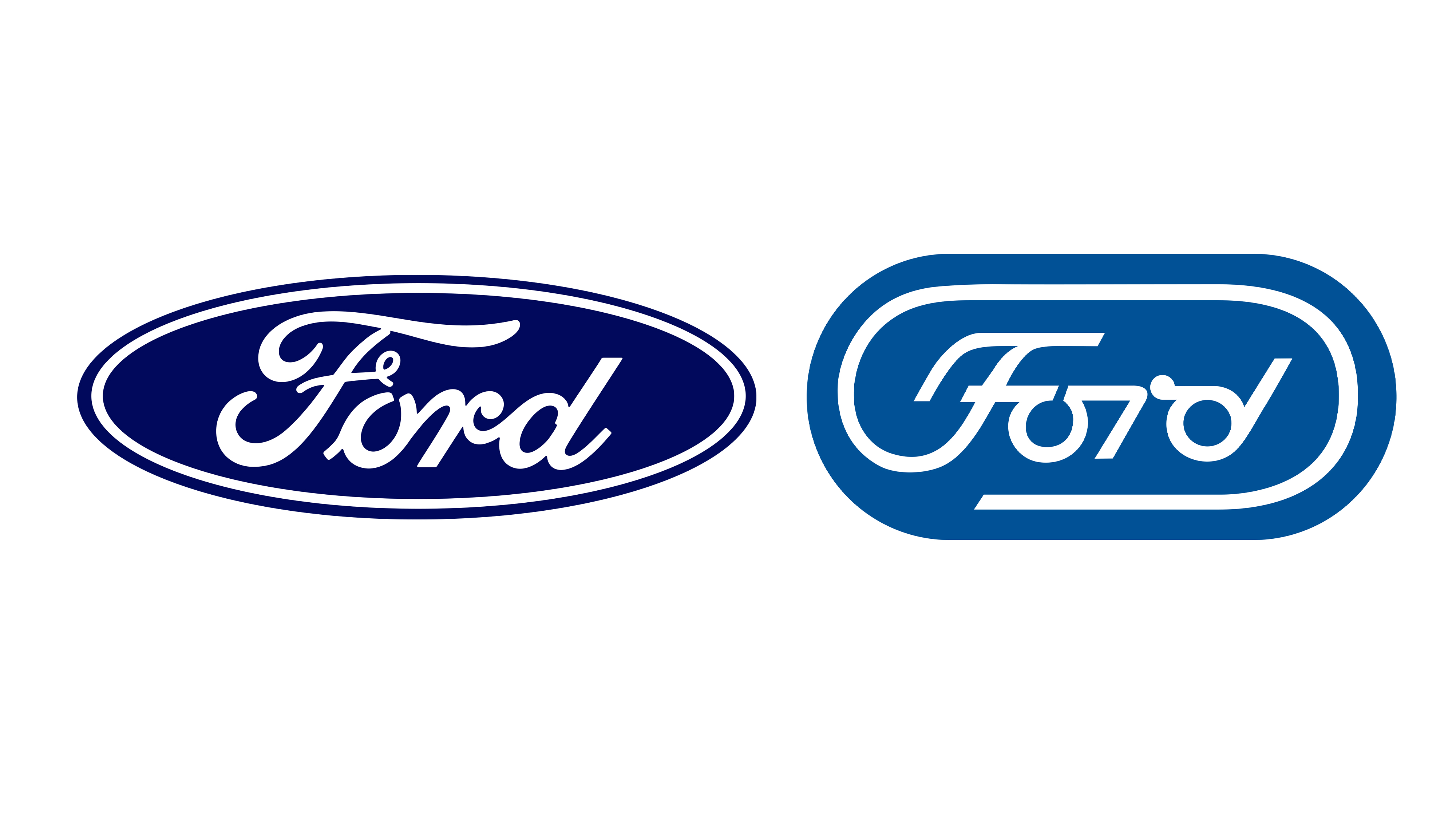
It seems like pretty much every major car manufacturer has rebranded in recent years, with most opting for a flat, simplified version of their previous logo. One brand that's bucked the trend by sticking to its existing wordmark with just a tiny change is Ford – but if it were to rebrand, it could do a lot worse than revisiting a brilliant unused design from 1966.
The logo by esteemed graphic design Paul Rand does the rounds on social media every few years, and is once again enjoying renewed appreciation on Reddit and X. Indeed, it might be one of the best logos that never was.
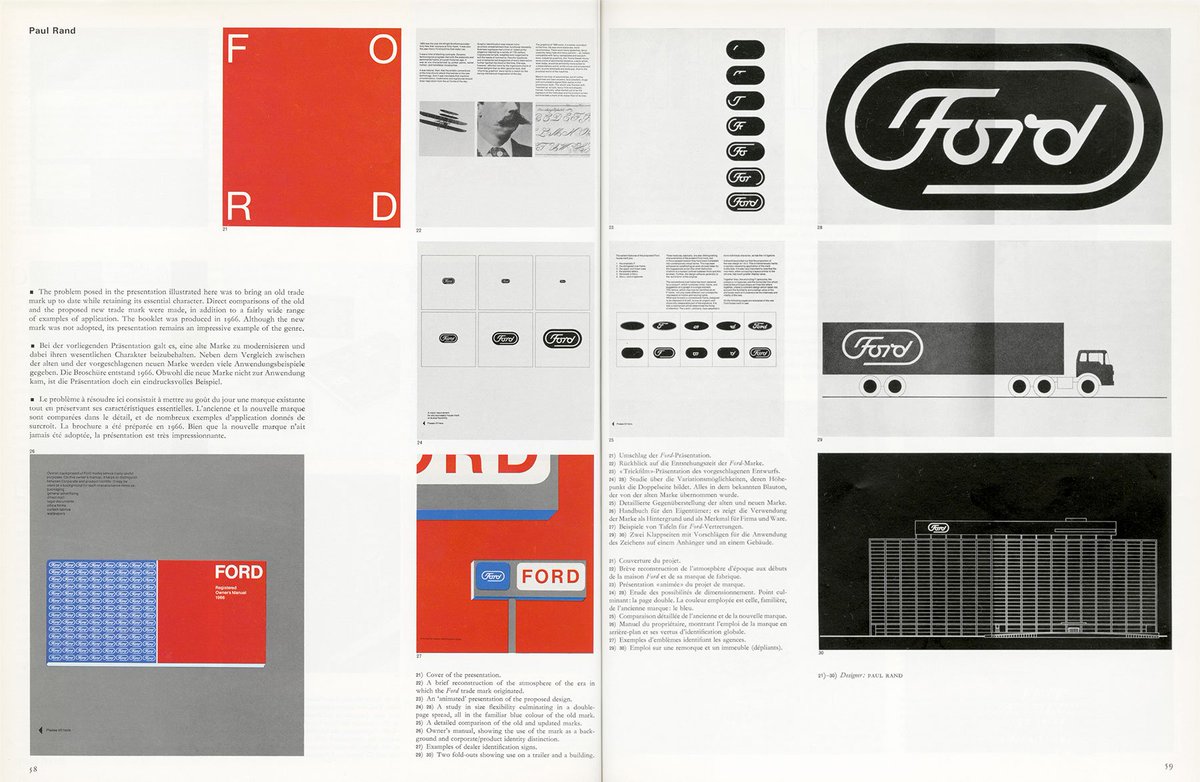
Rand, who has created logos for IBM, ABC and UPS, was brought in by Henry Ford II to modernise the logo and its calligraphy script. Rand's proposal retained key features such as the ligatures between letters and the break in the 'O', but adopted a more modern even-stroked lettering and used the tail of the 'F' to create an elongated oval frame.
Obsessed with Paul Rand's Ford logo design from 1966 pic.twitter.com/HTfgE2tCloOctober 5, 2023
Comprehensive design notes can be found on Paul Rand's website. "In the design of a house mark, it is difficult to overemphasize the importance of simplicity," they explain. "Simple things are obviously easier to remember, often easier to fabricate, and always easier to apply. Simplicity gets to the heart of a problem. It generates awareness by its brevity, inspires confidence by its understatement, believability by its frankness, and memorability by its uniqueness. It is the embodiment of form and content. The proposed house mark for Ford Motor Company has been designed with these thoughts in mind."
Unused Ford Logo. from r/graphic_design
From the original Star Wars logo to Sony's unused design, we've seen plenty of radical logos that weren't meant to be. For a roundup of the best, take a look at 8 big brand logos that never saw the light of day.