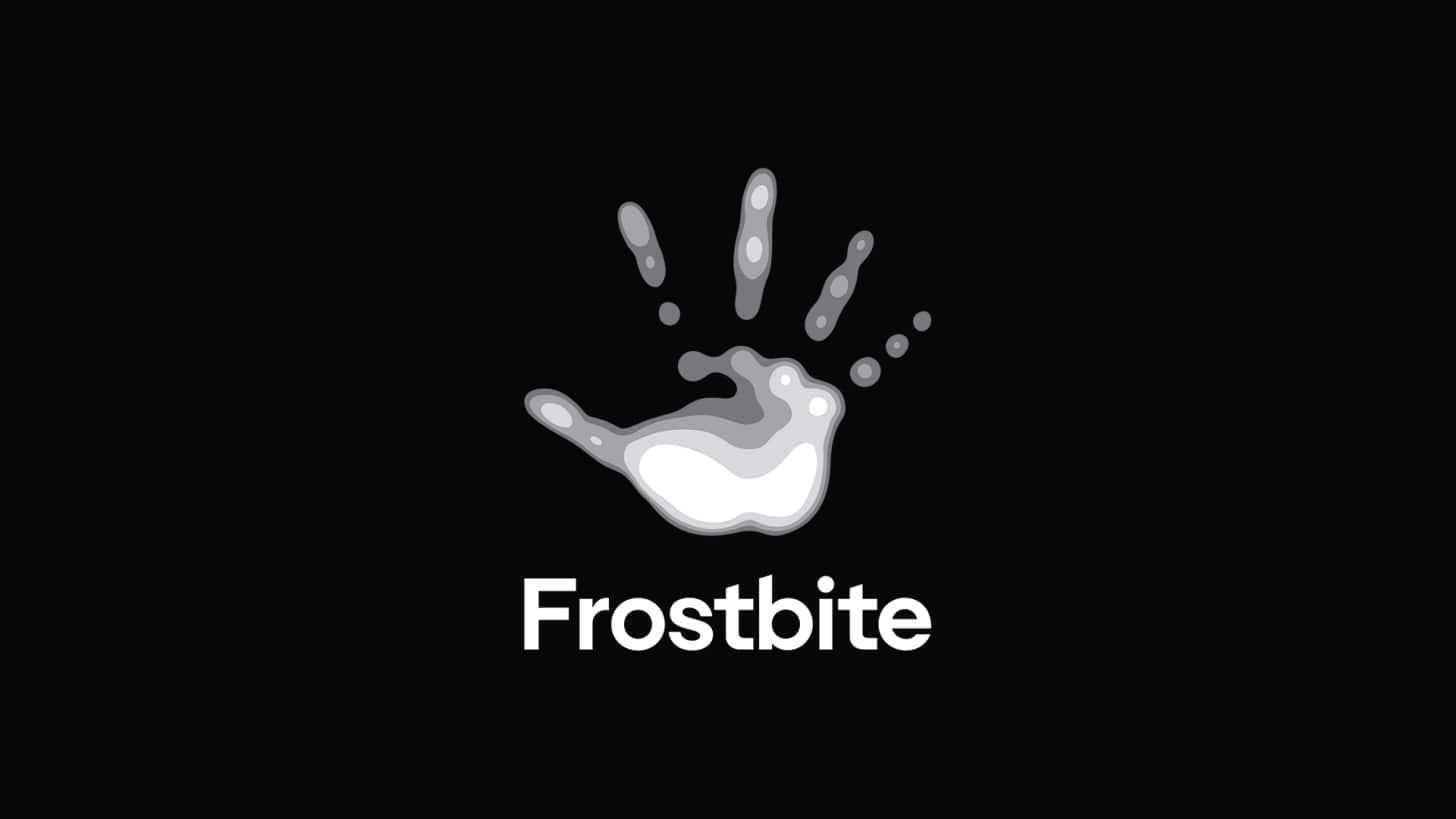
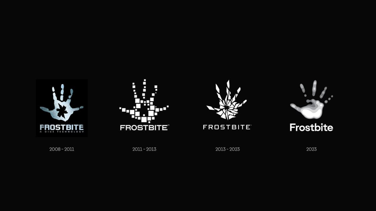
The video games publisher Electronic Arts has revealed a new logo for Frostbite, the multi-platform game engine that powers its biggest franchises. The new Frostbite logo design still features a hand, but it's much softer and no longer shattered into a million lethal jagged shards.
EA says there's a deep meaning behind the change, which is intended not only as a visual shift but also to represent a more profound philosophical evolution for the brand. It might be too late to make it into our pick of the best and worst new logo designs of 2023, but I'm quite taken the newfound cuddlesome approach.
The new Frostbite logo comprises fluid consecutive overlapping layers, smoothing out the sharp edges of previous designs. Electronic Arts says the new branding is intended to present its engine as a "platform for collaborative innovation" with an emphasis on partnerships with teams and collaborators.
It notes that the previous two versions of the Frostbite logo featured a fractured or broken handprint. "This made sense when we were emphasizing our destructible environments in Battlefield," it says, "but with today’s rebrand, we wanted to tell a different story – one about the collaborative relationships transforming Frostbite from within." Aww.

EA says the layers in the new design reflect "how our teams build upon each other’s strengths, reaching beyond what is possible when they work alone". It goes on to say that "each layer, like each piece of Frostbite technology, is both an innovation and a foundation, enabling the layer above it and building toward a cohesive whole." Meanwhile, the smoother edges reflect the brand's "commitment to addressing Frostbite’s rougher edges, creating a smoother experience for both creators and players."
And there's more. It says the "innately human" handprint "represents both the human touch that brings games to life and the creative imprint left behind by every person who helps get those games to launch." The handprint is also a "point of connection, keeping us in touch with our past and everyone who has contributed to Frostbite." That's a lot to pack into a logo design.
EA also seems to have had a change of heart when it comes to its philosophy of seeding Frostbite into every game possible. It says that EA game teams are now "free to develop on any engine they choose." All in all, it seems it's woken up a new person.
Frostbite was developed by DICE in 2008 for Battlefield: Bad Company and only expanded beyond Battlefield around five years later, providing the base of Mass Effect and Dragon Age. In 2015, it was introduced to EA Sports titles such as FIFA and Madden NFL.
For more ingenious new logo designs with hidden meanings, see the new Hodder & Stoughton logo.