A neutral palette is timeless. Imagine a crisp, off-white wall to brighten the space, while a warm caramel rug envelops the room with comfortable warmth — it's dependably chic. However, with daring colors making a return in contemporary interiors, an all-beige space can sometimes read too expected, too clean.
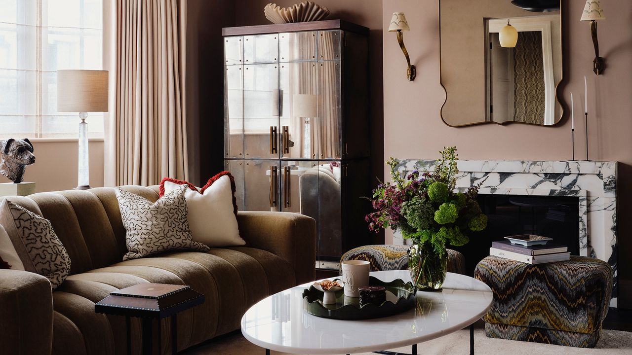
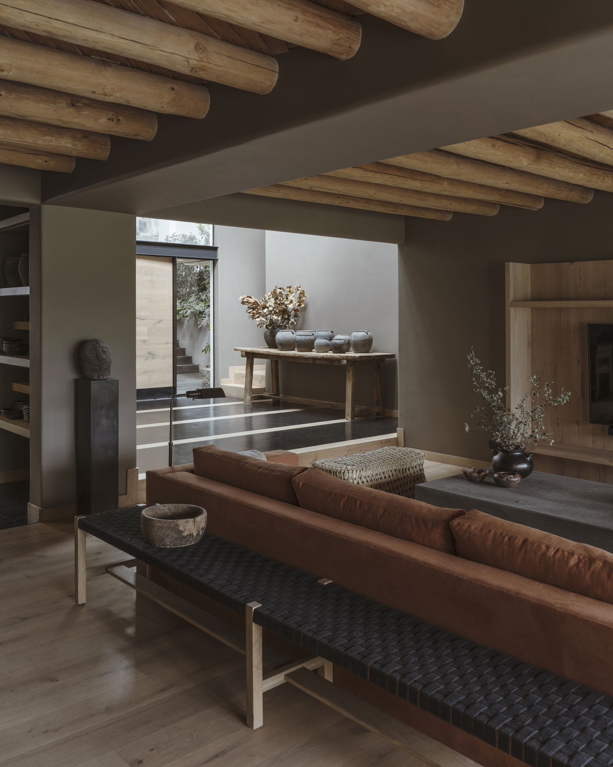
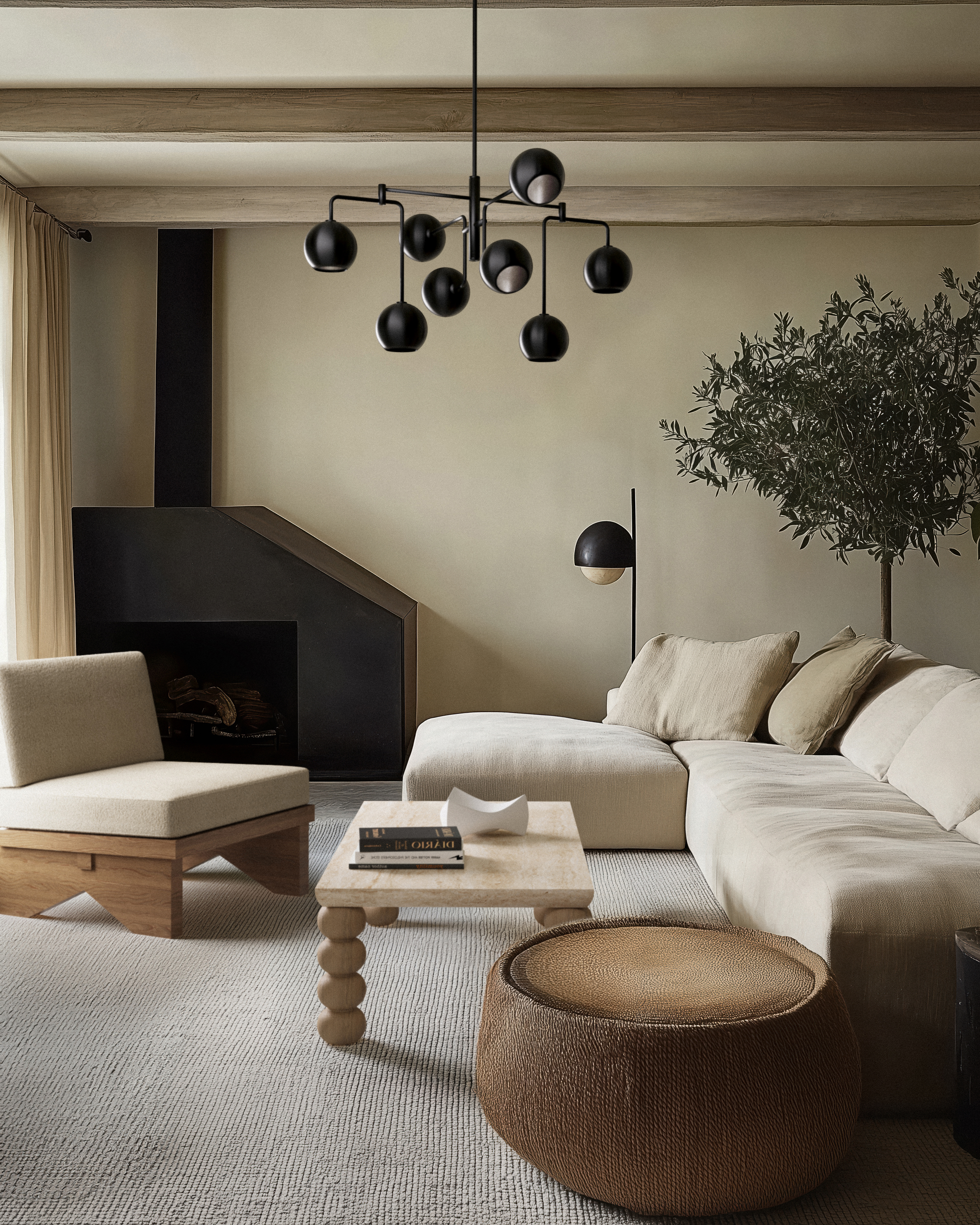
The solution? It's time to get our hands dirty when it comes to browns and beiges. Something a little bit muddy and murkier, if you will. Dirty neutrals go beyond the clean complexion of the most expected neutral color schemes in interior design, offering a more lived-in, aged quality that makes them feel effortless. "These shades soften the edges of a scheme, creating depth and nuance that brighter tones don’t quite hit, forming atmosphere and making a room grounded, layered, and relaxed," explains Livingetc's color expert, Amy Moorea Wong.
So, step away from the flatness of clean beige or stark gray, and lean into something with depth, grit, and complexity. Below is everything you need to know to begin elevating your neutral palette.
What are Dirty Neutrals?
In Livingetc's round-up of master British interior designers, Tiffany Duggan, of Studio Duggan, shares that 'sludgy' has become her new buzzword when decorating with color. And it made me think: how could 'sludgy' be translated into the world of neutrals? What actually is a dirty neutral?
"These are hues you’ll find loitering around near the shadows, colors that hang around close to the floor or perhaps lurk long-forgotten in the attic," says Amy Moorea Wong. "They’re dusty or a bit grubby, roughed and tinged by tones such as gray, brown, or black."
And while that doesn’t sound particularly nice, when translated into design terms, it more or less means they feel softly cloudy, approachable, and familiar (but with a slight edge).
These new neutrals encompass shades such as mushroom, stone, or olive. "These colors bring the outside in with a hint of atmosphere and intrigue, connecting to the landscape in a way that’s uncomplicated and honest as well as evocative," adds Amy.
As for things like hue, tint, tone, and shade, it's best to keep things ambiguous. "I gravitate toward colors that sit in the space between warm and cool, shades that resist being pinned down," says interior designer Nina Lichtenstein.
For instance, a mushroom taupe with a greenish undertone, a gray infused with a touch of brown or mauve, or a deep putty that feels both warm and moody — these neutral paint colors read as more complex but still easily fluctuate between design styles.
How to Style Dirty Neutrals in Your Home
As with every color trend, the true magic lies in how you layer and style each shade. Rather than just acting as a backdrop, dirty neutrals instantly add sophistication because they create atmosphere.
"They connect a space to the natural world, like weathered wood, river stones, or worn clay, and bring a sense of timelessness," says Nina. Start with a paint color that reflects this familiarity, and build your neutral room idea from there.
Amy highlights a few schemes as a jumping off point: "Stone and olive point to nature in a low-key, subtle way (add rust or ochre for earthiness), while tones such as putty, taupe, camel, or fawn work together for a comforting warmth."
For cooler and more classic colors, "try shades such as ash, pewter, charcoal, or flint. These bring a sense of gentle refinement," says Amy.
For a complex taupe-brown that shifts with the light, try Mouse's Back by Farrow & Ball.
French Gray - Dark by Farrow & Ball reads as a smoky gray with green undertones.
Heath is a warm, stone-toned neutral with an organic, weathered elegance.
From there, don't be afraid to mix and match your dirty neutrals with an array of textures to create a scheme that’s both cocooning and elegant. Dirty neutrals are chameleonic and pair beautifully with natural materials, while leaning either rustic or refined.
"I love combining them with warm metals like aged brass or antique bronze to amplify richness," notes Nina. On the other hand, textural elements such as linen, bouclé, and raw wood allow the tones to feel organic and a touch softer.
For unexpected contrast in design, Nina recommends trying "sludgy taupe walls with crisp white trim or muddy green cabinetry with pale stone countertops." "This combination makes the palette feel dynamic," she says.
Where clean neutrals can sometimes feel sterile, dirty neutrals envelop a space with warmth and depth, making it feel intentional, layered, and emotionally resonant. Below are a few decor pieces to inspire your next dirty neutral refresh.
The deep olive green paired with the texture of the mohair gives this throw a dynamic and dirty style.
This slightly muddier take on caramel is the perfect dirty neutral accent for any tablescape or mantel.
Rust is a bolder take on dirty neutrals, and this lamp has a worn finish that makes it more visually interesting.
Dirty neutrals prove that a neutral palette doesn't have to be boring. "They carry undertones of earth, clay, smoke, or stone, making them more layered than 'safe,' yet still versatile enough to anchor a room," says Nina.
Loving this new wave of neutrals? Neutral maximalism is another exciting way to spice up your more monochrome ideas.