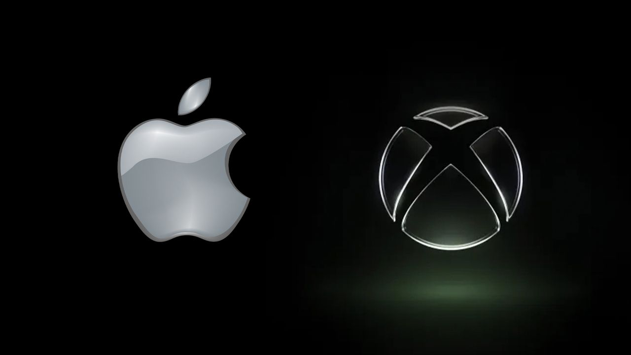
Back when Apple revealed its new Liquid Glass design language to the world, it was widely mocked. Everyone from graphic designers to Microsoft piled on, claiming that the splashy, glassy UI was straight out of the noughties. But if the new Xbox logo is anything to go by, Microsoft isn't laughing anymore.
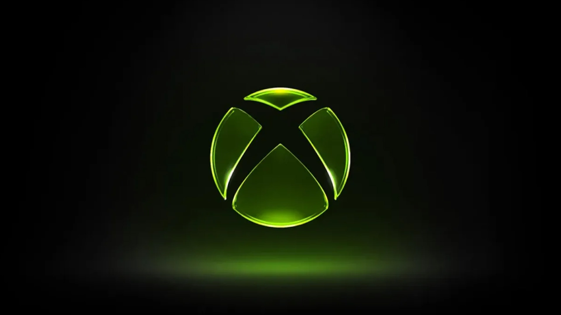
This week, Xbox revealed a shiny and translucent take on the classic Xbox sphere which, with its neon green colouring and ostentatious lighting, looks like a knowing throwback to the brand's early aesthetic. But it's also reminding plenty of people of, yep, Liquid Glass.
It’s official, Liquid Glass is now the design language of the era https://t.co/lNe6BhzlDdApril 24, 2026
In a world of brands bringing back their old logos, it's hardly surprising that Xbox is going for nostalgia with this one. The skeuomorphic glassy aesthetic looks straight out of the original Xbox dashboard – something plenty of fans have picked up on.
The design also marks yet another brand shifting away from minimalism, and embracing the fun world of maximalism. Skeuomorphism, with its tactile textures and 3D shapes is back, and last orders has definitely been called at the flat design party.
But while many Xbox fans have argued that the noughties Xbox aesthetic is the sole inspiration, it's impossible to ignore the context and timing. Less than a year after the launch of Liquid Glass, here comes an Xbox logo that looks like... liquid and glass. And as we know from the impact of Apple's shift to flat design in 2013, the design language of iOS is capable of impacting the entire UI industry. But then again, Liquid Glass has been accused of copying the Frutiger Aero of noughties Windows UI design, so who really knows what came first?
But if anything, both Liquid Glass and the new Xbox logo show that ultimately, design moves in cycles. What's old is new again across the board, with the return of skeuomorphism and the rise of heritage celebrating rebrands. Whether or not Microsoft took inspiration from Apple isn't certain, but one thing's for sure; like everybody else, they're both running away from minimalism and flat design.