Branding nutritional drinks can present a dilemma. Often brands will want to focus on ingredients and scientific claims, but that can sometimes make a product less impactful on the shelf.
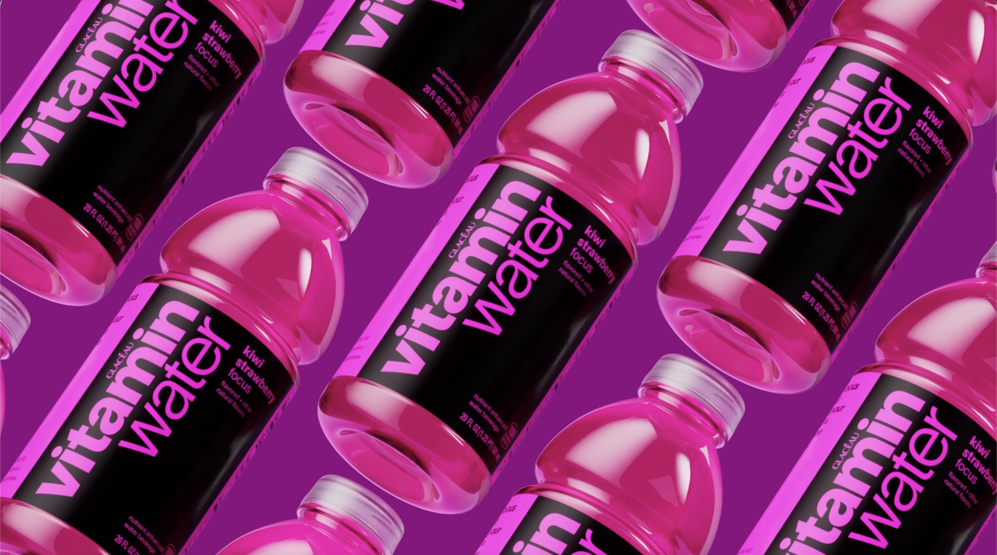
Coca-Cola's vitaminwater has taken a different approach with its rebrand. It's ditching the previous slightly pharmaceutical-looking identity in favour of bolder branding that aims to be fun rather than scientific. There's a clear influence from the current bold minimalism trend, but the new look boasts added personality and a nod to the previous identity in a couple of clever hidden details in the new logo design.
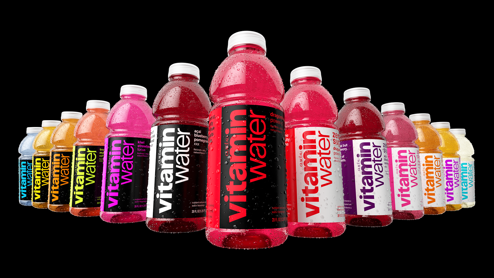
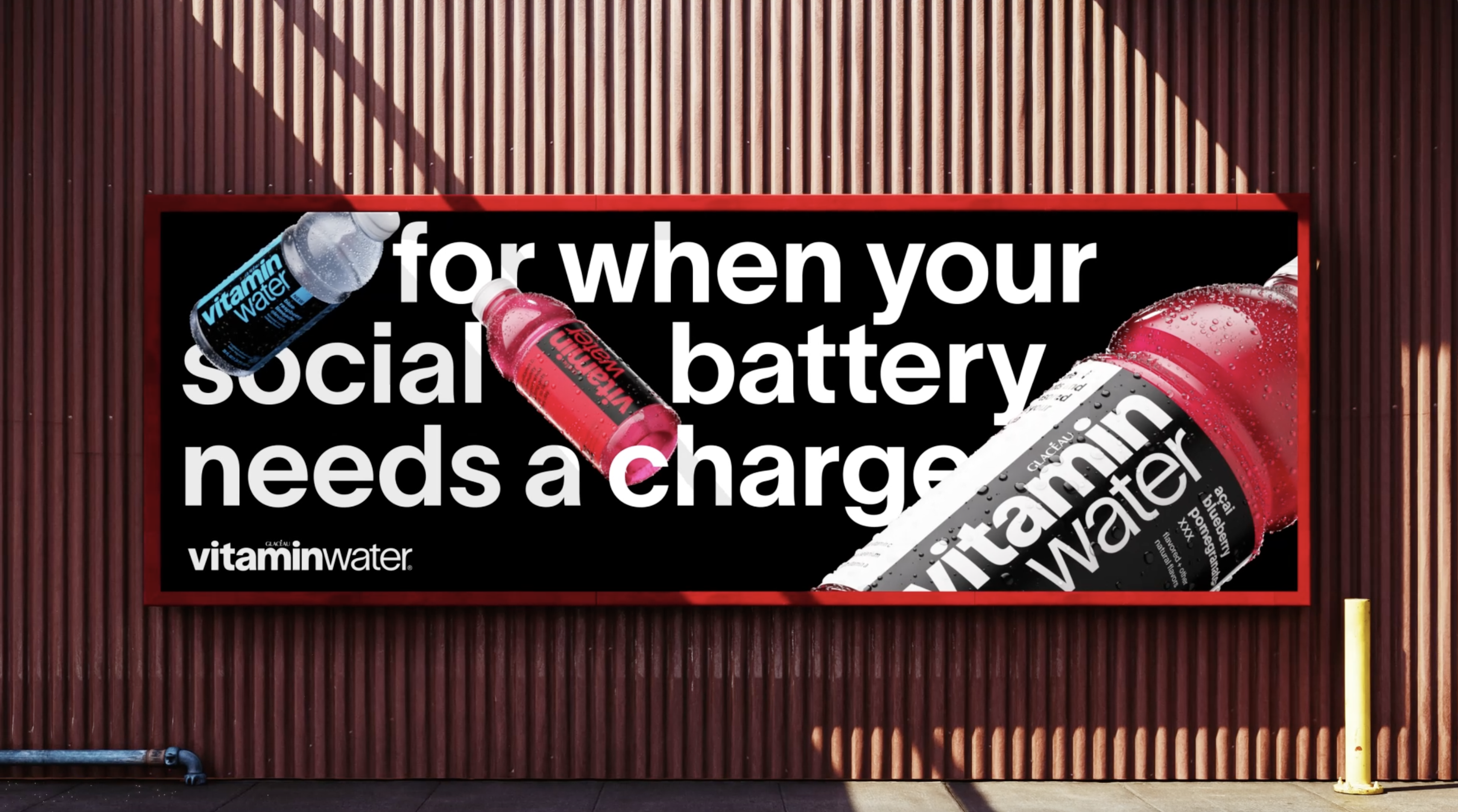
The rebrand is all about trying to stand out more on crowded store shelves, aiming for maximum impact to enhance visibility as well as flavor recognition.
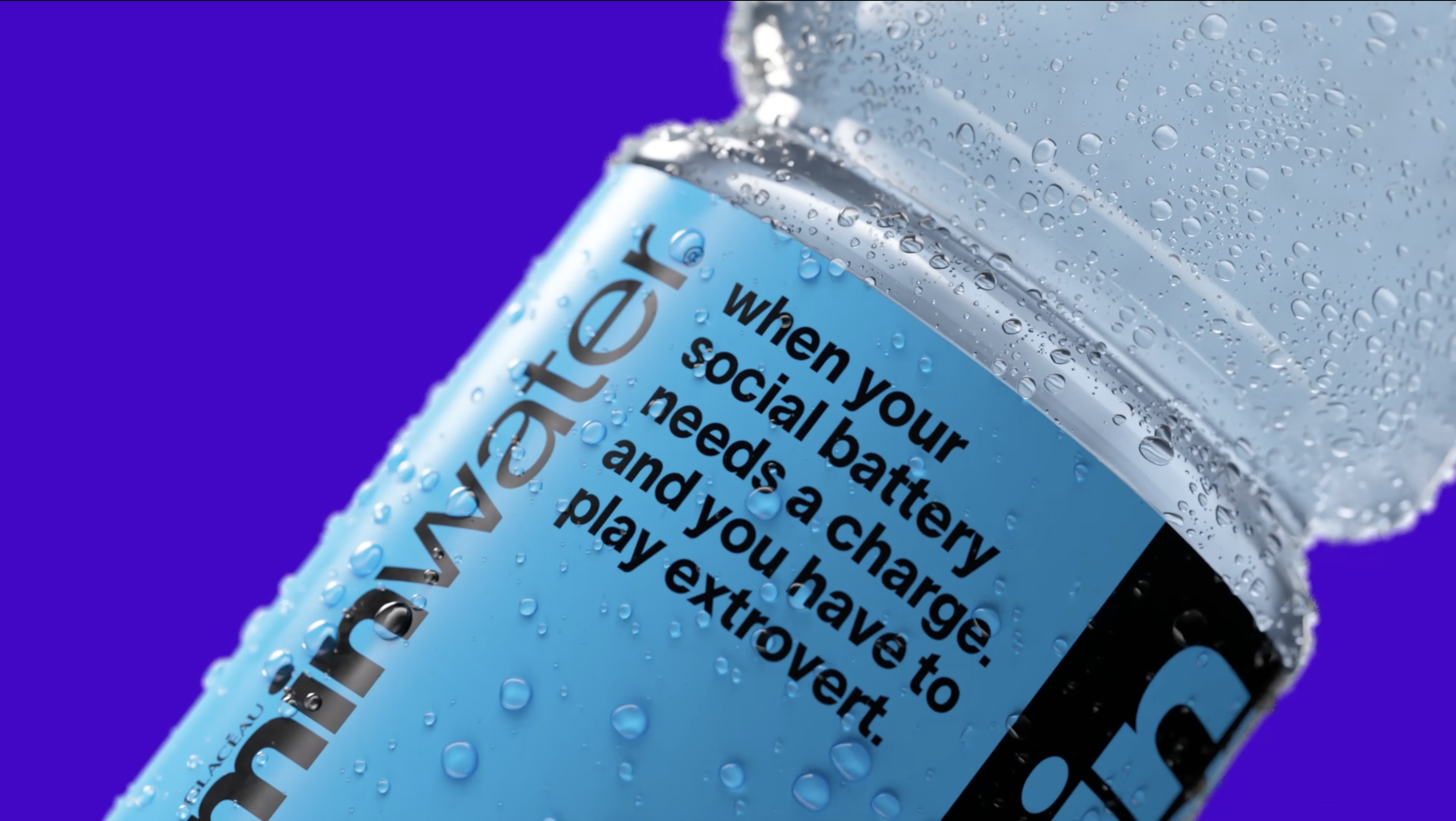
Full-bleed color labels aim to make flavour selection easier and more intuitive. That includes for two new flavours: 'Elevate' (blue raspberry and limeade) and 'Re-hydrate' (pineapple and passion fruit). There's also a clearer differentiation of the full sugar varieties and zero sugar varieties with crisp white labels on the latter.
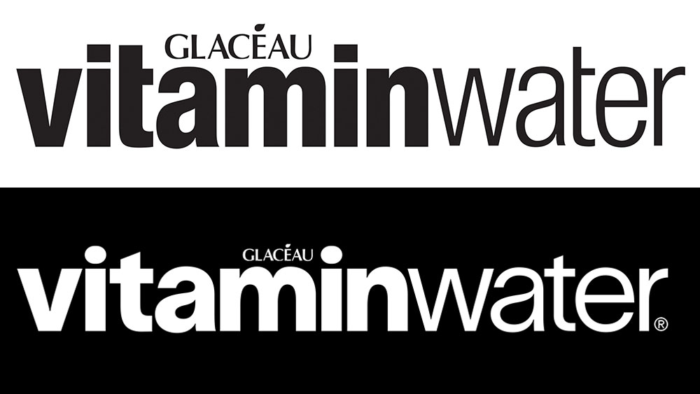
As for the logo, the new design is bigger and bolder, and the typeface had been updated from Helvetica to TWK Lausanne. The bespoke details are subtle, but look closely and you'll see some clever references: a droplet-inspired ‘a’ replacing the separate drop icon used on previous packaging designs, and a stretched dot on the ‘i’ that mimics a vitamin pill.
The creative studio forpeople, which was responsible for the rebrand, says the aim of consolidating the brandmarks was to eliminate visual clutter and create a singular, impactful "front-face" that ensures immediate brand recognition.
The tone of voice has been updated too, eschewing authoritative but dry wellness jargon for a more sparky, cheeky brand voice from the Innocent school. This aims to connect with younger generations and draw on the brand's New York City routes. Instead of plugging cognitive benefits or immunity boots, copy calls for: "Immunity from all the BS" or invites customers to "Focus: Time for a full review of your ex's profile."
"A threesome of antioxidants & full uncensored flavor” one variety claims. “Sports drink levels of electrolytes. For when you went so hard you had to go home,” is another description.
In a way, the direction of this brand refresh contrasts with Coca-Cola's recent Bodyarmor rebrand. The new packaging design for Bodyarmor brand gives pride of place to ingredients and nutritional details to highlight the science behind the product as it seeks to compete with the likes of PepsiCo's market-leading Gatorade and Coca-Cola's own cheaper brand Powerade.
"At the beginning, vitaminwater was far ahead of its time in the enhanced water space. Now that the world's caught up, it's our responsibility to make sure the brand stays at the forefront of today's culture," says Rapha Abreu, Global Vice President of Design at The Coca-Cola Company. "As an identity that started out as fresh and iconic, it's lost some of its vibrancy over the years. We needed a shot of visual and verbal punchiness to cut through all the new noise on the shelf.”
For more ideas for your own work, see our roundup of inspiring packaging design.