In the midst of all the fashion and design weeks, autumn brings about another important category of trend forecasting for the interior design world: the 2026 Color of the Year announcements. Benjamin Moore is the latest brand to reveal its shade slated to set the mood for 2026, and it seems the trend cycle is, thankfully, starting to slow.
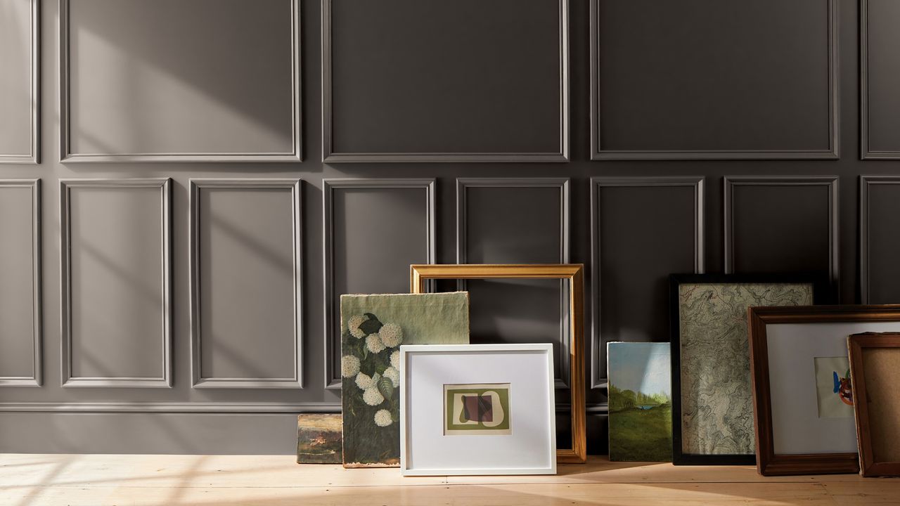
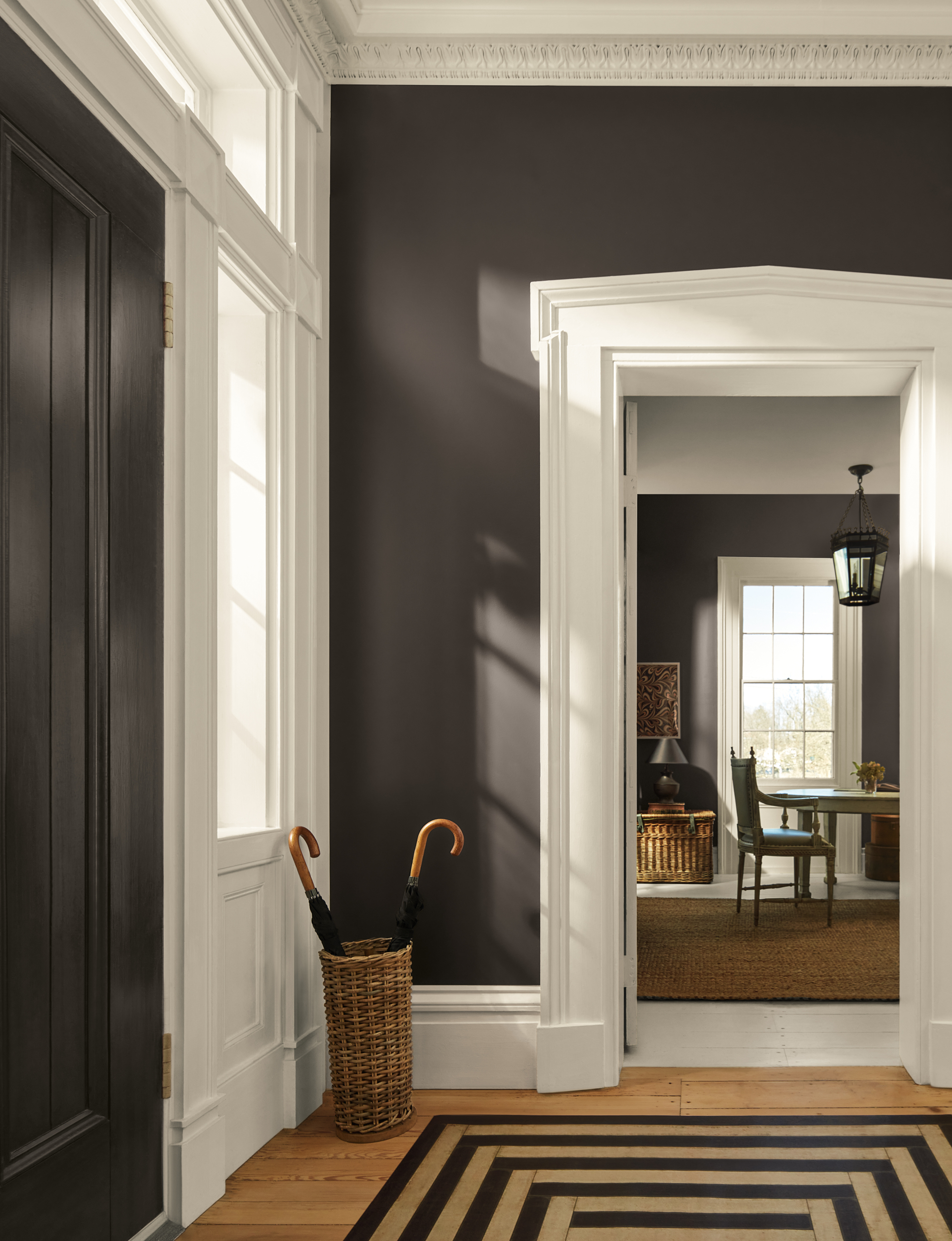
Yes, the newly crowned shade from Benjamin Moore, Silhouette, is a deep, warm brown with strong gray and purple undertones. It's elegant, timeless, and a shade that both stands out as an accent or blends into a neutral palette. But more interestingly, it's not that different from Benjamin Moore's color of the year 2025, Cinnamon Slate — "an evolution, not a revolution," as Benjamin Moore's Helen Shaw explains.
It's a pretty timeless neutral for a Color of the Year, but as design principle of interior design studio 1508 London, Ailsa Connery explains: "It's the type of color that makes a perfect base — think of it as the backbone of your scheme." And while some Colors of the Year go extreme in their choices, this one is a paint color we can see a lot of people actually using.
Indeed, embracing familiarity was key to the brand's thought process when choosing Silhouette, along with the accompanying color palette, 'Tailored Classics.' Much like a favorite suit or little black dress, these shades are livable and have serious staying power.
We're seeking saturated, elevated shades that inspire us in our interiors, while still feeling rooted in the comfort of nostalgia. Silhoutte captures these characteristics and feels like a natural progression for 2026. So, how should you bring it into your home? I've broken it all down below.
Benjamin Moore describes this shade as "reminiscent of tailored suiting," and I don't think it gets more accurate than that. It's not just a brown or a gray, but a sleek combination of the two with notes of purple, another regal color.
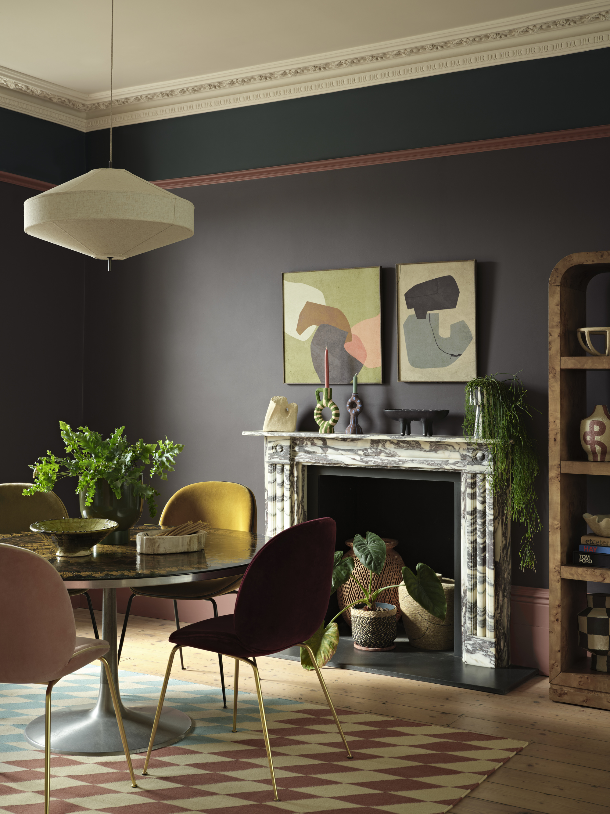
"There is a comfort and reassurance in classic pieces and the cornerstones of traditional design. They have staying power for a reason and offer an opportunity to be more dynamic and innovative in the composition of a scheme," explains Helen Shaw, color expert and director of marketing at Benjamin Moore.
Current color trends point towards a softer, more bespoke take on the familiar classics. For instance, rich oxbloods that read brown in certain lights, or darker teals that don't feel as vibrant or overpowering in a room. Helen says, "With Silhouette, it's all about the details and the attention that goes into dressing an outfit and dressing a room."
There is a balance between comfortable and chic that allows it to easily fall in the classic colors category, as well as adopt an extremely versatile nature. It can be an espresso shade when you need it, or it can lean more charcoal depending on the light and how you utilize the color, as Ailsa explains. "In the daylight, you'll get that cooler, fresher gray, while at night, it feels more warming and comforting," she says.
Colors That Go With Benjamin Moore's Silhouette
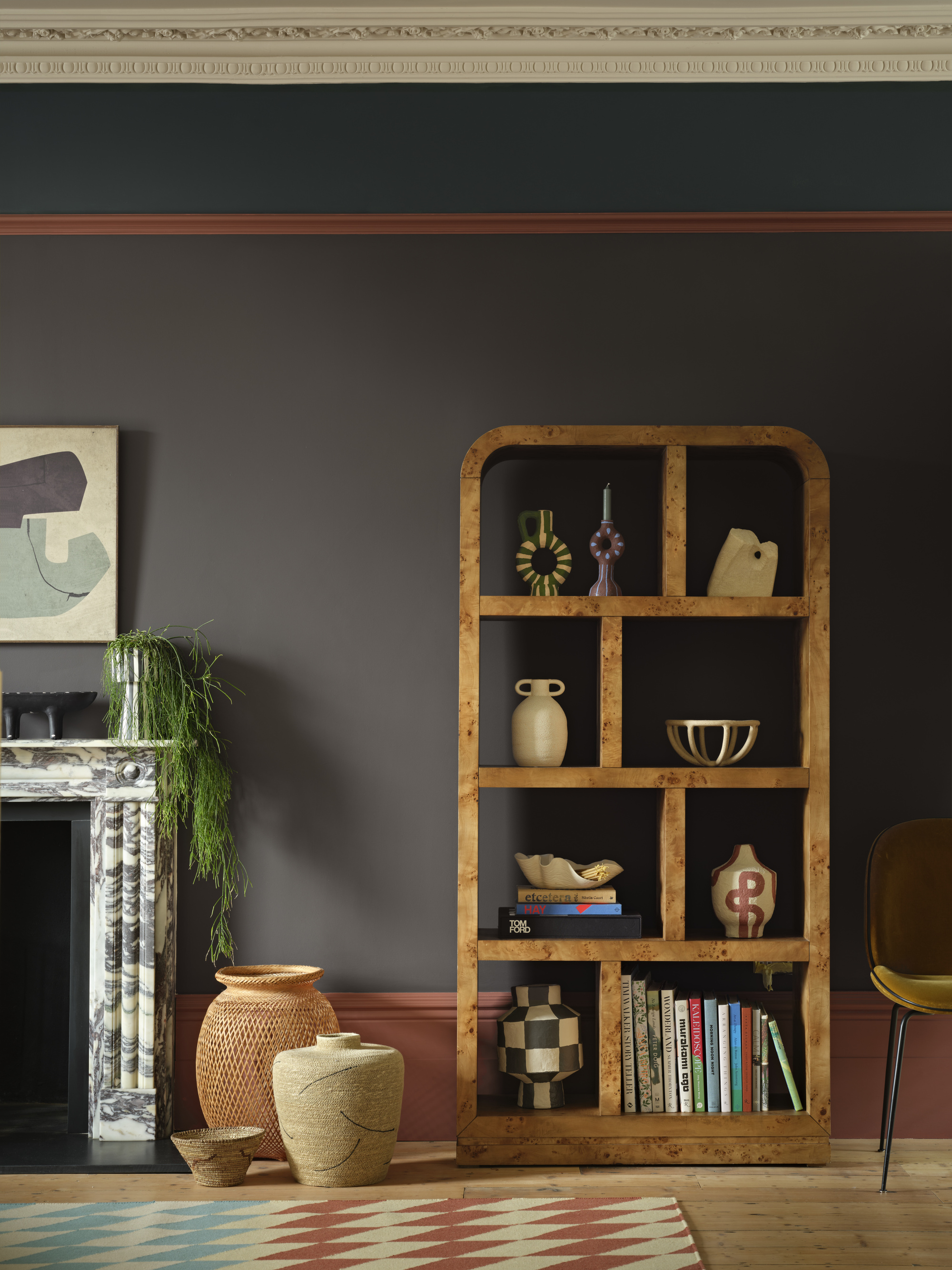
Being adjacent to brown and gray on the color wheel in interior design allows Silhouette to flow with neutral color schemes, monochromatic looks, and even as a grounding color with bright shades. It's a true workhorse.
However, Benjamin Moore has done all the hard work for you, having curated a palette of eight hues perfectly tailored (hence the 'Tailored Classics') to showcase the capsule-wardrobe-for-your-walls nature of Silhouette.
From neutral pairings to all-out color, below are a few of the shades you can expect to see in the palette.
Loving this timeless tone so much that you're already planning where to style it? Check out Graham & Brown's color of the year for another rich and regal shade that might just be another perfect pairing for Silhouette.