It’s always an event when a legacy brand embarks on a visual shake-up. Last week, the design world was aflutter when the RSPCA announced the first major redesign of its branding since the 1970s. As the organisation celebrates its 200th anniversary, it looks to the future with a modern, forward-facing brand identity that’s brimming with creative energy and purpose – reflecting the increased urgency of the charity’s mission as ecological destruction continues apace.
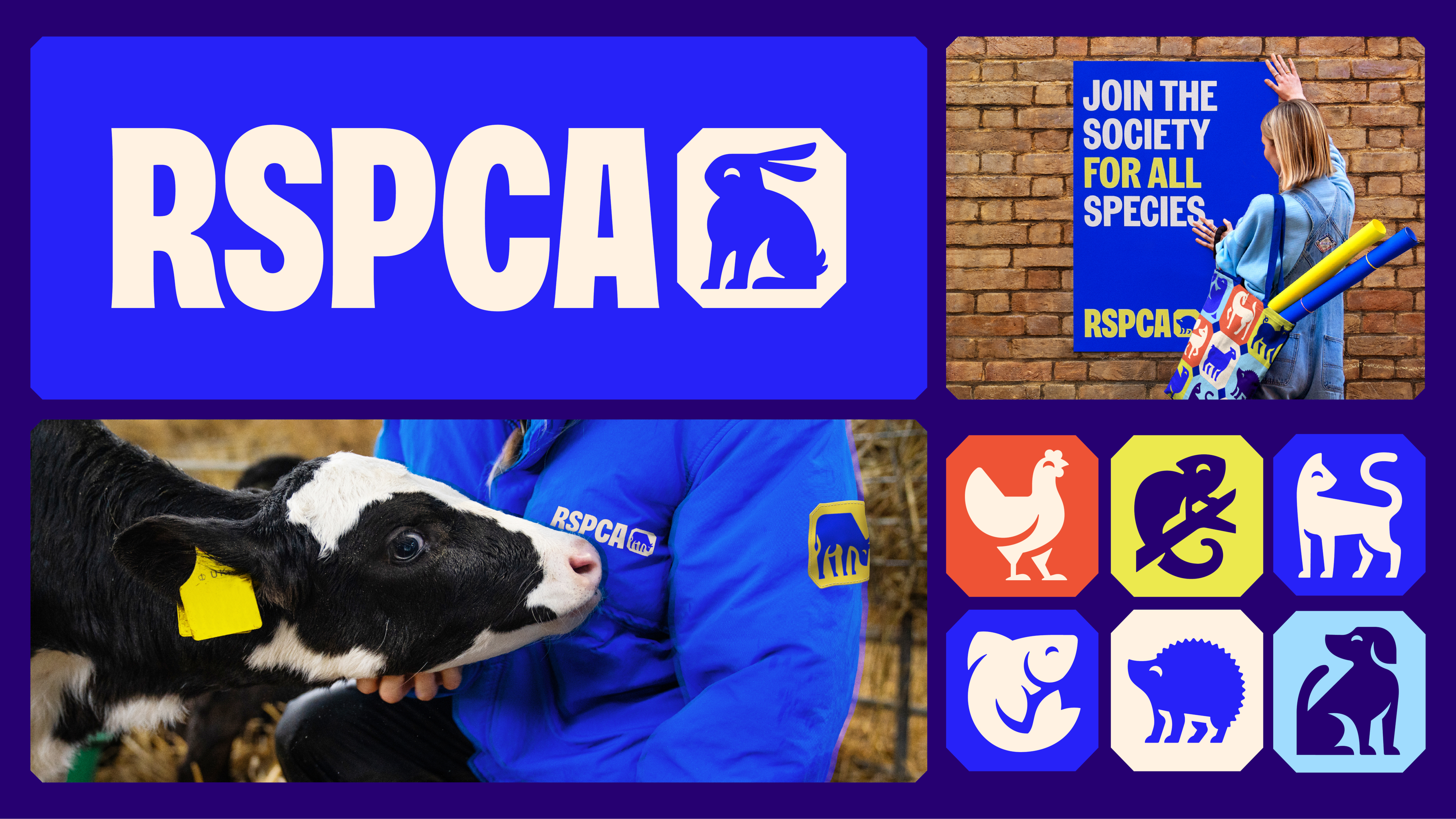
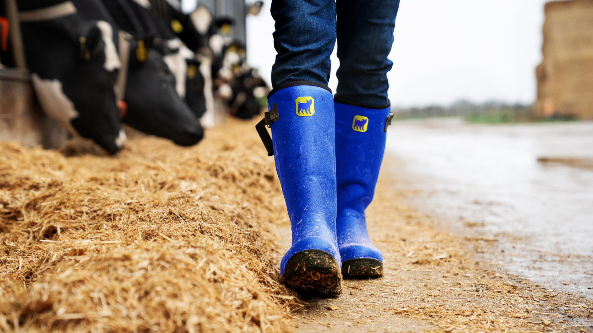
The RSPCA is, of course, a charity that advocates for the rights and welfare of animals, and as such, animals are the cornerstone of this rebrand. The central piece is a new logo, which is really multiple logos at once (not even the best logos can make that claim). An octagonal shape similar to a British postage stamp – a nod both to royal heritage and the charity’s previous logo – is used to enclose a series of simple and distinctive illustrations of different kinds of animals.
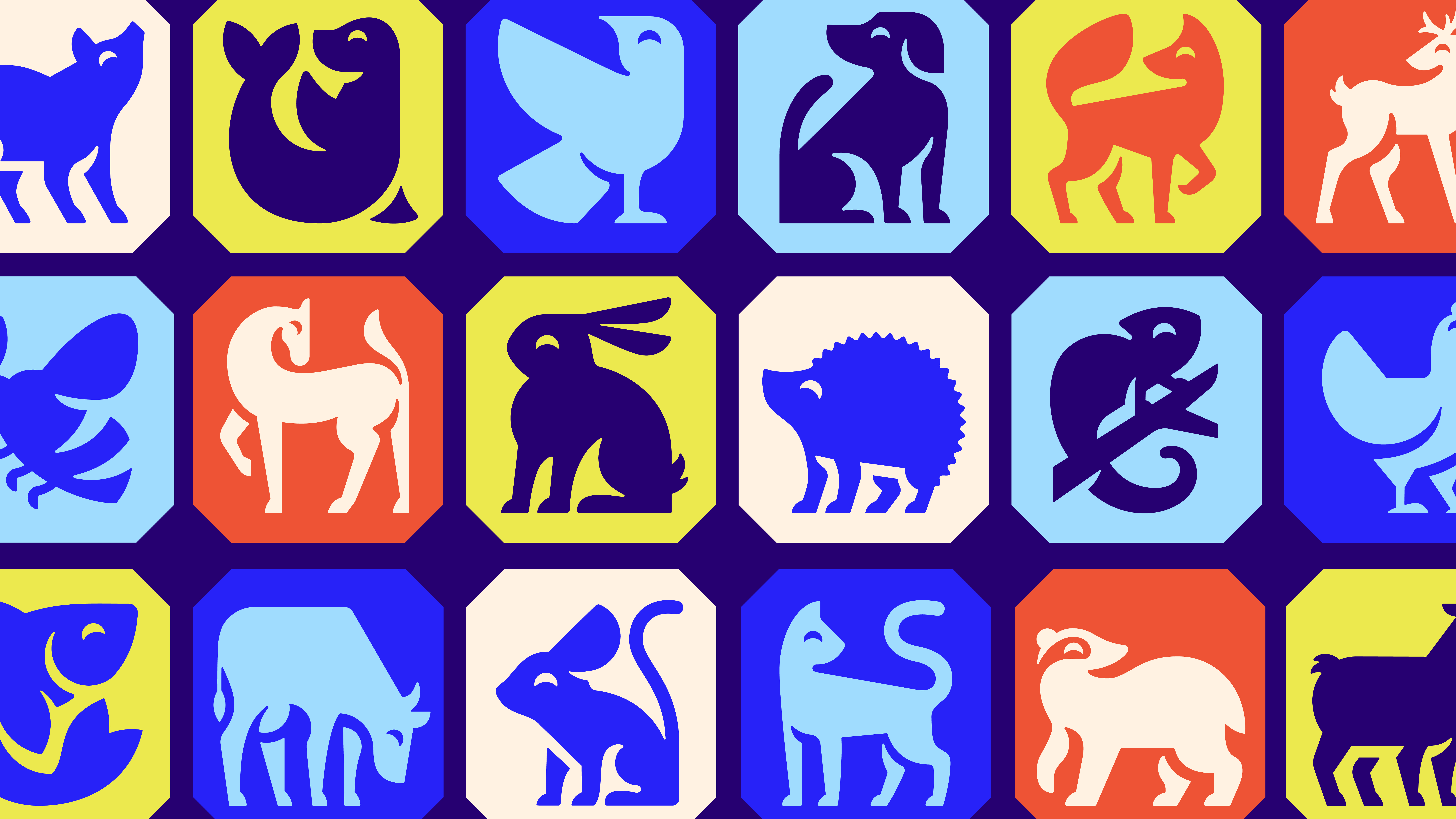
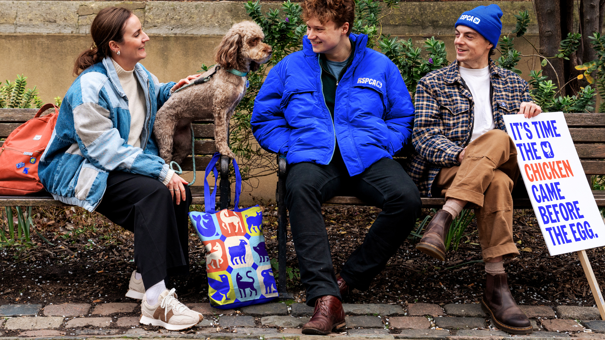
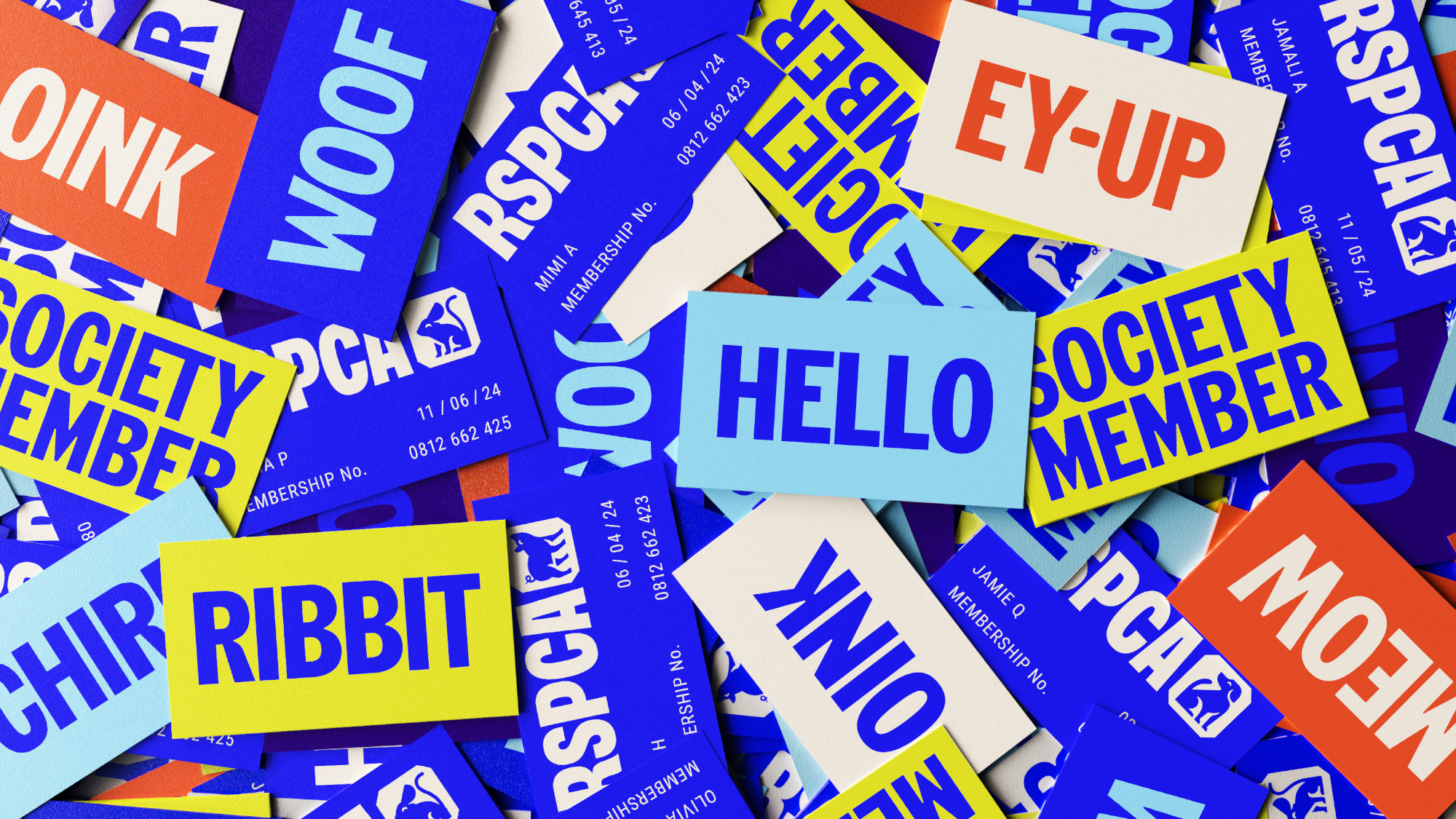
From cats and dogs to iguanas and hedgehogs, the logo and its illustrations exemplify the charity’s creative purpose for the twenty-first century – to inspire people to join in creating a better world for all animals. These logos are used with and without a new distinctive typography, creating a malleable brand identity that can be used in all sorts of different contexts.
Making all this happen was a huge task in itself. The RSPCA, aware that its brand needed a refresh, had reached out to global branding agency Jones Knowles Ritchie (JKR) for help with the challenge of updating its identity for a new era of fighting for animal rights. We spoke to some of the team behind the reband to learn more about how it all came together.
Rebranding the RSPCA
"Taking on any legacy rebrand – especially one that has as much heritage as the RSPCA – is always nerve-racking. But it’s a huge creative opportunity too," says Ellen Moriarty, Design Director at JKR, speaking to Creative Bloq. "We had 200 years to draw on, while also thinking about what we needed to create for the next 200 years. Some elements we knew we would need to evolve – like the logo – but there were also a lot of distinctive areas to build on."
It helped that the RSPCA themselves proved to be something of a dream client – the charity was well aware its branding was long overdue for a change, having been basically untouched since the 1970s. Moriarty says this made for an enjoyably collaborative process, with both sides holding each other to account. The JKR designers also threw themselves into the world of the RSPCA, visiting farms, touring wildlife centres and witnessing animal rescues alongside the charity’s officers.
"This extensive and hands-on process grounded us," says Ellen. "It reinforced that this went way beyond the creation of a new logo. It was about crafting an identity that would serve and inspire all the people engaged in the amazing work of the RSPCA. It made it feel real and enabled us to see how important this process was and the impact it would have."
This particularly helped with crafting the all-important illustrations. While the designs needed to be simple and striking, they also needed to show animals that were happy and healthy, as part of the charity’s positive vision of a better future for animals. Spending time with RSPCA vets proved hugely influential in terms of crafting not just the look of these drawings, but also how they would move in the distinctive animations that give the new branding such playful character.
Also key were the new colours for the brand: Rabbit White, Lizard Green, Butterfly Blue, Fox Red, Swallow Blue, and of course, RSPCA Blue. According to Ellen, the key to developing these often lay in delving into the RSPCA’s extensive archives of designs, photographs and printed materials. "This exploration served as a guide, ensuring that our work remained loyal to the organisation’s legacy," she says. "In fact, a book published celebrating their centenary [in 1924] was the inspiration behind the new shade of electric blue."
The typeface
A significant aspect of the rebrand was nailing a new typeface. For this the team at JKR approached typography specialists Studio DRAMA, proposing that the two agencies should work together on creating a new typeface that could support the RSPCA into the future. However, on accepting the brief, the team at Studio DRAMA realised that the key would be looking into the past.
"We started by looking back to move forward, taking inspiration from the organisation’s rich archives," explains Chris Nott, co-founder and creative director at Studio DRAMA. ‘The typeface draws inspiration from the classic British grotesque typeface classification and woodblock typography. Stephenson Blake’s Grotesque No.9 was a core inspiration, evoking characterful enclosed terminals and apertures reminiscent of old RSPCA wordmarks and signage.’
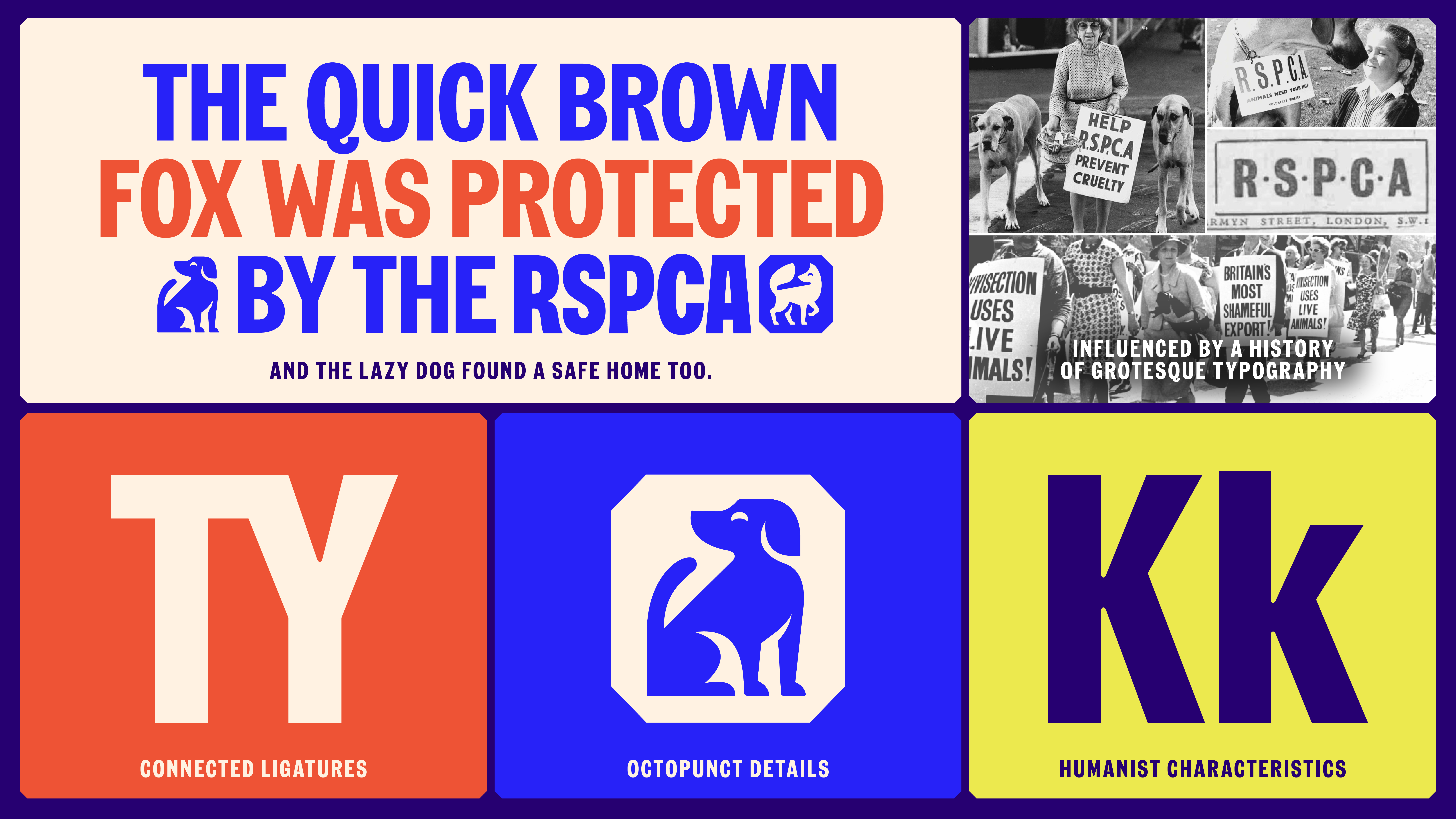
The final typeface also draws influence from the RSPCA’s more radical history as an organisation for activism, protest and fighting for animal welfare. The team looked at protest signage, drawing on the handmade lettering of protestors to influence the design. "This felt like a natural source of inspiration," says Nott.
For the final tweaks, it was all about making sure everything was working in harmony and the typeface complemented the new illustrations. ‘We worked closely with the JKR creative team to build common characteristics like soft ink traps and blunt detailing,’ Nott says. ‘This enabled the typeface to pair seamlessly within the toolkit.’
The final typeface is named Wilberforce Sans – a hat-tip to William Wilberforce, British politician and abolitionist. In 1824, Wilberforce was a founding member of the Society for the Prevention of Cruelty to Animals, which in 1840 would gain the patronage of Queen Victoria and become the Royal Society for the Prevention of Cruelty to Animals, or RSPCA as it still is today.
For Every Kind
The new brand identity is launching alongside a full campaign promoting the new ethos of ‘For Every Kind’ – the idea that every animal, of every kind, is worthy of respect and protection. The RSPCA developed this campaign in partnership with advertising agency AMV BBDO, and it kicks off with a two-minute film from Raine Allen Miller, director of Rye Lane, which you can watch below:
To learn more about the RSPCA’s ‘For Every Kind’ campaign, visit rspca.org.uk/foreverykind. Our thanks to JKR Global and Studio Drama for their help with this story.