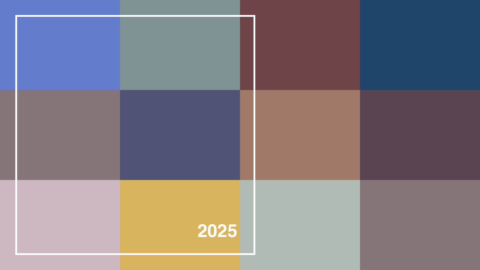
What colour is 2025? Various creatives make it their mission not only to assign a colour to each year, but to predict the colour in advance, in the annual round of Colour of the Year (or Color of the Year) pronouncements.
Every artist and designer is familiar with the idea of colour psychology – the way people instinctively respond to particular colours. Red commands attention, for example, while yellow lifts our mood and blue has a calming effect. Beyond that are cultural norms that have lasted for centuries – as in China, where red is famously associated with life and vitality, playing a pivotal role in traditional customs.
Choosing a colour of the year is a different take on colour psychology. It’s an attempt to read our collective mood as events unfold around us, then represent that through colour. We share a sense of seasons having hues – blossom-pink for spring, say, or russet red for autumn – but is it possible to brand an entire 12 months with a particular shade? And what, according to the experts, are this year’s colours – and which, if any, have resonated with the creative community and the broader public?
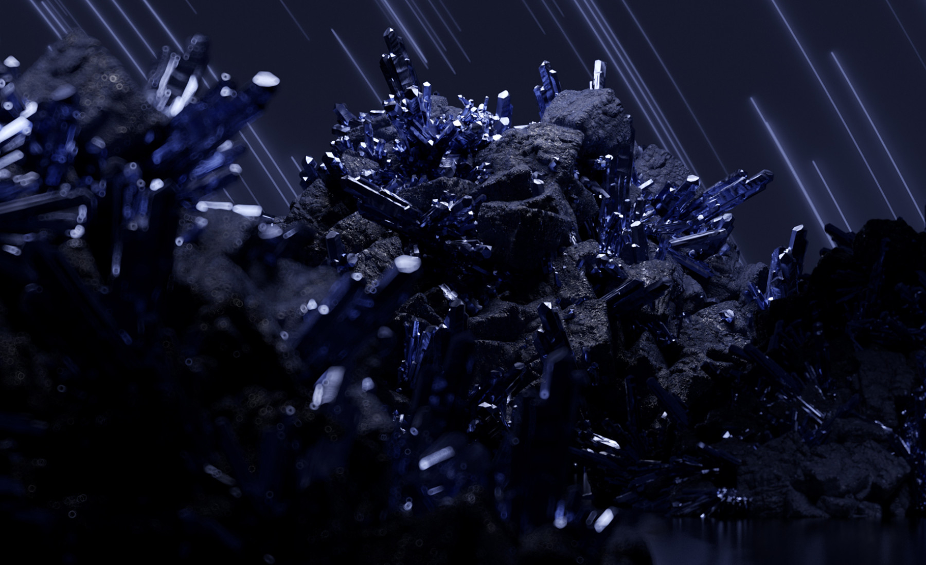
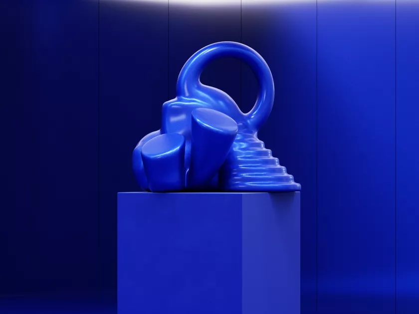
The colour of 2025 is... Future Dusk
First out of the gates among the ranks of colour forecasters were consumer analytics company WGSN and design system firm Coloro, who collaborate yearly to nominate a tint from Coloro’s palette. Not content with announcing the Colour of the Year near the start of the year, as you might expect, they boldly came out with it over a year in advance. Their Colour of the Year for 2025 was announced in 2023 (and reported on Creative Bloq) – so don’t say you didn’t have any warning.
The choice for 2025 was Future Dusk (129-35-18 in the Coloro system), a deep blue with more than a hint of purple to it. In terms of psychology, blue is associated with feelings of calmness and stability, and darker shades like this also relate to problem-solving.
Considering the presumptive timing of the announcement, WGSN’s reasoning has turned out to be pretty well on the nose: “As consumers continue to feel anxious in an era of polycrisis,” they wrote, “colours that bring a sense of reassurance will be key in 2025.”
But while coming out out so far ahead might boost WGSN’s crystal-ball credentials, it hasn’t resulted in a surge of Future Dusk decor or products. Submerged in a tide of subsequent colour-of-the-year declarations, it’s pretty much been forgotten.
Undaunted, WGSN and Coloro have already nailed down the colour of 2027. Luminous Blue (Coloro 125-28-38) looks quite artificial in the publicity photo, but is said to embrace traditional dyeing techniques – a contrast that WGSN suggests will exemplify the sense of interconnectedness we’re going to be feeling in 2027.
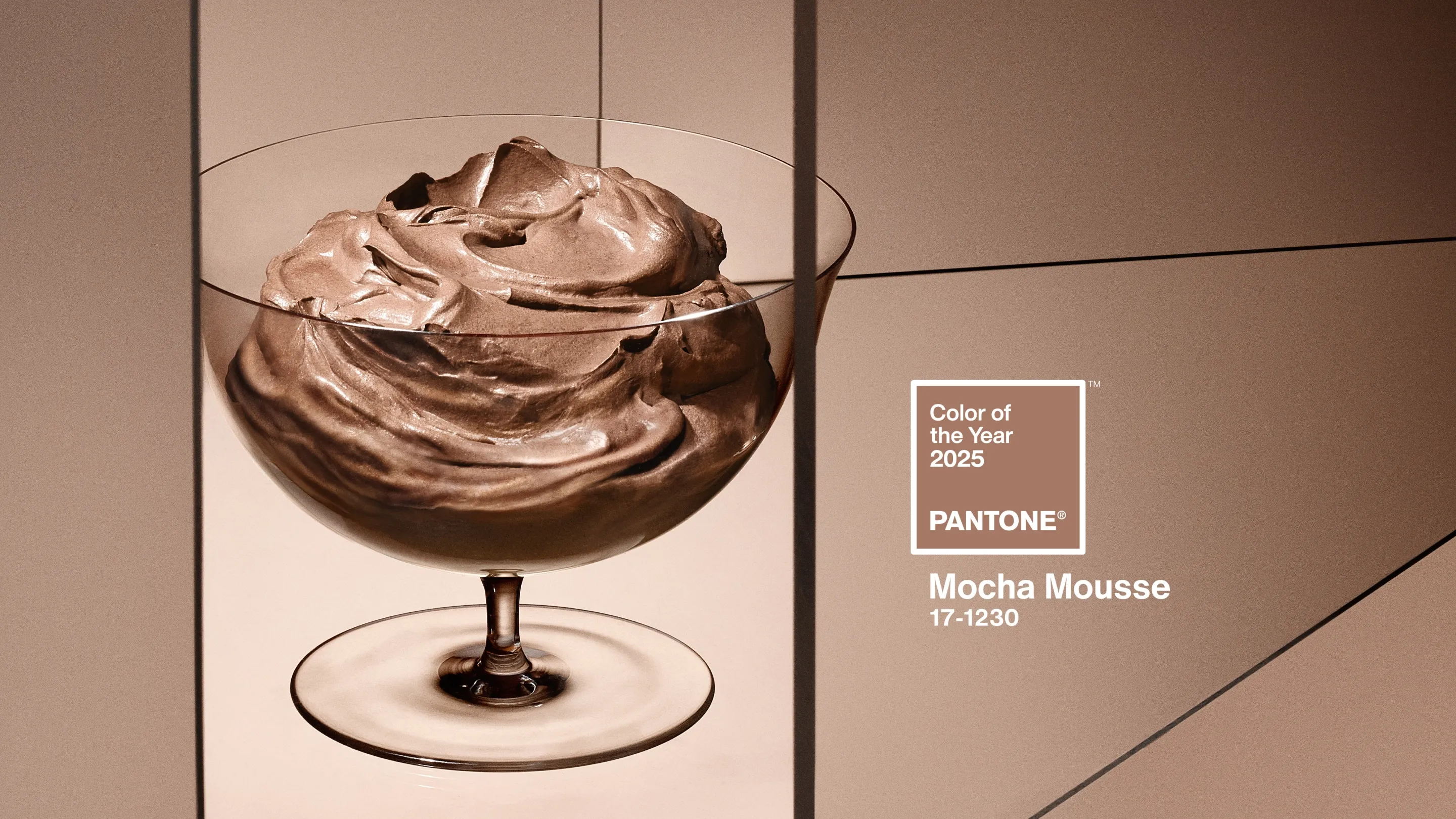
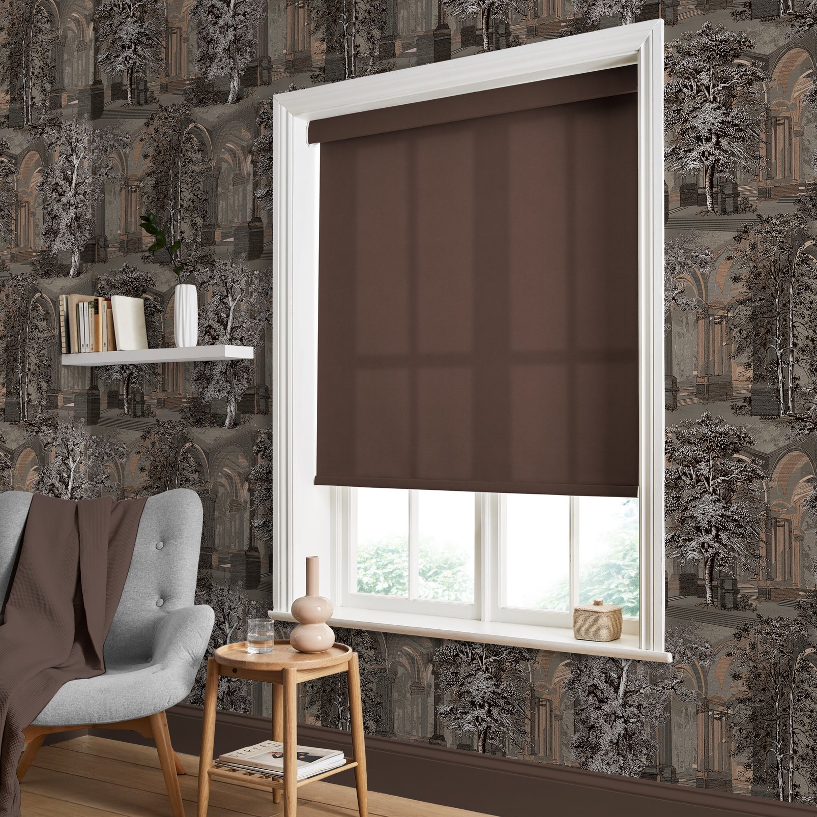
The colour of 2025 is... Mocha Mousse
The traditional big dog among Colour of the Year forecasters is Pantone, developer of the ubiquitous colour matching system. As someone who’s worked in magazine publishing for decades, I’ll forever associate Pantone with its printed swatches, which helped us select the ‘fifth colour’ (on top of CMYK) for each issue’s cover – maybe something metallic or fluorescent to really help the logo pop. But as well as print and packaging design, Pantone works with fashion, interiors and industrial designers – anyone for whom achieving a precise, consistent colour on a real-world object is important.
Established in 1999, Pantone’s Color of the Year announcement sees its marketing machine kick into high gear. The selection is unveiled at a launch party in New York, while multiple companies present products styled in this year’s shade. Hundreds of outlets pick up the press release.
The colour itself is selected via careful research done by the Pantone Color Institute, which works with businesses to develop branding strategies around hue. They look around at the colours that are appearing in content and conversations worldwide, aiming to find (or create from scratch) a tint that surfs the prevailing cultural wave. This 2023 interview with Color Institute VP Laurie Pressman goes into more detail about the process.
If the team do their job well, the selection Pantone makes almost becomes a self-fulfilling prophecy. Style websites and magazines might choose to create editorial around the colour, extending the coverage from days to weeks, ensuring that the Pantone brand feels both current and authoritative.
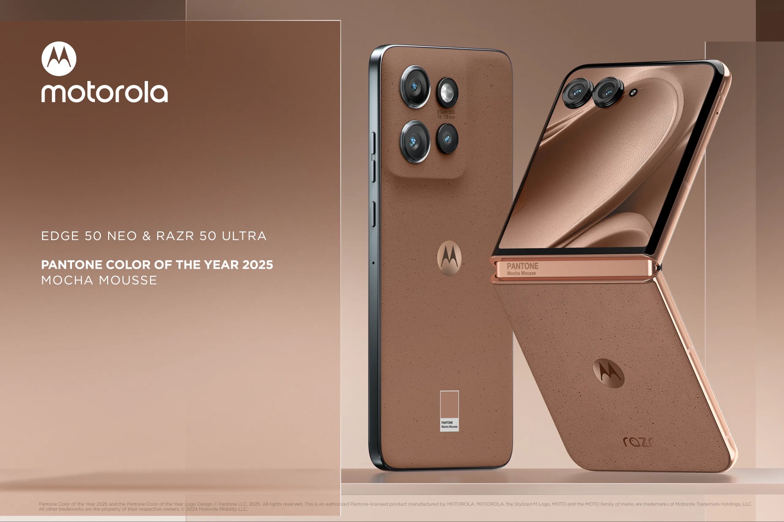
2025’s choice was Mocha Mousse (17-1230 in the Pantone system), a warm chocolate brown that Pressman says “extends further into our desire for comfort, and the indulgence of simple pleasures that we can gift and share with others”.
Some observers on social media had a different interpretation, as Daniel reported last December. “If your initial reaction to the colour was actually one of discomfort, you're not alone,” he wrote. “You don't need a PHD in colour theory to see what it resembles.”
Despite these reservations, and even aside from the licensed products that Pantone promoted during the launch, including Motorola phones and Joybird furniture, Mocha Mousse does seem to have reached out into the broader consciousness. Numerous trendsetters and magazines have picked up on Mocha Mousse’s comforting, back-to-nature vibes.
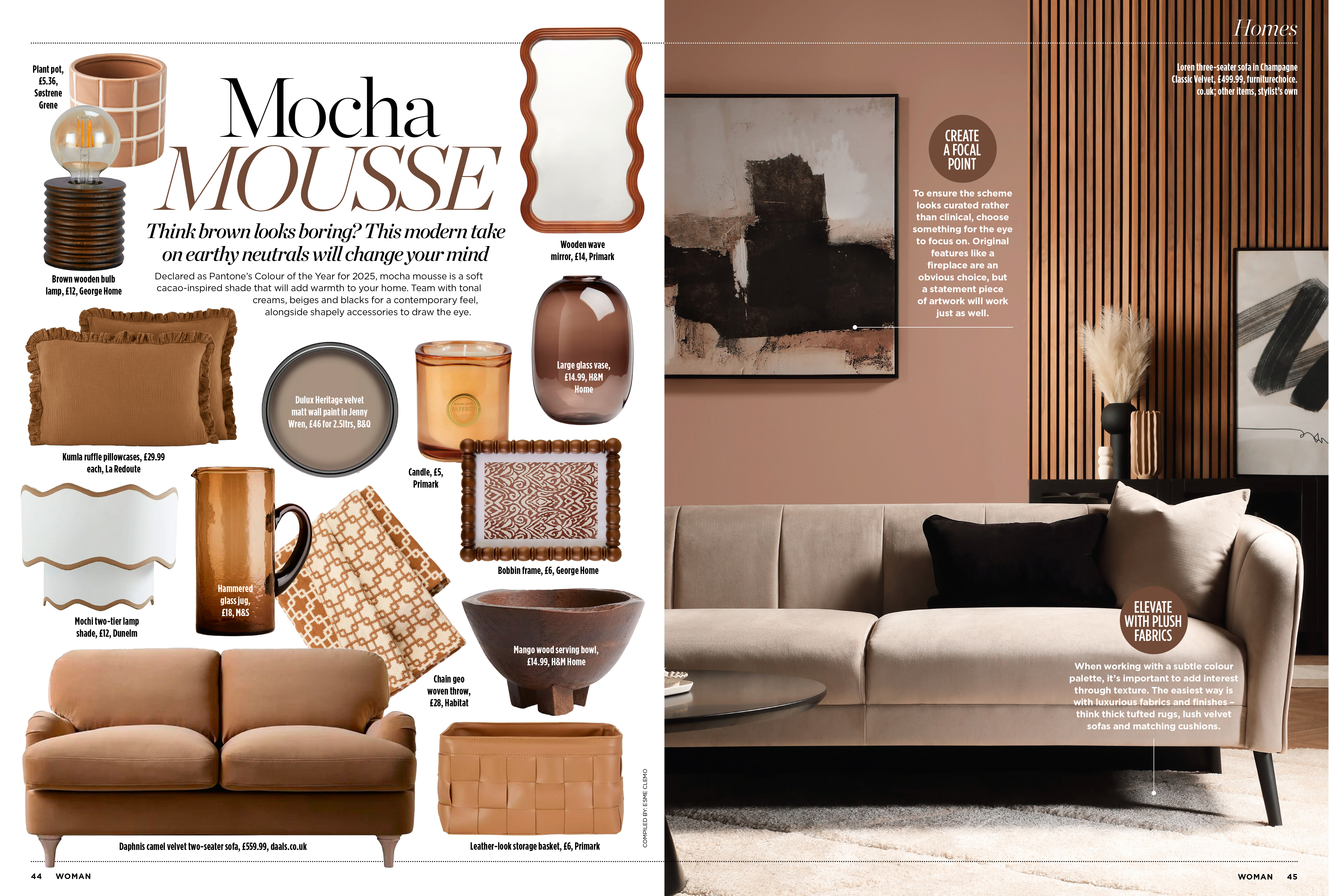
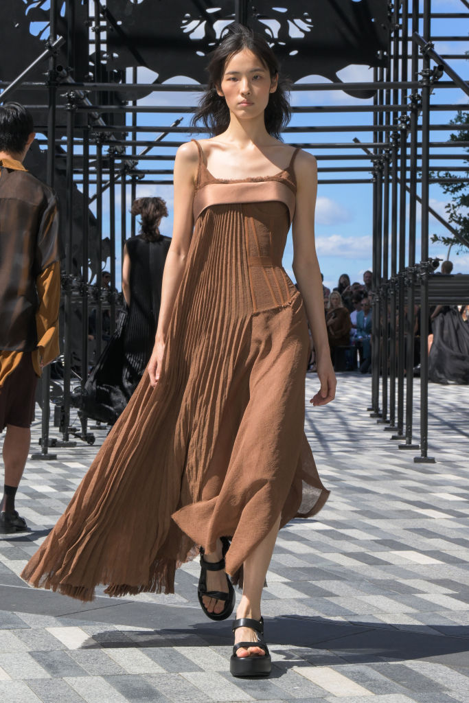
And in a March 2025 Adobe survey quizzing members of the public on what they thought would be the colour palette that would define 2025, 36% suggested earthy, organic shades – the joint-top response. So it really does seem like brown is in this year.
The colour of 2025 is... AI-generated
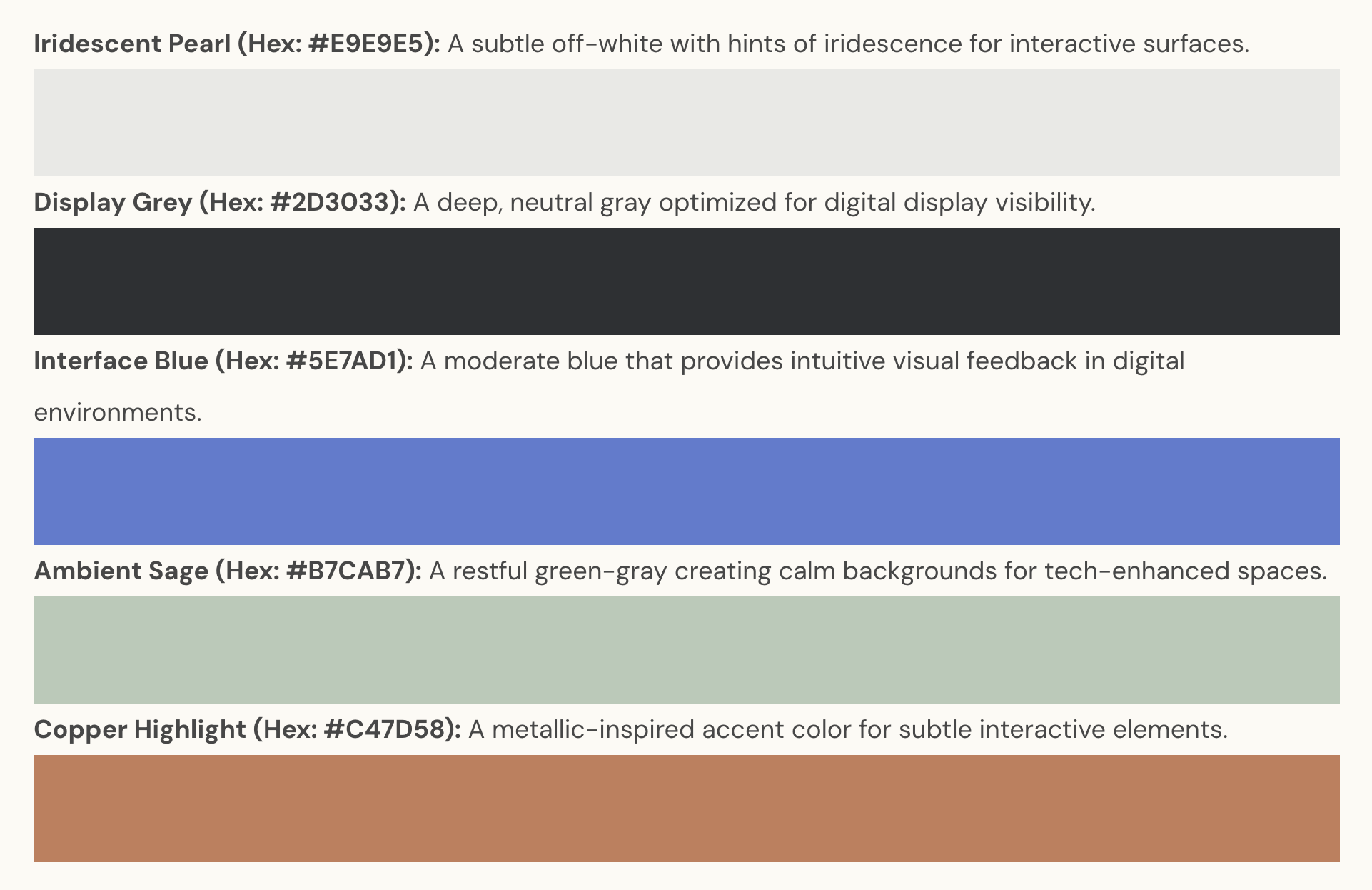
The other joint-top answer in the Adobe survey spotlights the connection between colour, psychology and culture in a perhaps predictable but still revealing way. Another 36% of survey participants chose a colour palette of metallic, unnatural hues inspired by science fiction. Arguably, both this selection and the preference for natural earth shades are a response to Big Tech and AI, and the prevailing sense that machines are taking over our lives.
A post by Bojana Radovanovic on the Color Psychology website (essentially a handbook for what different colours mean to us) picks up on this contrast as she chooses several mood palettes for the year. An artificial-looking set of colours is based on what Radovanivic calls “ambient intelligence” – the idea that digital technology has become pervasive, like the air we breathe – while a couple of more muted, earthy palettes express a reaction against this trend, a desire for authenticity and physicality. “The color trends of 2025 speak of a community that is striving to strike a balance between the paradoxes in life – the interaction of technology and nature, global and local, and the ideas of expression and reflection,” she writes.
Adobe explored this relationship between digital technology and colour further in its survey. Its researchers posed several questions around the potential use of AI to make colour selections and other branding choices – effectively taking over from flesh-and-blood designers and creatives. Only 20% agreed with the statement “AI-generated color palettes can be just as effective as human designs”, although a surprising 34% said they were prepared to “trust brands that use fully AI-generated branding”.
Around 30% of the 1,000 people surveyed expressed an interest in what Adobe calls “living color palettes”, where AI is tasked with changing the colour scheme of a website or app on the fly, in response to the user’s mood or preferences.
The colour of 2025 is... Take your pick
There’s been perhaps a surprising degree of consensus around the colour of 2025 so far – but don’t worry, that’s about to end. Enter the interior design market, which sees an annual parade of vested interests, from paint companies to fabric manufacturers, lining to present a shade from their range that they feel will resonate with their customers.
Wallpaper designer Graham & Brown’s choice, for example, is Elderton, a warm chocolate-brown (that sounds familiar) inspired by the elder tree, while paint mainstay Dulux has put forward True Joy, given that name because ‘slightly mustard-y yellow’ doesn’t quite have the same ring to it. Sherwin-Williams, meanwhile, has gone with Mauve Finery, clearly not getting the memo that purple is an optical illusion.
The real colour of 2025 is...
While the suggestions that natural hues and artificial tints best characterise 2025 do make sense, and the likes of Glidden’s Purple Basil and Benjamin Moore’s Cinnamon Slate are attractive, personally I feel that all these suggestions have missed out on capturing the true zeitgeist of the moment. Although we’re only halfway through the year, I think the colour most of us won’t be able to forget when we look back on this year is perfectly obvious.
What colour is 2025?

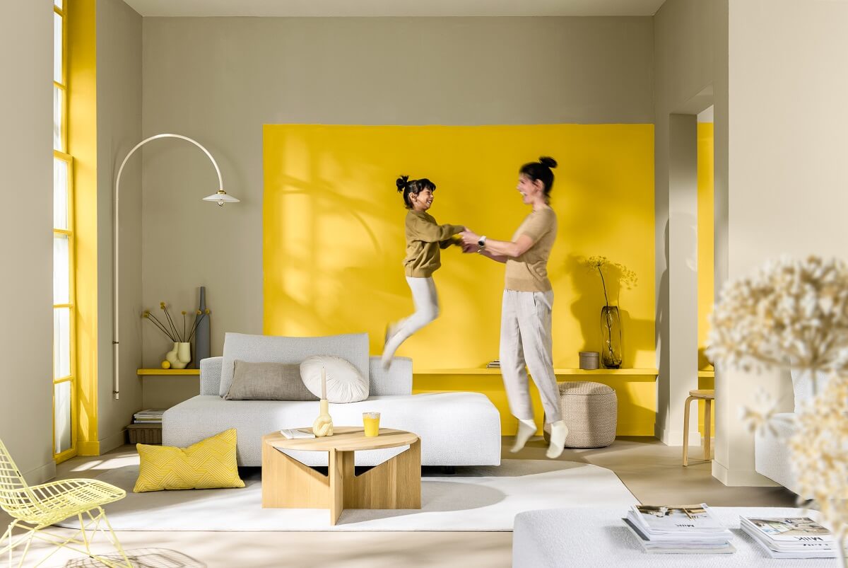
It’s orange.