The advice that interior designer Charlotte Thomas gives to anyone wanting to add colour to their home is simple: ‘Paint walls off-white or at least a neutral shade throughout when you first move in. Live with it like that for a while and learn how the light affects each room, how the rooms feel at different times of day, how you want to use each room.’
And she followed her own advice when she and her former husband purchased the beautiful period home that she now shares with her two daughters and 85-year-old father.
Every part of the interior was treated to a mix of palatable pale neutrals. These simple colours allowed Charlotte to understand the dynamics of each interior space before she began to introduce pigment.
Creating a home's colour story
It was only whe she understood how her home looked in different seasons and at various times of day that Charlotte could think about introducing colour. Today, the colour scheme features a moody and sophisticated mix of greens, blues and pinks that has transformed her centuries-old country house into a haven of colourful charm, with hues that are in harmony with her personality.
Charlotte has always had a passion for colour, and actually studied with colour guru Karen Haller,whose philosophy focuses on its impact on our moods and behaviour.
‘This allowed me to identify my primary personality type as Autumn, favouring an earthy colour palette; and my secondary as Summer, which is quite serene,’ Charlotte says.
‘My training in colour psychology helped focus me when selecting schemes for my own house, to create the right mood and flow from one room to the next.’
The house
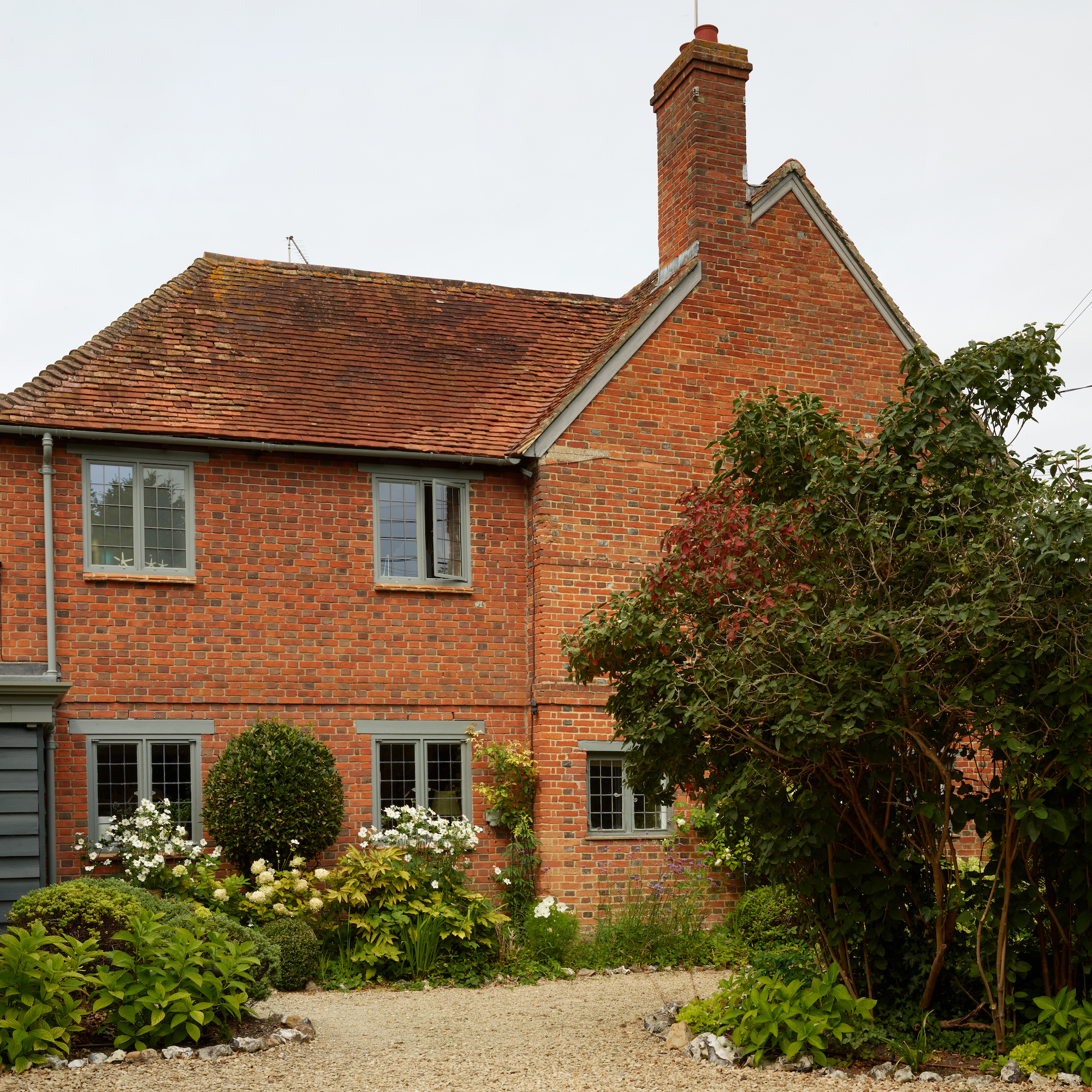
Originally built as a thatched cottage, the earliest part of the house dates back to 1610. During the Queen Anne period, the house was extended and its footprint doubled, with a French-style rendered exterior façade added, offering up an elegant symmetry.
‘It looked like the kind of house a child would draw. It seemed to have a gentle feel to it, a calmness that was reassuring and attractive,’ Charlotte says.
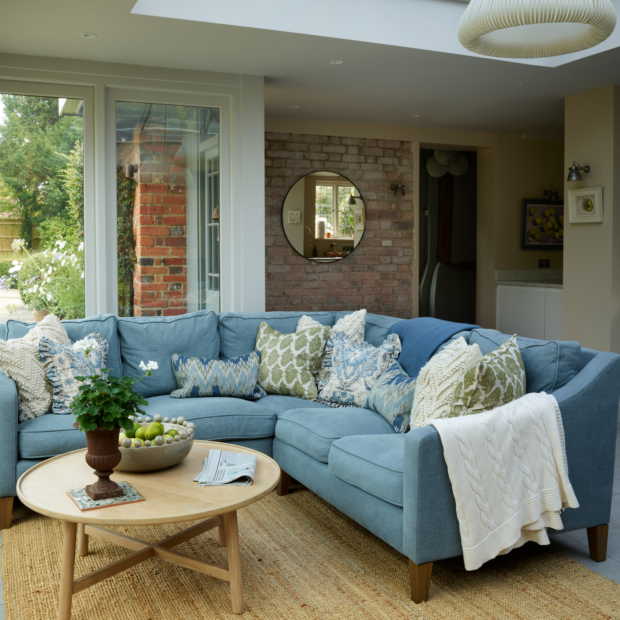
The layout includes an entrance hall, two living rooms, home office, downstairs shower room, TV room/snug, cloakroom, utility, kitchen, orangery, primary bedroom, en-suite bathroom and dressing room, 5 further bedrooms, family bathroom and shower room. In the large garden, an old haybarn used by Charlotte as her interior design studio.
Living room
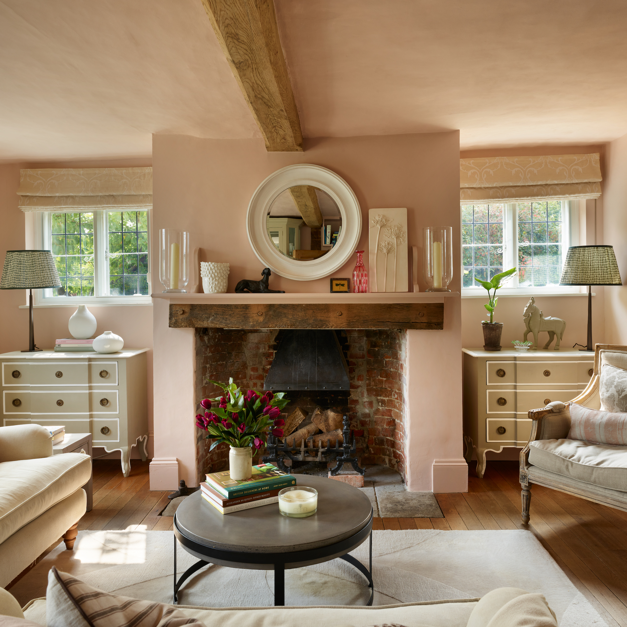
Charlotte opted for a calming dusty plaster pink for the main living room colour scheme, specifically because she and her daughters use the room mostly in the evening as a place to relax. 'Pink is nurturing, caring and soothing. The colour has been tested scientifically and can physically lower the heart rate, blood pressure and pulse,' Charlotte says.
All the colours she chose for the house are the perfect enhancements to the centuries-old walls and period details. Charlotte pinpoints the likes of Edward Bulmer, Farrow & Ball and Little Greene as particular favourites. ‘These brands make eco-friendly low VOC paints and are experts in historic colours, making it reassuringly easy to select shades that work naturally in an old house.’
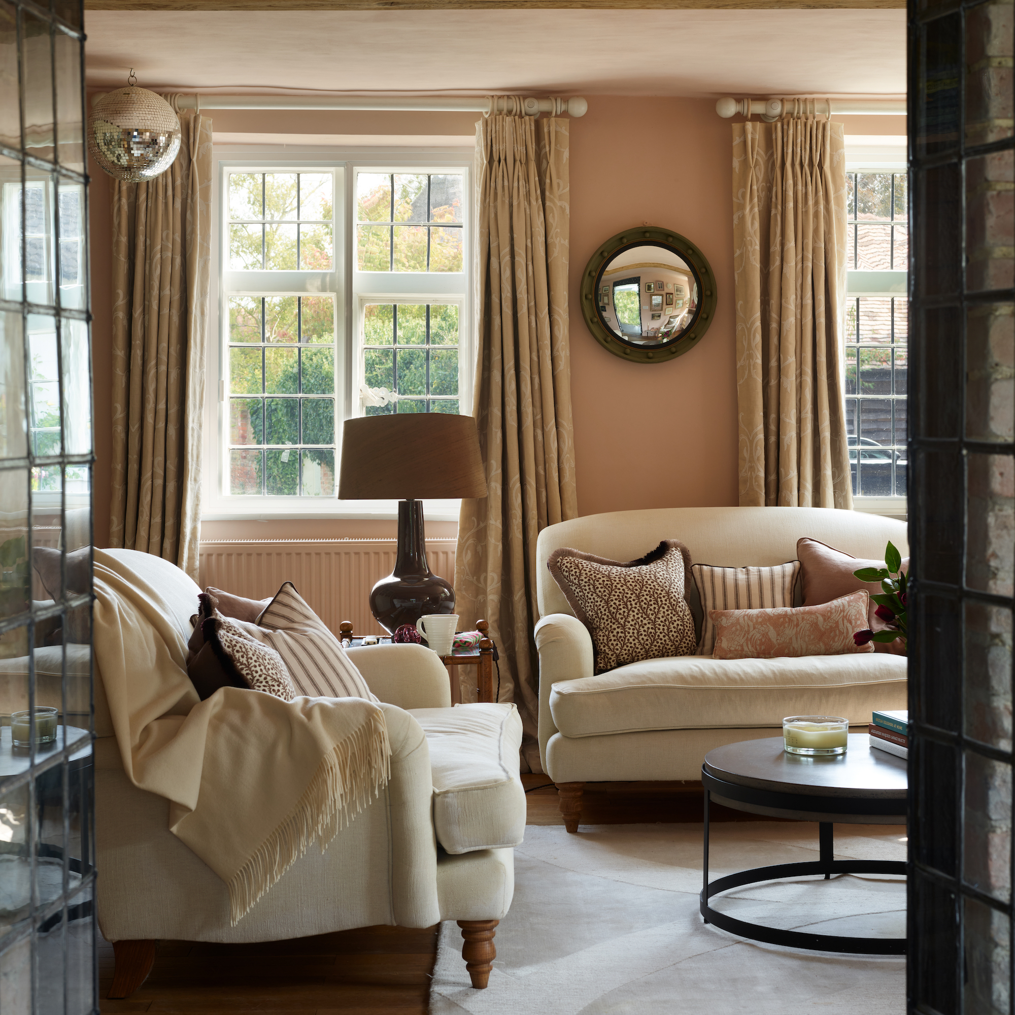
Elegant antique furniture in neutral tones, a mix of pattern in soft furnishings and a gallery wall of framed artwork combine to introduce sophistication and personality to the space.
'Given my love of antiques, I mix these with vintage, hand-crafted and with new – I like the eclectic, unpretentious effect this gives,' Charlotte says.
Kitchen
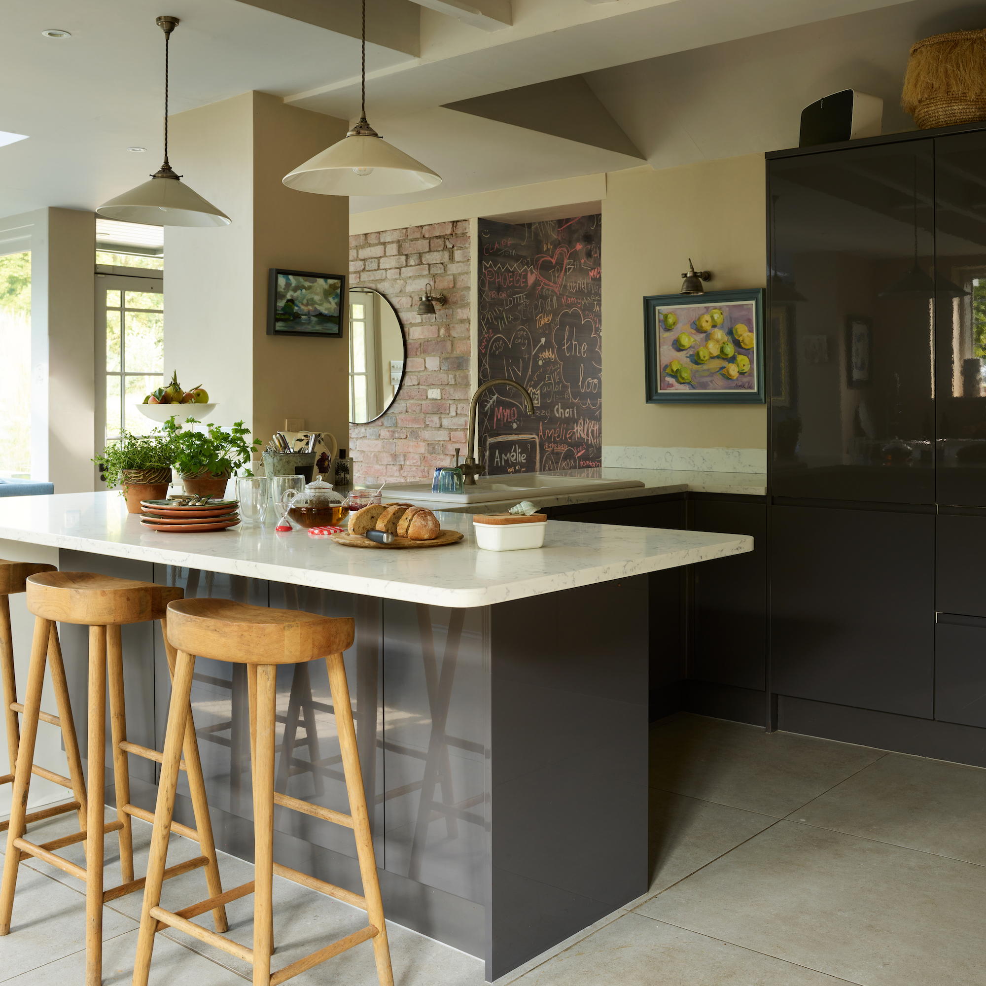
The kitchen is a large space, perfect for sociable occasions. The main kitchen prep area has been decorated in warm tones and muddy neutrals to complement the exposed brick wall. A breakfast bar with stools provides the perfect place for casual dining.
Inspiration for the kitchen ideas also came from the surrounding countryside. ‘Nature is like an open book of ready-made colour palettes,’ Charlotte says. ‘If you look at a plant it will be a mix of hues that clearly work well together – pink-tipped white flowers set against green leaves; a brown branch that has snapped to expose the taupe and pinky bark inside; autumnal brown leaves that are yellowing at the edges.’
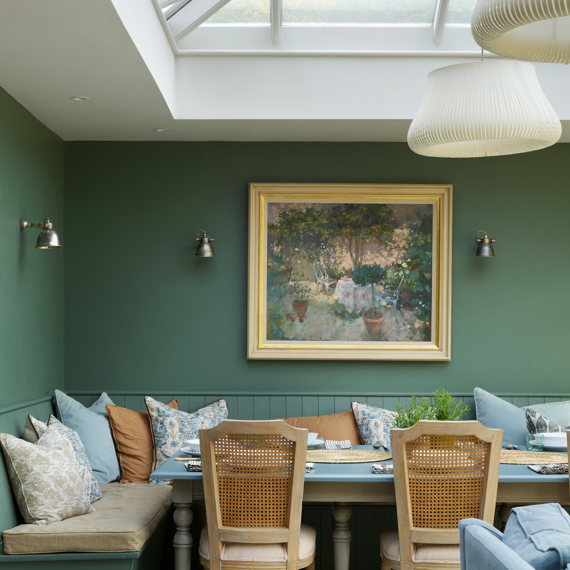
Orangery
A painting of a corner of a garden in dappled shade hangs above the banquette and provided the starting point for the colour scheme. Bringing the outside in is key to Charlotte’s interior design philosophy and something she emphasises through use of colour. Here a palette of greens and blues echo the trees, plants and sky as well as subliminally defining areas for dining and conversation.
'Green is reassuring on a primitive level – it is very restful, relaxing and indicates balance and harmony,' she says. 'Blue is obviously the colour of the sky and sea, but it is also the colour of communication – encouraging discussion and the sharing of ideas so it is perfect for a sitting area in a kitchen where you want your family and guests to relax and chat.'
TV room/snug
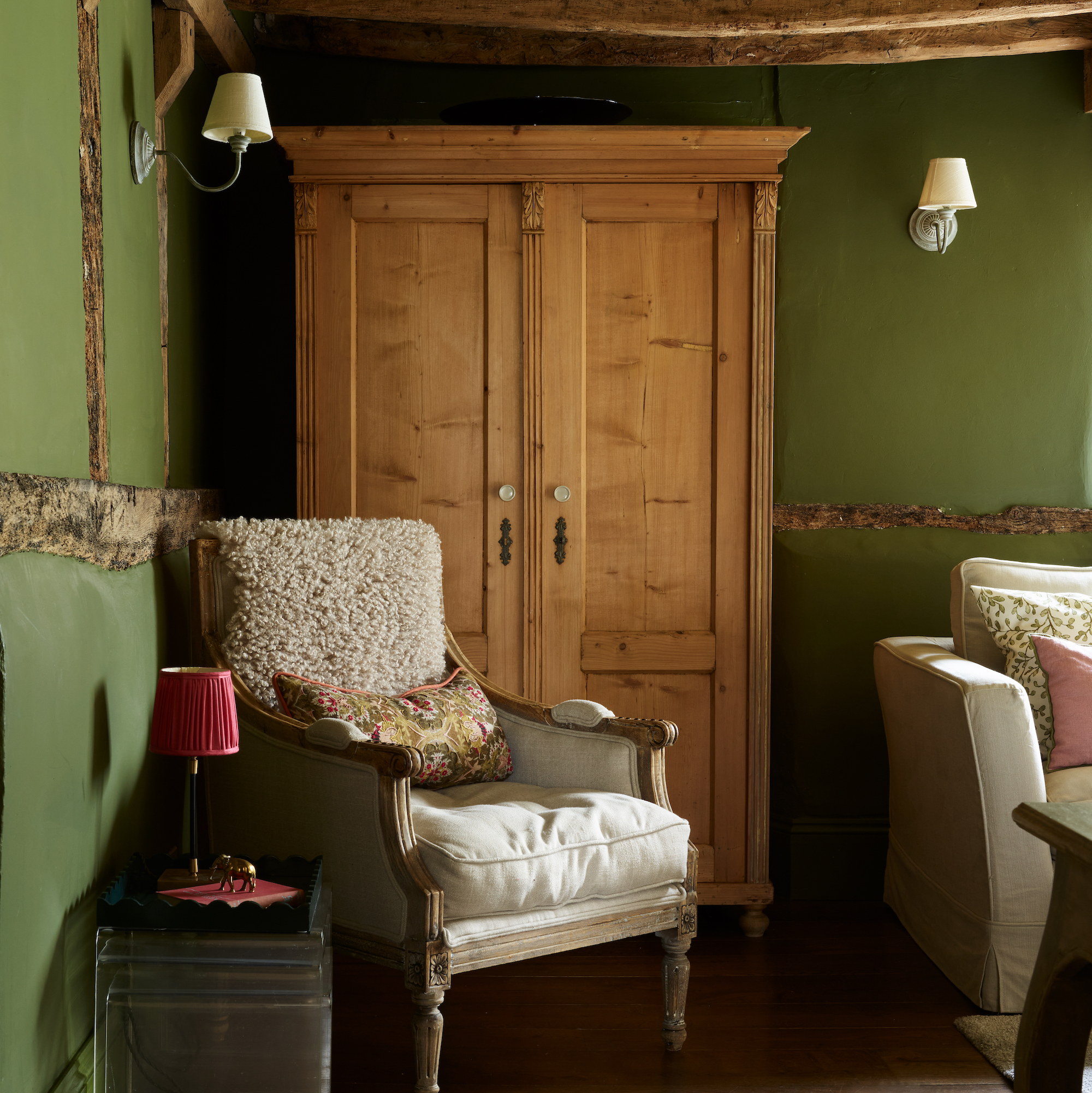
A rich, earthy green shade on the old wattle and daub walls offsets the natural tones of the exposed timber structure of the building.
Staircase
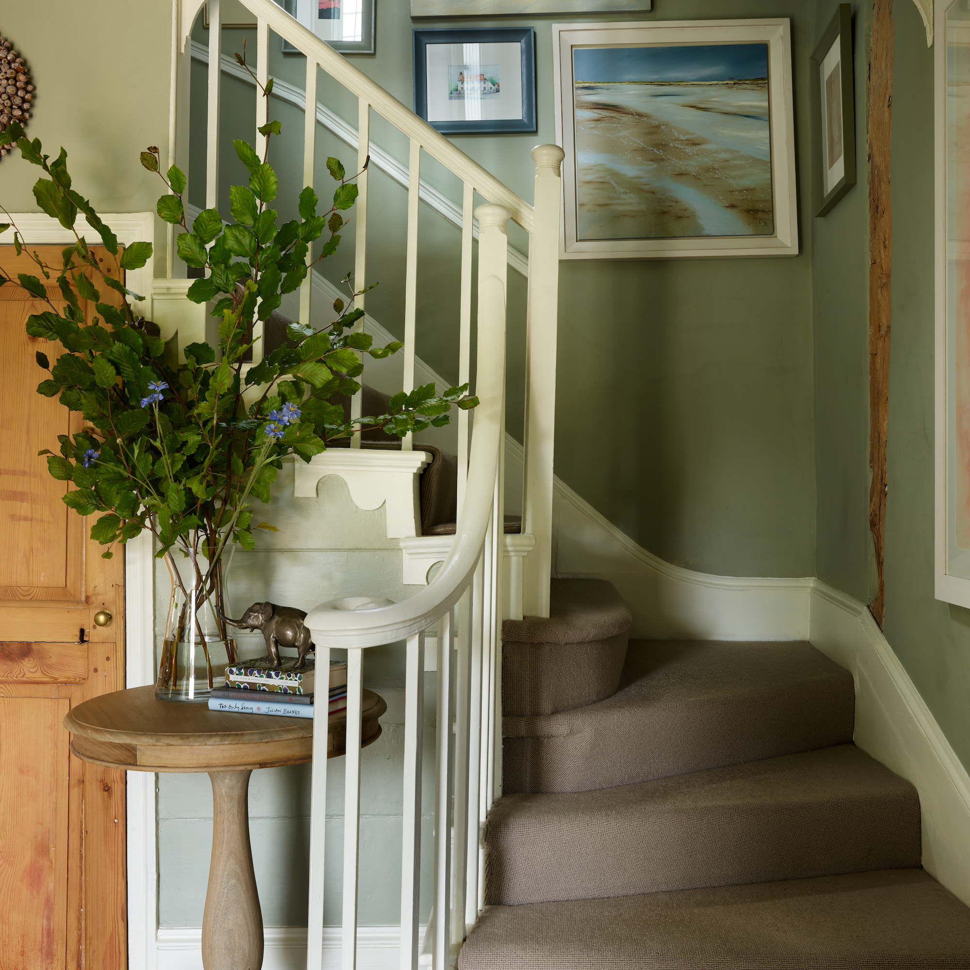
Nature provided the inspiration in the classic country hall and staircase. A collection of paintings of landscape scenes adorns the grey-green walls.
Main bedroom
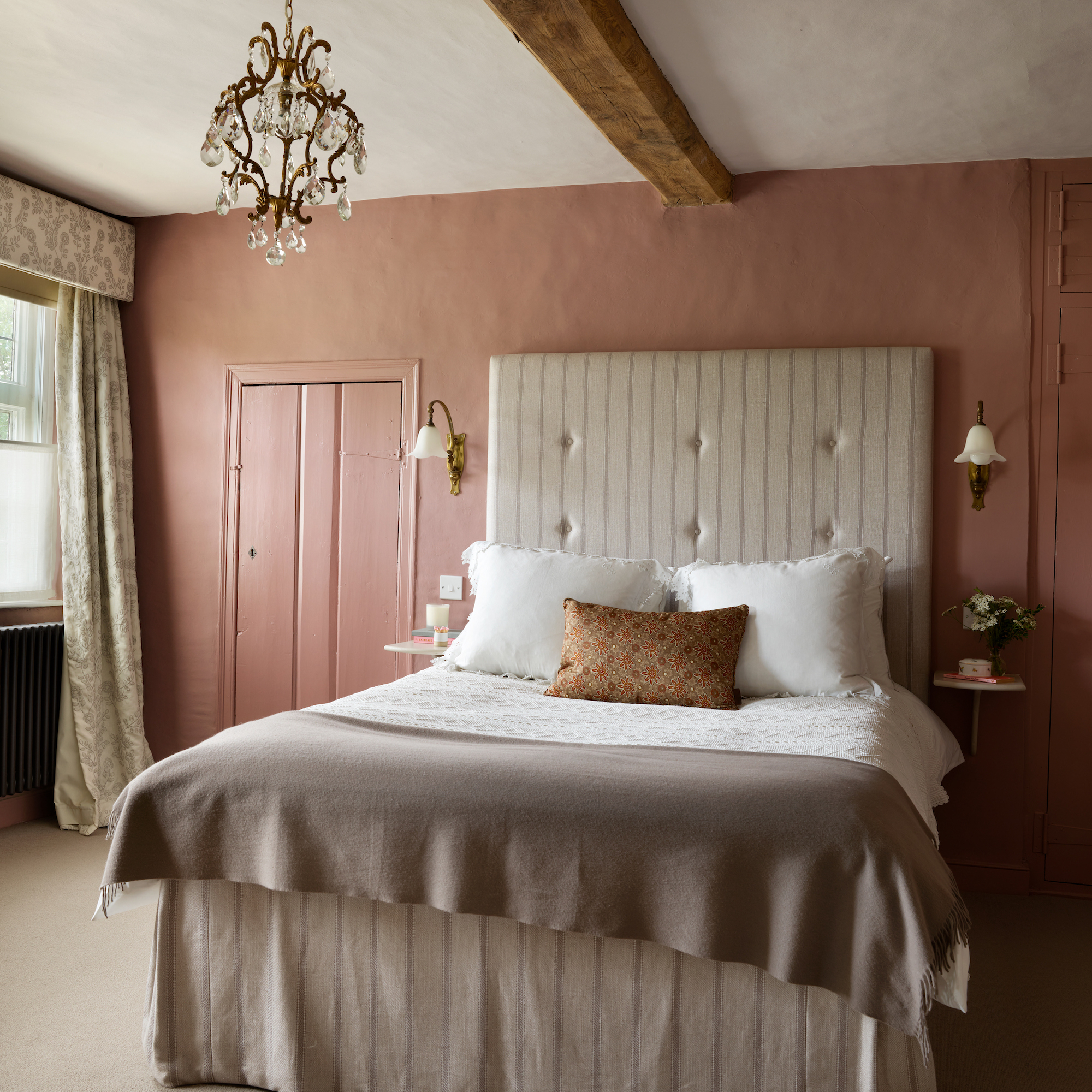
This bedroom is feminine and elegant, with a lovely dash of country charm. Charlotte has opted for a statement headboard as a playful contrast to the low ceilings. Delicate, low-level lighting and uniform stripes add plenty of visual interest. For the colour, she chose a deep, earthy rose pink which, she says, is moody and cocooning.
Second bedroom
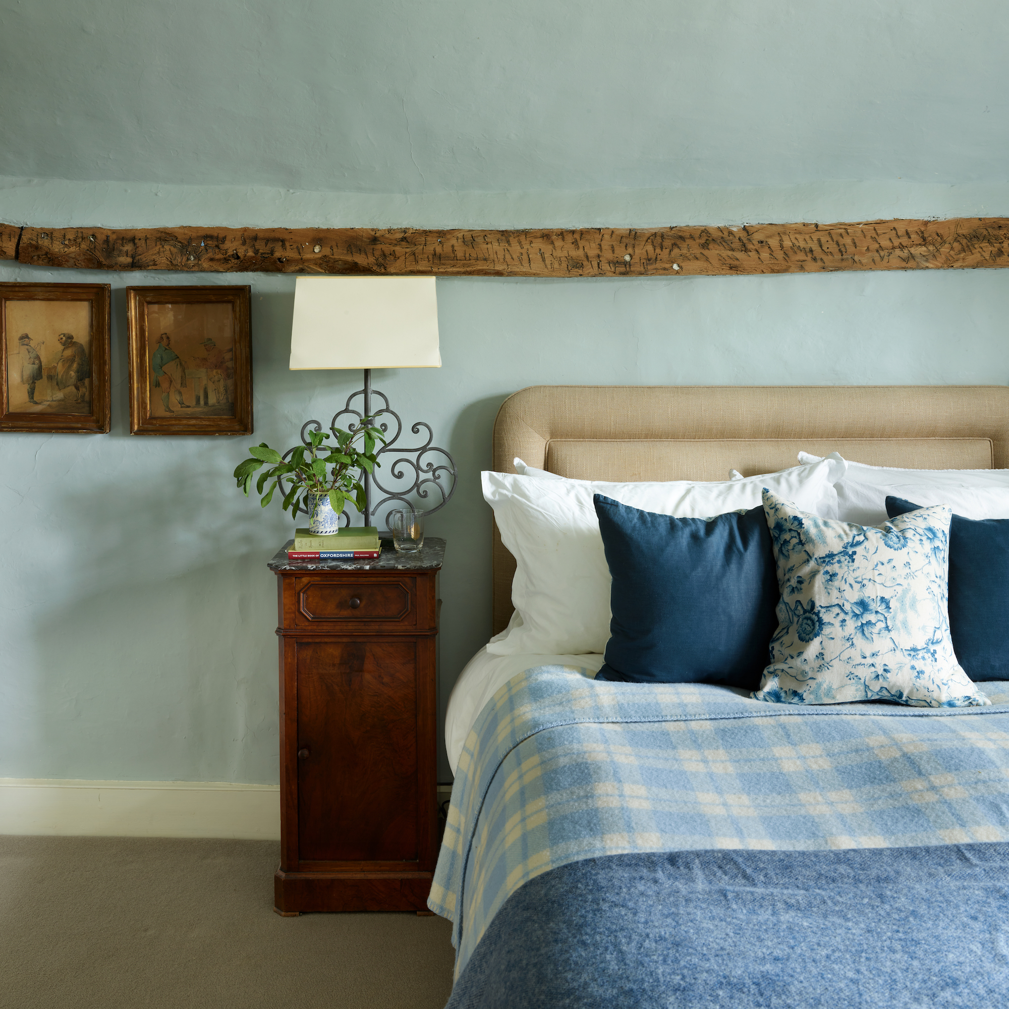
Charlotte’s father’s bedroom is decorated in a calming chalky blue-grey colour, and a collection of antique furniture that all work in harmony with the historic notes of the interior.