
If you've been tuning into Amanda & Alan's Italian Job on BBC One, you'll know that Amanda Holden is somewhat of an interior design fanatic. She recently took to Instagram to share how she gave her daughter's room a huge makeover – nailing a surprisingly bold choice of clashing patterns.
Although bedrooms have historically been famed as a space to unwind and relax, more recent bedroom trends have brought a new twist to the otherwise 'soothing' sanctuary. It's only January, but we already see this year's bedroom colour schemes going bolder, bigger, and more unapologetically striking.
Who is at the forefront of this resurgence? Nobody other than Amanda Holden, of course. The Britain's Got Talent judge has never shied away from expressing how she is 'all for bold patterns and pops of colour and personality', and her most recent home renovation project attests to that.
For the bedroom makeover, Amanda had two non-negotiables: no carpet and no neutrals. In her words, she was after 'Beverly Hills hotel vibes'. She opted for bedroom wall panelling and dark herringbone bedroom flooring and paired the panelling with a gorgeous tropical leaf wallpaper – but what really caught our eye was the dressing area draped in light pink and white stripes, even extending to the ceiling.
Believe it or not, stripes could actually be considered a neutral as far as mixing and matching patterns go, helping to hold clashing prints together and even so much as make your home look bigger when used intuitively.
'Stripes are the most neutral pattern available,' begins Ann Marie Cousins, interior designer and founder of AMC Design, 'so a wide stripe can be used to tether a stronger pattern and will act as a counterfoil to strong vibrant patterns.'
Ann Marie assures that stripes 'can be used with a wider range of patterns, making it ideal to marry with a floral, a weave, and check all in one space.'
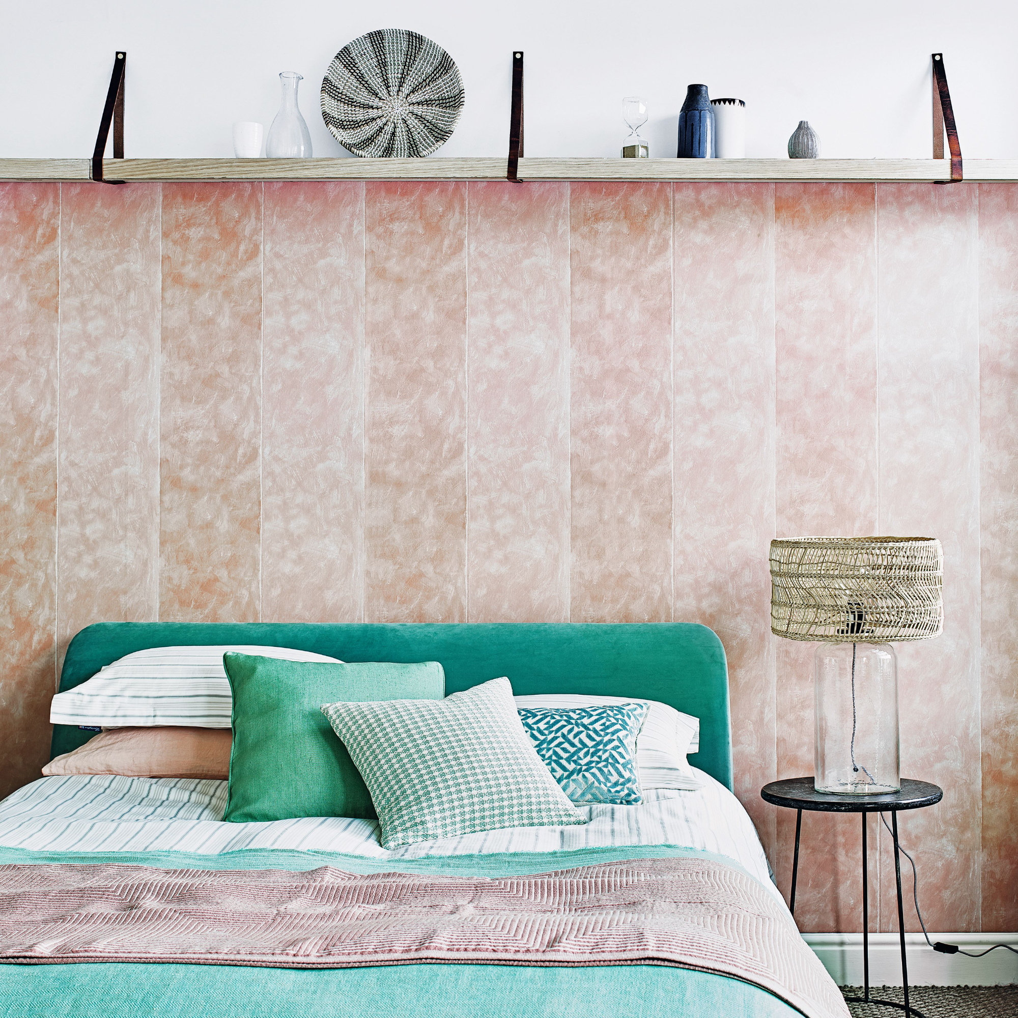
We see this very marriage of patterns as Amanda continues the stripe motif into the bed's headboard and accent cushions paired alongside the main tropical theme of the room, making everything feel cohesive.
On the other hand, stripes can also be used as a clever design feature to make the most of a small bedroom by playing tricks on the eye.
Ally Dowsing-Reynolds, co-founder of home decor brand and retailer Dowsing & Reynolds says, 'Vertical stripes can ground a room when used on the bottom half of walls, and by using them on the top half and ceiling, you're adding interest that draws the eye upwards, making the room feel larger and grander.'
She also adds that opting for lighter colours will make everything feel airier, noting that 'pinks feel playful and pale blues like the sky'. Therefore, we think Amanda's choice of light pink and white is not coincidental whatsoever.
While the Britain's Got Talent judge went down the route of a wider stripe for this bedroom reno, there's no reason why you can't use stripes at different scales to achieve varying results.
Ann Marie explains that a 'smaller stripe is a more classic look – think English country house sitting rooms – while wider stripes create a modern look and should be used more generously and in unexpected ways', just as Amanda has done with her striped ceiling. The interior designer notes that taking stripes up to the ceiling also creates a 'cosy, intimate vibe' that is perfect for a bedroom.
How to mix and match patterns
'If you're looking to layer patterns, we recommend choosing one dominant colour that will remain the focus throughout the room and tie all the prints together,' begins Chelsea Clark, head of brand at Lust Home.
For example, the dominant colours in Amanda's bedroom makeover are pink and green to emulate that 'Miami' kind of vibe.
'If you're not sure of which colours to use, look at the basics of colour theory,' advises Chelsea. 'The best colour clashes are from colours that sit opposite each other on the colour wheel. Keep the tonal palette between the patterns consistent too, clashing brights are just as effective as subtle, more pastel hues.'
To make things as simple as possible, Sophie Clemson, co-founder and director of The Living House recommends opting for patterned wallpaper as a starting point when designing a room. You can dive in head-first with a bold bedroom wallpaper idea encompassing the whole room, or you can consider using it for a dedicated bedroom feature wall to dip your toes into the world of pattern.
Echoing Chelsea's advice on colour theory, Sophie notes that 'if you choose a wallpaper with several colours, it can be your colour palette for the whole room'.
'You can pull out the colours and introduce them as accents in soft furnishings and accessories. Making it much easier to achieve a flow throughout the space,' she continues.
However, if there's any advice the experts ought to leave you with, it's to simply let loose, get playful with it, and have fun exploring the wide world of mixed and matched patterns.