Now, I know what you're thinking: Do I really expect this tangy, slightly-sour lemon-with-a-twist-of-lime color to be in everyone's homes in 2026? The answer is no, not necessarily. But I do think that it represents where color is headed in our homes. It's bold, brave, and bashes through with an I-don't-care attitude — and most of all, it's designed to elicit an emotional reaction, whatever that may be: good or bad. It doesn't care, and that's the whole point.
"It’s a shade that goes against design and aesthetic convention; it hurts the eyes, but it’s a delicious kind of hurt like an acidic lollypop or a strong twist of lemon in a drink," describes Livingetc's color expert, Amy Moorea Wong. "It’s like the physicality of an electric shock or alarm bell, shouting ‘wake up!' It signals confidence and wit, and brings a mischievous, energizing spark into the home."
And that's what we're seeing in color trends lately, whether in interiors or on runways. It's not just about adding a sense of playfulness, but being bold enough to play with rules and conventions. "It’s the antithesis to the soothing, organic shades that have set the cultural tone for the last five years," adds Amy. "It’s so obviously a human-made hue that it feels deliberately engineered to catch the eye, provoke curiosity, and energize a space in a way no natural shade could."
And as much as it may feel unexpected, unnatural, and uncomfortable, our now-christened Sour Chartreuse actually sits quite comfortably alongside the design milieu right now. "It draws a direct line to the psychedelic 70s, 90s rave culture, and fluorescent Y2K resurgence that’s ruling the zeitgeist, but with a modern clarity that makes it feel curated and less chaotic," says Amy Moorea Wong. "Yes, it ticks the nostalgia boxes, but now it’s more grown-up and gallery-ready than glow stick."
Dare we say, she reluctantly goes on to suggest, it may be the grown-up, more design-led take on the controversial and purposefully-ugly Brat Green trend that seemingly vanished just as quickly as it surfaced in the summer of 2024? "It's got all of the sparkling energy and wit but with a little more restraint and complexity," she notes.
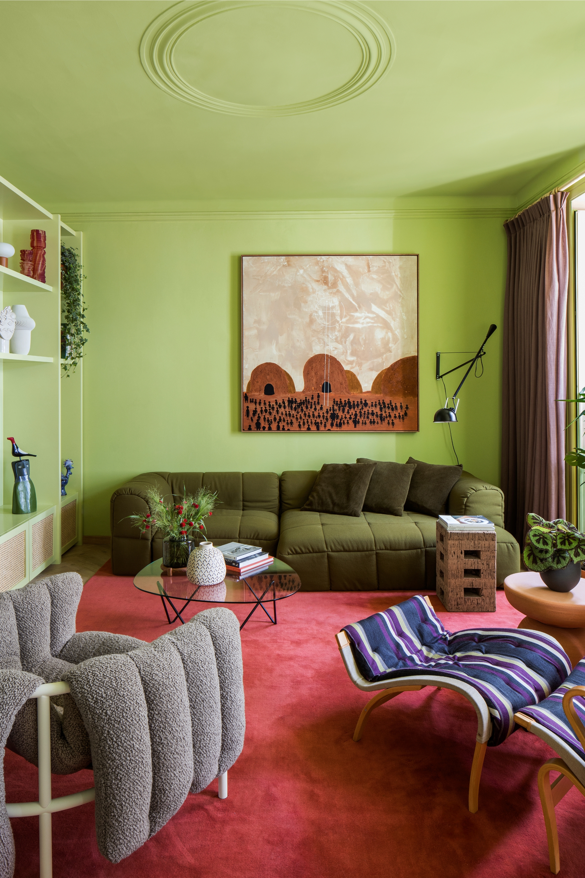
Perhaps the key difference here is that even as such an energetic color, this sour yellow-green can, in fact, work harmoniously within an interior scheme (rather than just provoke). And perhaps, even more surprising is its application — the more of it you use, the less of an assaulting impact it seems to have.
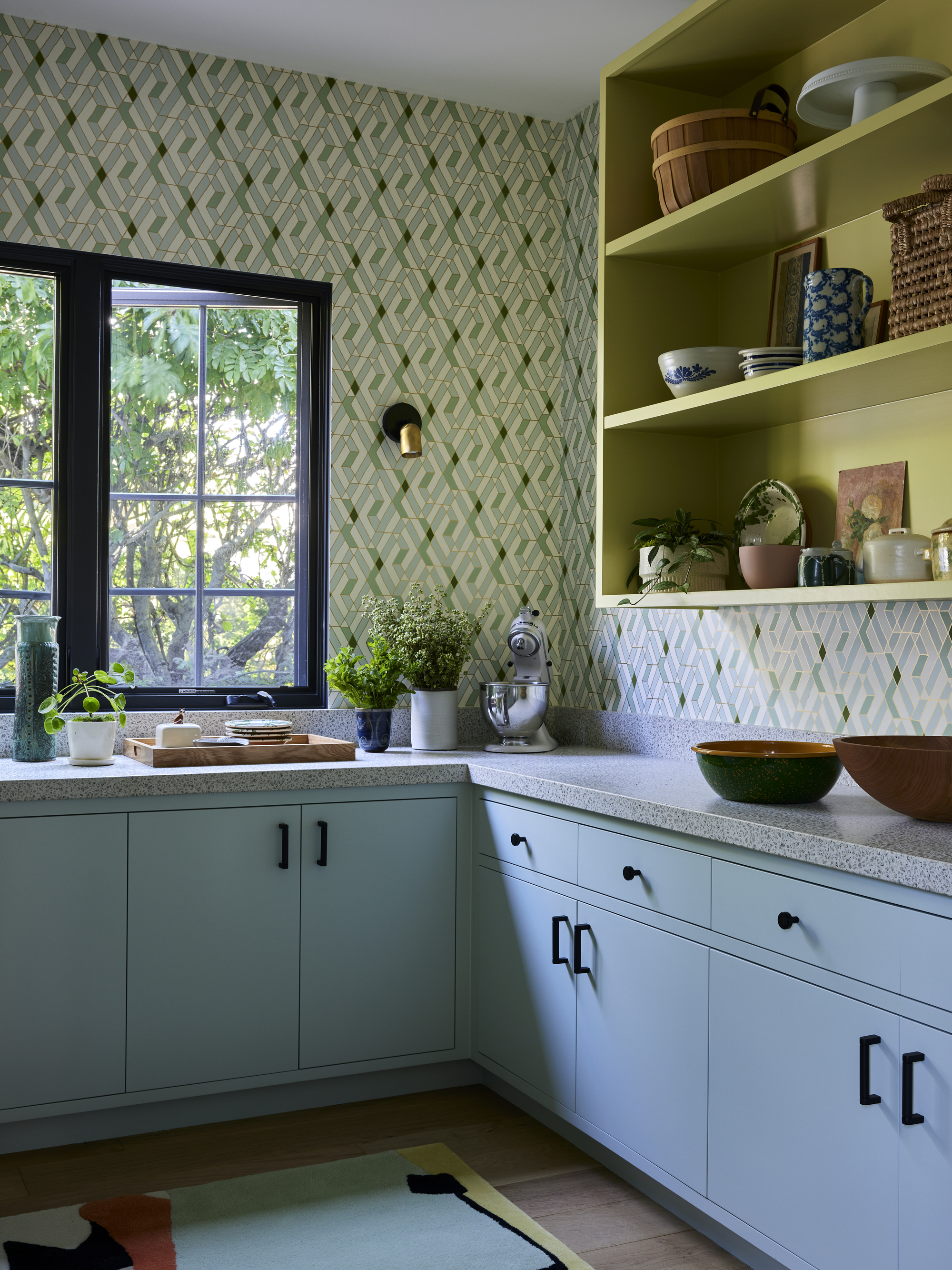
Sure, the trepidatious might like to use it as a cherry-on-the-top accent, but I have to admit that a room color-drenched in Sour Chartreuse, as seen both above by design studio Estudio Guto Requena and below by London-based Golden, somehow feels less intimidating, less overwhelming. With less contrast to jar against, it almost recedes within the room (at least, as much as a shade so vibrant could do).
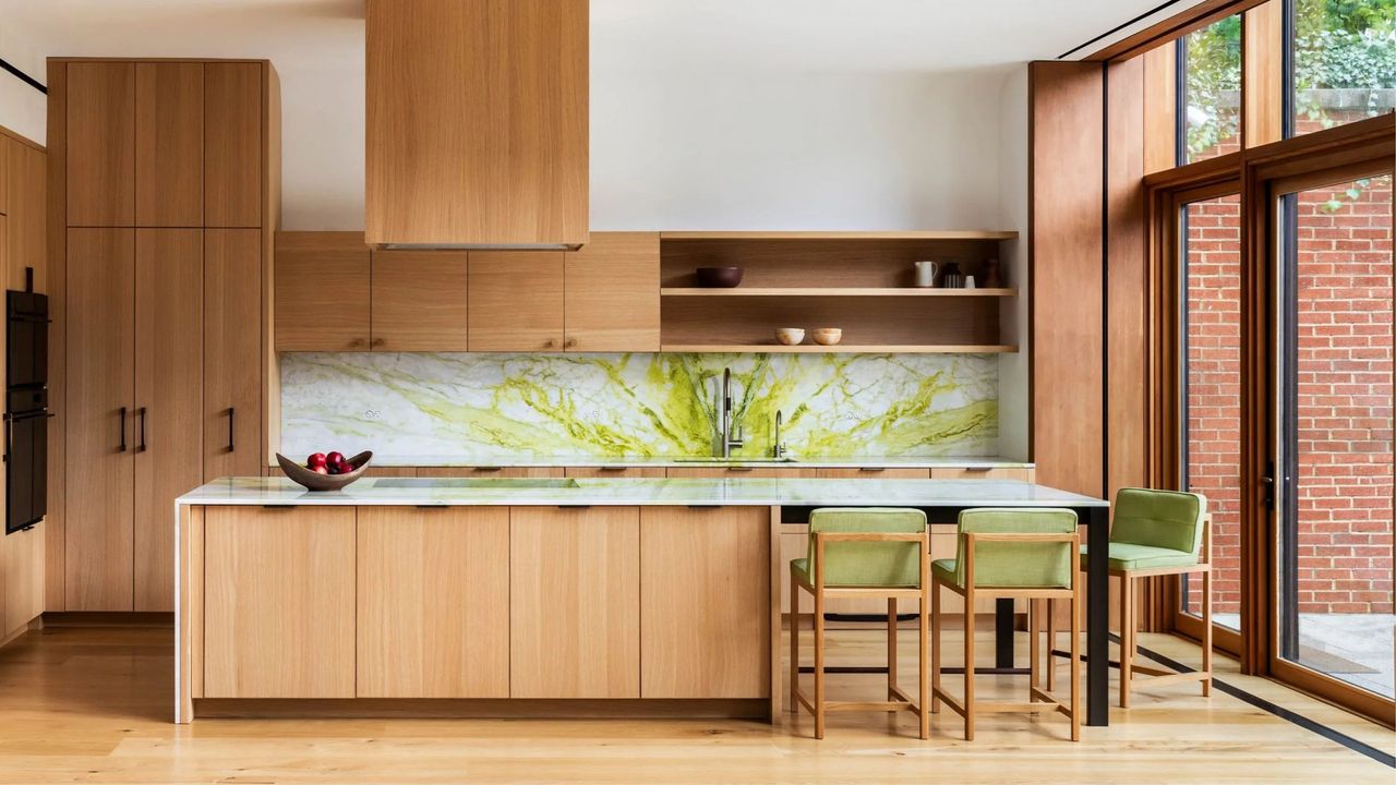
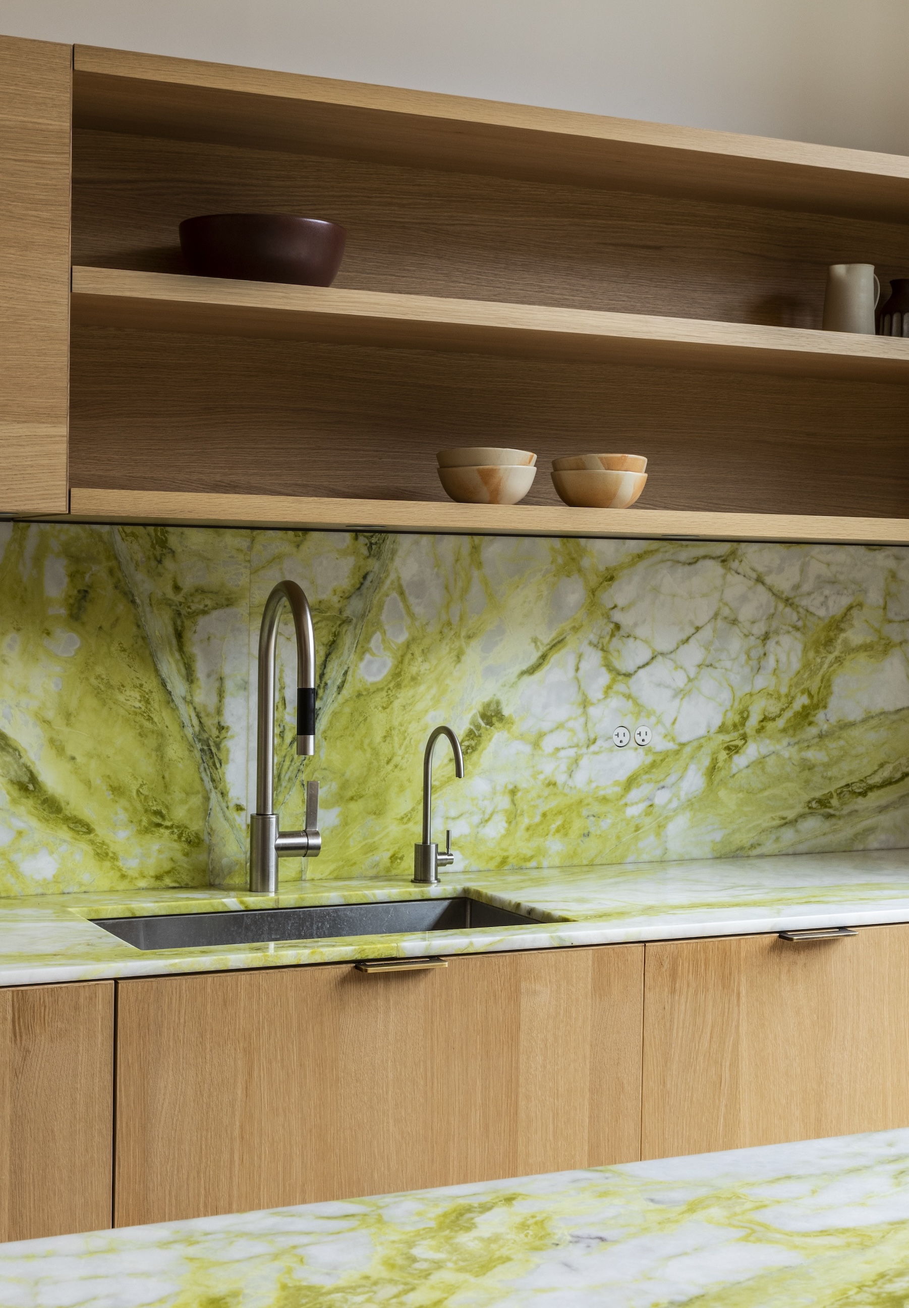
But that's not the only way. "I think the phrase is 'proverbial shock stimuli,'" says UNIONWORKS's founder, Poonam Khanna, who specified a shocking (to the system, not the eyes) green marble for the backsplash in the timber kitchen featured at the top of this article. "This chartreuse-y green definitely catches your attention, but I also think that the placement helps to ground it, especially in the blurry space between inside and outside that this project afforded us."
The warm walnut tones of the kitchen cabinetry needed some tension, she explains, "and this specific brightness, acidity, and shade of green immediately created a conversation between the kitchen, the garden, and the adjacent living-dining areas."
Sitting somewhere between green and yellow, color expert Helen Shaw, the director of marketing at Benjamin Moore, describes this trending color as "often possessing an almost neon lime characteristic that instantly adds energy to a room." She adds that it's a mood-boosting color, best used in spaces you want to feel optimistic and energized.
As for the more practical side of things, it certainly takes a deft hand to do right. Consider placement, intensity, and finish so as not to tip the scale towards overwhelm. "You need to balance everything from lighting levels to surface finishes and texture to make sure it feels as sophisticated as possible, while still delivering that fun, fizzy feeling," says Amy Moorea Wong.
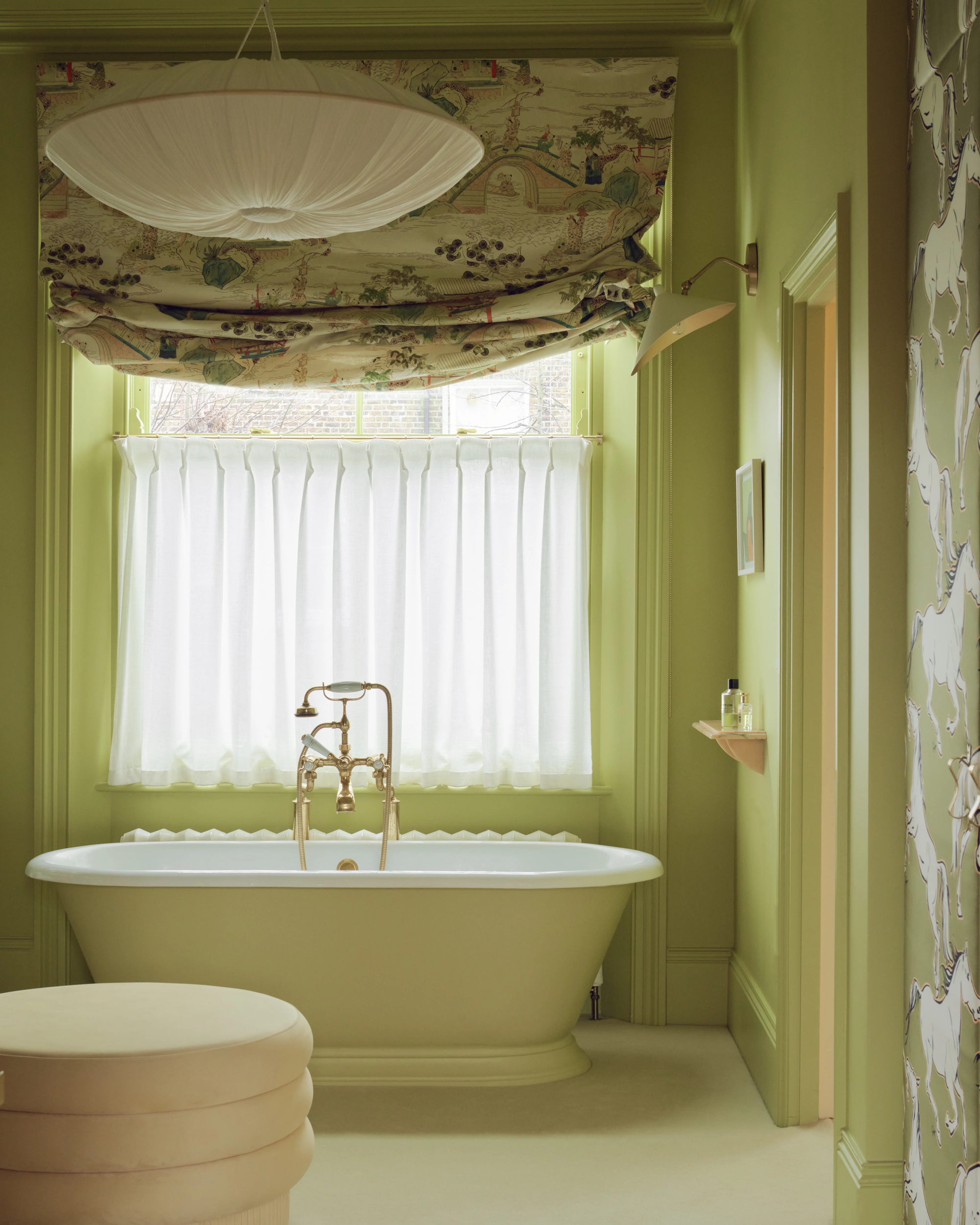
Even as such an unnatural color, it sings under natural light, adds Alice Bettington, co-director of London-based design studio, Golden. But, of course, not all natural light is the same, and it's important to consider that different lighting can dramatically affect the appearance of paint colors.
"In cooler light — both natural or artificial — chartreuse will feel zestier, with the green notes amplified by the crisp illumination," explains Helen Shaw. "However, in warmer light — whether that’s late afternoon sun or the glow of a warm bulb — it can feel more yellow, losing its more 'sour' edge."
But remember, with this color trend, that 'sourness' isn't something to shy away from (as you might naturally want to); it's actually what sets it apart. "It injects a shot of energy and modernity into more classic schemes, offering just enough tension to keep spaces feeling fresh and forward-looking without tipping into full-blown maximalism," adds Helen.
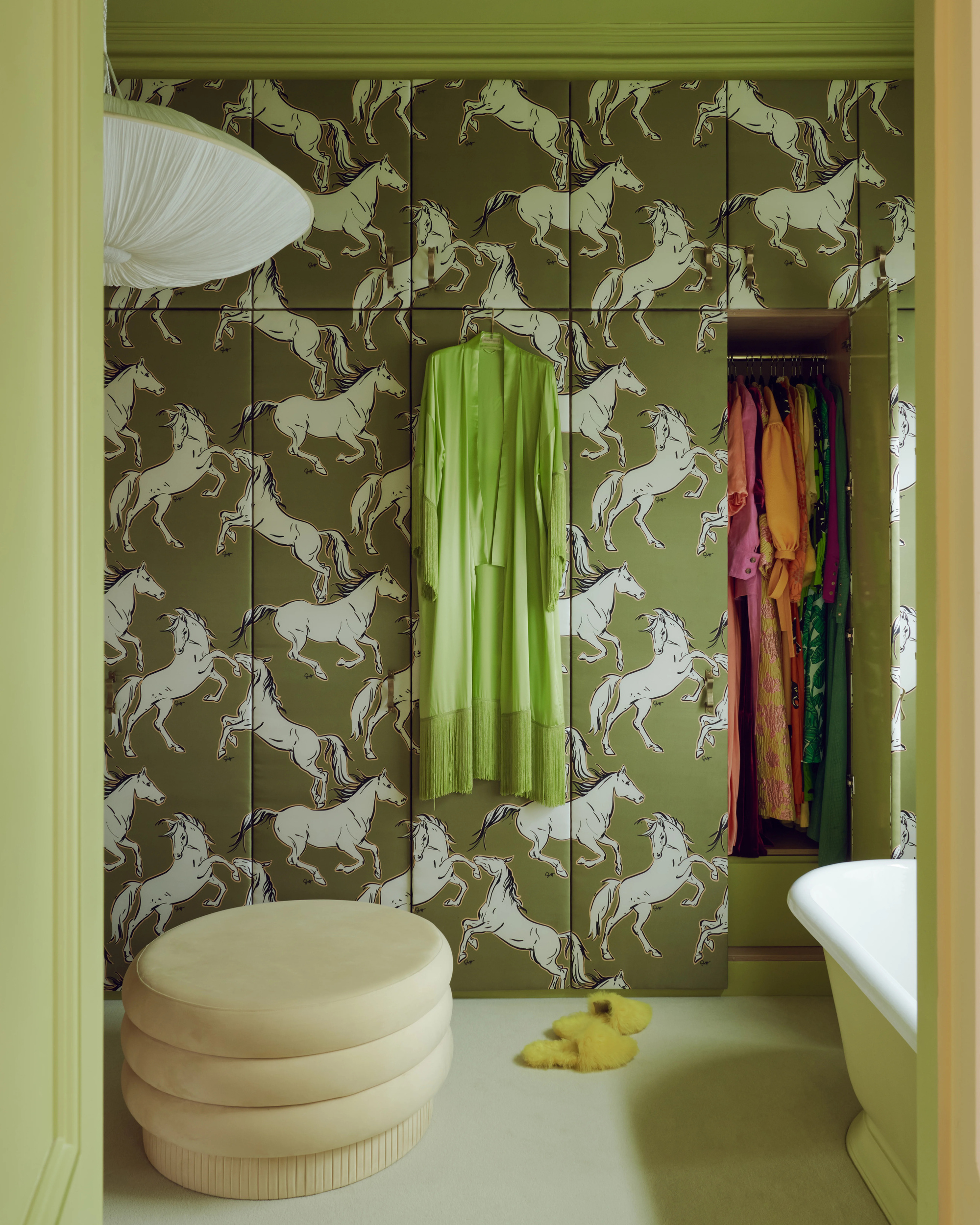
And then, there's what you pair it with. "As the shade gives a nod to both 1970s and mid-century influences, it works particularly well alongside timber, which may be why it plays so well into these specific moments in design," explains Golden's Alice Bettington.
In fact, it's often best paired with sleek finishes such as chrome, timber, and stone (all big interior trends right now), rather than other colors. "It doesn’t really like sharing the spotlight," says Amy. Instead, "Natural textures and materials ground it, adding an aura of warmth and calm to the space, for it to disrupt with well thought through intention," she adds.
If other colors are a must, "Try moody neutrals such as cocoa, espresso, or deep navy to increase the contrast," adds Amy. "Or to amplify the hits of dopamine, speckle in dashes of fuchsia, coral, or teal."

So, the big question: is Sour Chartreuse a soon-to-be fixture or fleeting fad when it comes to our interior color schemes? It might, actually, be neither, but rather a call to arms to be more courageous with your approach to using color.
It's not necessarily asking you for a big commitment — so experiment with it, enjoy it, and play. And when you're done, and the conversations around it have settled, know that you achieved something that all good design should do: you created a space that made people feel something. And then pick up a paintbrush and try something new.