Green is a classic, timeless shade, and unlike some other colors the 'in' tone to use doesn't come and go all that quickly. It's always on trend in all its forms from sage green to the ever-popular deep greens. However, we are noticing that dark green paints are being used far more easily than they once were and not only on kitchen cabinets where they have lived for decades but in softer rooms too.
And that's something you don't often think of when you think of dark green paint, but it can be such a soft and calming shade despite being dramatic. Pick the right paint and it can be such a versatile room color idea, getting the perfect balance between soothing and striking. But what is the best dark green paint? We asked interior designers for the favorite shades they have worked with.
The best dark green paints
Decorating with green creates timeless spaces, no matter what shade you go for, for a dark green feels particular classic. Plus, it works with any interior design style from super sleek and modern to rustic spaces.
'When using green paint, I love to ensure that the color feels organic, saturated and rejuvenating,' explains designer Marie Flanigan. 'As a bold wall color, it transcends mere aesthetics, transforming rooms into verdant sanctuaries that truly envelop you in a space.'
'Moreover, when employed as an accent hue, green paint offers a captivating moment that’s both elegant and a statement. Further, the colors that typically complement a lush green are beautiful gem tones that give a sense of understated opulence.'
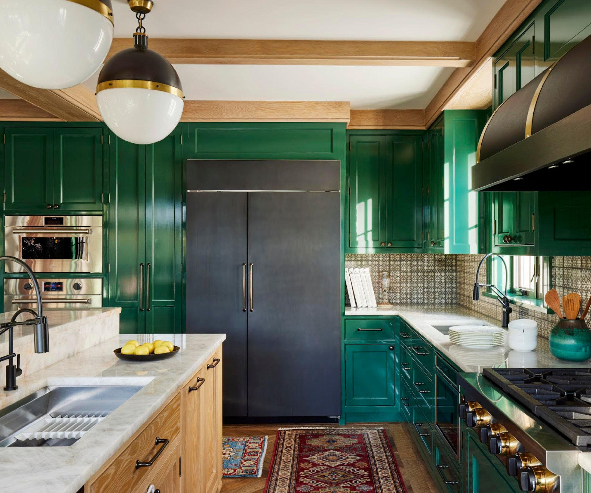
1. Gondola Ride, Benjamin Moore
Dark green as a kitchen cabinet color has been a trend for years now, a softer more liveable than the once-love navy blue it's definitely one of the most popular cabinet shades right now. And it looks so fabulous in a high gloss finish in this kitchen, it's an unexpected shade for this style of rustic kitchen, but it very much works.
'And for the kitchen in this Boston project, we're making a statement with Benjamin Moore's 602 Gondola Ride – an assertively rich green that's reminiscent of the grandeur found in old-world studies. These colors are not just reminiscent of the outdoors; they bring an intense, confident flair to our interiors, marrying the beauty of nature with luxurious sophistication,' explains Kati Curtis.
'As someone who is obsessed with deep greens, Benjamin Moore's 644 Garden Cucumber was also the perfect choice for our new office paint color. It commands attention and energizes the room without overwhelming the senses, and creates the perfect moody backdrop for our design presentations,' she adds.
2. Rosemary, Sherwin-Williams

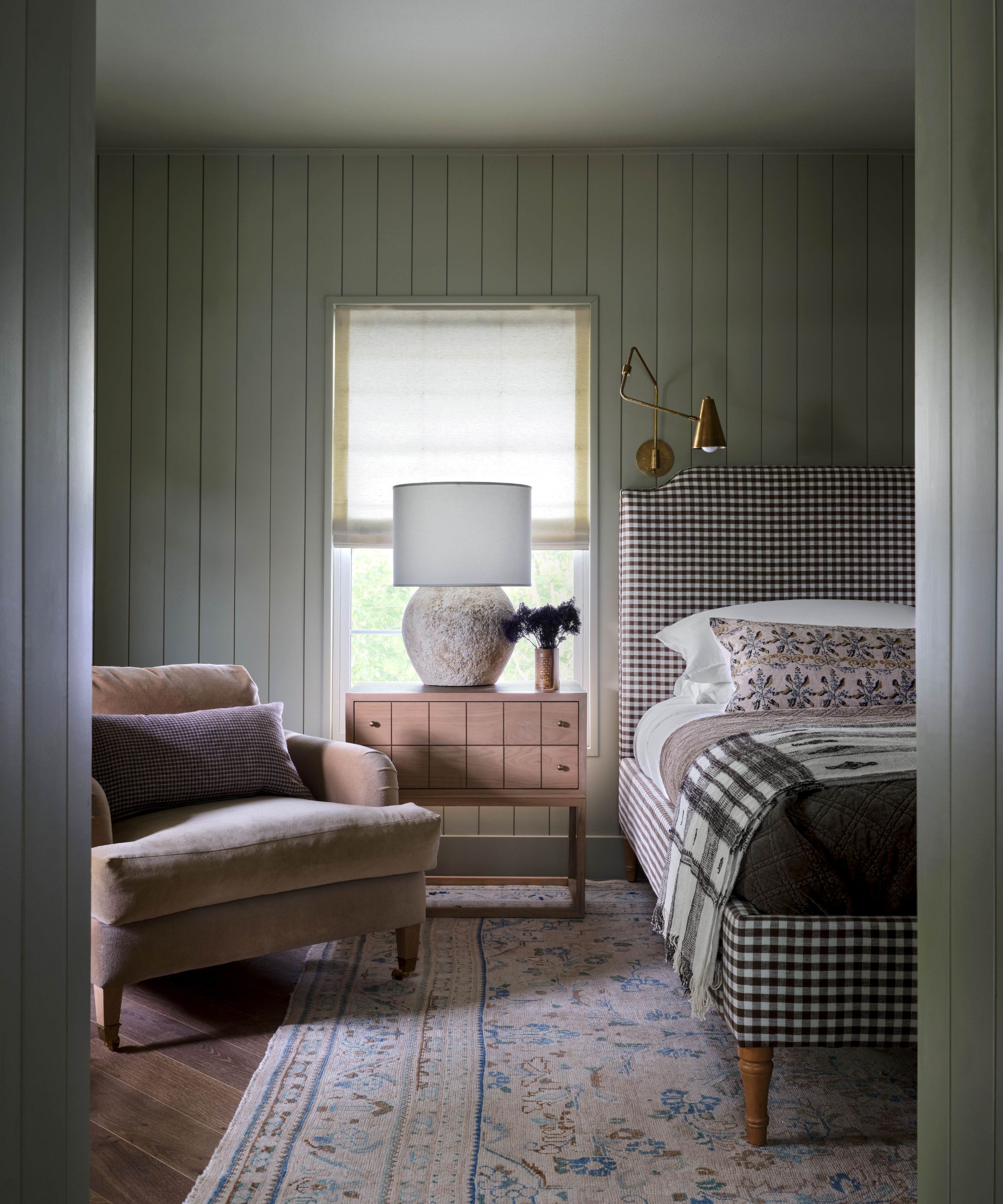
For a really soft version of a dark green, you want to look for paints that have a more olive or brown undertone. Rosemary by Sherwin-Williams is exactly that, described as a 'deep, organic green.'
'SW6187 Sherwin Williams Rosemary is a favorite saturated green that gives a major bang for your buck. And in a semi-gloss finish like this one, it feels quite magical. If you want to be transported to a forest, this is your color,' says Mollie Ranize founder of Dmar Interiors.
This is the kind of paint color that works really well in smaller rooms, especially if you color drench the whole space. It's not so dark it feels overwhelming or gloomy, but it's dark enough that you get that cozy, cocooning effect. The semi-gloss Mollie used in this bedroom too helps to bounce a bit more light around and lift the walls slightly.
3. Pewter Green, Sherwin-Williams
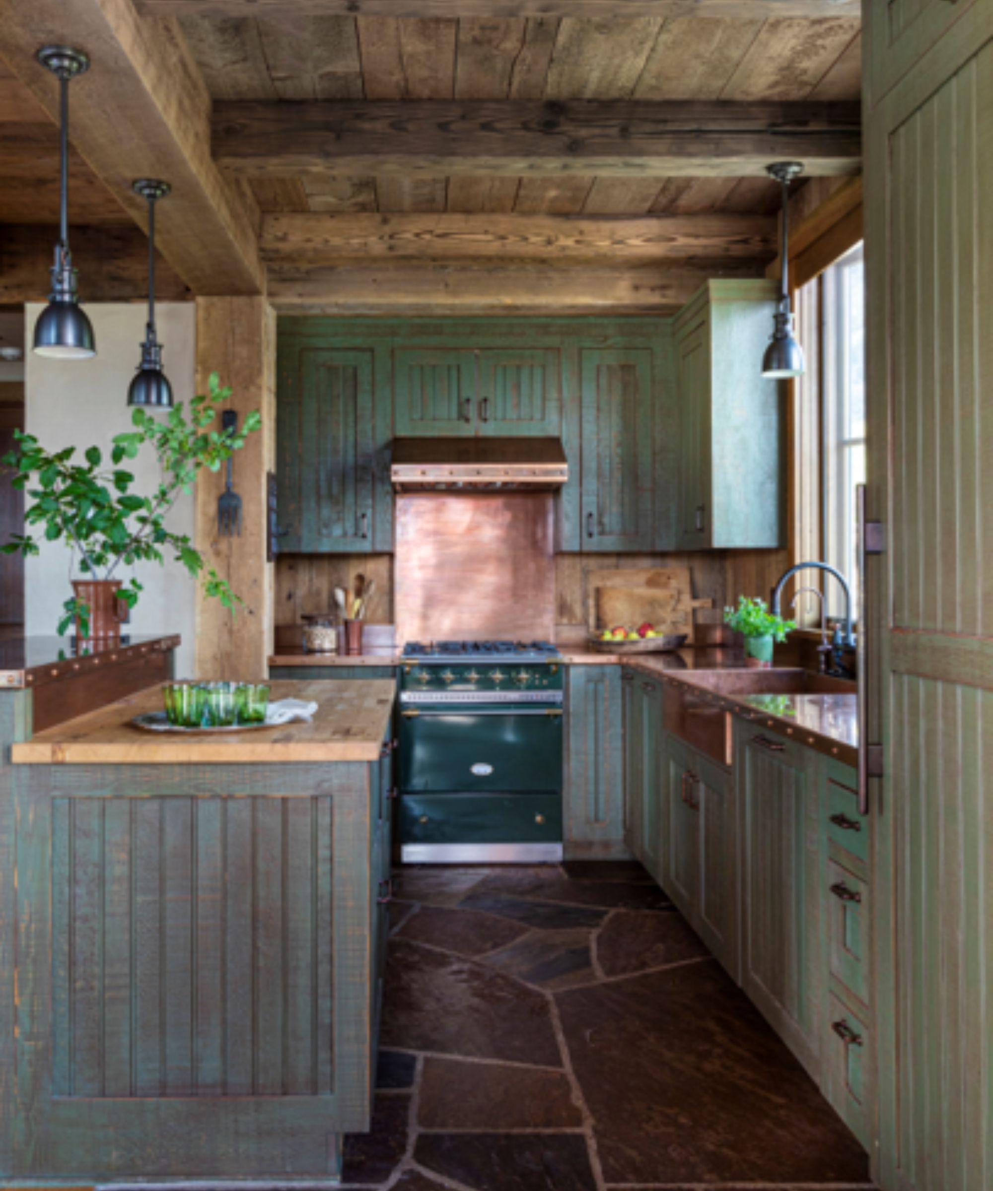
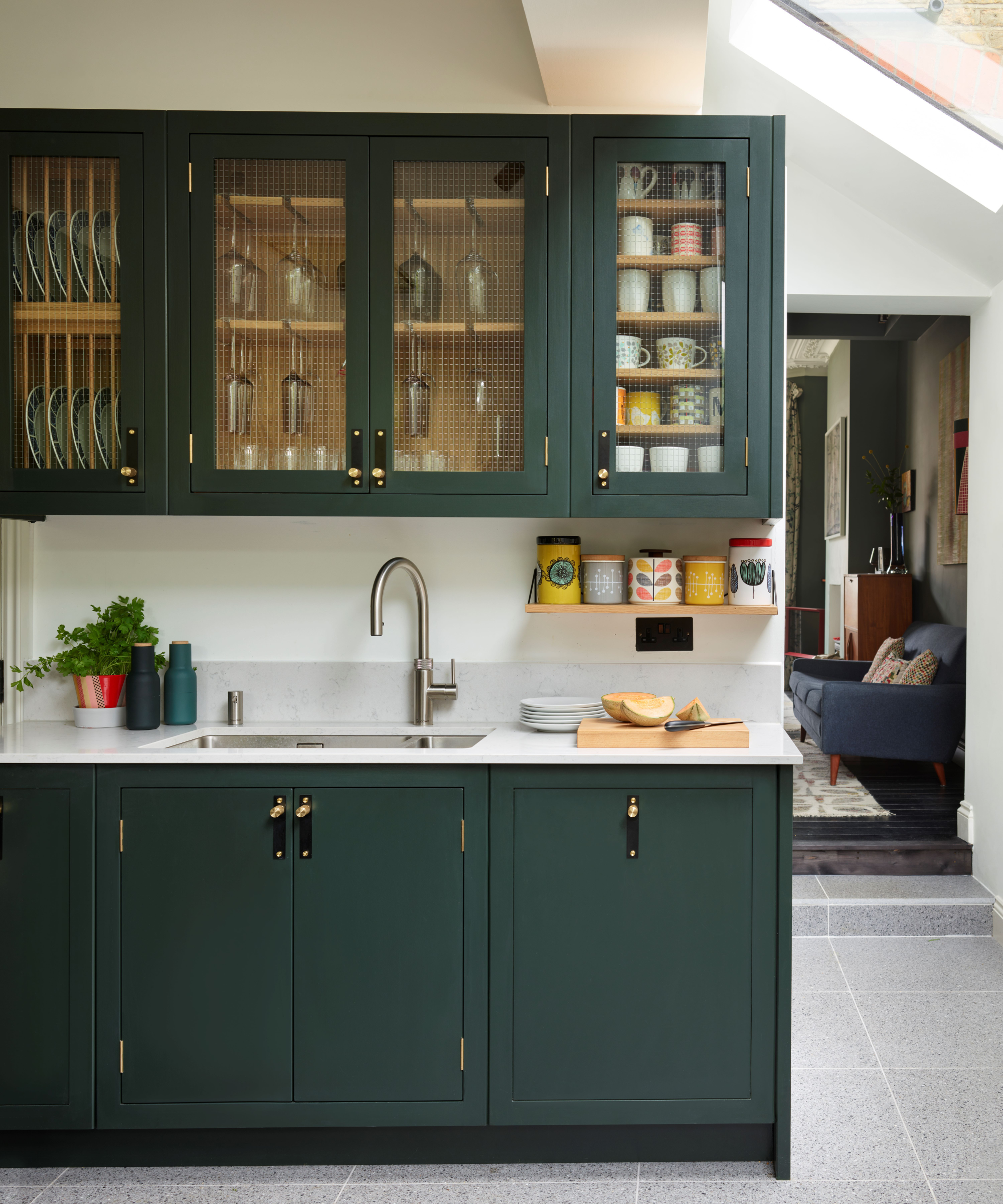
'Pewter Green by Sherwin-Williams was a gorgeous paint stain in the kitchen of this Rocky Mountain home, unifying the warmth of copper, stone, and reclaimed wood details,' explains Kara Childress.
It's interesting how dark green paints are typically thought of as cooler shades. However, as this modern rustic kitchen demonstrates, they can work so well amongst warmer color schemes and almost become a warm shade themselves when you pair them with woods and copper tones. Sherwin-Williams describes Pewter Green as 'a cool green that complements natural elements like wood and metal.' So spot on for this space.
4. Green Smoke, Farrow & Ball
'Green is the ‘ultimate’ color group that color psychologists always suggest to imbue calm. And Green Smoke will always deliver an effortlessly sophisticated atmosphere, from kitchen cabinets to living rooms and outdoor spaces. Its gentle blue undertone ensures it looks magical in both sunlight and candlelight for a cozy, immersive feel,' explains Patrick O’Donnell, brand ambassador and color expert at Farrow & Ball.
As the name suggests, this is a very smokey dark green and has a very heritage feeling to it. That's not to say it would only suit more traditional styles, it's a very versatile paint that despite being dark is very serene and calming. It pairs well with plenty of other shades too from bold primary shades to neutrals – for a fresh look pair with crisp whites, but if you want to up the smokiness, choose soft blacks and browns.
5. Tate Olive, Benjamin Moore
'Benjamin Moore’s Tate Olive was used on our kitchen cabinets and in our butler’s pantry,' says Anastasia Casey, editorial director of The Interior Collective. 'It balances yellow and blue undertones for the perfect green that still reflects light, while feeling like a commitment to color. This particular shade of deep green will transition through trends as it acts as a neutral, making it a timeless option - especially in kitchens.'
Using green as a neutral is such a good way to make this color more accessible. Even in a slightly darker form like Tate Olive, these sagey, olivey shades work beautifully as part of a tonal neutral scheme, layered with warm grays, creams, beiges and whites.
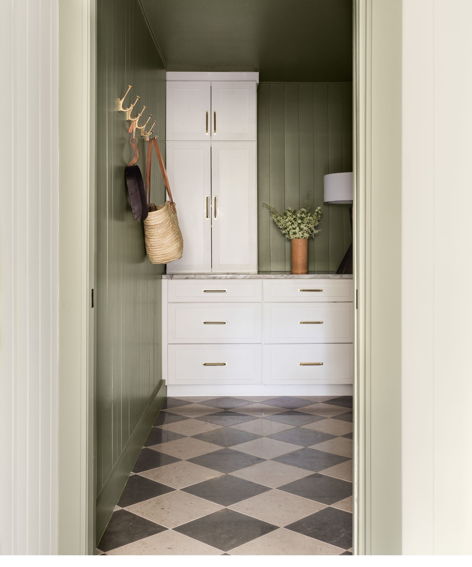
6. Ripe Olive, Sherwin Williams

Another olive-toned dark green paint, Ripe Olive by Sherwin-Williams is much darker than Tate Olive, but it's still a very useable, liveable shade. And despite being darker, Sherwin-Williams still notes this shade as a very 'neutral green', describing it as a 'deep green with blue-gray undertones, this neutral can offer a well-lit space an intriguing, sophisticated mood.'
It's the perfect shade for this nook designed by Dmar Interiors, creating a cozy but calming feel that gives the area depth without darkening the corner. Mollie Ranize explains, 'Ripe olive is the perfect dark green with plenty of depth to handle custom wall treatments with sophistication. Depending on how much light it receives, it can feel dark and moody or even brighter and welcoming,'
7. Hunter's Green, Benjamin Moore
'My favorite dark green paint is Hunter Green from Benjamin Moore,' Kathy Kuo told H&G. 'I love how this color reads both as dark and green. It's perfect for a space that you want to add elegance and timeless sophistication to – it's very reminiscent of stately English manors and Ivy League studies. If you're into upscale aesthetics like Dark Academia and Quiet Luxury, Hunter Green is a perfect choice!'
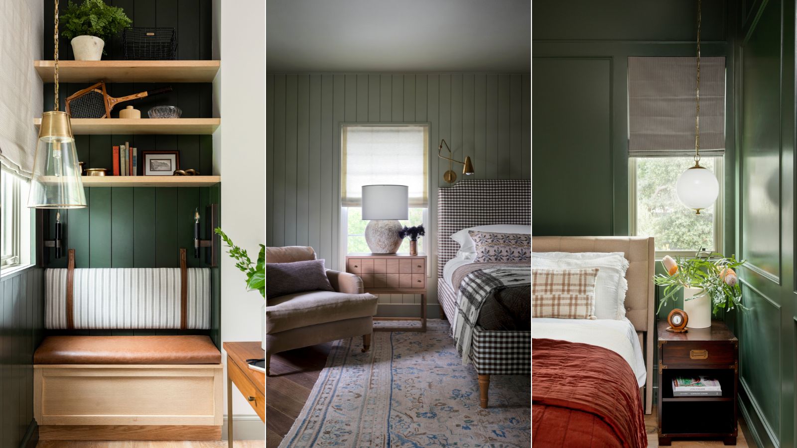
8. Nantucket Gray, Benjamin Moore
'Surprisingly, Benjamin Moore’s Nantucket Gray color appears fairly pale in the swatch book but reads with immense depth in person,' says Anastasia Casey. 'We color-drenched our bedroom with it for the perfect, calming, deep green hue.'
'Remember when selecting your paint colors, to hold them up vertically, instead of laying flat on a table, to ensure you’re seeing how the light will be reflected on your walls. It can change the color immensely if not holding it upright.'
Green is such a chameleon shade, especially in darker forms, so do be sure to always order samples to see how they change in your space. As Anastasia mentioned, greens that appear pale can get much darker depending on the amount of light. And undertones can look totally different depending on the colors you bring into the rest of the room.
The best dark green paint will always come down to your personal tastes, the colors you intend to pair it with, and the light in the room. However, these picks are a good place to start, all tried, tested and loved by the experts.