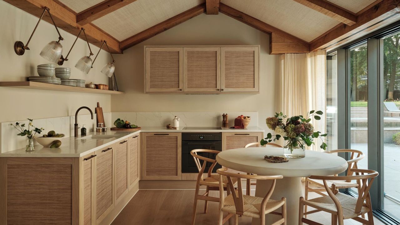
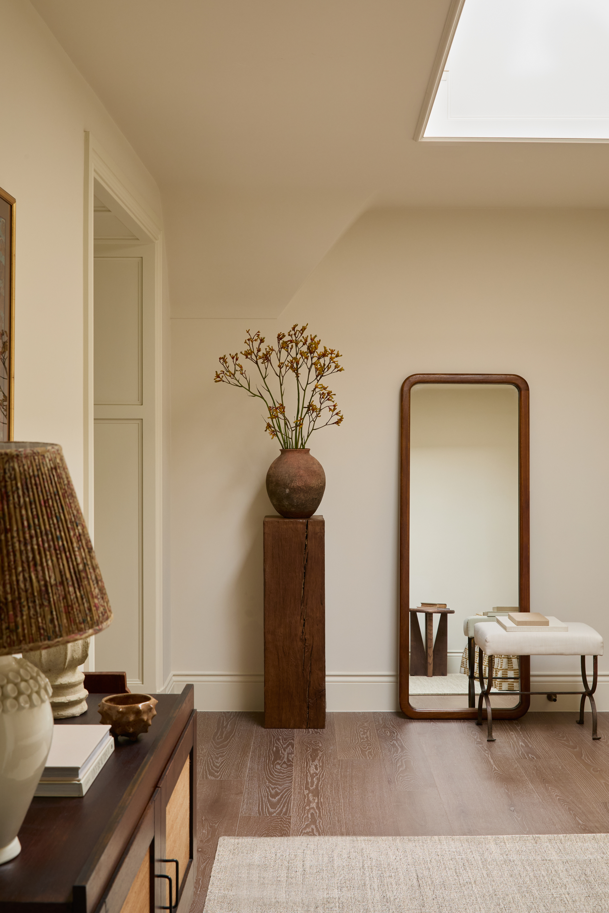
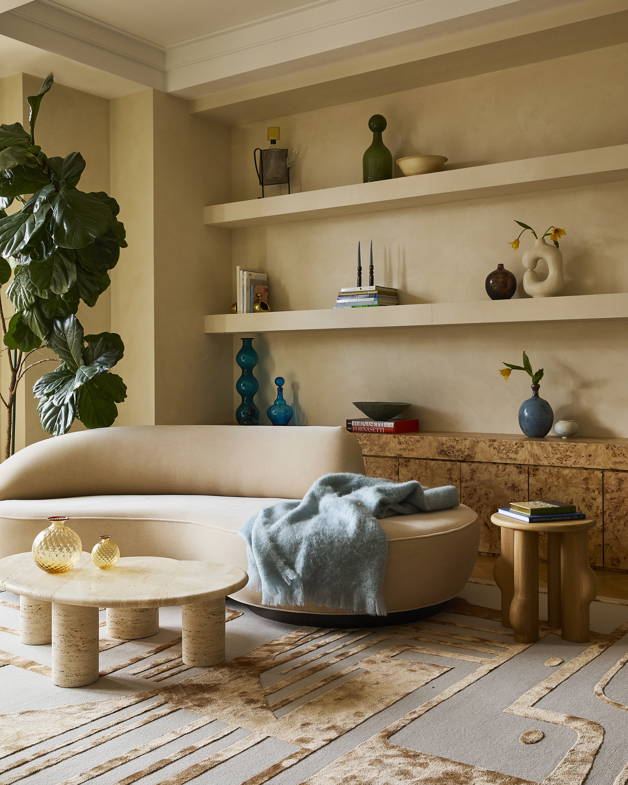
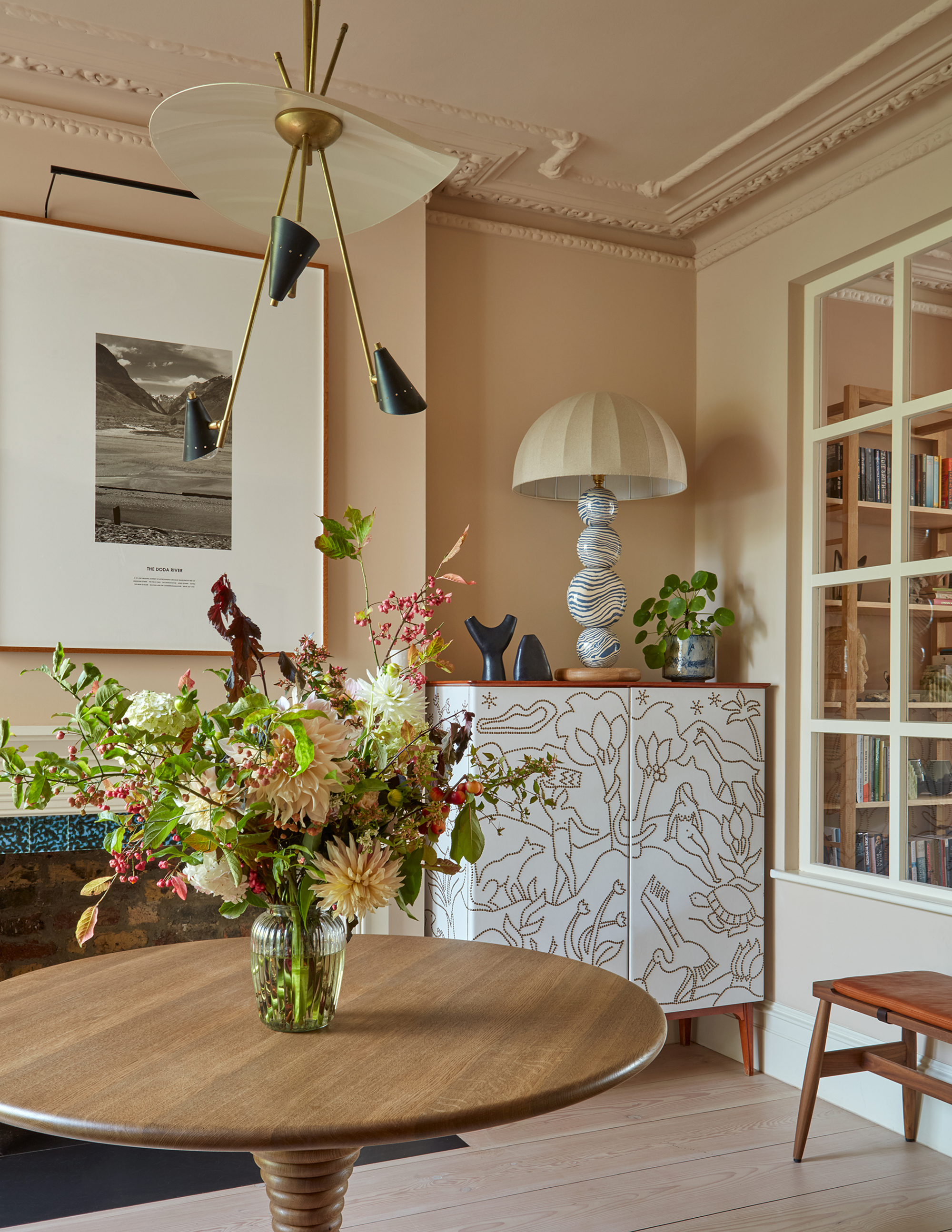
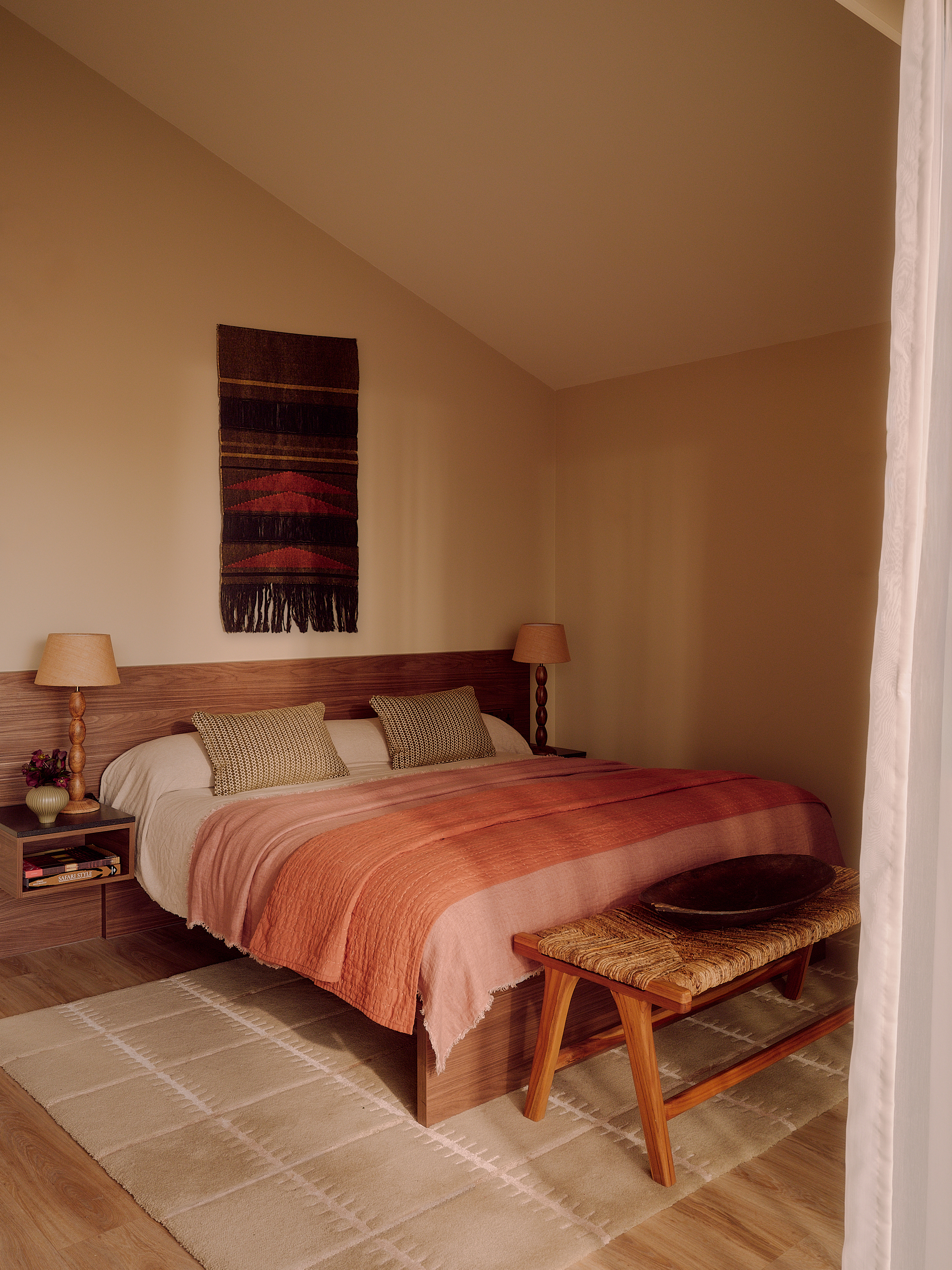
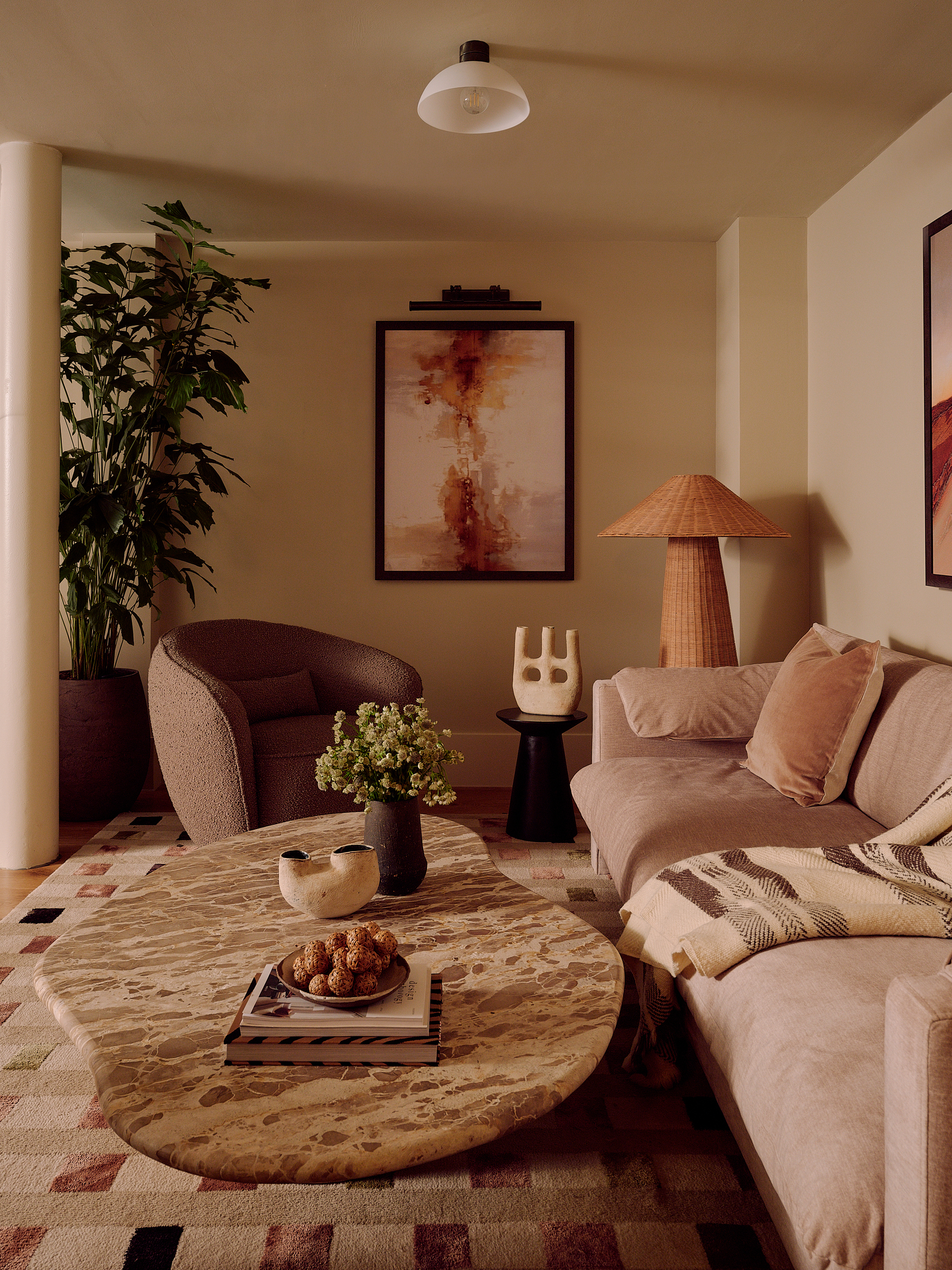
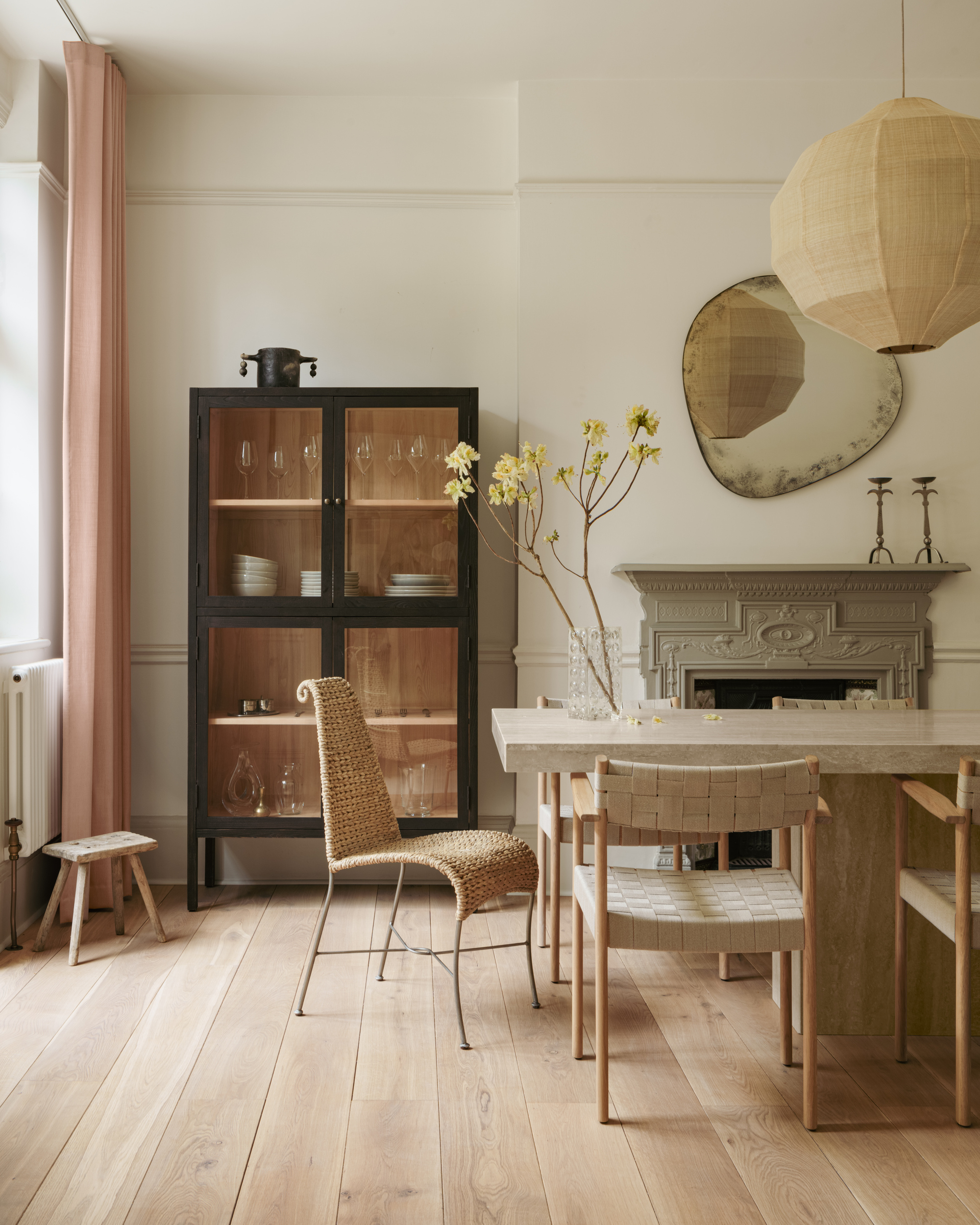
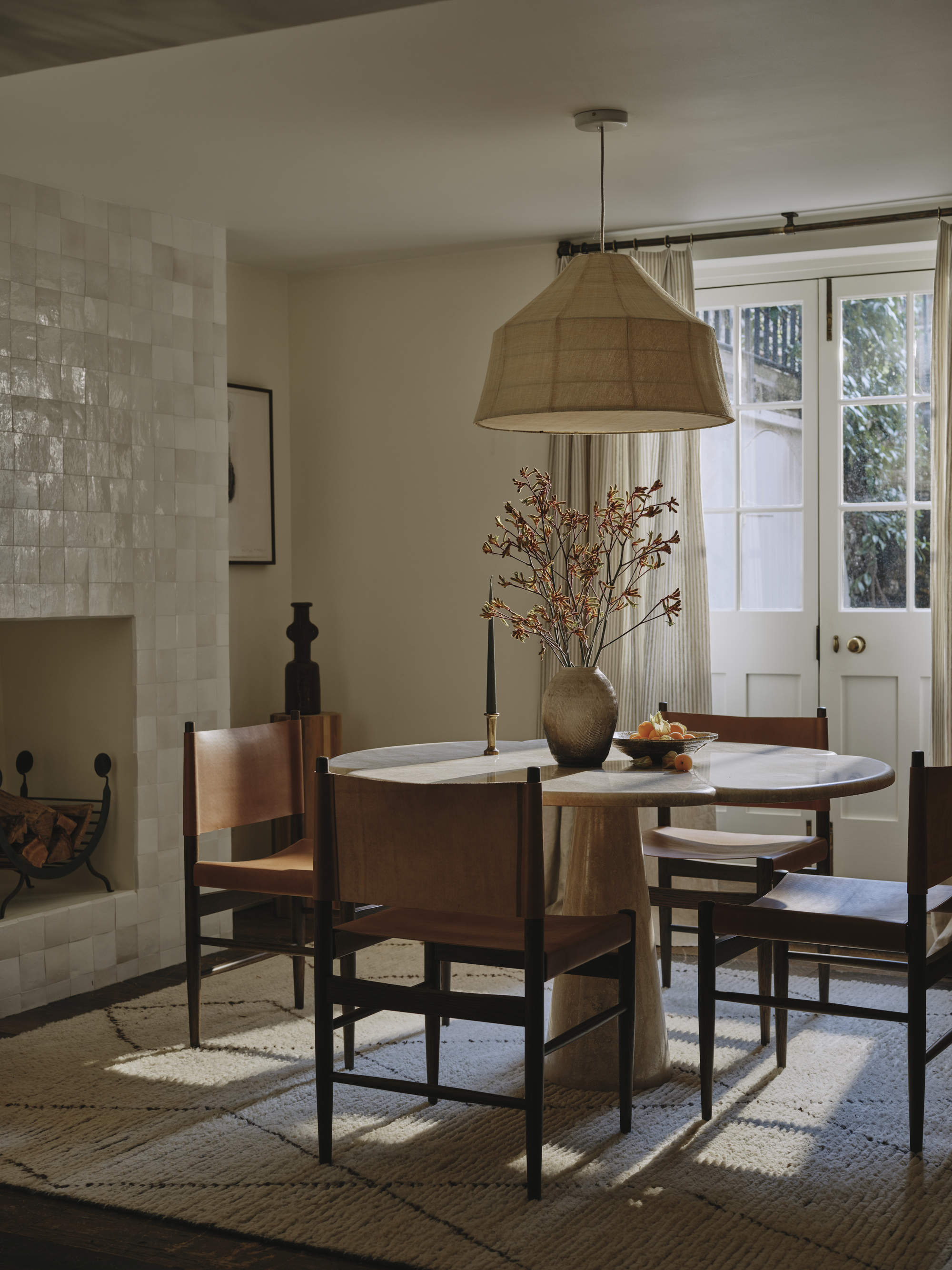
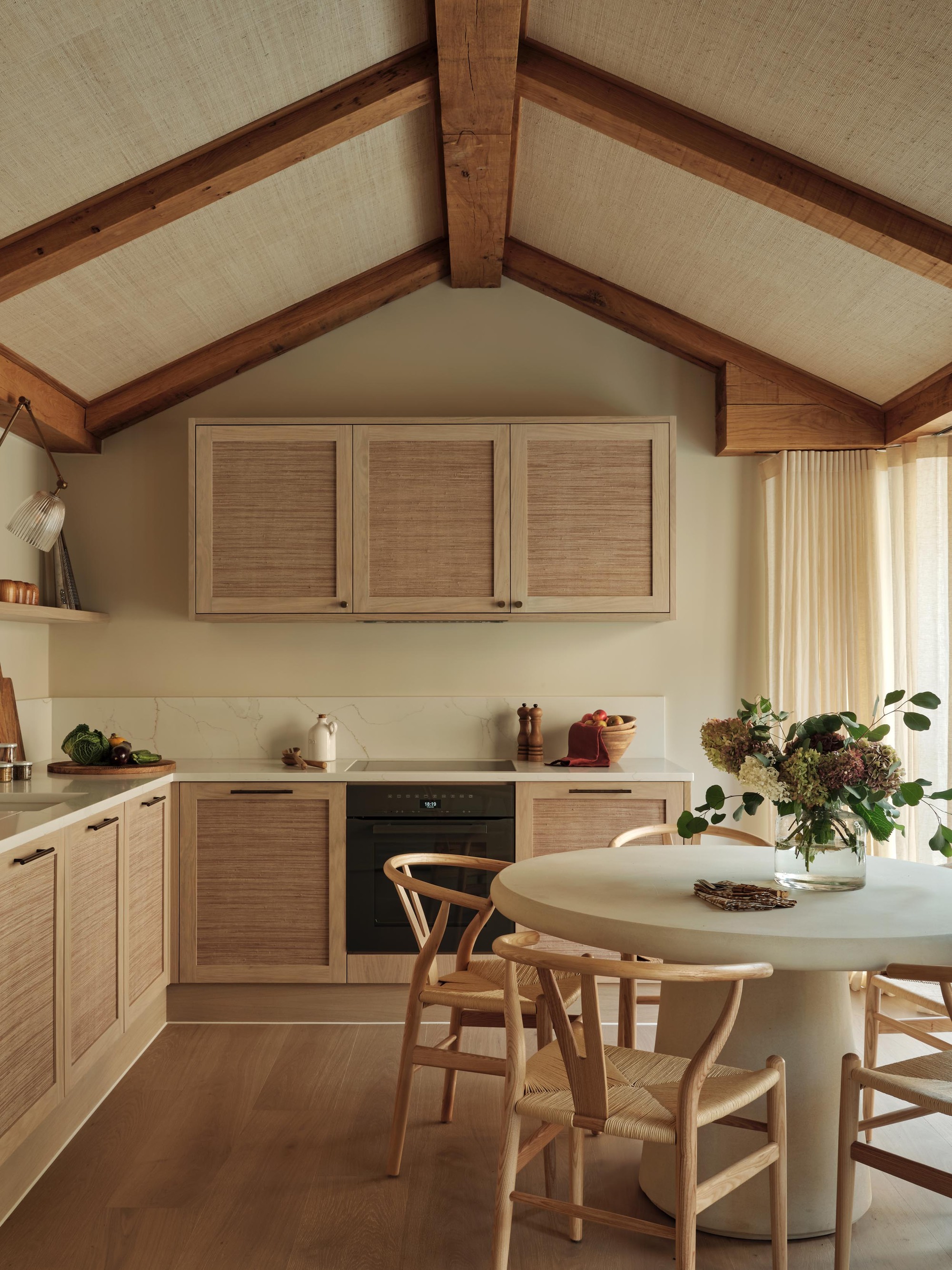
Neutral rooms are sometimes thought of as flat or boring, and public opinion is often against them. But what neutrals bring to a room is nothing short of transformative, creating areas that exude not only calm, but warmth, tactility, harmony, and creativity. These rooms are not about playing it safe — they’re about crafting interiors that are curated, considered, and full of understated, confident character. And neutral paint colors are where it all starts.
Neutral tones go hand in hand with the natural, where many of their shades are drawn from, spanning dusty clay and sand to plant-based linen and hemp, rocky pebble and stone, weather-drawn mist and cloud, food-rooted oat and mushroom, and woodland-y ash and oak. Even neutral perennial beige is so named after the tone of undyed wool. These are spaces that feed the soul, as well as the senses.
But decorating with neutrals is a land of nuance, of exploring undertones, of studying light, and of getting into complexities — and as such, it can be a journey best traversed with the help of an experienced guide. I spoke to seven renowned interior designers about the shades they lean on when they’re creating nuanced, neutral rooms, for when you’re finding it hard to see the difference between your ivories, chalks, and creams. Here are the exact tones the experts choose for rooms that feel complete without color.
1. Farrow & Ball's 'Stirabout'
A pale neutral with a hint of earthiness and just a little gray, Farrow & Ball's Stirabout takes its name from the traditional porridge eaten in Ireland. Like its milky, oat-y namesake, it creates balanced, sustaining warmth.
"Stirabout is the embodiment of a cozy interior, making rooms feel calm, grounded, and effortlessly livable," says Jack Simpson, founder and CEO of London interior design studio and real estate developer Nomad. "It adapts easily to its surroundings, complementing other accents, rather than creating harsh contrasts. The softness and consistency of the color create a quiet backdrop, allowing natural materials to add warmth, depth, and personality without overwhelming the space."
2. Benjamin Moore's 'Sail Cloth'
A very fine, measured beige-y, white-ish shade, Benjamin Moore's Sail Cloth does indeed have an essence of the faded-by-a-life-at-sea about it. It says effortless elegance as well as 'I’ll work anywhere.'
"Sail Cloth is an off-white neutral with delicate beige undertones; soft, soothing, and sophisticated. It’s not a bright white, but gentle enough to feel refined while still cozy," says Paris Forino, founder and principal of New York interior design firm Paris Forino.
"I’m drawn to its quiet, grounding quality," she adds. "It has a subtle warmth that’s intentional without ever being overpowering, creating a backdrop that allows the furniture, textures, and objects to shine, while the walls remain elegant and understated." (An important color rule when working with neutral colors.)
3. Edward Bulmer's 'Clove 60%'
A deep beige tinted with red oxide for a little spice, Edward Bulmer's Clove brings a dash of pigment to the world of neutrals for a little heat and spice. (A bit more of a 'dirty' neutral, if you like.)
"Clove has real depth while not being overly powerful in terms of color," explains Sarah Davies-Bennion, senior designer at London-based interiors brand Kate Guinness Design. "It’s really cozy without being oppressive. It’s ideal for light-filled spaces as it works well with high natural light levels, glowing wonderfully in the sun without washing out."
4. Crown Paint's 'Milking Lane'
A light, velvety beige, Crown Paint's Milking Lane (available at B&Q) has a muted butteriness that makes for organically welcoming spaces. It rejoices in light of all kinds, leaning cozy and snug rather than becoming heavy.
"Milking Lane sits somewhere between soft stone and baked clay; there’s a gentle earthiness to it that feels balanced and quietly expressive, like a mineral pigment that’s settled over time," muses Franky Rousell, CEO and founder of Manchester and London-based interior design studio Jolie. "It has a calming presence that allows the space to breathe, not competing with furniture or textures but holding everything together. It feels timeless and familiar."
5. Farrow & Ball's 'Wimborne White'
Almost but not quite a pure-white, Farrow & Ball's Wimborne White is given softness and ease with just a sprinkle of yellow, mixing cleanliness with brightness.
"Wimborne White is a beautiful and versatile off-white, a stony neutral that feels much gentler than a standard brilliant white. Its tiny hint of yellow gives it a distinct warmth without being creamy or dated," explains Annie Harrison, interior designer and founder of London’s Fare Inc. "It responds very well to natural light, not turning gray or cold in the shadows and staying luminous throughout the day."
6. Farrow & Ball's 'Pointing'
White with a warmth and delicacy, Farrow & Ball's Pointing is named after the shade of lime pointing used in traditional brickwork. Fresh and uncomplicated, it creates pretty walls imbued with poise and composure.
"Pointing is a chalky off-white with a subtle heat to it. It has a gentle cream undertone which gives it a relaxed, lived-in quality, bringing a calm, welcoming softness," says Rachael Gowdridge, founder and creative director of London’s Rachael Gowdridge Interior Design. "It’s timeless and quietly elegant, reflects light in a very flattering way, particularly in changing daylight, and creates an inviting backdrop that makes a space feel intimate yet airy."
7. Farrow & Ball's 'Shadow White'
A mellow white that had a little dalliance with gray somewhere along the line, the tone of Farrow & Ball's Shadow White is (you may have guessed this from the name) drawn from what happens when white falls into the shade. Think of it as a white paint with an air of mystery about it…
"Shadow White is a soft white that’s calm yet refined," explains Annabel Hickton, co-founder of international creative design studio Untold Interiors. "It responds beautifully to changing light, and creates a relaxed, elegant feel without the harsh contrast of pure white."
Neutral walls have all sorts of powers. The power to hold a room together without drawing attention to themselves. The power to hush visual noise. Even the power to make a room seem more expensive. In other words, they’re hard workers — pared-back, yes, but utterly room-enhancing.