Dark paint colors are everywhere right now. One might argue it's the time of year and that winter of course lends itself to deeper, moodier hues. And while yes these shades do get a boost during the darker, cooler months I think dark paints are becoming more of a classic than a seasonal trend.
Once seen as a statement choice (which they still can be) dark paints are now as popular as beloved grays and white. Dark paint on kitchen cabinets for example are now top of the kitchen color trends, and color-drenching rooms in a moody hue is the go-to solution for smaller spaces. We are no longer scared of dark blues, grays, blacks, and greens and instead, designers are encouraging us to use these colors just as we would neutrals
But which paints are best for embracing this look? We asked interior designers for their top picks.
The best dark paints according to experts
Dark paints come in many forms, how do you pick the best? Well, something we have noticed from all these designer picks is that they are always very soft, despite being really dark and dramatic they are also on the warmer side, cocooning and cozy rather than harsh and overly gothic.
And swatch swatch swatch! Choosing a dark paint is a commitment, you want to get it right. So order samples and paint large sections of the room you are considering it for so you can sit with it and see how it looks in your home, with your lighting.
1. Railings, Farrow & Ball
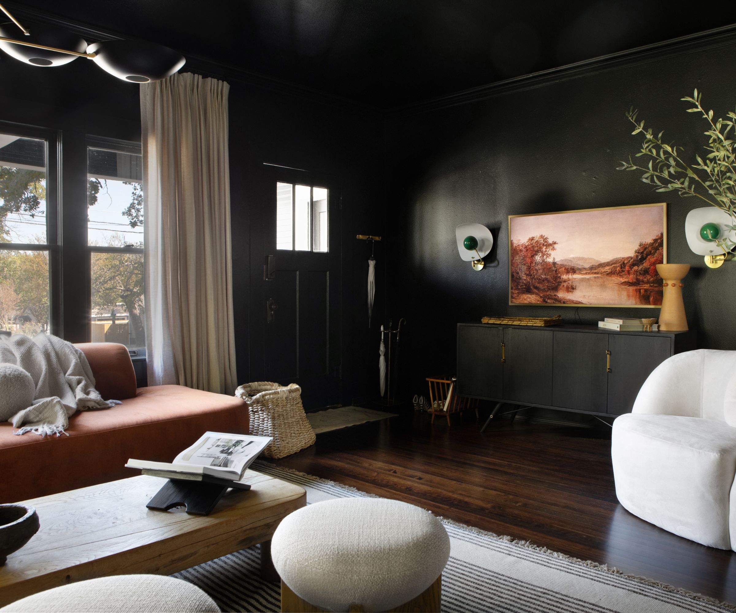
'Black may seem a rather dramatic departure from the perceived norm, however, it can be a surprisingly successful option, especially in a naturally poorly lit room or small room as darker walls tend to recede. Decorating with black can also create a wonderful backdrop to pictures on the wall allowing them to register in a new light.' explains Patrick O'Donnell of Farrow & Ball.
'Consider more nuanced blacks such as the charcoal-toned Off-Black or the perennially popular Railings with its subtle blue note for a slightly softer look. For a fully immersive color experience, paint your woodwork in the same color - especially if the room has quite low ceilings as this will help accentuate the height of the room.'
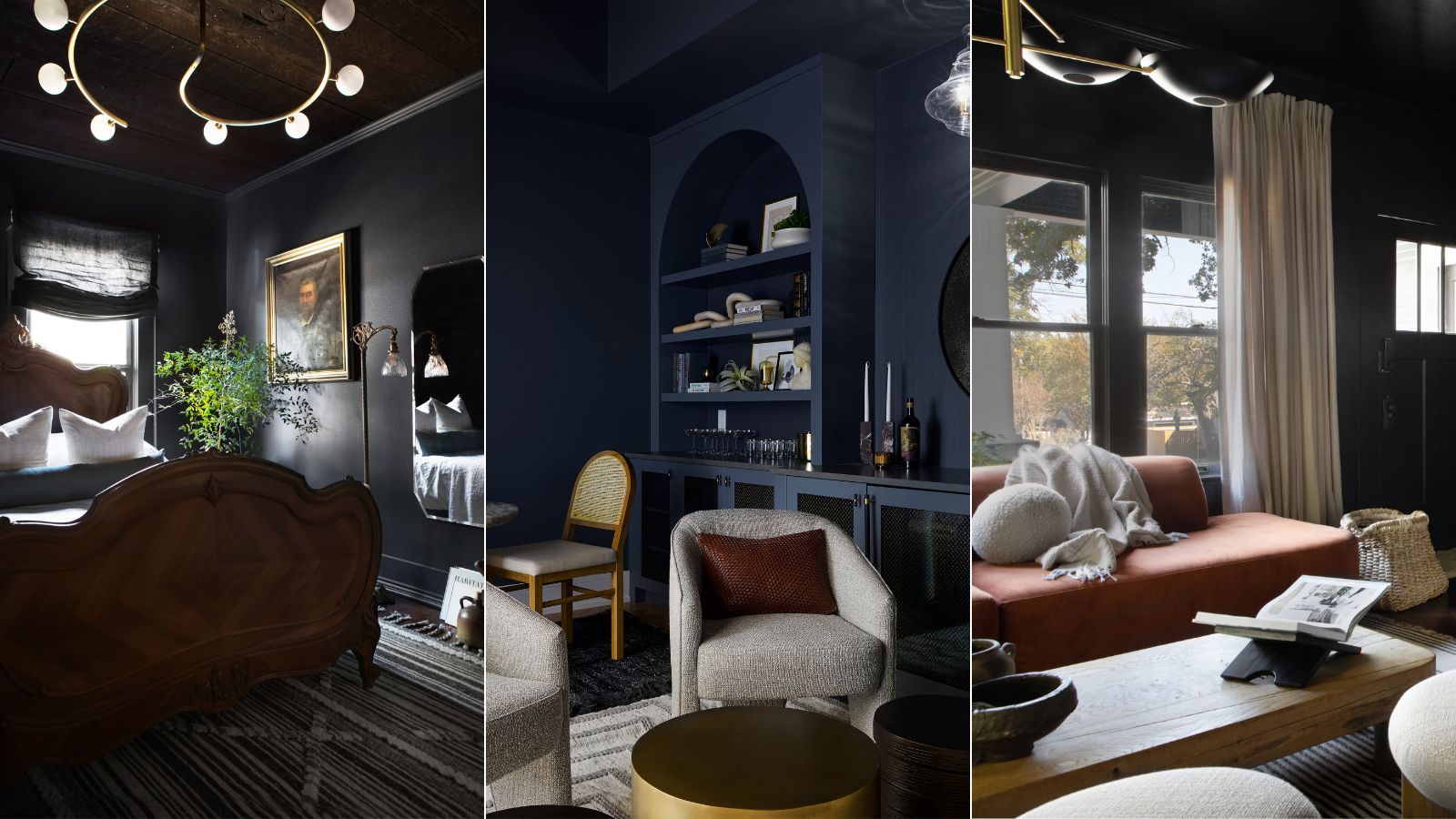
Designer Jennifer Davis is an advocate of the popular shade too, explaining that 'We gravitate towards a selection of dark paint colors for their ability to infuse spaces with depth, sophistication, and a touch of drama. Farrow & Ball's "Railings" (No. 31) stands out for its deep, almost-black-blue hue, adding both elegance and a cozy allure, making it an ideal bedroom color.'
2. Off Black, Farrow & Ball
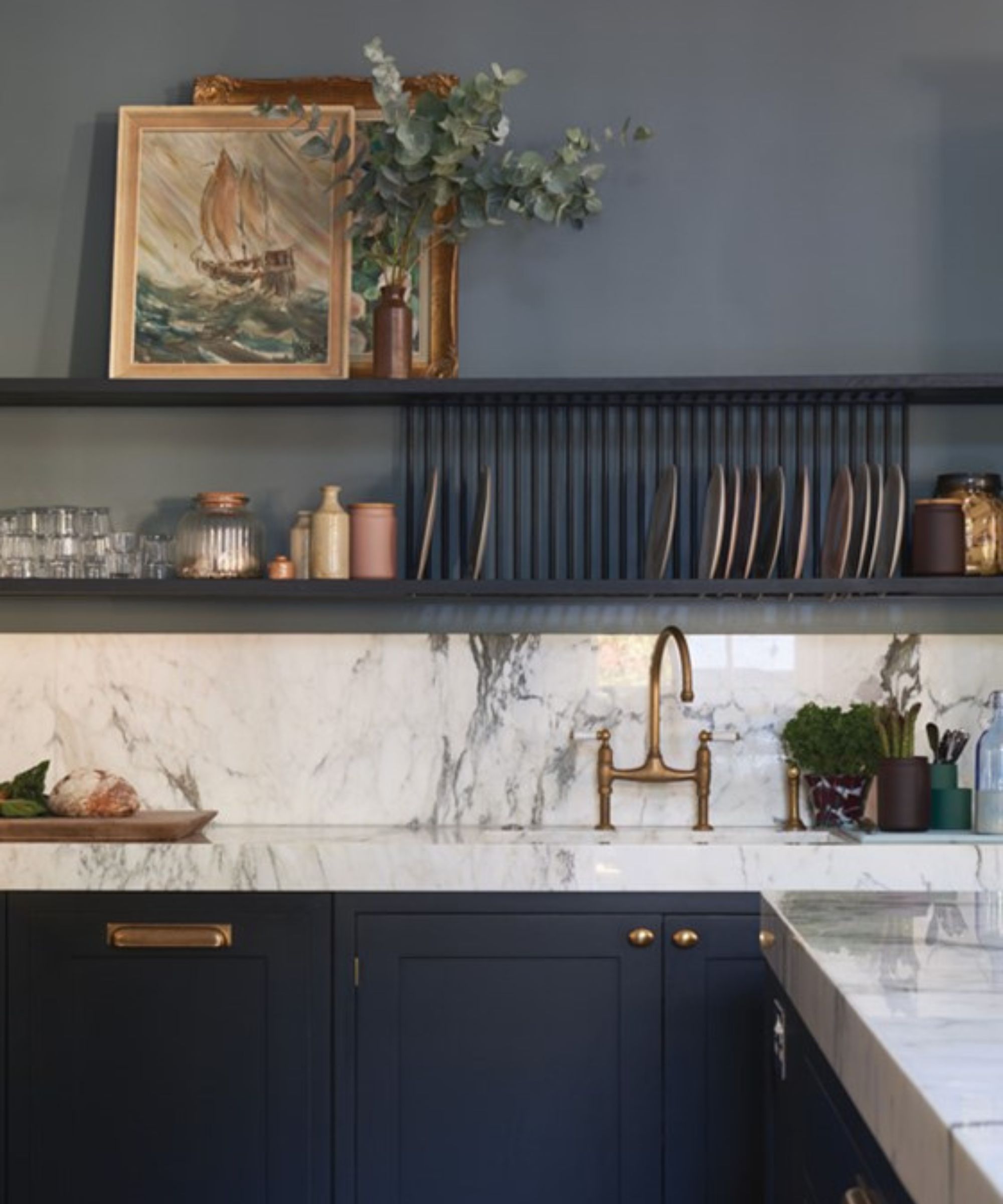
Another Farrow & Ball favorite, Off-Black is a gorgeous soft black. Less blue than Railings, this is more like a deep gray and is surprisingly warm too, far less harsh and far more useable than a true black. It also works really nicely as an accent shade for soft warm whites, as can be seen here in this kitchen color scheme. There's less of a stark contrast than there would be with a darker black.
'For those seeking a softer alternative to pure black, Farrow & Ball's "Off-Black" (No. 57) with warm undertones creates a cozy intimacy, explains Jennifer. 'Sherwin-Williams Urbane Bronze (SW 7048), a rich brown with gray undertones, imparts tranquility and sophistication, making it a favored choice for an earthy black alternative too.'
3. Ashland Slate, Benjamin Moore
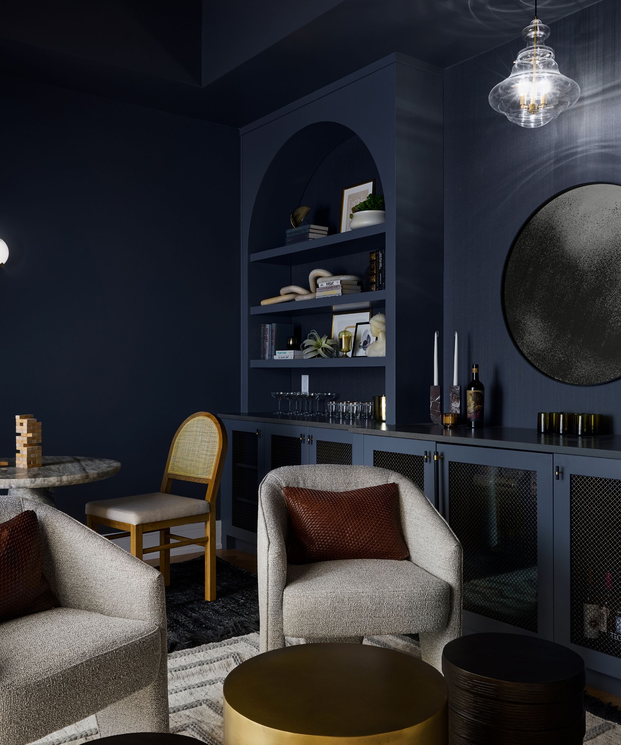
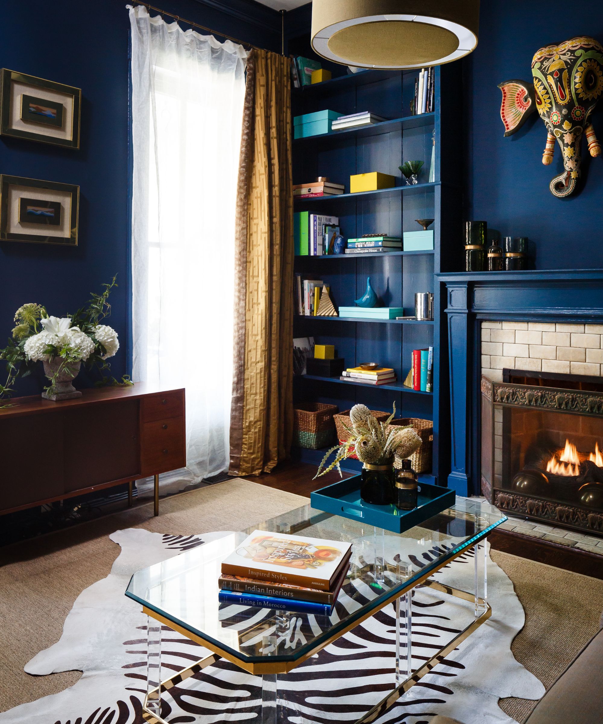
'Benjamin Moore Ashland Slate is a moody, medium gray with blue undertones. The cooler tones compliment warm, earthy colors, balancing a space out nicely which is important to do when making a room dark and bold.' explains Devon Wegman Design Director and Founder of DGI Design x Build.
This is key to a dark paint if you want to really soften the look and lean into that cozy feel - it needs to work with warmer, earthy neutral colors. See how in this space the super deep blue is balanced by soft greys, creams, and warm wooden and gold tones. It softens the dark walls and makes the whole room feel less overwhelming and more welcoming.
4. Inkwell, Sherwin Williams

'Inkwell by Sherwin Williams is a black paint color that enhances the warm and enveloping feel of a room with subtle blue undertones.' says Ginger Curtis, founder of Urbanology.
One similarity to note is that so many of these dark, almost black paints have slightly blue undertones. It makes them far less flat and intense, there's depth to the paint that prevents it from becoming too...black. When color drenching a room like this, you want to look for paints that have that a softness, so look out for blue or brown undertones that will just slightly tone down the intensity.
Pairing these super dark paints with softer colors and wooden accents works really well too. The wooden paneled ceiling and statement antique bed used in this black bedroom give the dramatic color scheme more of a rustic feel. Plus, you can really see here how darker paints can in fact make small rooms look bigger if you take them over every surface.
5. Black Forrest Green, Benjamin Moore
Dark green paints are having a moment right now. They are arguably the most usable of the darker colors since they have that very soft, earthy, natural feel that never feels overwhelming or overly dramatic. It's a surprisingly useable shade. Dark green is a very soothing, grounding color and works so well as a backdrop for warmer, lighter colors.
'Benjamin Moore's Black Forest Green is a rich and moody black with deep undertones of green that create a dramatic first impression, like when used here in the entry of the Urbanology Cottage.' explains Ginger.
Designer Kathy Kuo agrees that 'When it comes to dark interior paints - whether for an accent wall or for a full room - I love organic jewel tones like Benjamin Moore's Deep Sea Green, Slate Teal, and Hudson Bay. Colors that pull their essence from nature, but also offer the opulence of gemstones, exude the perfect combination of serenity and sophistication.'
6. Paean Black, Farrow & Ball
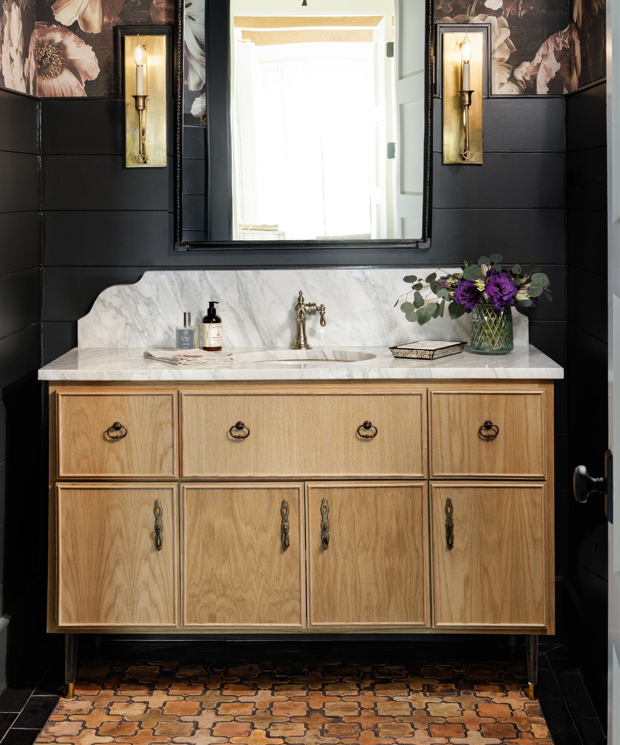
'For a moody statement, Farrow & Ball Paean Black is a good option. This classic color has a hint of red that gives it a touch of fun and glamour. This would look especially good in their high gloss,' suggests Eddie Maestri Principal Architect and Owner of Maestri Studio. 'I've also used Sherwin Williams Tricorn Black in several projects and love the bold statement and depth it brings to any space.'
And note how Paean Black works so well in this small powder room. Often it's light colors that are used for their space-expanding effects but dark paints can have that effect too. As Helen Shaw, Director of Marketing at Benjamin Moore explains, 'Some fear that adding a deep or bright color to a small space will make it appear claustrophobic, opting instead for light neutrals.'
'However, dark colors cleverly absorb the light, making the division between walls appear blurred. This ‘blurred edges’ effect adds depth and dimension to a room, making the space appear larger, rather than more cramped as some may fear.'
7. Gentleman's Gray, Benjamin Moore
'One of my all-time favorite dark paint colors is Gentleman's Gray by Benjamin Moore. It's more like a very dark teal, rather than a navy so it plays with all sorts of other, brighter colors beautifully, but looks so sophisticated while doing so.' explains designer Bethany Adams.
Decorating with jewel tones is becoming more and more popular as trends move away from 'safe' colors and neutral schemes to bolder palettes influenced by the rise in dopamine decor and creating homes that really reflect the owner's personality and style. Colors like deep teals, rich dark reds, and greens all might sound like brave shades but the outcome can be surprisingly liveable and sophisticated.
Choosing a dark paint isn't always straightforward. These more dramatic shades are a commitment so getting the right one is worth the trial and error. We'd recommend ordering plenty of samples to see how these colors look in situ and consider what other colors you want to bring into the space to balance out the drama.
The rooms you pick to paint should be considered too. Darker paints work so well in small spaces like powder rooms, small living rooms, snugs, and guest bedrooms. But you also might want to consider them for rooms that you want atmosphere like a dining room or a more formal living area. And of course, we all know that these darker shades are classic kitchen cabinet colors too.