With the rapid development of technology, people might easily assume that maps are gradually disappearing. However, they are still thriving in the digital age, only in a more refreshed and advanced form. Some are even transformed to keep us updated with population density or what the Earth will look like in millions of years.
As a result, the World Wide Web is full of interesting and captivating maps that teach us something new and expand the way we see the world. Eager to share them with you, Bored Panda has collected the best ones that might make you see things from a different perspective. To find them, all you have to do is scroll down!
While you’re busy admiring them, don’t forget to check out a conversation with map enthusiast, artist, and cartographer Anton Thomas, who kindly agreed to answer some of our questions about all things maps.
#1 Occupied Bald Eagle Nests In Wisconsin. 1974 vs. 2019. Growth Credited To The Clean Water Act
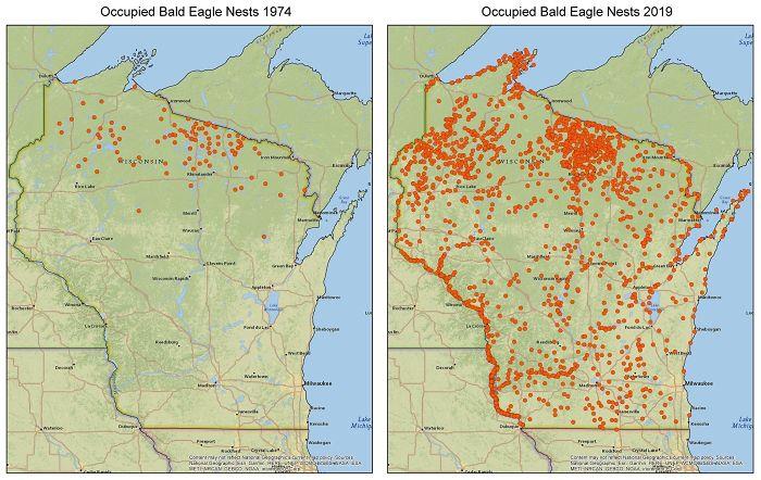
Image credits: zstahowiak
#2 To Increase Local Tourism, Lithuania Has Made A Map With Magnets That You Can Only Find In Corresponding Cities
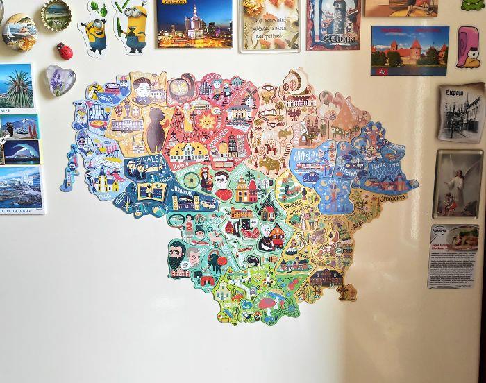
Image credits: greycoconut
#3 This Is My Wedding Gift To My Wife
We get married next Sunday. I used a woodburning kit to burn a map of all the states we have visited as a couple. We both love to travel and backpack do I want to to keep adding to it as we get older.
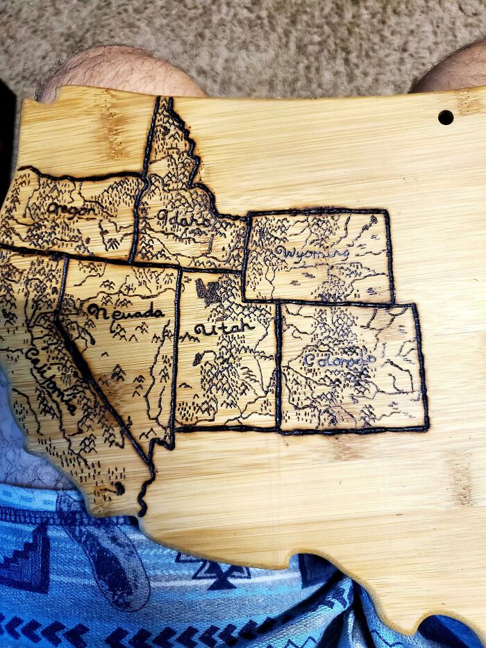
Image credits: Doofinx
Anton Thomas’ approach to maps is one of the most unique and beautiful ones out there. The Australia-based artist hand-draws them in meticulous detail with only a pen and colored pencils. His giant map of North America took him nearly 5 years to complete and was recognized as one of the best maps of 2016 by National Geographic.
Naturally, we were curious to know what initially sparked his interest in them. He told us, “I was born and raised in New Zealand's South Island, surrounded by beautiful landscapes. This geography influenced my love of maps.
The places around us were so interesting, so rich in mood, emotion, and grandeur. I would see fictional fantasy maps in books or video games, and I loved the way geography was displayed so expressively. But then I would look outside at New Zealand, and realise I was somewhere far more amazing than fantasy. And it was all real!
From childhood, maps helped me understand reality, fall in love with the world, and instill a sense of adventure. And combining maps with illustration was a bridge between science, art, and storytelling.”
#4 An Image Of GPS Tracking Of Multiple Wolves In Six Different Packs Around Voyageurs National Park Shows How Much The Wolf Packs Avoid Each Other's Range
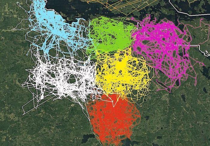
Image credits: john3806
#5 The Baltic Way. On 23 August 1989, Two Million People Joined Their Hands To Form A Human Chain Spanning 675.5 Km Across The Three Baltic States
The protest was against the Soviet occupation, and to support the independence movements of the three States (2014).
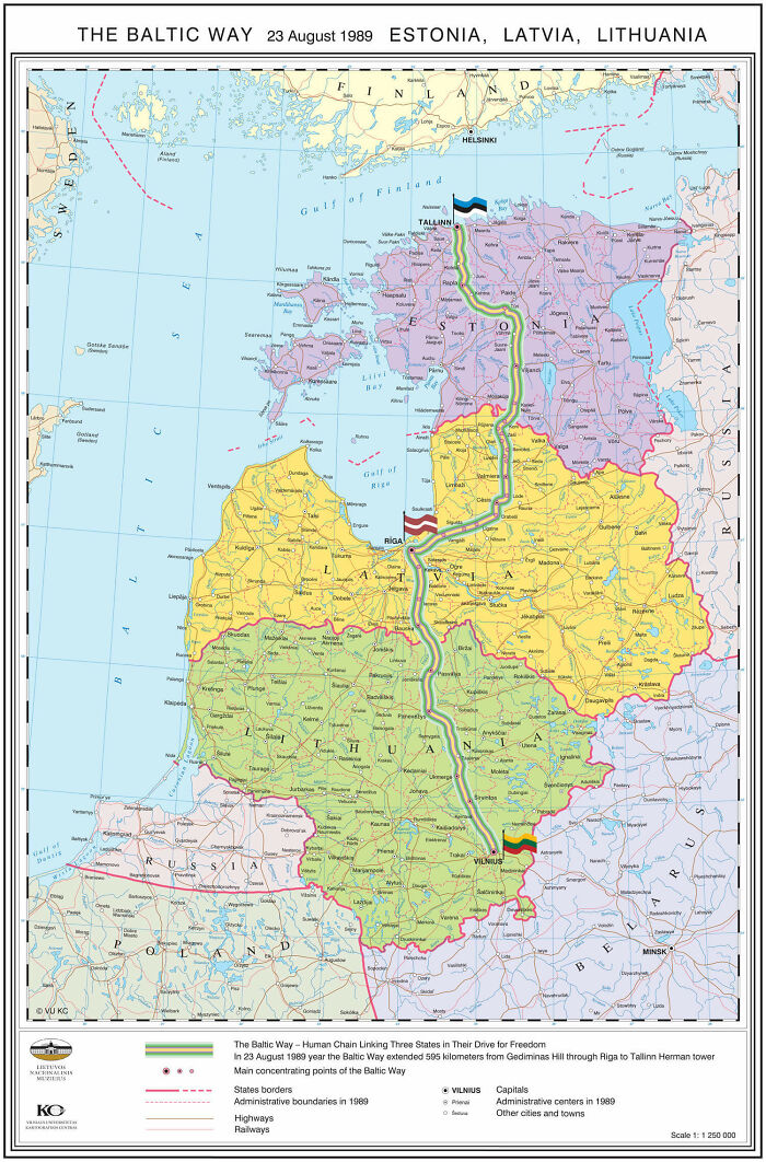
Image credits: SteO153
#6 Map Of Regional Rug Patterns Of Iran
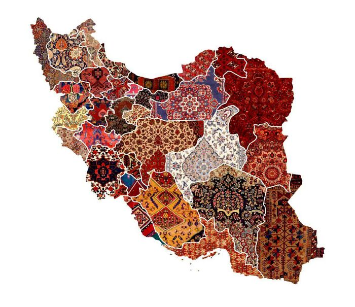
Image credits: knownothingwiseguy
What inspires his distinct method of cartography is a love for the vast planet and all the amazing places it holds. Therefore, he strives to create maps that give off the feeling of what it’s like to be at a certain location. “Maps allow you to show this at any scale, and art allows you to bring it to life,” he adds.
Even though his maps are known for their illustrations, he’s passionate about ensuring their graphic accuracy as well. He tells us, “I want to create artistic maps that are also great educational resources. I believe art is one of the best ways to communicate science, so about 30% of my labor is pure research. When preparing a new map, I will first choose a projection - then trace that outline accurately on the drawing paper.
#7 There Is A Lake In Finland, That Looks Like Finland
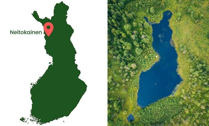
Image credits: Inutilmono
#8 This Is Awesome
Image credits: Physical-Order
#9 The United States Of America: Alaskan Perspective
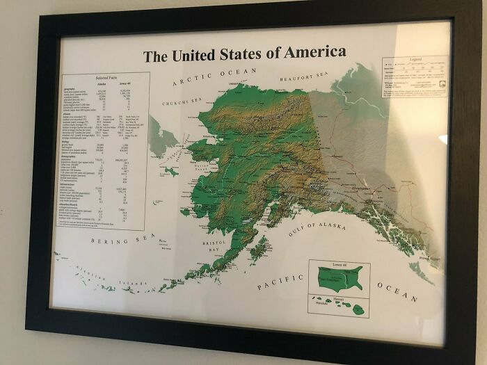
Image credits: Pariahdog119
Taking his ‘Wild World’ map of nature as an example (which took three years), he further shares its creation process. “I chose the Natural Earth projection, printed a high-resolution base map at the drawing size, then stapled it to the back of the art paper. I then traced all the coastlines, rivers, and mountain ranges with a light pad (a tracing tool).”
When the framework is completed, he then goes region by region, continent by continent, researching and learning about the wildlife and physical geography of each place. “Our world is so complex, so filled with information, that a cartographer's job is often to choose what NOT to draw. What to omit. So it's helpful to have rules and conventions with each map, to help select the data and stories you wish to tell. Once you create these guidelines and filter out some of the noise, it's easier to see your creative opportunities,” Thomas says.
#10 Hello! I Cross Stitch Earth Science Maps And Have Been Told They Belong Here. Great Lakes Bathymetry Is My Favorite So Far
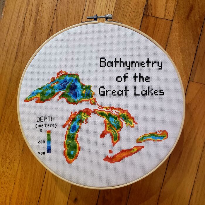
Image credits: blondeboxshell
#11 My Great Grandpa Drew This Map Of Africa In The 1910’s. Thought You All Might Like It
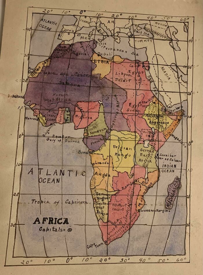
Image credits: zherper
#12 The Earth Being Centered On Great Britain Is Arbitrary, So Here's A Map Centered On New Zealand
Image credits: ParadoxicalCabbage
We were also interested to know what he thought about the future of maps. He told us, “Maps are much more fundamental to our lives than we realise. Billions of us use map apps, daily. The entire field of health & medicine is across a map of the human anatomy. As long as there are different elements across a space that need representation, there will be maps.”
Even in the hypothetical world where everything would be managed by AI and there would be no need for humans to create cartographies, Thomas believes that they will retain their aesthetic, historical, and storytelling value. “We did not stop painting when the camera was invented,” he adds.
#13 To Combat The Threat Of Desertification Of The Sahel (The Region Immediately To The South Of The Sahara)
The African Union is leading an initiative to plant the Great Green Wall, a 7,775 km (4,830 mi) belt of trees crossing the entire breadth of north Africa.
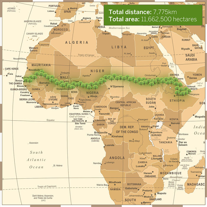
Image credits: InkyScrolls
#14 Existence Of Pangaea Proven With Evidence Of Similar Fossils Across Continents
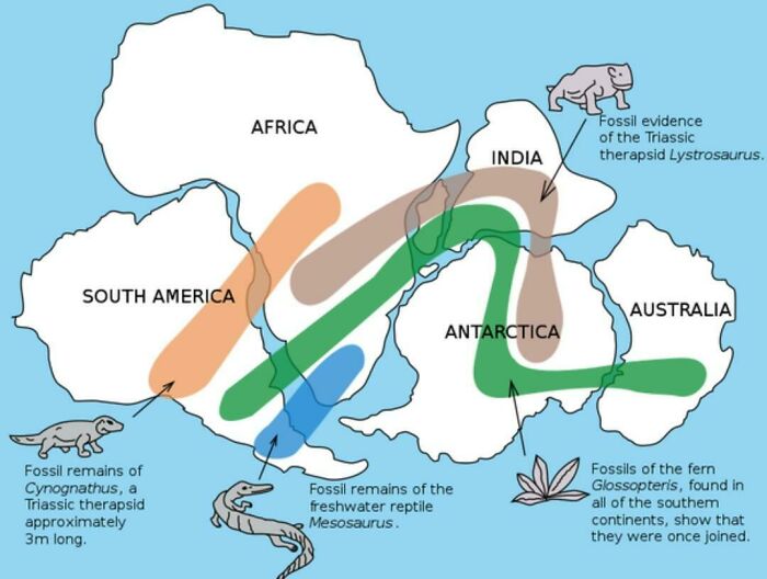
Image credits: No_Woodpecker259
#15 Tracking Of An Eagle Over A 20 Year Period
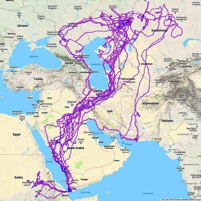
Image credits: HDeo950
“This has already been proven to be true,” he further explains. “Just look at the transition in recent decades: we no longer have to unfold road maps to plan a trip, running a finger along roads, trying to remember turnoffs. We simply enter an address in our phone and press Go.
Yet the demand for wall maps has actually become stronger. Why? Because maps are not simply tools or niche curiosities, they are one of the most fundamental methods of storytelling and communication we have. We yearn for their breadth and depth and beauty. Just think: in how many art forms can you display the whole world (albeit simplified)? We love maps because they tell the story of places, and places are fundamental to who we are.”
#16 Light Blue Is A Map As We Know It And Dark Blue Is The Actual Size Of Each Country
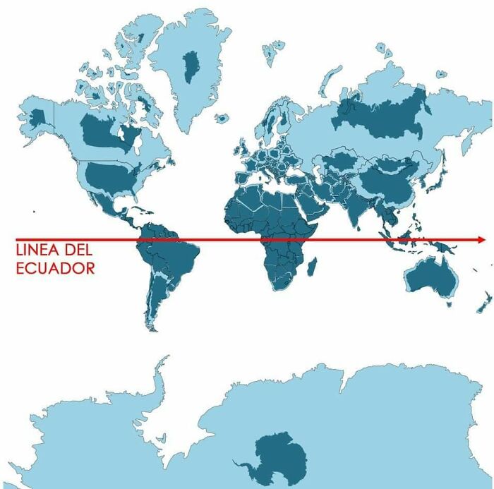
Image credits: aisbosseth
#17 A Map Of Finland's Bear Population, Made Up Of Bears
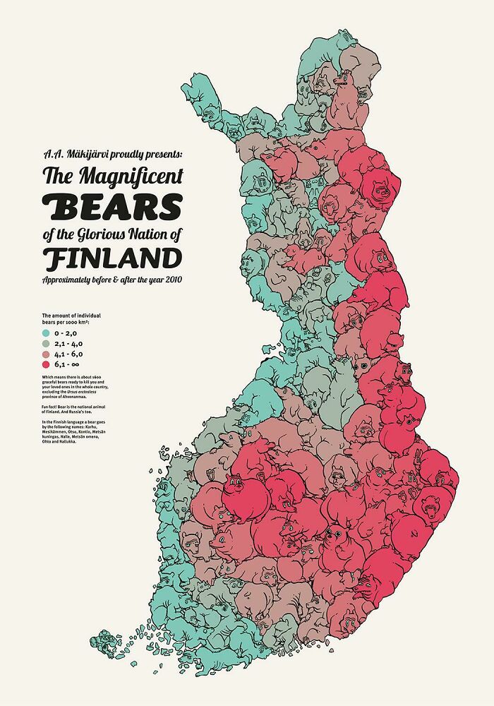
Image credits: Asmodeane
#18 When A Band Announces A World Tour
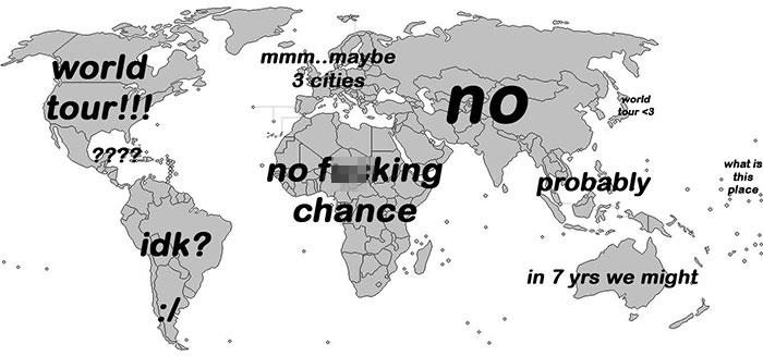
Image credits: esloubro
Nowadays, with the right tools, maps can be manipulated to present any information, which makes them that much more interesting and multifunctional. The majority of the maps we see on this list are cartograms that use some statistical data, such as population, survey results, or natural phenomena, and combine it with geographical location.
While regular or topographical maps prioritize geographical accuracy in terms of shape, size, and location, cartograms rescale map regions to statistical data and try to maintain geographical features as far as possible. Besides, they are a powerful tool for presenting information effectively and raising awareness of important issues like substance abuse or world poverty.
Since they combine statistical and geographical information, they can also provide insight into patterns and trends in the world around us. Combining this with their aesthetic appeal makes them a great supplement for information in newspapers, magazines, and textbooks.
#19 World Map Mural
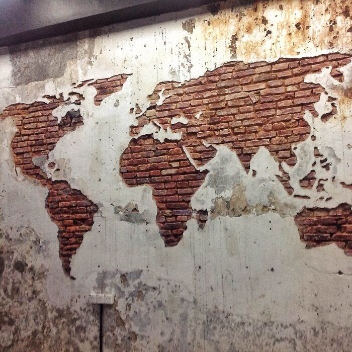
Image credits: eveildancer
#20 List Of Countries Mentioned Or Referred In The Bible
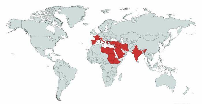
Image credits: Erik_John09
#21 No One Lives In The Green Part Of New Zealand,the Population Density There Is 0 People Per Km And That Is About 78% Of New Zealand Land
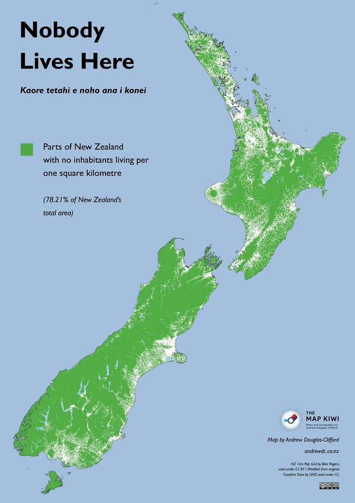
Image credits: Felixheifgwofbebrjwh
This kind of visualization has been used for many years, with the first reference to it dating back to at least 1870. The first specimen of its kind was published in 1876 by French statistician and geographer Pierre Émile Levasseur, who created a series of maps representing European countries as squares. They were sized and arranged in order according to their area, population, and even national budget.
He created them as teaching aids, helping children realize the size of countries and their certain characteristics. However, his technique wasn’t able to catch on, and only a few similar maps appeared in many years. The following notable development was made by Hermann Haack and Hugo Weichel, who presented election results for the German Reichstag in 1988. This time, creations alike soon emerged in the US, where they were introduced in the popular media after 1911.
#22 Rivers Of Italy
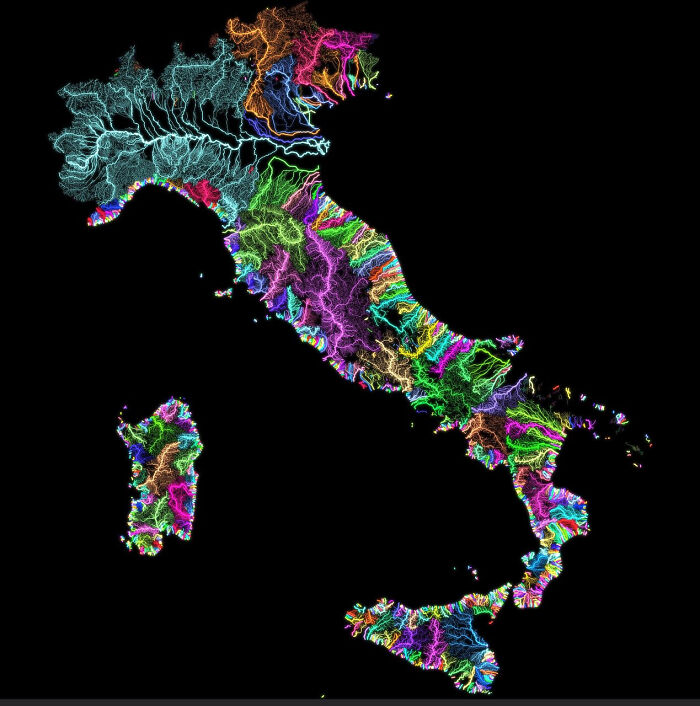
Image credits: JoeFalchetto
#23 Countries Which Offer Paid Maternity Leave And The Time They Provide For Expecting Mothers
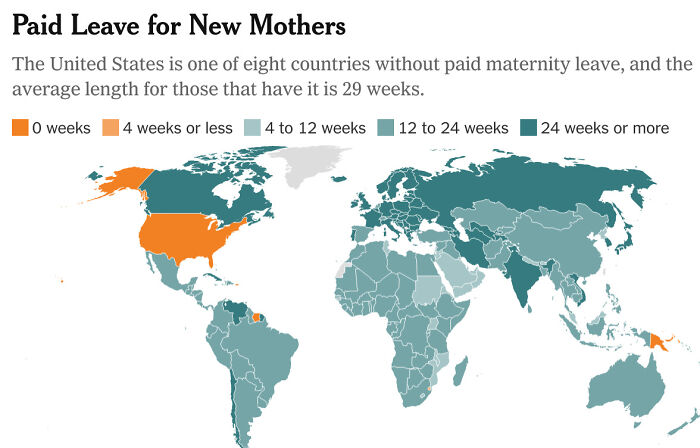
Image credits: No_Negotiation_7176
#24 Japan, How Big It Is In Reality?
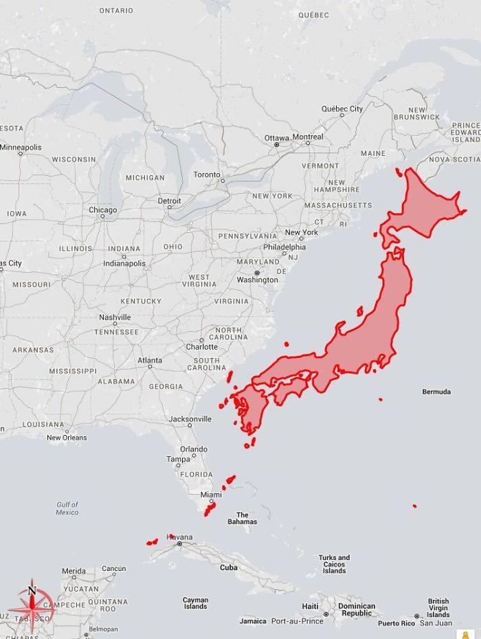
Image credits: c0urso
The biggest challenge in producing them has always been drawing distorted shapes, which encouraged people to develop computer software to automate this process. Waldo R. Tobler invented one of the first algorithms in 1963, and since then, a wide variety of them has emerged. Before his work, cartograms were created by hand.
#25 Concentration Of Castles In Europe
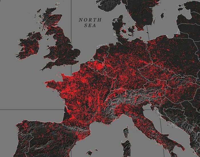
Image credits: MardukSyria
#26 Size Comparison Between Australia And The United States
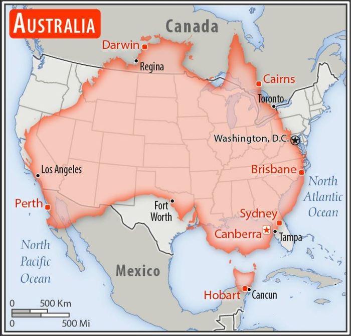
Image credits: AJgloe
#27 After Tokyo 2020 This Map Remains The Same. All Men’s Water Polo Gold Medal Winners Since 2000 Were Born Inside This Circle
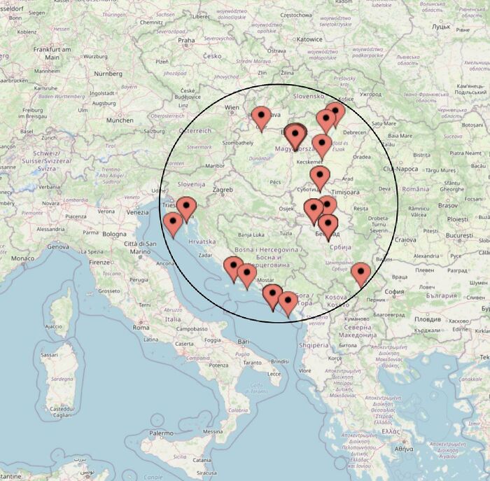
Image credits: ASR004
While a geographical map is helpful when you want to find your way around the world, a cartogram allows us to take a closer look at the inhabitants, natural phenomena, or language of a place—a side of it we might easily miss.
Eager for more magnificent maps? Make sure to check out our previous publications featuring informative and unusual maps as well as maps that portray lesser-known facts about America.
#28 3D Render Topographic Map Of Europe
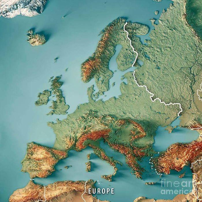
Image credits: reddit.com
#29 Wolf Distribution In Italy From 1900 To 2020
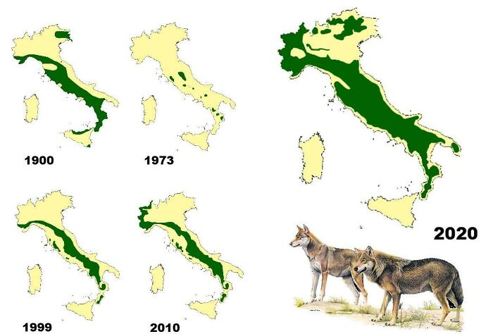
Image credits: Risingmagpie
#30 World Map Cantered On Antarctica
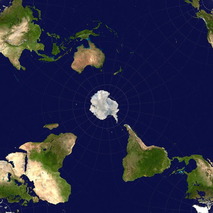
Image credits: axeman_05
#31 Where Penguins Are Found Naturally In The World
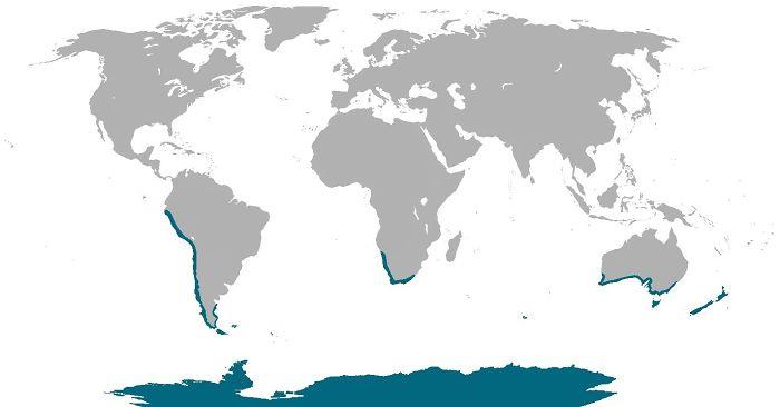
Image credits: cheeseface35
#32 Each Section Has 10% Of The World's Population
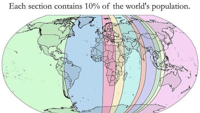
Image credits: AppleBiryani
#33 US Watersheds
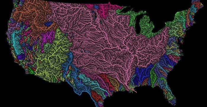
Image credits: MrAllOrNothing
#34 Cheese Map Of Europe
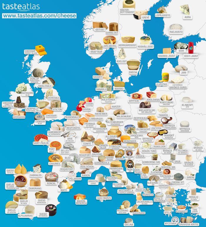
Image credits: dazzledvulture
#35 The Longest Possible Train Travel In The World
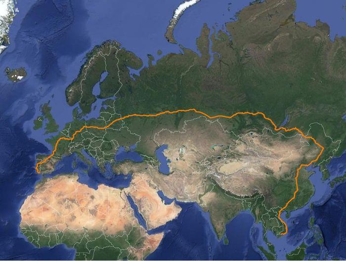
Image credits: matias90
#36 Land Reclamation In The Netherlands
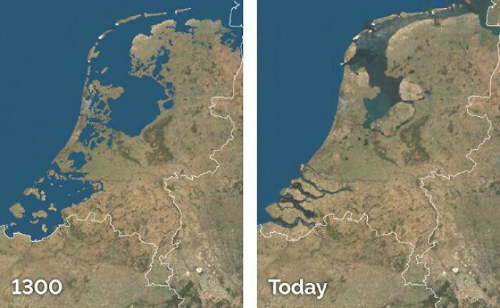
Image credits: Wrub229
#37 Map Of Most Photographed Places In The World
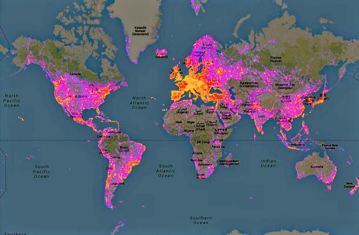
Image credits: the-70s-kid
#38 United States Elevation Map
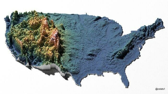
Image credits: blntdfam
#39 Most Commonly Spoken Language In The Us After English And Spanish
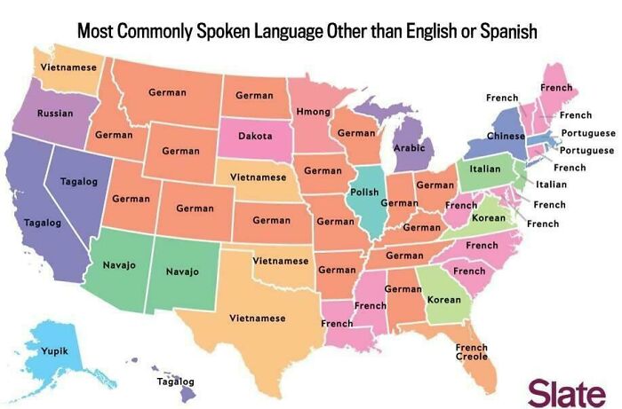
Image credits: AlpineEsel
#40 50 Percent Of Canadians Live South Of The Red Line
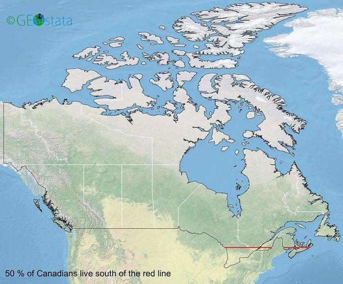
Image credits: midlleeastcelts
#41 Abstract World Map
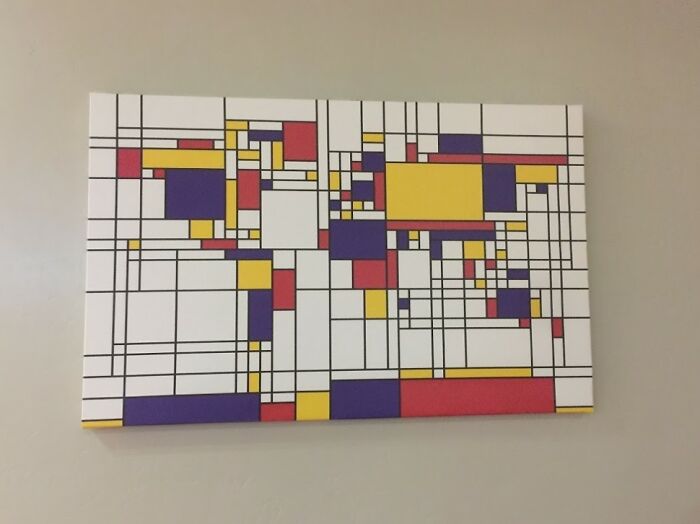
Image credits: CHWDP_2137
#42 United Kingdom
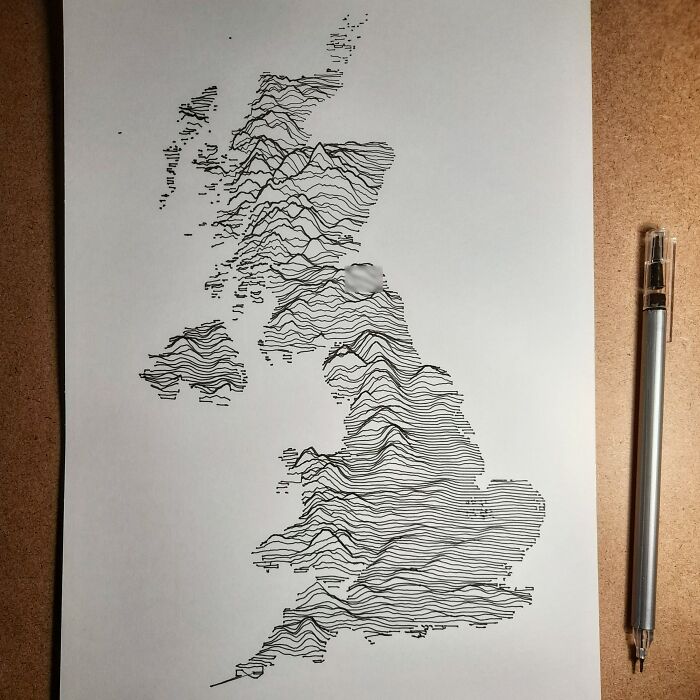
Image credits: orialairo
#43 Europe Used To Look Like This, Before It United
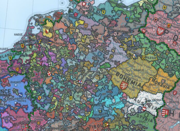
Image credits: Over9000Holland
#44 Tree Cover Map Of The Us
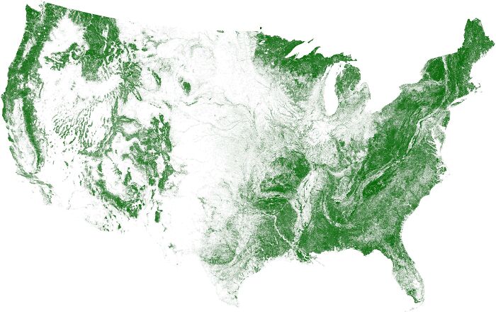
Image credits: DrWendigo
#45 The Topography Of The Roman Empire, Ad 117
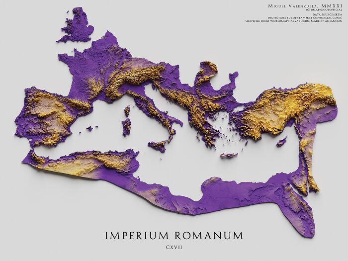
Image credits: boytutoy