It’s no surprise that white has long been the default color for kitchens. However, with changing times and more modern interiors, designers suggest it may be time to move away from this conventional choice. Other shades not only elevate the look of the room but also offer far greater practicality and ease of maintenance.
Yes, while white may seem like a safe, go-to tone, it's a kitchen color going out of style in 2025. Stains, marks, and scuffs show up easily on this shade, not to mention that it can make a space feel rather vanilla, especially in a utilitarian room like the kitchen.
There are several more interesting options to consider for kitchen walls. Deeper tones are ideal for those looking to inject personality while making cleaning a breeze, while warmer off-white hues can imbue the space with coziness — without feeling over the top.
1. It Shows Stains
Of course, white kitchens have always been a classic choice, but several issues come with this clean, sterile hue. One of the biggest drawbacks is how unforgiving it is when it comes to daily wear and tear. “Every fingerprint, splash of sauce, or dust particle stands out, making regular cleaning essential,” says Lindsay Olson, principal and founder of Lulu Designs. “Over time, white surfaces can also yellow or discolor due to sunlight, cooking oils, and moisture.”
If yours is a busy household with kids and pets, or multiple cooks making the kitchen a hotspot for splashes and messes, it might be a good idea to switch to darker tones. A black kitchen or gray kitchen could suit your needs better—and even make the space feel more modern.
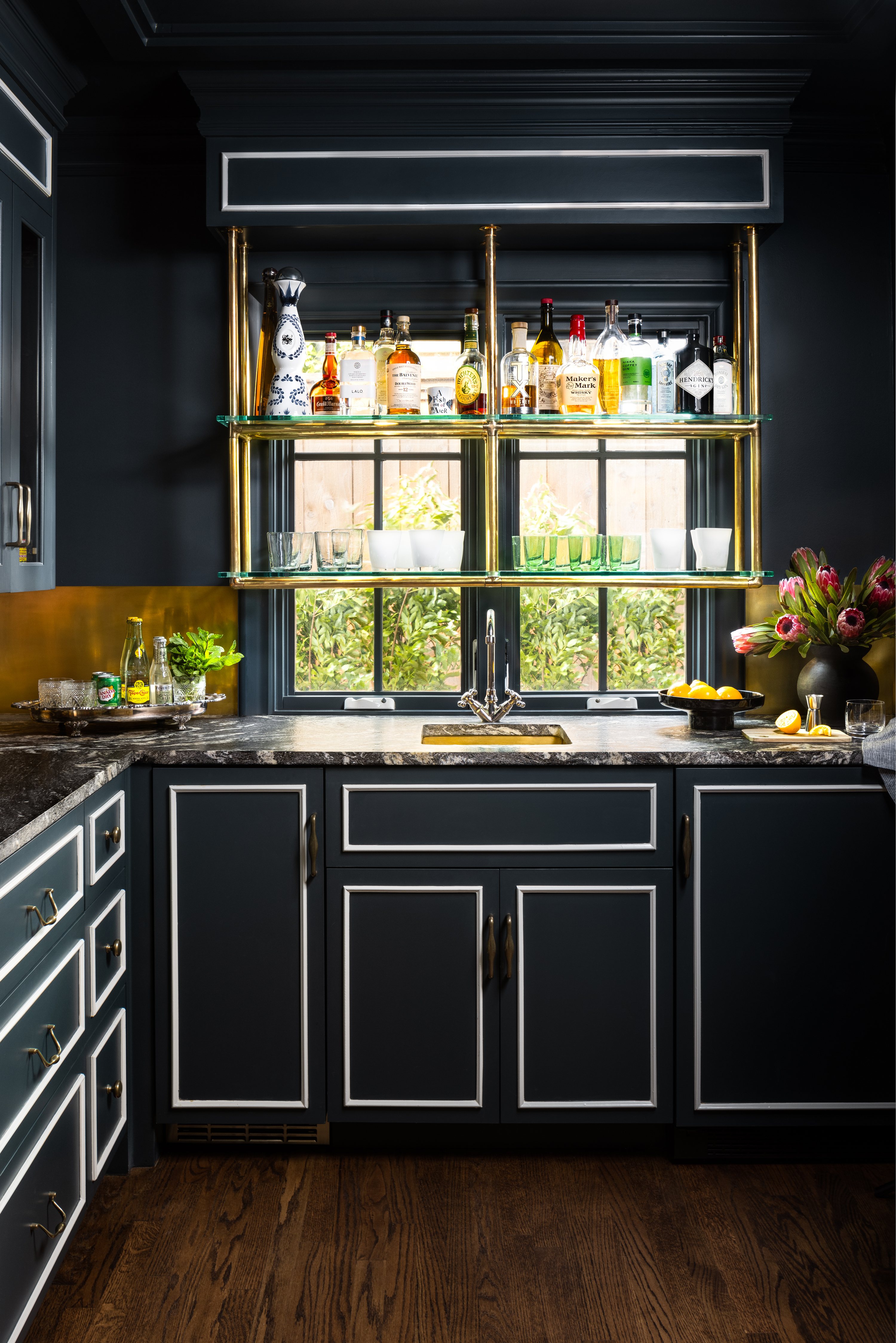
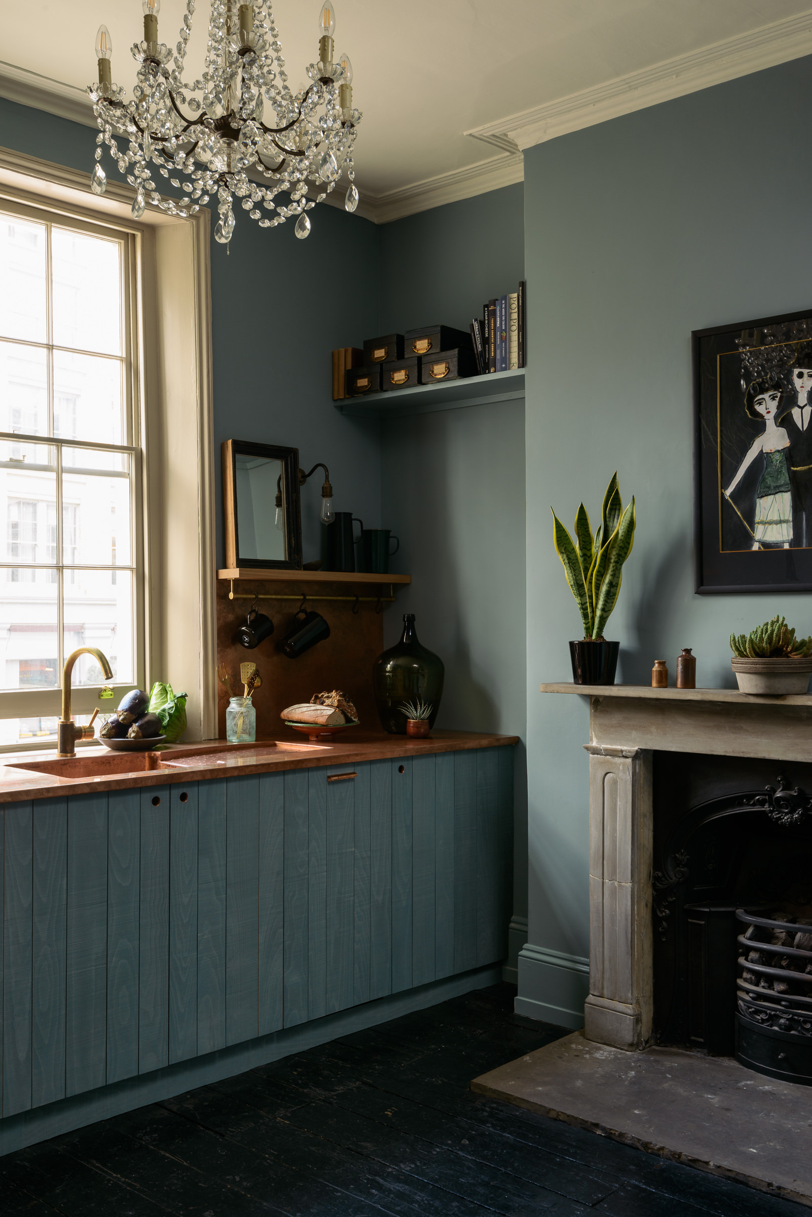
“In this kitchen, the color scheme was all about drama and mood—rich, dark cabinetry with crisp contrast trim, punctuated by polished brass and glowing glass,” shares Eddie Maestri of Maestri Studio. “It channels the timeless elegance of an old-world hotel bar, with just enough boldness to feel fresh and unforgettable. We wanted the space to feel like a destination within the home.”
Price: £63/2.5L in Modern Emulsion
This Georgian-inspired, red-based black paint color pays homage to the rich hue of old leather hymnals, traditionally used for songs of praise and paeans. The Modern Emulsion finish is ultra-durable, easy-to-clean, washable, and mould-resistant.
Price: £45/2.5L in Matt
A refined charcoal gray with subtle blue undertones, the paint brings a sense of quiet luxury to any space. Its soft, matte finish enhances the color’s depth, creating a rich yet calming atmosphere.
Price: £56/2.5 L for Matt Emulsion
Firework captures the quiet intensity of a bonfire night after the last sparks have faded, leaving behind a smoky, inky sky. This deep, elegant navy lends a bold, contemporary edge to interiors.
2. White Can Look Too Cold and Stark
“While white can make a kitchen feel open and airy, it can also tip into feeling cold or clinical, especially if the shade is too stark or if the space lacks warmth from other elements,” says Lindsay. “Without the right balance, a white kitchen can lack the inviting, lived-in quality many homeowners desire.”
Also, white can be too much of a contrast with other kitchen cabinet colors. "The biggest challenge I see with using white paint in a kitchen is the subtle—but—often jarring disconnect that happens when you pair it with other white elements, like cabinetry or a backsplash,” says Hannah Goldberg, founder of Hannah Charlotte Interiors. “Whites are rarely created equal; they all carry distinct undertones, from cool blue-grays to warm creams. When these variations sit side by side, even a slight mismatch becomes glaringly obvious. Instead of a crisp, cohesive look, the space can end up feeling off—like something is visually clashing, but you can’t quite put your finger on it. It undermines the harmony we strive for in a well-designed kitchen.”
Instead, there are plenty of interesting kitchen color ideas to experiment with. “From a designer’s perspective, I find that certain color palettes are more forgiving and timeless than stark white,” continues Lindsay. “Muted greens, taupes, and warm grays are increasingly popular for their ability to create a cozy, grounded atmosphere. They’re also less likely to show every smudge or stain. Soft blues, greens, and even gentle yellows can bring personality and warmth without overwhelming the space or feeling dated.”
“A soft minky brown-grey is a wonderfully chic color to pick for a kitchen, as it feels less harsh than a standard grey and works well in both contemporary and period interiors,” adds Helen Parker, creative director of deVOL. “It’s also easy to pair with rich dark reds and greens, or more muted pinks and browns.”
3. White Walls Look Boring
While white is available in several shades and variations, it can still feel quite vanilla, especially as modern homes increasingly embrace color and bold patterns, even in the kitchen. From a beautiful two tone kitchen to layered palettes, there are countless ways to elevate this space’s aesthetic.
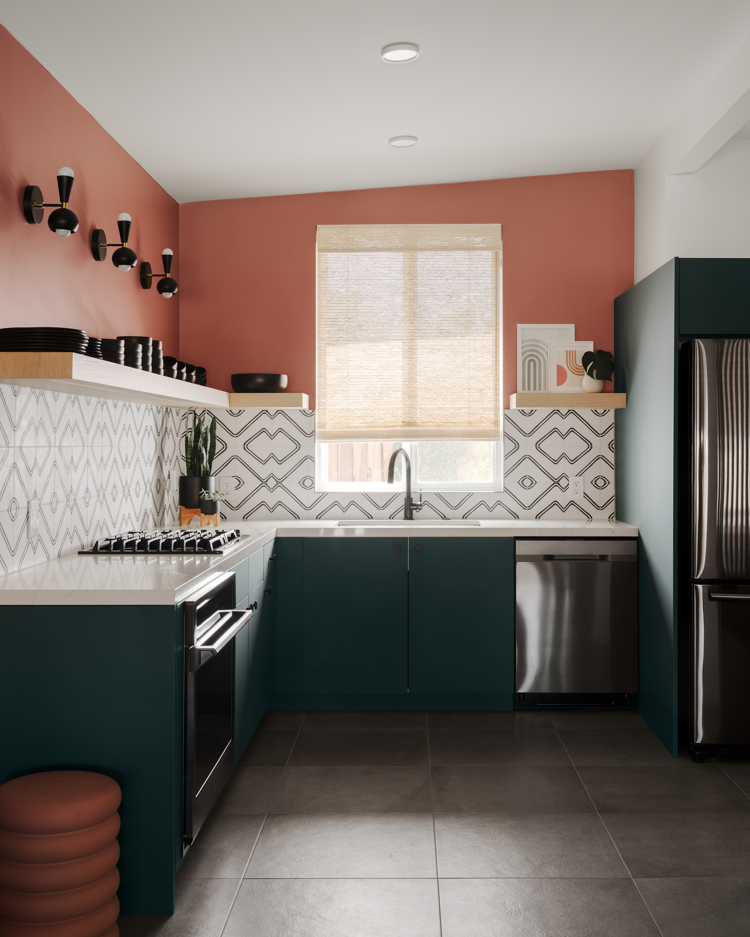
Many designers encourage homeowners to embrace bold tones on kitchen walls—whether bright and vibrant or deep and earthy—to make the space more dynamic. “For this kitchen, I wanted a color with a contrasting warm tone that connected to terra cotta, which is authentically Spanish and tied to the property's architecture,” says Michelle Boudreau of Michelle Boudreau Design. "Here I used Terra Rosa DE 5096 from Dunn-Edwards."
4. It can Make the Kitchen Feel Too Bright
Another important factor to consider is how white reacts to lighting. Extremely white walls, when paired with typical kitchen lighting, can create an uncomfortable glare.
“Natural light is a double-edged sword in white kitchens,” warns Lindsay Olson of Lulu Designs. “It can make the space feel bright and cheerful, but too much direct sunlight can create harsh glare and even speed up the yellowing or fading of white paint. The orientation of your kitchen and the size of your windows will influence how white appears throughout the day. The type and temperature of artificial lighting also dramatically affect how white reads in a space. Warm bulbs can give white a creamy, cozy feel, while cool LEDs can make it look crisp—or even stark.”
Even the color temperature of the lighting can alter how white appears. “A warm light (2700K) will pull the yellows from an already warm white, while a cool white light (4000–5000K) will accentuate any blue undertones in white paint,” says designer Hannah.
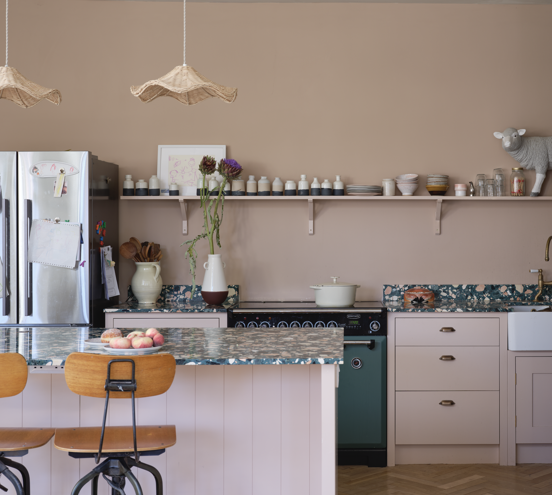
With this in mind, it's often better to opt for a kitchen color scheme that feels warm and absorbs light in a way that keeps the room well-illuminated but not overly bright. “A good idea may be to embrace pink,” says Patrick O'Donnell, Brand Ambassador of Farrow & Ball. “Avoid a candy pink in favor of something more gentle and nuanced—something slightly browner and more earthy. Setting Plaster offers a delicate dose of warmth, adding softness to any stone elements. For a splash of drama, add an island in our blackest blue, Railings, which introduces a modern note and acts as a focal point.”
And if you’re truly set on white, Lindsay suggests opting for off-white shades with subtle undertones—think ivory, cream, or greige—that bring warmth and depth, making the kitchen feel more inviting and less clinical.
5. It's Difficult to Maintain White Walls
And finally, a major reason not to paint your kitchen walls white is the challenge of maintaining that crisp whiteness. Over time, white walls are prone to yellowing and staining. What’s worse is if your paint finish doesn’t allow for easy cleaning with a damp cloth.
“If you’re not prepared for a bit of extra maintenance, white might not be your best friend,” advises Lindsay. “High-gloss finishes amplify this effect, so I often recommend matte or satin finishes to soften reflections.”
Patrick suggests using Modern Emulsion paints. “Ours are protected against mold, making them an ideal choice for moisture-prone areas such as kitchens and bathrooms. Not only that, they’re fully washable and scuff-proof—perfect for handling everyday mess.”
FAQs
Why Has White Become Unpopular in Kitchens?
White kitchens are no longer the default choice for modern homes. Their pristine appearance comes at a cost — white walls and surfaces easily show dirt, stains, and wear, requiring constant upkeep. Under certain lighting, they can also appear stark or overly bright, creating a sterile atmosphere. Today’s many designers suggest warmer, more expressive color palettes that bring personality and softness into the space. Earthy tones, soft neutrals, and deeper hues offer a more inviting, forgiving backdrop that hides everyday mess and feels richer and more relaxed.
White kitchen walls may seem timeless, but they’re high-maintenance, prone to glare, and quick to show stains and discoloration. Instead, opt for warmer tones like taupe, muted greens, or earthy pinks, which add character and hide everyday mess. Choose washable, matte or satin finishes for a softer, more practical and inviting look.