Kitchen countertop colors tend to be a little more timeless than most, but over years, we still see trends come and go.
Some kitchen worktop colors are overused, others just don't vibe with the other styles coming to the forefront in kitchen design.
So, which colors are kitchen designers turning their back on? As well as which colors they're avoiding, they've also pointed us in the direction of the countertop colors they'd choose to use instead. It's not just about trends; the experts are helping us move towards timeless, beautiful finishes. So you won't have to discover your kitchen is outdated again in five years.
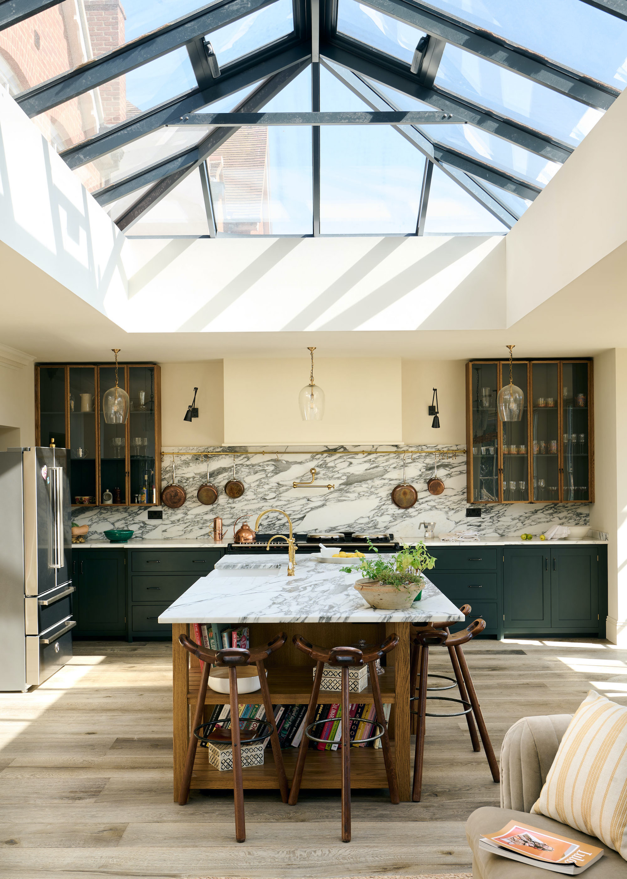
1. Dark, Heavy Tones
"Worktops in dark, heavy colors — particularly deep browns and blacks — are starting to feel outdated, especially when paired with high-gloss finishes," says Jonathan Middel, senior designer at Roundhouse.
While there is a certain appeal to the moody, dark color schemes that were so popular in kitchens of the early 2000s, nowadays, they can feel slightly too heavy. "These surfaces can make a kitchen feel closed in and tend to dominate the space, rather than complementing the overall design," Jonathan explains.
Although, of course, this often depends on the context of your space. In kitchens with large windows and plenty of light, a darker counter can appear more balanced. As Jonathan says, "Much of it comes down to the architectural context of the kitchen — particularly the amount of natural light in the space. Many clients don’t have an abundance of natural light in their kitchens, and dark, glossy surfaces can absorb what little there is, making the room feel smaller and more enclosed."
Rachel Davis, a senior designer at Harvey Jones, agrees with Jonathan's point of view and tells me, "We're seeing a clear shift in worktop preferences away from high-gloss blacks and heavily speckled browns toward softer, matte finishes and warm neutral. What matters most is how the surface will serve you on a day-to-day basis."
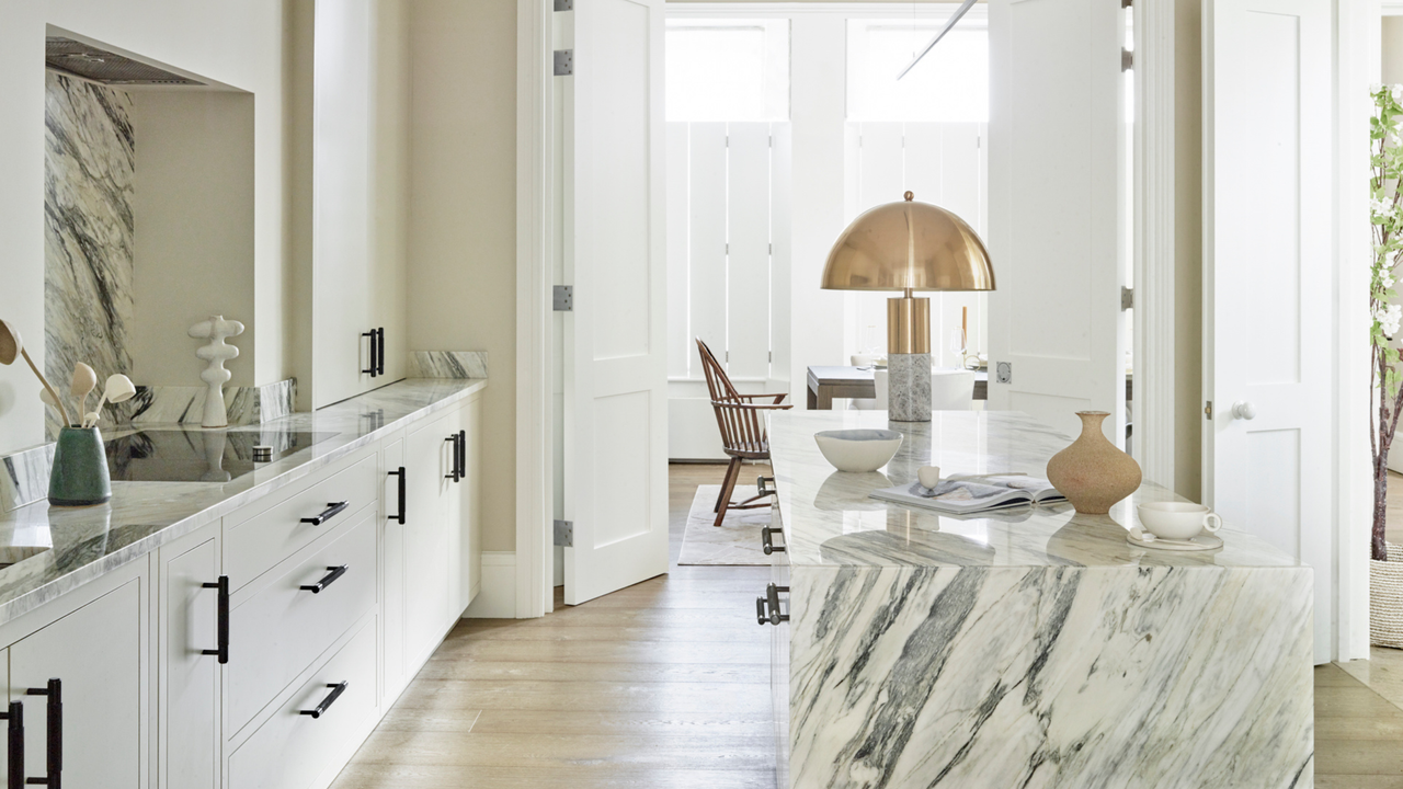
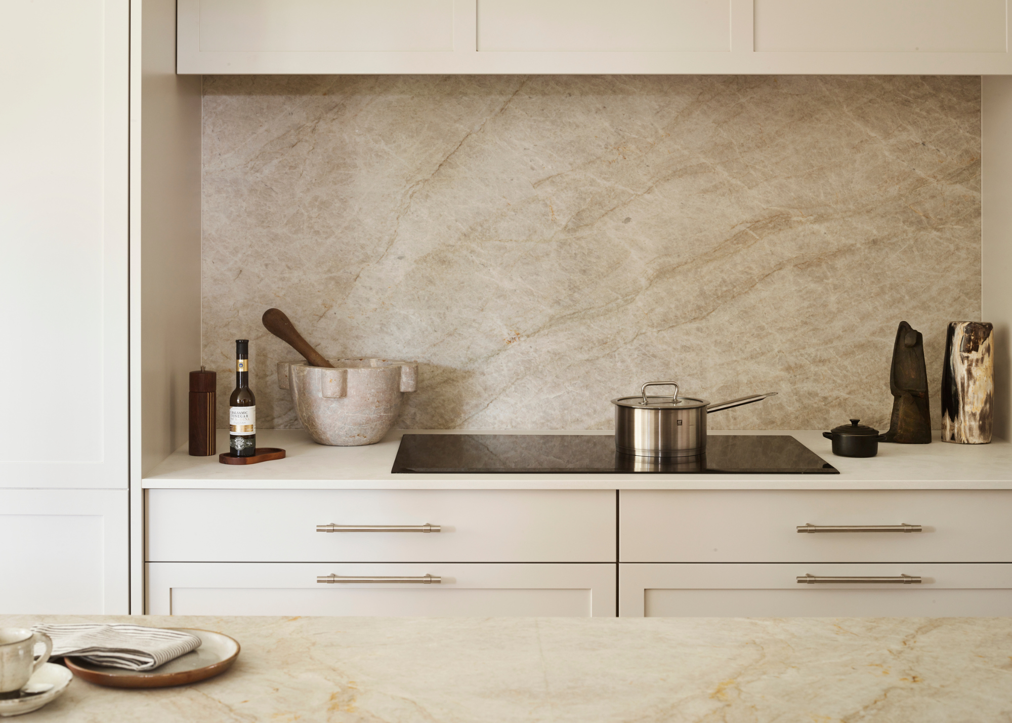
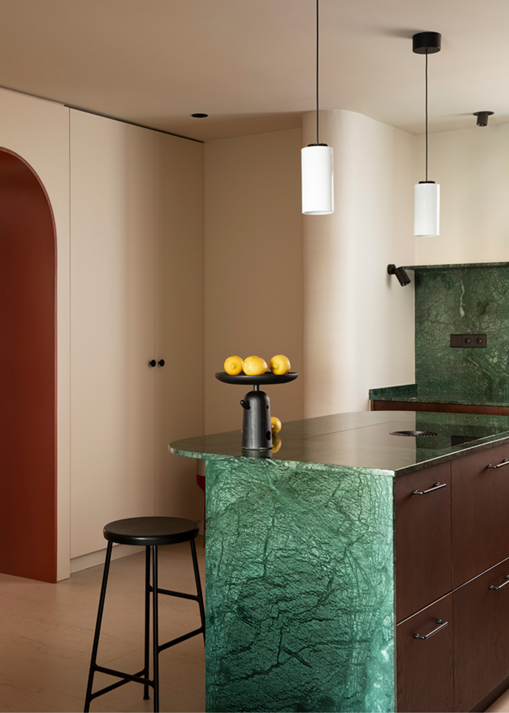
2. Cold Grays
Over the past few years, there has been a clear shift toward warmer, earthy tones. Meaning your cool, stark gray counter has been left in the dark, now thoroughly and decidedly out of style.
As Simon Mayhew, founder and interior designer at TXTURED, says, "Gray countertops tend to feel flat and cold, lacking the warmth and character that people are now drawn to."
In comparison to the highly textured look of terrazzo counters or the warmth of popular stones like rosso levanto marble, these flat, cold counters seem exactly that, flat and cold. People are, instead, looking for more characterful finishes.
3. Full Wooden Runs
"Butcher block counters had their farmhouse-chic heyday, but as a full kitchen countertop, it’s fallen out of favor," argues Charmain White, associate director of interior design at HollandGreen.
This modern farmhouse style was a popular counterpoint to the stark minimalist look of the early 2000s, offering a warmer, more homely feel. But while it may look cozy and laidback, the upkeep of these surfaces is anything but.
"The constant upkeep — regular oiling, susceptibility to stains, and visible scratches — makes it impractical for most modern lifestyles. Wood also doesn’t stand up well to heavy cooking zones without looking tired quickly," Charmaine explains.
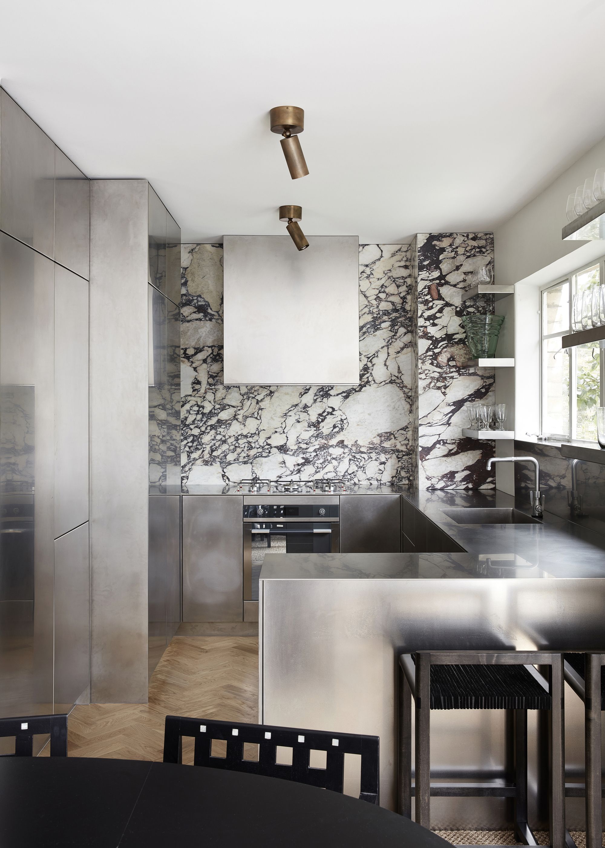
4. Black Granite
Another fallen favorite, granite, has officially lost its spot as the marker of a luxury kitchen.
As Richard Davonport, from Davonport, explains, "Granite once defined the idea of an aspirational kitchen, but its ubiquity has meant it no longer has the same design impact it once did. For many homeowners, it now feels safe and standard rather than distinctive, and in today’s kitchens, individuality is key."
Unfortunately, as Richard references, granite has suffered from the plague of popularity and has now descended to the ranks of overdone, boring kitchen designs.
Jonathan echoes this view and says that, "One example is glossy black granite, which was once considered the height of contemporary style. Its highly reflective surface and deep color can make a kitchen feel heavy and enclosed, and it tends to show every fingerprint and smudge - making it less practical for modern living."
5. Stark Whites
"Crisp white counters once defined the minimalist kitchen trend, but many now feel stark, clinical, or unfinished. In today’s interiors, where warmth and tactility are highly prized, these hard-edged tones can read as flat and uninviting," explains Charmain.
Now that earthy color palettes reign supreme, the 'clean' look offered by sleek white counters is no longer considered desirable. Instead, white kitchens are now regarded as sterile, lacking that welcoming warmth we now aim for in our homes.
"Bright white counters, while once popular, can come across as clinical, highlighting every mark and failing to age gracefully," Simon adds.
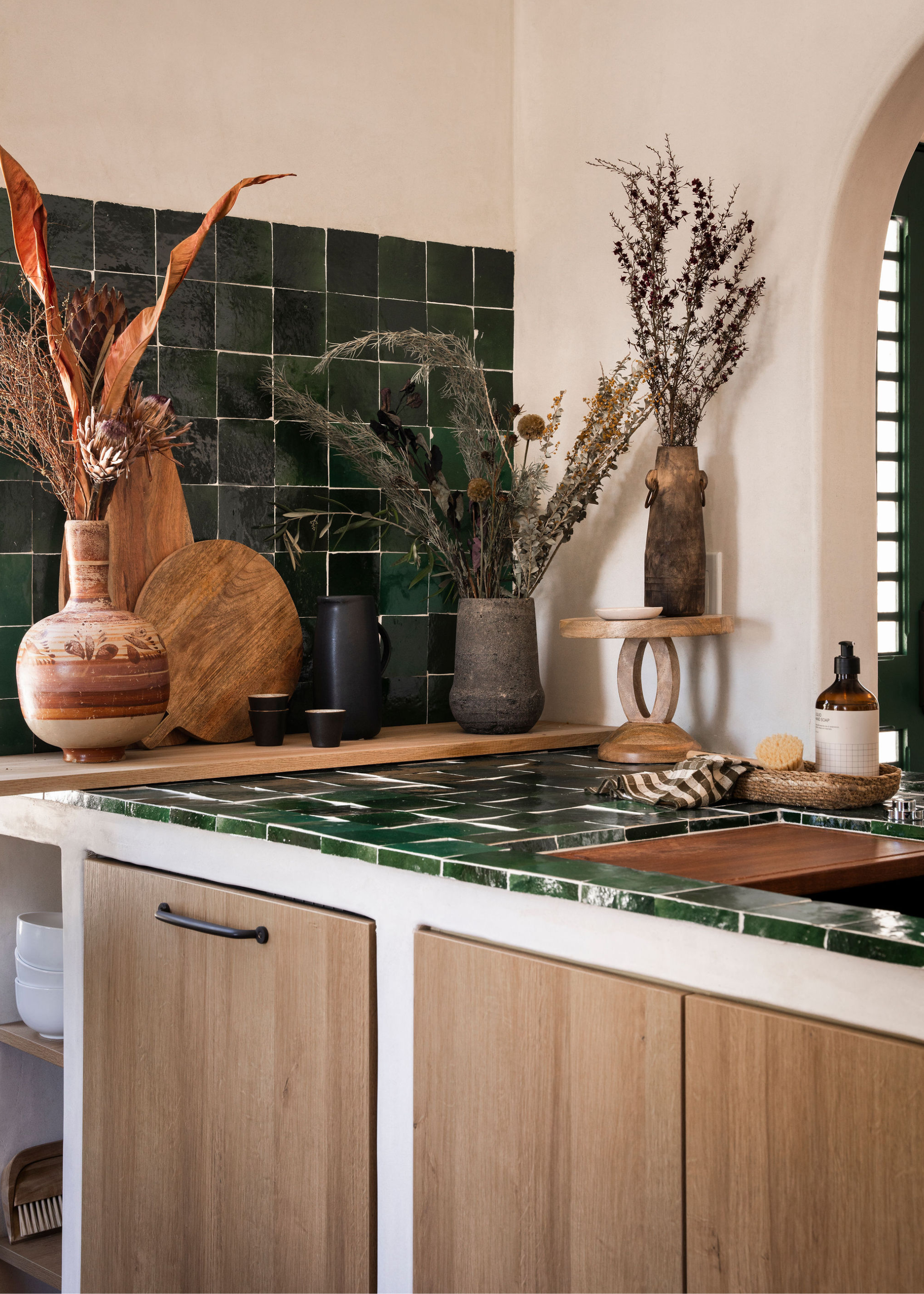
Style Up Your Kitchen Countertop
Add this to your kitchen to quickly bring some more texture into your home
Warm tones and natural materials are key features in today's kitchens, and this bowl achieves both.
A magnetic knife holder has quickly become one of the coolest accessory you could have in your kitchen, and it's super functional, too.
This beautiful, dark wooden tray is a lovely way to bring some stylish organization to your kitchen.
This gorgeous tiered vase is an excellent way to bring in some of those earthy tones the experts love so much.
A small marble tray is an easy way to elevate your kitchen design, bring more warmth and a luxury touch
Now that the brutal part is out of the way, it's time to make way for a more positive, forward-thinking route. For example, why not take some time looking over the kitchen trends we foresee taking over this year? Or, if you're really in need of a mood boost, a scroll through some dopamine decor is sure to do the trick.