Art Deco color palettes are not subtle — and that’s what makes them all the more exciting (even a century after the style first emerged) as a contrast to minimal and restrained palettes often seen in modern homes. And while not everyone is keen on Gatsby-level glamour, one way to dip into the drama is to set a cinematic tone by way of color.
The palettes most associated with the Art Deco interior design movement were bold, rich, and luxurious. “In the 20s and 30s, this often meant dramatic contrasts — think deep emerald greens paired with inky blacks, or vibrant teals set against rich golds and silvers,” says Tom Kennedy, co-founder at Divine Savages, who produce wallpapers with plenty of Deco attitude. “Jewel tones were particularly iconic of the era, with green standing out as a color that symbolized both opulence and a growing appreciation for the natural world.”
Paint, naturally, isn’t the only way to inject color into your palette. Tom also notes that Art Deco style often featured a dialogue between glossy finishes (think lacquered furniture) and sumptuous textures (think velvet upholstery), both of which give colors way more strength and vibrancy — not to mention rich variation.
And if these colors are familiar, it’s because Art Deco never officially disappeared — lately, it’s been showing up across more minimalist forms, à la New Deco. “The colors remain as lush as ever; it’s just the shapes they dress that have slimmed down a bit — like a Gatsby party guest who's traded sequins for sleek tailoring, but still knows how to make an entrance,” says Josh Rose, principal and co-founder of LA's Citizen Artist.
Take a look at the inspired spaces below to get a sense of how to build an Art Deco color palette in your own home.
1. High-Contrast Shades With a Hint of Gold
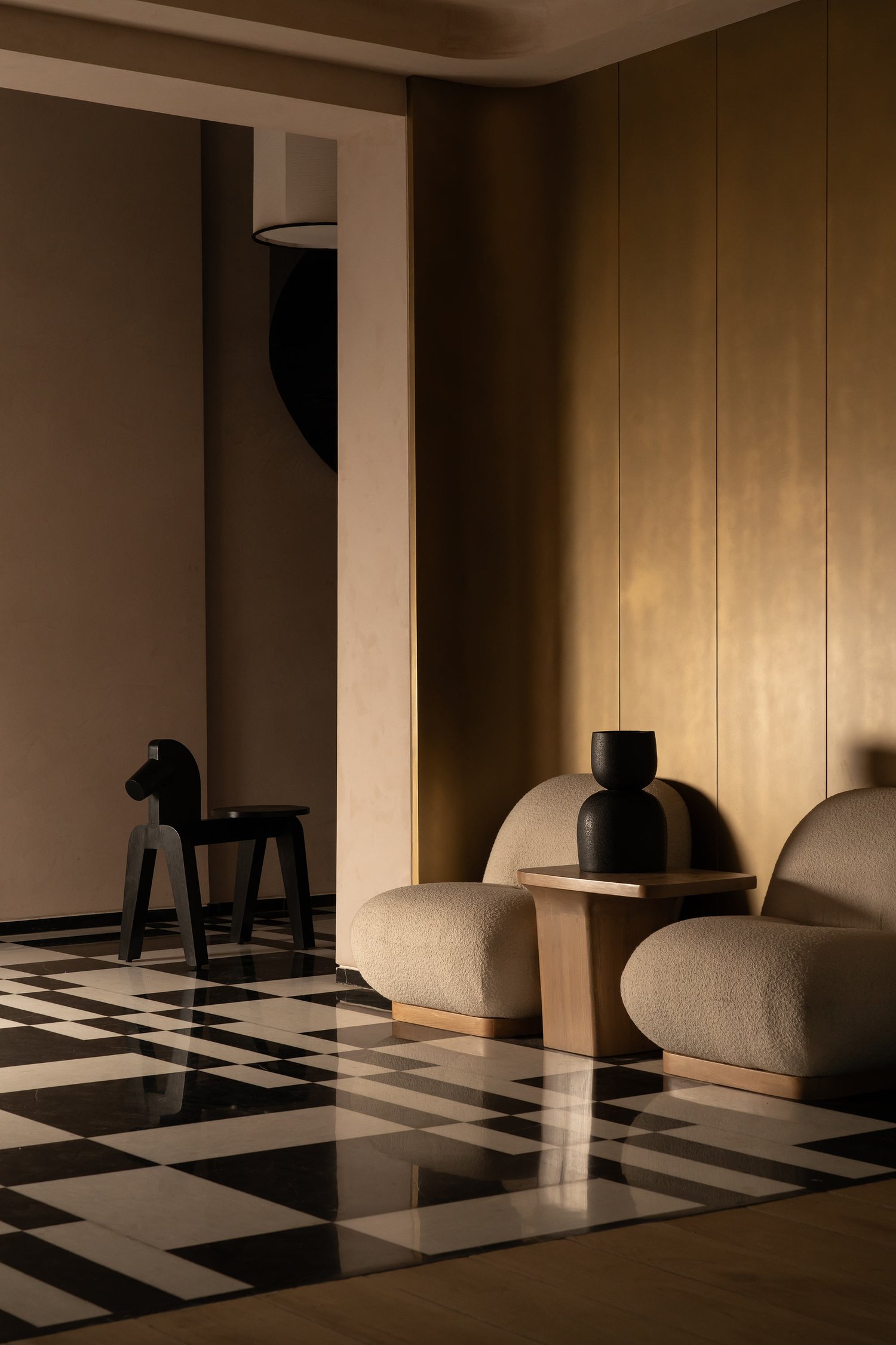
In truth, most folks aren’t featuring textbook Art Deco color palettes at home anymore. But many of the iconic colors and finishes from the era can easily be interpreted in contemporary styles across more simplified forms. One palette that translates rather easily is Art Deco’s use of high contrast for even higher drama — a bold balance of light and dark color, like in the foyer above.
“This particular area, featuring checkered flooring, gold-panelled walls, and sculptural seating, captures a distilled, modern interpretation of Art Deco, utilizing three dominant tones: black, brushed gold, and ivory or cream,” says Neha Garg, founder and principal designer at Studio Jane Designs.
Given how strong these tones are, Neha stresses the need for using balance in interior design to avoid a heavy, overstylized look. Black, a grounding element of Art Deco style, was often used for definition. “It works best in structured elements, such as flooring patterns, frames, trims, or accent furniture,” says Neha. “Avoid using it on large walls unless the space has ample natural light.”
Gold, too, works well on surfaces that catch light (you can capture the warmth and mood of gold with an earthy, mustardy yellow like the paint featured below), but certainly used in moderation. “Overusing it, especially in glossy forms, can quickly shift the space from refined to overdone,” adds Neha. “Keep it matte or satin, and pair it with textured neutrals to avoid visual fatigue.”
You have more freedom with ivories and creams, which Neha recommends as a base color for your primary Art Deco color palette. “Use it on walls, upholstery, and larger furnishings to create breathing room for the darker and shinier elements,” she says. “It also helps soften the contrast, making the space more livable.”
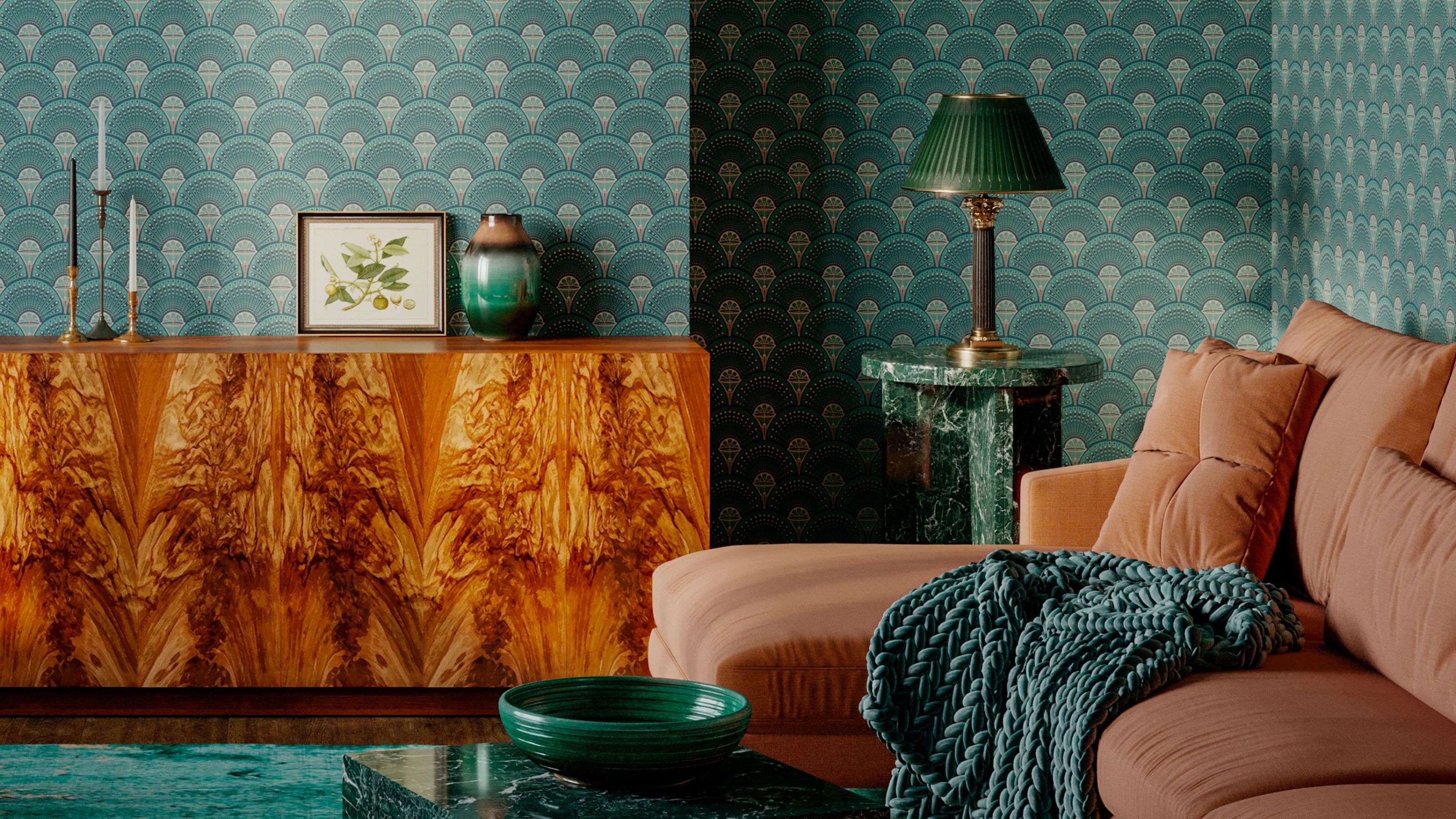
2. Deep Jewel Tones With Metallic Accents
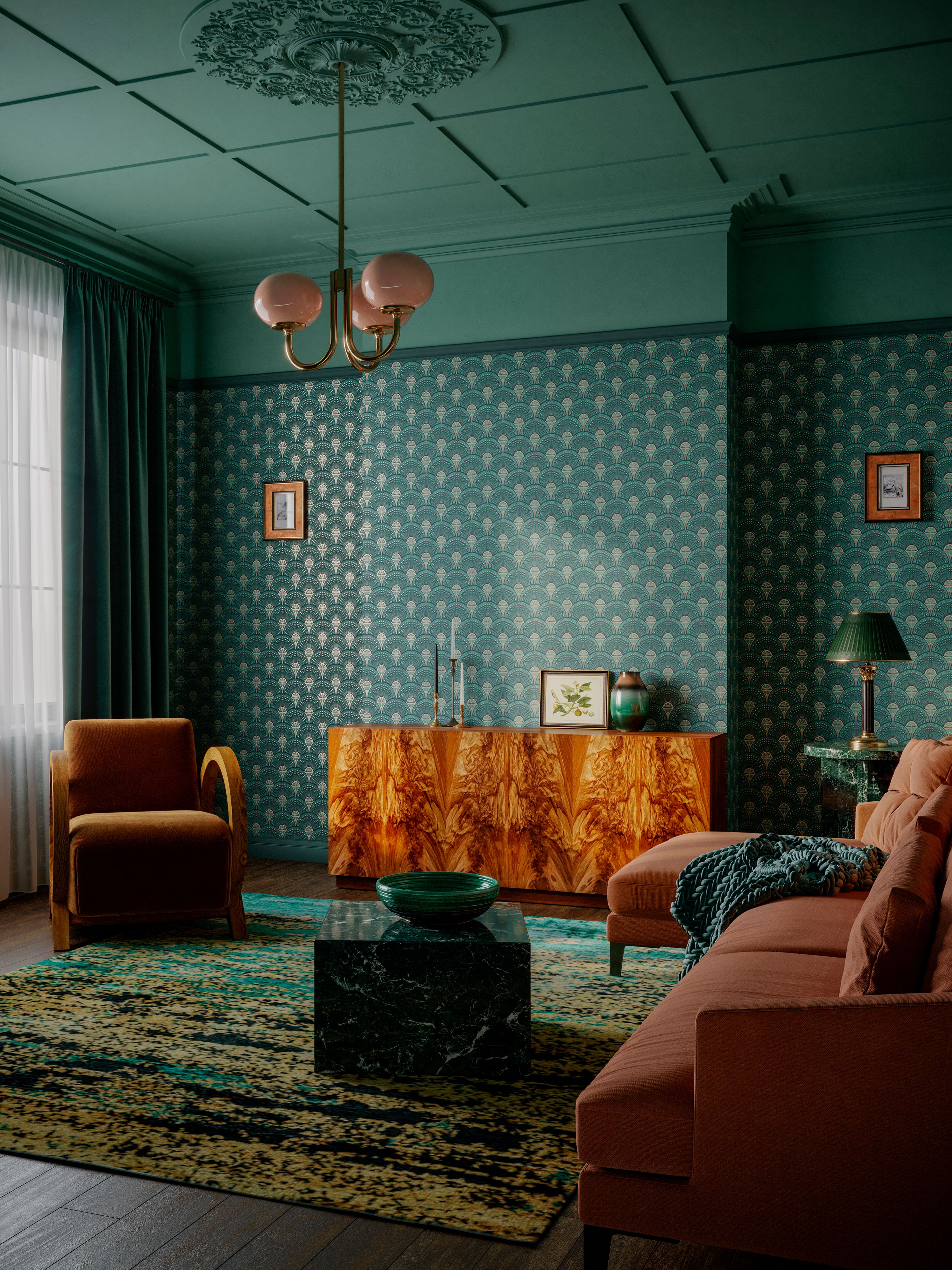
What’s more glamorous than jewels? Jewel tones, as you can imagine, were used to convey a sense of luxury in Art Deco color palettes. “Each of these shades has a historical resonance within the Deco movement, yet they come together here in a way that feels fresh and immersive for the modern home,” says Tom. Here, a combination of green, gold, and rust results in a rich color scheme.
“This palette of green, gold, and rust can be incredibly striking in the home, but the key is in balance and layering,” adds Tom, who used one of his Divine Savages' wallpapers, Deco Martini, which has metallic highlights in the pattern. “Green is a wonderfully versatile base and works beautifully when used generously, as we’ve done here, across painted walls and ceilings and in the wallpaper.”
Metallics are best used as accents. Anything from light fixtures to hardware can easily stud your scheme with a metallic glint. “It’s the sparkle in the palette, so a little goes a long way in catching the eye and elevating the mood,” adds Tom.
He also recommends using a grounding tone like rust to add warmth and contrast to your Art Deco color palette. It doesn’t need to be painted directly on the wall — you can work this in through tactile materials like velvet, suede, or even a richly grained wood (all very glamorous indeed) across armchairs, cushions, or perhaps a lacquered cabinet.
“The key tip is to use texture to bring the palette to life — Art Deco is all about visual richness,” adds Tom. “Play with sheen, softness, and pattern to keep things dynamic while staying true to the elegance of the era.”
3. Modern Pastels Pulled From Nature
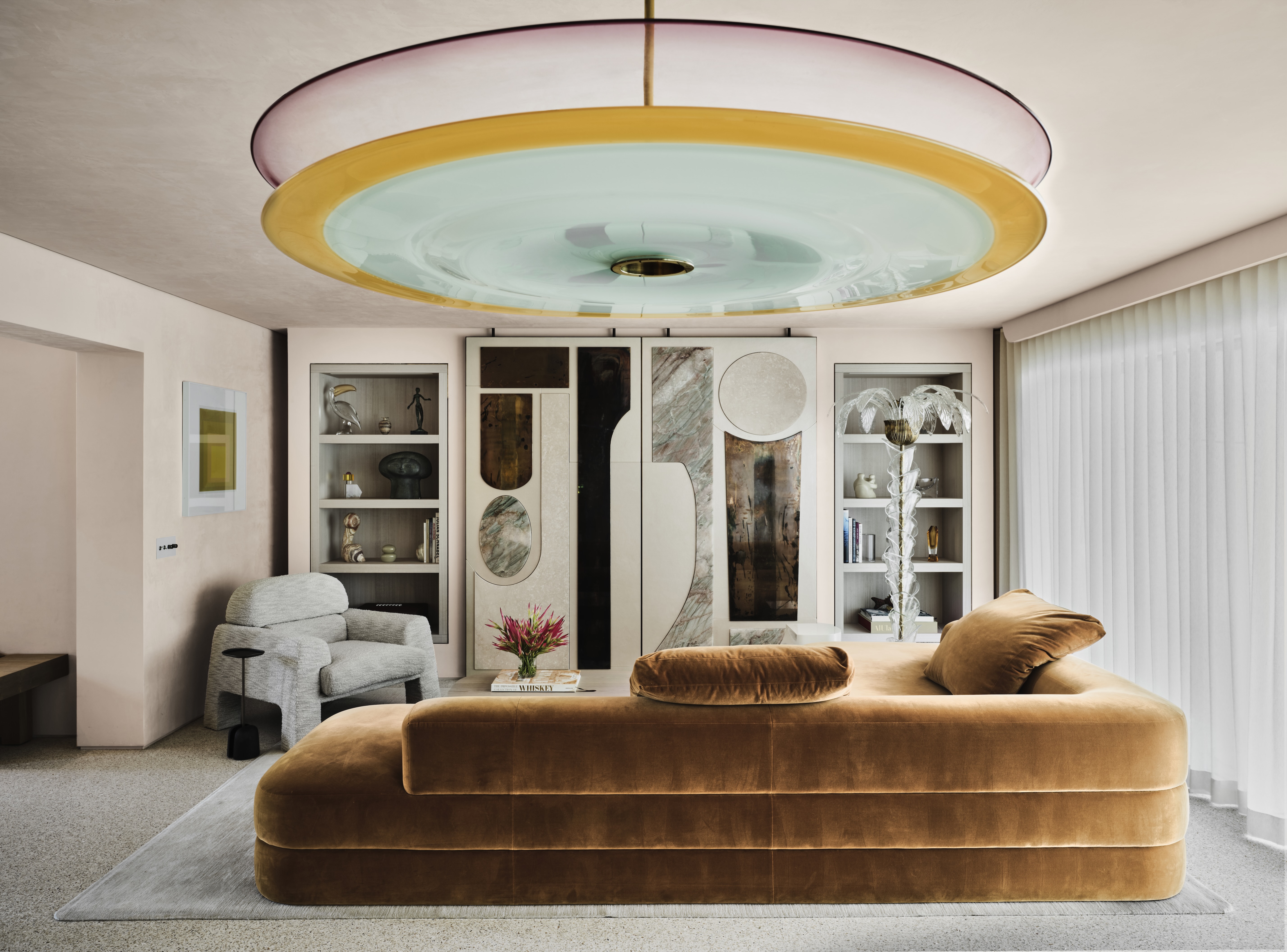
For a lighter, more coastal take on the style, this interior by Citizen Artist nods to Tropical Art Déco — made famous in Miami Beach — which the LA-based studio channeled through pale pink, seafoam green, and nougat.
The use of pastel colors, like many of Miami's facades, pulls from nature (specifically the sea, sky, sand, and sun). "Our palette follows that same elemental logic: each of the primary colors is drawn directly from nature’s most cinematic moments," says principal and co-founder Josh Rose of the core colors. "When the sun hits just right and pours through the windows, the effect is something close to alchemy: it feels like you’ve stepped directly inside a sunset."
This Art Deco color palette, unsurprisingly, is not for the faint of heart. "Our advice: commit," adds Josh. "These colors, while full of subtlety, are undeniably bold — and making them work requires a bit of nerve. It takes a leap of faith to use them, and just as much discipline not to overdo it. Go too far, and suddenly you’re under the big top. The key: when in doubt, refer back to nature — she will never steer you wrong."
FAQs
What Are Neutral Art Deco Colors?
Historically, Art Deco color palettes incorporated plenty of neutrals that helped balance some of the bolder, more saturated colors used throughout the era. "White — especially on the warmer end of the spectrum — is a timeless staple," says Josh Rose, nodding to neutrals like cream and ivory. "It never fails."
A bit deeper, Art Deco also dabbles in gentle browns. "Beiges and taupes also make excellent foundations, grounding a more adventurous palette without competing with it," adds Josh.
Is Pink an Art Deco Color?
If you ask Tom Kennedy, decorating with pink has never gone out of style. "Pink is most definitely an Art Deco color," says Tom, who has used plenty of pinks in glammed-up wallpapers like Charleston Blush and Flamingo.
"Immediately La Casa Cor de Rosa — the Pink House of Serralves — in Porto springs to mind, a beautiful example of Art Deco architecture designed by Portuguese architect José Marques da Silva," he adds. At the end of the day, it leads back to glamour. "We believe pink is timelessly glamorous, daring, and unapologetically bold," he adds.
While many might assume that Art Deco color palettes would be as bold as the times they were born, it's not necessarily always the case.
And now you've got the palettes picked, it's time to bring them to life, and these Art Deco living room ideas should help with that.