Every aspect of a grocery store’s layout is meticulously designed with a single goal in mind: to make you spend more money. Supermarkets employ a team of psychologists and marketing experts to create a shopping environment that encourages impulse buys and guides you toward the most profitable products. From the moment you walk in the door to the final seconds before you pay, these 10 clever layout tricks are working to separate you from your cash without you even realizing it.
1. The Decompression Zone and Produce Section Entrance
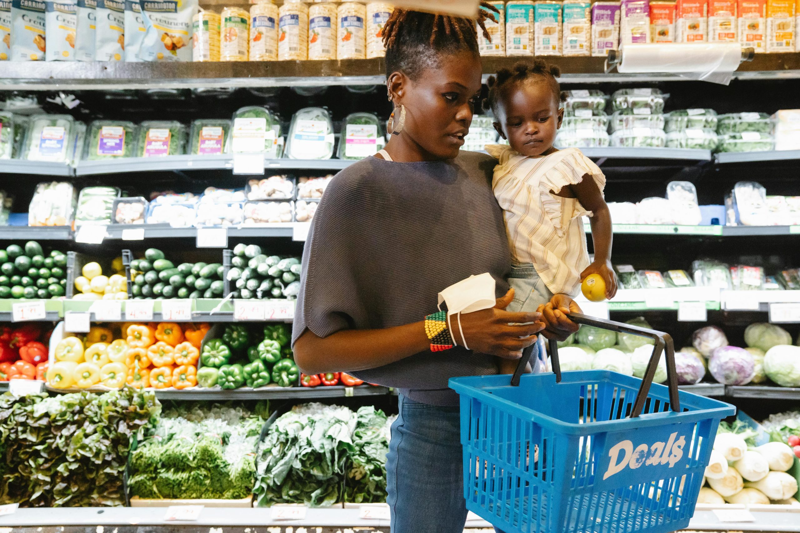
The first thing you see when you enter a grocery store is often a wide, open space called the “decompression zone,” followed immediately by the vibrant colors of the fresh produce section. This is intentional. The beautiful display of healthy fruits and vegetables makes you feel good about your shopping trip from the start. This encourages you to be less price-conscious and more likely to make indulgent impulse buys later on in your trip.
2. Placing Essentials at the Back of the Store
Retailers place essential, high-demand items like milk, eggs, and dairy at the very back of the store. This forces you to walk through the entire length of the supermarket to get the items you need most. This long journey exposes you to thousands of other products and countless opportunities to add unplanned items to your cart along the way.
3. Large Shopping Carts
Grocery stores provide you with shopping carts that are much larger than what you probably need. The large size of the cart creates a psychological effect: a half-empty cart feels like you haven’t bought enough. This subtly encourages you to fill it up with more products, often leading to a much larger final bill than you had originally planned.
4. The Most Profitable Items Are at Eye Level
Product placement on the shelves is not random. The most expensive national brands and the products with the highest profit margins for the store are almost always placed at adult eye level, where they are most likely to be seen and grabbed. Cheaper store brands and bulk items are often placed on the highest or lowest shelves, forcing you to look for them.
5. The Long, Aisle-Based Layout
The long, narrow aisles of a grocery store are designed to maximize your exposure to products. They discourage a quick “in-and-out” trip and force you to walk past many different categories of goods. The layout makes it difficult to just grab one or two things without being tempted by the thousands of other items that line the path.
6. Strategic End-Cap Displays
The displays at the end of the aisles, known as “end-caps,” are prime real estate that brands pay a premium for. These displays create the illusion of a special sale, but the items featured are not always on discount. Stores use them to feature new products or high-profit items, knowing that their prominent placement will lead to a huge increase in impulse buys
7. The Bakery and Rotisserie Chicken Near the Entrance
The smell of freshly baked bread or a roasting chicken is a powerful psychological tool. Stores often place their bakery and rotisserie chicken station near the front of the store so the delicious aromas greet you as you walk in. These smells trigger your hunger and saliva glands, making you more likely to shop on an empty stomach and make unplanned food purchases.
8. The Checkout Aisle “Temptation Alley”
The checkout lane is the final frontier for impulse buys. Stores line the queue with candy, magazines, soda, and other small, cheap items that are easy to grab. They know that after a long shopping trip, your willpower is at its lowest. It is then that you are more susceptible to adding a few last-minute treats to your cart.
9. Grouping Complementary Items Together
Stores often place complementary items next to each other to encourage you to buy both. For example, they will place tortilla chips next to the salsa and guacamole, or put strawberry shortcakes in the produce section right next to the fresh strawberries. This strategy, called “cross-merchandising,” makes it easy to grab the extra item without thinking about whether you need it.
10. The Confusing Cereal Aisle
The cereal aisle is intentionally overwhelming. The sheer number of choices, the bright colors, and the placement of kid-friendly cereals at a child’s eye level are all meant to slow you down. They also encourage impulse decisions. This confusion often leads parents to give in to their child’s request or grab a familiar, expensive brand rather than compare prices.
Navigating the Maze
A grocery store is not just a place to buy food. It is a carefully crafted environment designed to influence your behavior. The most powerful tool a shopper has is a simple shopping list. By creating a list and sticking to it, you can take back control of your trip. You can also navigate the store’s psychological tricks, and ensure you leave with only what you came for.
Which of these grocery store tricks have you fallen for in the past? What’s your best strategy for sticking to your budget at the supermarket? Let us know!
Read More
Inside the Radical Psychology of Grocery Store Layouts
7 Grocery Chains in Florida That Locals Say Are No Longer Worth the Trip
The post 10 Grocery Store Layout Tricks That Cost You More Without Realizing It appeared first on Grocery Coupon Guide.