White paint is a classic and go-to wall color in many homes. And for good reason: it creates a neutral base that is versatile and can help rooms feel brighter. But, as color trends increasingly favor soulful and layered decor, we're seeing less white paint and much more color on the walls.
From gently colorful hues that add more warmth than white but still feel neutral – think powder blues, plaster pinks, and soft taupes – to much bolder and expressive tones that command attention, designers are embracing the joy of color when it comes to decorating with paint.
But what shades have designers' seal of approval? Below, you can find the ten standout paint ideas that they're turning to instead of white in 2026, along with specific paint color recommendations and stylish decor buys to complete your newly colorful scheme.
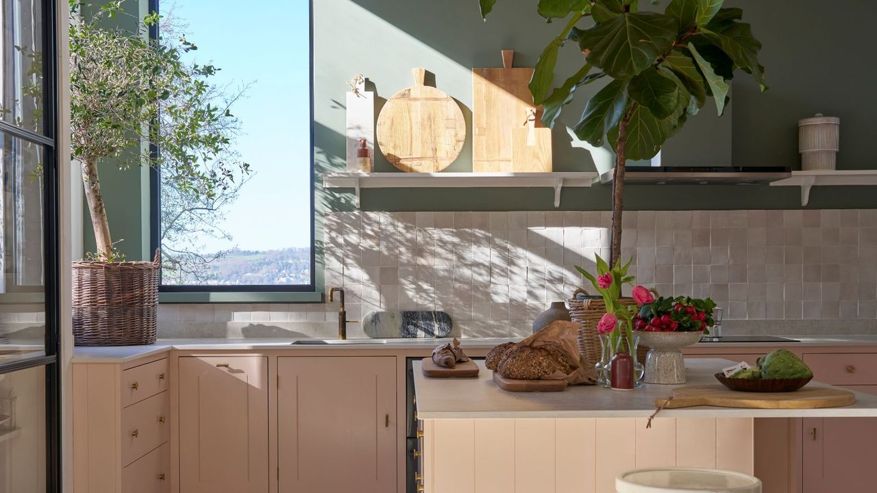
1. Smoky Green
A smoky shade of green offers warmth and a pop of color, while maintaining a calming look – much like Farrow & Ball's Green Smoke, which was used in this pantry.
'Some of my favorite projects this year include small spaces that we made visually impactful by using unexpected colors, each with a soft, smoky touch,' says the designer Sabah Mansoor of Sabah Mansoor Design. 'These hues can complement a variety of neutrals, earth tones, and materials, bringing balance and harmony to the eye.'
Refresh your bed or sofa with this silk pillow cover in a smoky shade of green.
A smoky green rug like this one adds more richness to a room than neutrals, while still feeling timeless.
In kitchens or entryways, the green vase would make a great addition – adding earthiness and texture.
2. Yellow
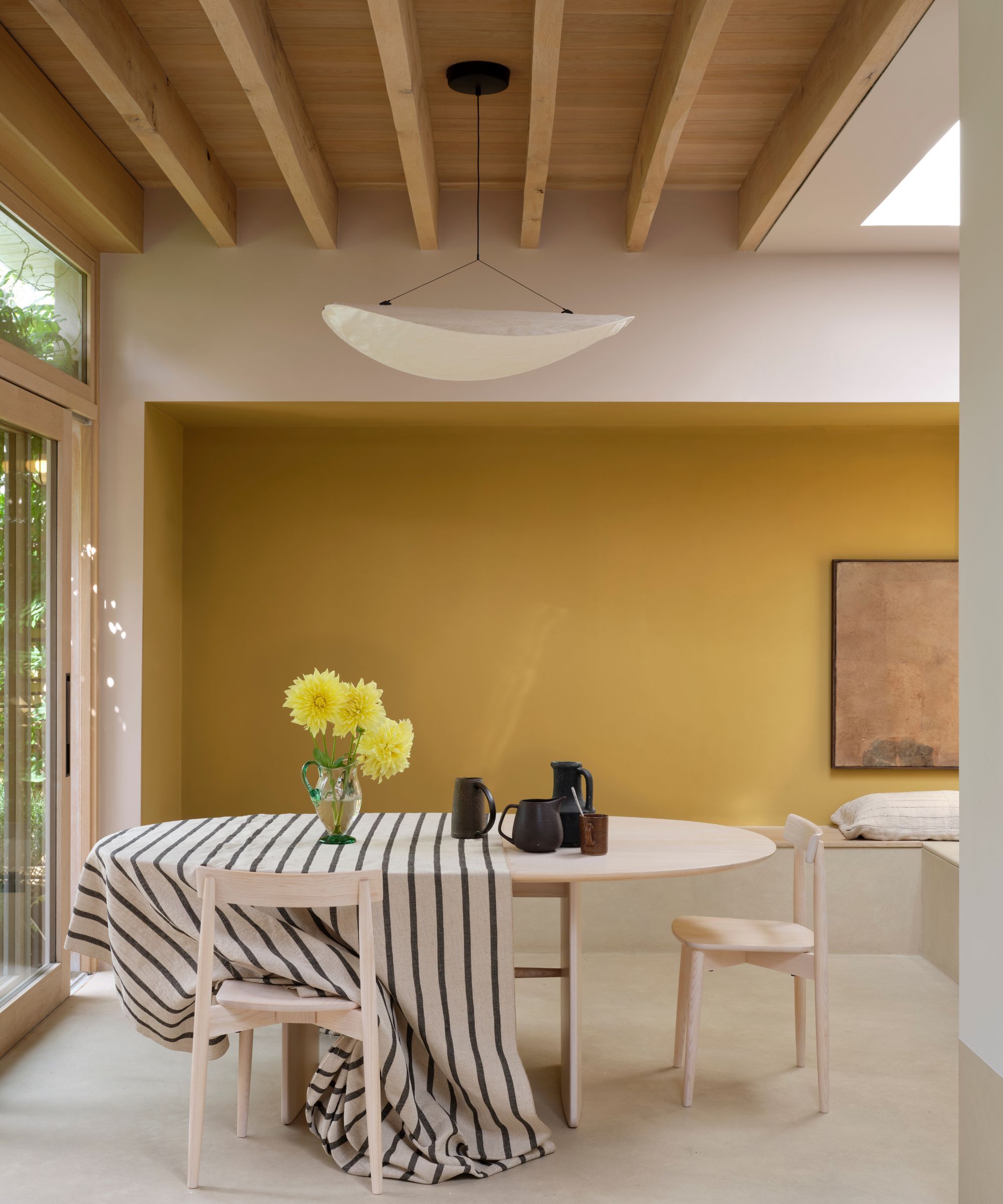
'As a longtime lover of the color yellow, I think we will see the use of this color more in 2026, ranging from butter yellow to deeper golds, and even mustard yellow,' says Debbie Mathews LeRoy of Debbie Mathews Antiques & Designs.
When it comes to decorating with yellow paint, Debbie assures there are plenty of styling options. 'Yellow can be incorporated as a wall color, trim color, front door color, or even for kitchen or laundry room cabinetry,' she says. 'While I adore many shades of yellow, Farrow & Ball's Sudbury Yellow and Sherwin-Williams' Butter Up and Solaria are among my personal favorites.'
Butter yellow is only a step away from neutrals, so it's a gentle introduction to this color trend.
Bring sunshine-inspired joy to your kitchen with this bright yellow decorative bowl.
If you prefer ochre to bright yellow, these towels are a stylish choice and a great way to add a pop of color to bathrooms.
3. Pale Blue
'One of my favorite alternatives to white right now is a soft, airy pale blue,' says Liz Williams. 'This shade feels calming and fresh, but still reads as a neutral – just with a bit more personality. It has a clarity that brightens a room, yet enough warmth to keep it from feeling cold.'
According to Liz, decorating with blue feels aligned with the desire for calming spaces. 'With the year ahead promising a continued focus on serenity at home, this airy blue offers a refreshing way to introduce color without overwhelming the space,' she says. 'Think of it as a whisper of color that instantly lifts the mood. A few beautiful options in this family include a powdery sky blue, a muted blue-gray, or a barely-there robin’s egg.'
Add just a small touch of soothing blue with this decorative vase.
This table lamp is timeless, working well in coastal homes and transitional schemes.
Blue and white stripes will always be timeless – a great way to add freshness to a room.
4. Taupe
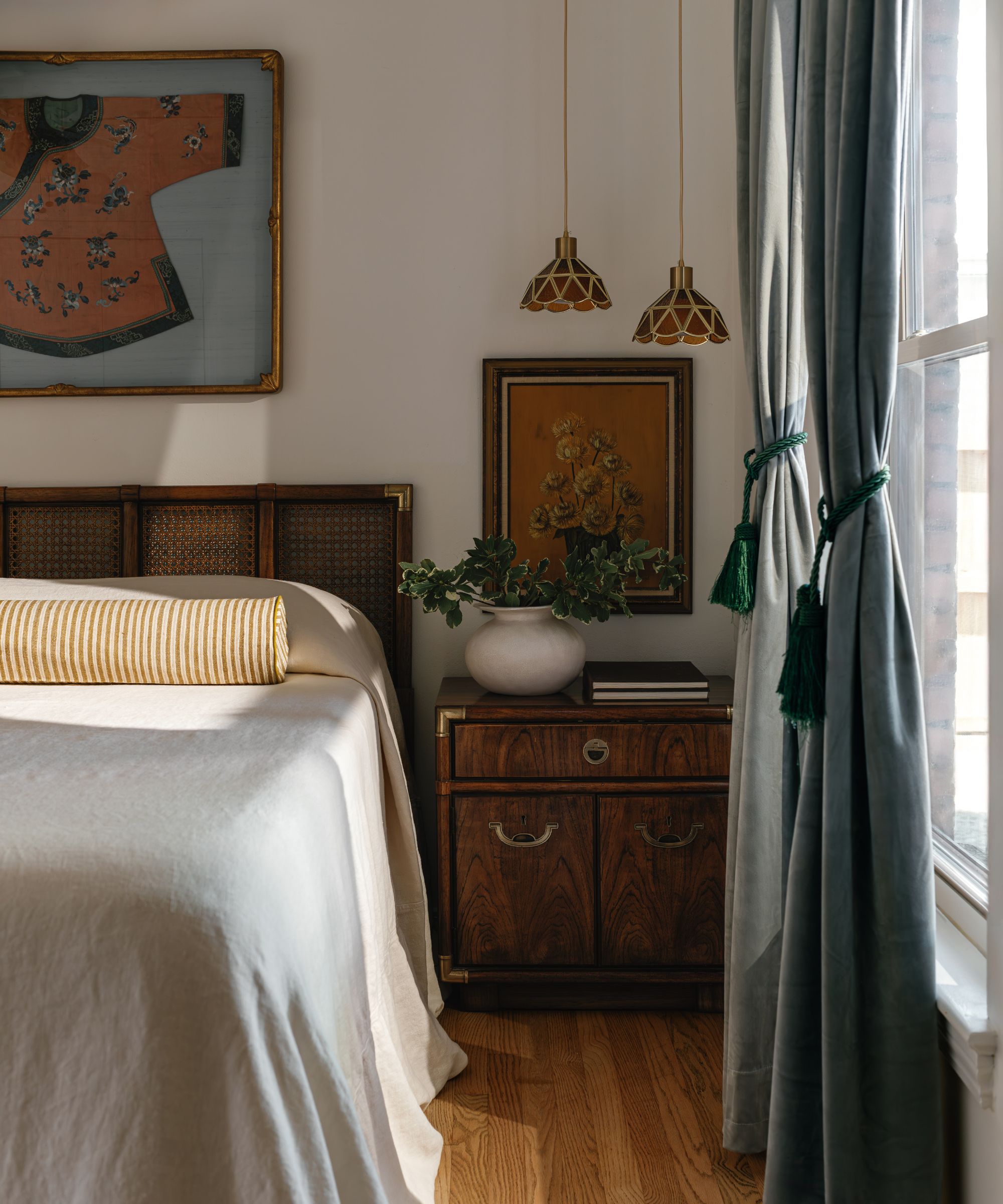
If you're a fan of decorating with neutrals but want more softness than white, consider the likes of taupe or greige paints. Not leaning too warm, these subtly cool tones are soothing and cozy.
'One of the best alternatives to white right now is a soft mushroom tone,' says Lauren Saab of Saab Studios. 'Soft mushroom has a very calming and organic feel to it, but it adds much more depth and visual interest than a plain white wall ever will.'
'In addition to creating a soothing background, soft mushroom tones work well with aged metal tones as well as other distressed finishes, which makes them one of the easiest options to live with in your home,' she adds. 'It also shines on millwork when you want to draw the eye without overwhelming a space.'
Add calming mushroom tones to your bedroom with this duvet cover set with a textured feel.
These linen napkins in the shade 'natural' are a timeless choice that will work with pretty much any tablescape scheme.
This wallpaper with a subtle pattern in a soft mushroom hue feels incredibly calming, making it a great choice for bedrooms.
5. Rich Reds
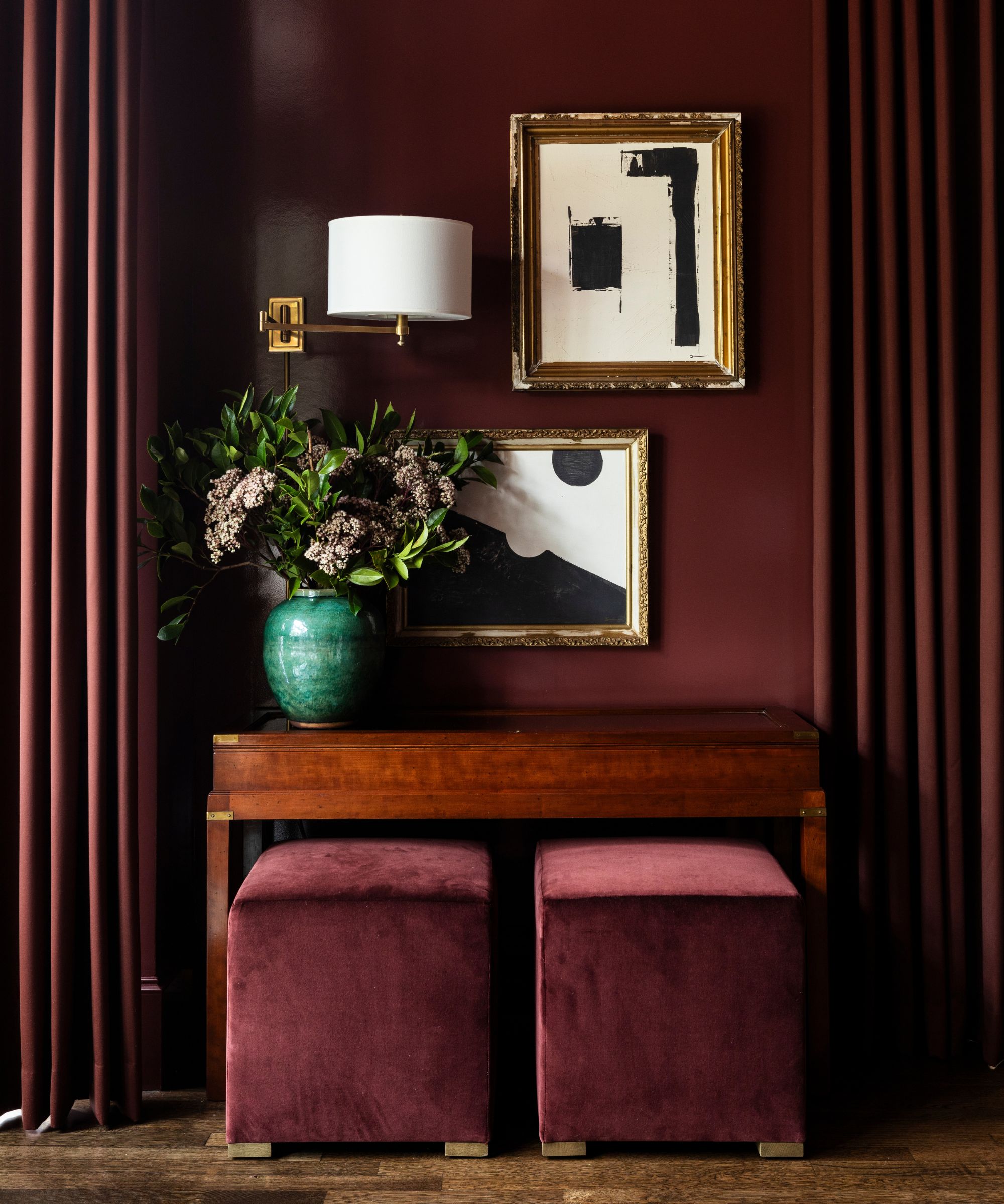
'I think deep, moody colors have made their way into our neutral color palette,' says Donen Kemnitz of Favorite Design Co, who highlights Sherwin-Williams' Borscht, a rich and warming red paint, as a stylish choice.
'I think color evokes emotion,' she continues. 'Using these deeper, richer colors is best used in cozy, intimate spaces that cause people to want to stay and linger. If adding color to a large space is a bit too much drama for you, try them in a powder bath or your laundry room. Even your pantry. These smaller spaces tend to get overlooked and can be a lot of fun to step outside your comfort zone in.'
This striped ottoman is a statement piece that would add lots of personality to a living room, while tapping into the red color trend.
Marble and rich reds are an incredibly chic combination, adding depth and sophistication to any room, from bedrooms to entryways.
Ease yourself into the red trend with this glass tealight holder in a rich ruby hue.
6. Pink
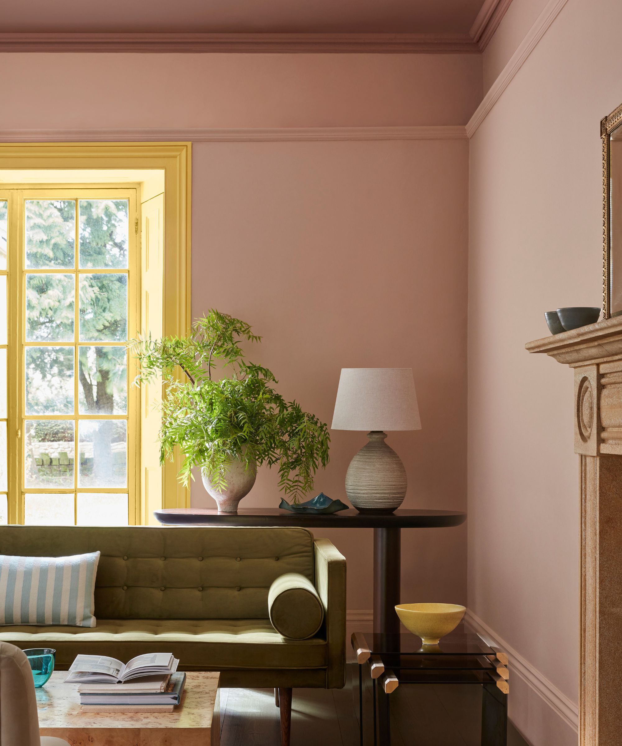
For Nicole Lanteri, pink paints are a go-to choice for the year ahead. 'I think earthy pink shades will become more popular in the next year,' she says. 'An earthy pink color feels neutral in that it is a grounding, can be used in large spaces without feeling too cold or too dark, and mixes really well with other colors.'
'It's a new way of viewing a neutral – something warmer and more interesting and complex than whites, creams, or grays that have more traditionally been viewed as a neutral,' Nicole says.
This plaster pink rug makes a wonderful alternative to neutrals, offering warmth and coziness.
Add a pop of earthy pink to your scheme with this mini glass planter.
This pendant ceiling light lends a vintage look, making it a stylish choice for traditional rooms.
7. Cobalt Blue
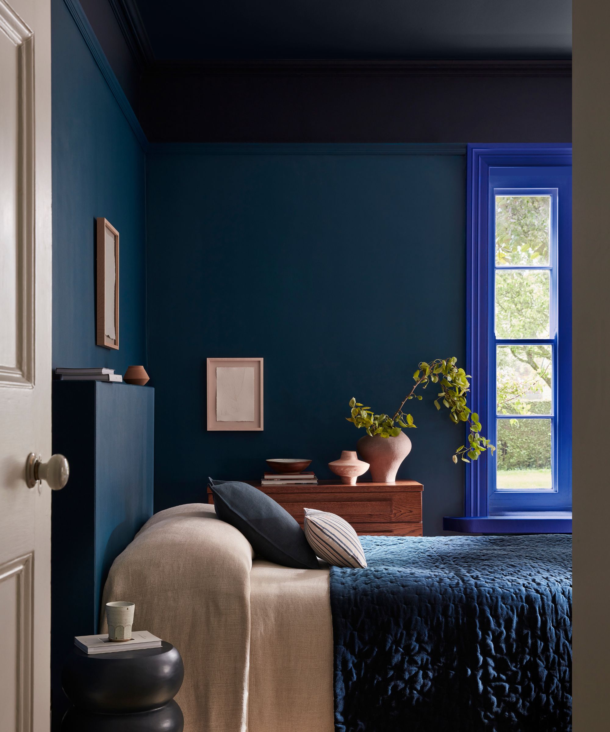
As well as pale blue paints, designers are also going bolder with much more vibrant shades of blue on the walls. For Lisa Gilmore of Lisa Gilmore Design, cobalt blue is a favorite.
'I'm enjoying pairing these highly saturated tones with colors that create "happy electricity"', she says. 'For instance, pairing cobalt blue with ochres and deep burgundy colors is a combination that feels very current.'
Bring rich blue into the heart of your home with this Le Creuset pie dish.
Make a statement with this dark blue ceramic vase, which would look especially stylish on an entryway table.
This blue patterned wallpaper would look wonderful on all four walls of a small powder room.
8. Pale Green
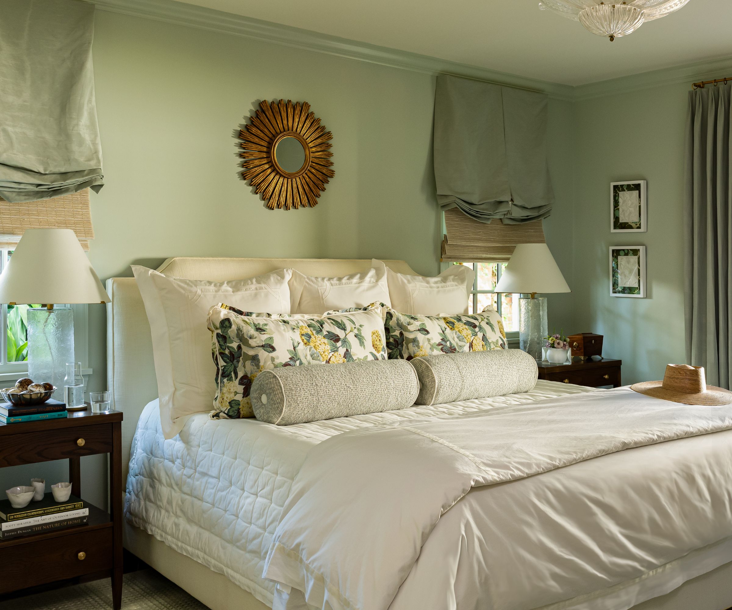
Another iteration of green that designers are turning to in 2026 is pale tones. 'I love to use a lighter, more earthy green in spaces meant for calming, such as a bedroom, instead of a white to add depth without overwhelming the eye,' says Lauren Robbins of Lauren Robbins Interiors. 'There are so many different shades to play with, offering more options to add depth than a white or a cream.'
'Green has the tendency to become a neutral in most scenarios and helps center the color story we are playing with, along with fabrics and artwork,' says Lauren.
Refresh your bedding with this linen set in a soothing shade of green with a ruffled edge.
This wall sconce would work wonderfully in traditional bedroom schemes.
Add texture to your scheme with this antiqued vase in a calming green hue.
9. Warm Neutrals
Warm neutral paints are a subtle shift away from white, while offering a lot more softness and a cozier feel. 'We’re loving the resurgence of warm neutrals, and our clients have loved the depth they bring to a space without feeling oversaturated,' says Jessica Bennett of Alice Lane Interior Design.
'Our current favorite warm neutral is Reticence by Sherwin-Williams,' says Jessica. 'It works great in all spaces from entryways to bedrooms.'
Add comfort and warmth underfoot with this sand-colored rug.
This handwoven throw is in a warming shade of beige and would add chunky texture to a space.
Warm wood is another stylish way to decorate with this hue, and this stool would add charm to dining spaces.
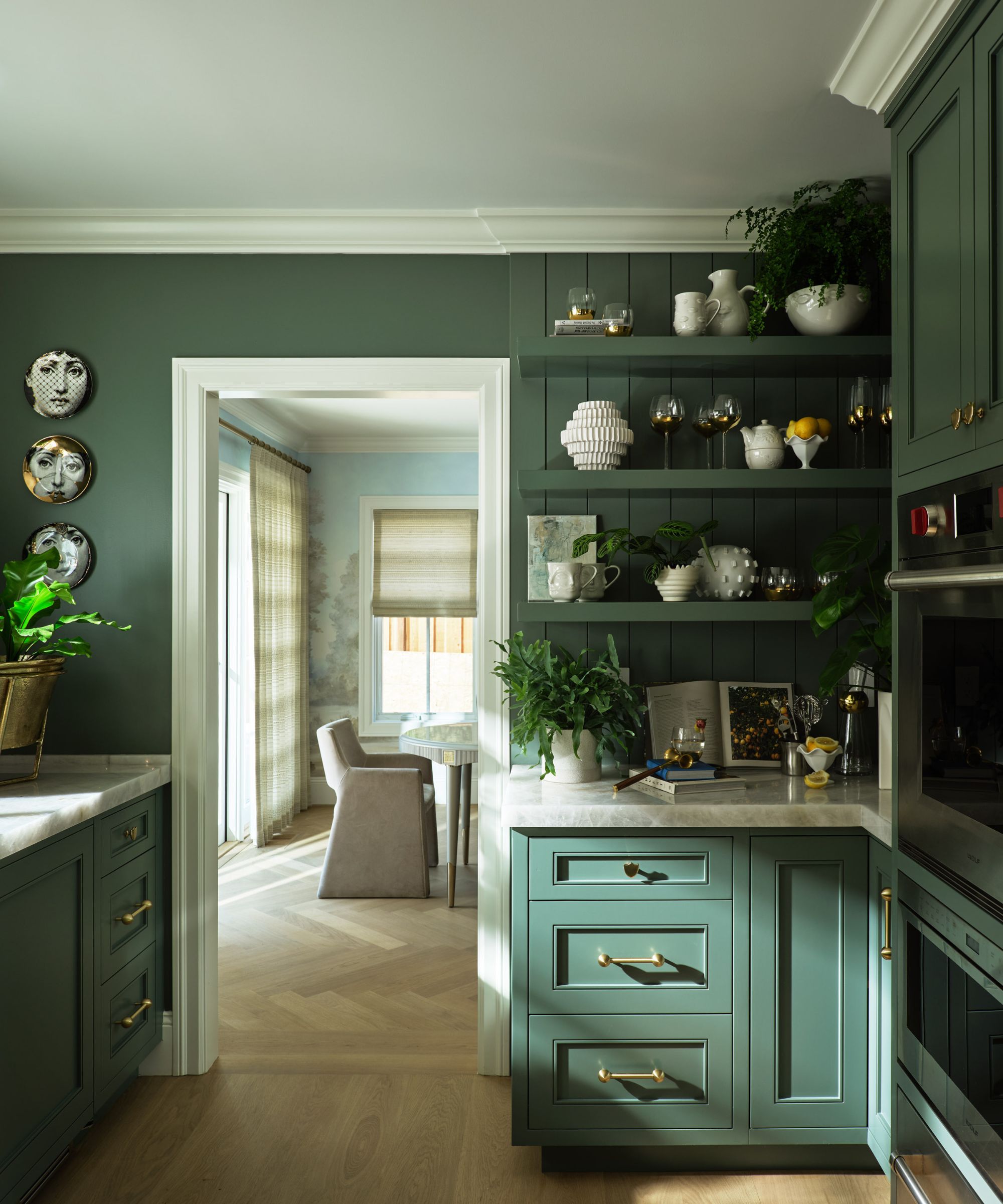
10. Emerald Green
Decorating with green is proving to be a popular alternative to white among designers, and the final shade that gets their approval is emerald. Roger Higgins of R. Higgins Interiors opted for Sherwin-Williams' Shamrock on the walls in this pantry, and it feels endlessly opulent.
Natasia Smith and Sandy Baisley, co-founders of Re-Find, comment on the wide appeal for green that can range from soft to much bolder. 'Greens are becoming the new neutrals,' they say. 'From chartreuse and arsenic-inspired hues to carriage greens and sap greens, the spectrum is remarkably versatile and timeless.'
This ceramic table lamp is a playful way to incorporate this rich shade of green.
Go for a much smaller addition of emerald green with this marble bowl that would look chic on a coffee table.
Style this trending shade with this wooden side table – a practical and stylish piece for living rooms.
Decorating with white paint will always be timeless, but designers are favoring bolder tones, which add more warmth and excitement to a room. Switching things up from white doesn't need to be dramatic (although these shades are certainly a favorite for the year ahead), with calming and pale shades of green, pink, and taupe offering a fairly neutral feel.
Don't forget to sample shades before committing – you'll want to see how your chosen paint color looks as the lighting shifts throughout the day.