Enjoy our content? Make sure to set Android Central as a preferred source in Google Search, and find out why you should so that you can stay up-to-date on the latest news, reviews, features, and more.
What you need to know
- YouTube is testing a mobile UI redesign with a focus on cleaner, content-first layouts.
- Profile images are bigger and placed next to video titles, while traditional channel names are swapped out for @usernames.
- Action buttons lose their text labels, leaving only icons; the notification bell now leads the row.
- YouTube Shorts also get smaller buttons, which some say are trickier to tap.
YouTube is experimenting with a bold redesign of its mobile app interface, and reactions are already split. The update hasn’t hit every device yet, but those who've seen it have plenty to say about the changes.
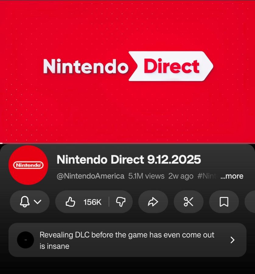
The most obvious tweak is the layout of video pages. The channel’s profile image is now larger and sits right next to the video title, instead of being tucked underneath. YouTube is also swapping traditional channel names for usernames, as spotted by Android Authority.
Meanwhile, the familiar row of buttons under a video — such as like, dislike, share, download, and subscribe — has lost its text labels, leaving only icons. The notification bell has also been nudged from its usual spot above the row and now leads the carousel of icons.

YouTube Shorts aren’t spared either, with smaller buttons that some users say are harder to hit.
Some users on Reddit say the new design looks “squished” and removes too much context at a glance, especially for those who rely on quick reads of channel names before deciding to watch or engage.
A limited test that could go global
As with most UI experiments, not everyone is seeing the update yet. It's possible this is currently being tested on a subset of users. That means YouTube is likely gauging feedback before a full rollout, though given the size of the changes, it’s clear the platform is serious about pushing the new look forward.
Whether you love it or hate it, the new YouTube mobile UI represents a clear shift in philosophy. It’s a bid for a cleaner, more content-first experience that tries to streamline how we interact with videos.
But as with any radical redesign, it’s a gamble. For every user who appreciates the fresh, uncluttered look, there’s another who sees a familiar, efficient tool being rearranged into something unfamiliar.
The real test won't be in the initial outrage, but in whether we all get used to it or if YouTube decides to listen to the feedback and tweak the formula once again.


