Listen, I love a good tile moment as much as the next design writer, so I understand if this statement may come as a shock, but it has to be said... There is such a thing as too much tile.
I know what you're thinking, 'what about tile drenching?', and I hear you. I'm not saying head-to-toe tiling is always wrong, or joining the graveyard of other outdated bathroom tile styles, I'm just saying there's a way to do it right, and a way to do it... less right. Unfortunately, there is a fine line between these two, and while some bathrooms can look strikingly elegant when drenched in tiles, others can easily end up looking suffocating and overwhelming.
And I'm not alone in this opinion. Even expert bathroom designers feel the same. But, unlike me, they know exactly how to tow the line, and they've been kind enough to share their knowledge with me.
What Makes Tiling Feel 'Too Much'
Proving I'm not alone in this feeling, Ca'Pietra's Grazzie Wilson says, "There’s a fine line between a bathroom that feels cocooning and creative, and one that tips into being overwhelming."
As Grazzie outlines, the tipping point between cocooning and overwhelming can be very fine, and getting the balance right is the key to a beautiful space.
Typically, issues begin to pop up when there's no clear focal point in your design. "Too much tiling usually happens when every surface is fighting for attention; a patterned floor, bold walls, mosaics in the shower, all happening at once. That’s when the eye doesn’t know where to land, and the effect feels more chaotic than curated," explains Grazzie.
This idea of muddying the visual clarity of your space is echoed by Otto Tiles' founder, Damla Turgut, "If floor, walls, and even ceilings are all tiled in strong designs, there’s no visual break — the eye doesn’t know where to rest," she says.
Understanding the effect of sight lines is one of the most helpful tools to grasp in interior design, not just limited to bathrooms, but across your entire home. Learning to design a room with this in mind will help you build more cohesive, welcoming spaces. In bathrooms that feel 'overwhelming', the issue is typically one of multiple competing elements.
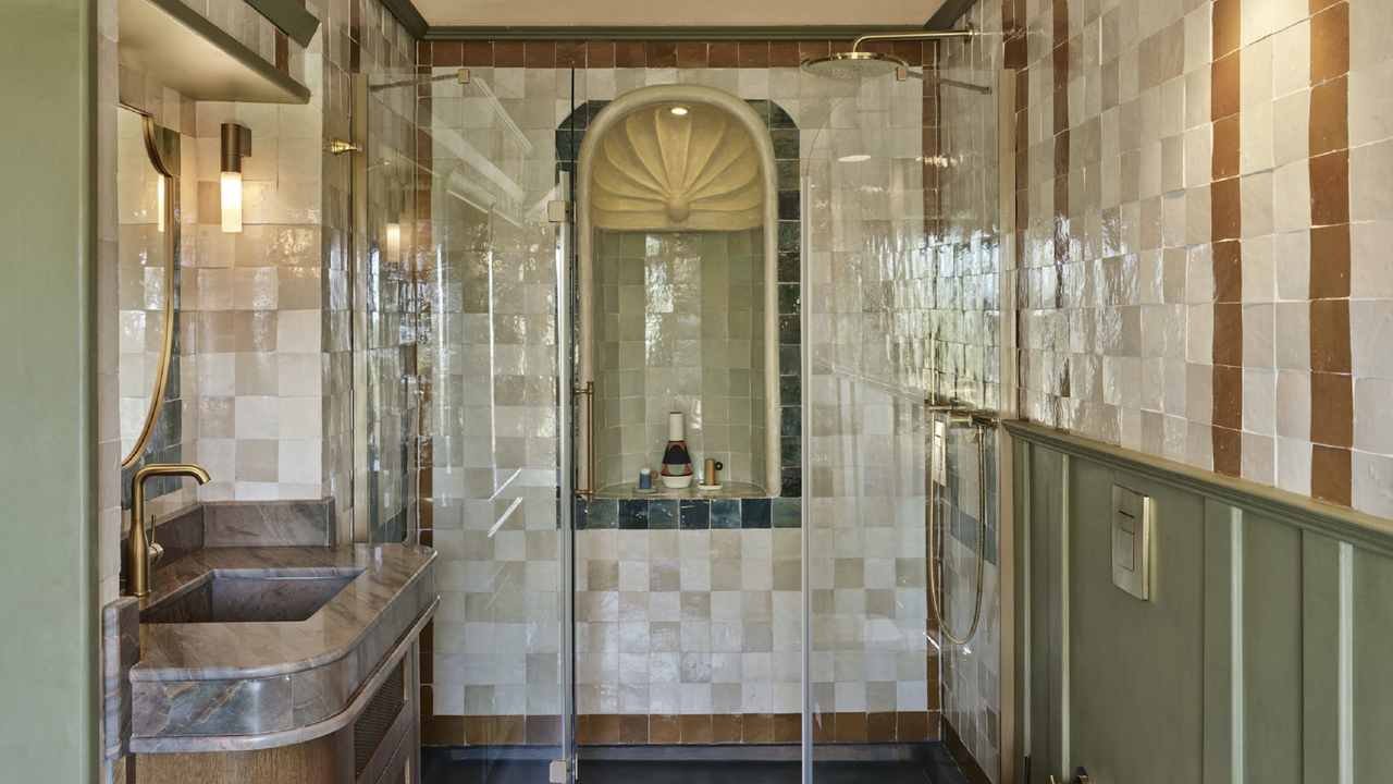
However, it is not solely a matter of layout and sightlines. The type of bathroom tiles you use will also dictate how balanced your space feels. As Damla says, "Sometimes this overwhelming look can be a result of the tile itself: for example, a small-scale circle mosaic over a large expanse with dark-toned contrasting grout color will likely cause a visual headache."
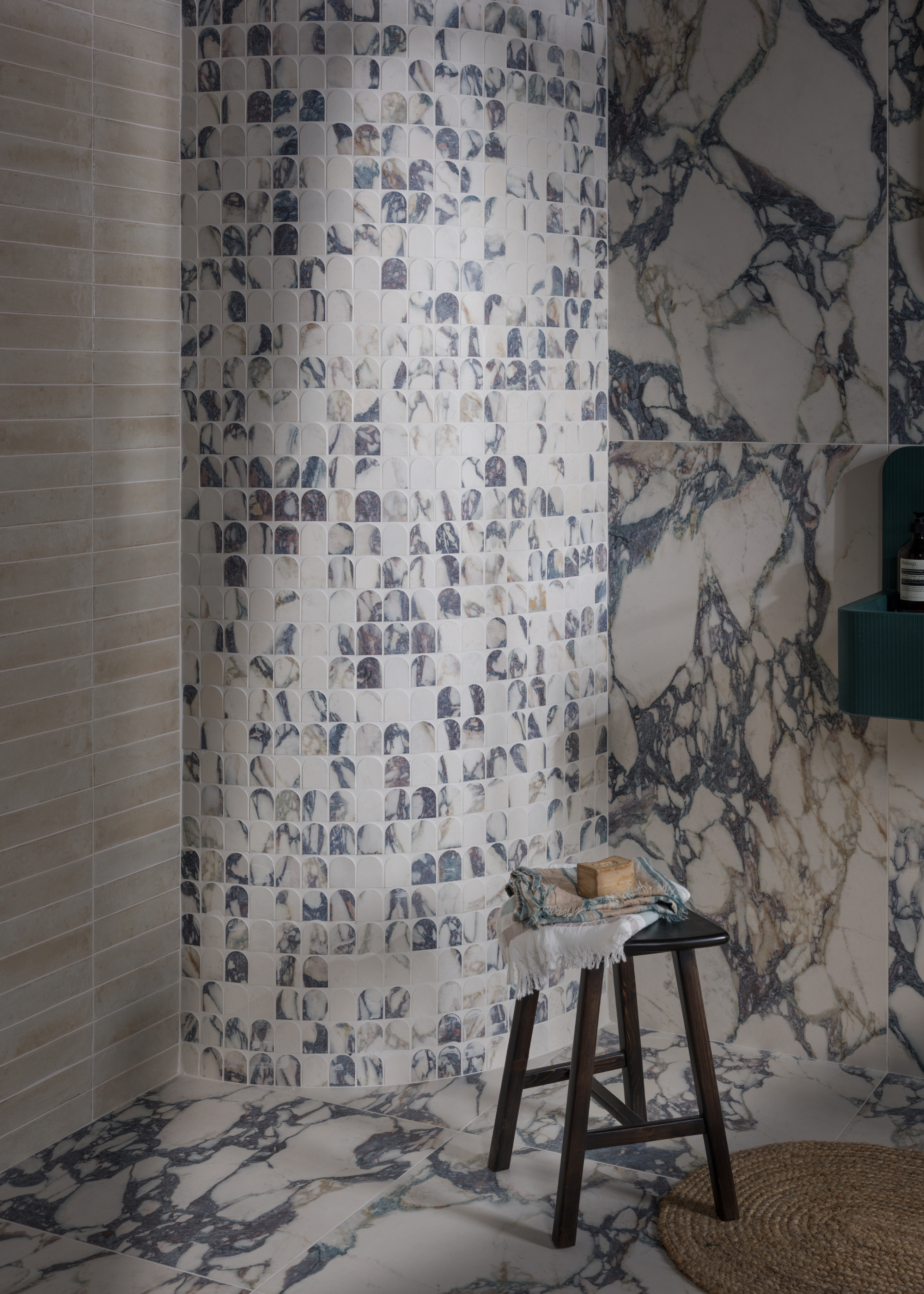
Even your favorite, luxurious materials can lean towards suffocating when misused. "Marble and marble-effect ceramic tiles with bold veining can also overwhelm a space if they aren’t book-matched as carefully as possible," says Damla.
And Grazzie agrees and says, "The tiles most likely to feel ‘too much’ are the divas of the tile world: statement geometrics, bold encaustics, or heavily veined marbles. They’re stunning in their own right but need breathing space to shine. Think of them as the hero piece in a room, they deserve to be center stage and not to be lost in a crowd."
How to Keep Your Tiling Looking Balanced
"For a balanced scheme, it is about contrast and relief," says Grazzie.
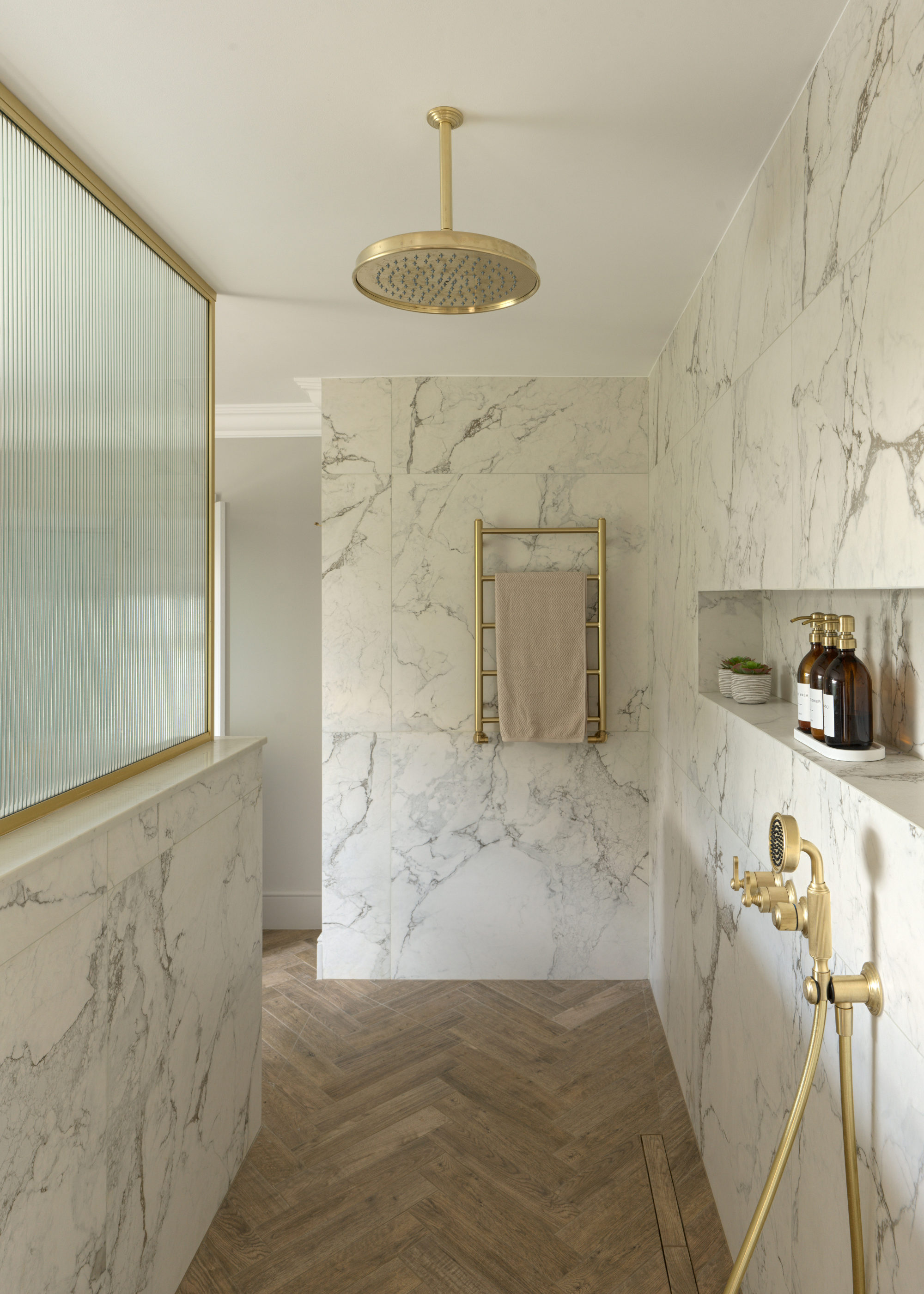
Identifying one clear visual focus point and then building your design around that will help you create a balanced, cohesive bathroom. So, if you want to go bold on the flooring, make sure the walls are more toned-down, and vice versa. "If your walls are color drenched, let your vanity, brassware, or even your ceiling act as a counterpoint," says Grazzie.
Combining contrasting finishes and materials can also help maintain balance, as Damla says, "Contrast is key. Pair statement tiles with calmer surfaces such as painted walls, micro cement, timber joinery, or softer textures like linen. Thoughtful lighting also helps — it draws attention to texture and detail without overwhelming the space."
However, this by no means is to say that tile-drenching as a whole is a no-go; it's just all about doing it right.
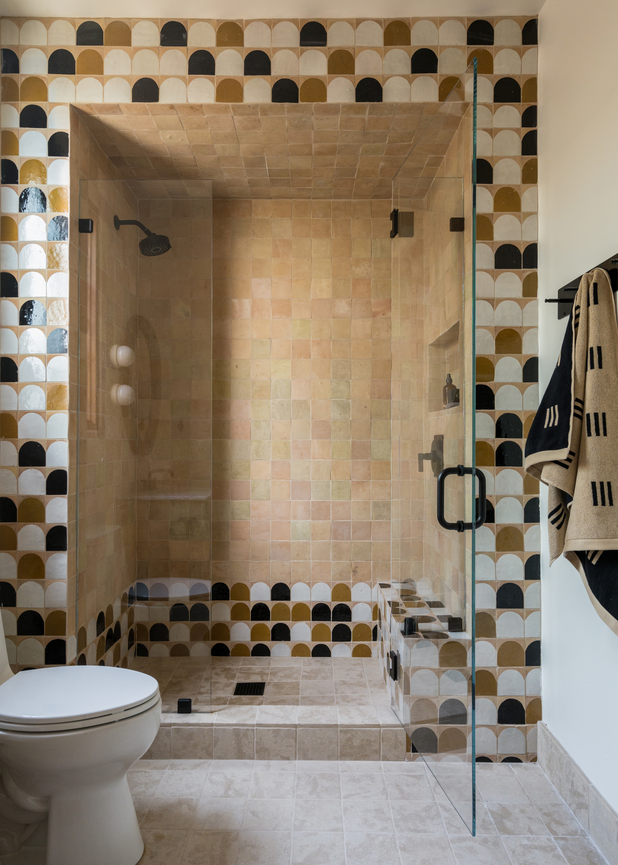
"Tile-drenching, when done well, is one of the most striking looks you can create, but the secret to making it work is cohesion. Stick to a single color palette and then play with variation, perhaps a gloss metro tile paired with its matt cousin, or a large-format porcelain on the walls offset with mosaics underfoot. By keeping the tones harmonious, you get drama and depth without sensory overload," says Grazzie.
Damla echoes this point, saying, "Keep the palette controlled. If you’re tiling wall-to-wall, stick to a single colour or a tone-on-tone approach, perhaps mixing matt and gloss finishes for depth."
Bringing in different shapes or finishes, while sticking to the same color and material, is a beautiful way to create depth and interest while maintaining cohesion.
Tiles That Never Look Overwhelming
But, as Grazzie says, "Some tiles will never feel like too much, no matter how you use them."
Sticking to these reliable types of bathroom tiles is a great guideline to follow if you're nervous about your bathroom design looking 'too much'.
Classic metro tiles, soft stone effects, and large-scale porcelains in muted shades are Grazzie's top, fail-safe choices. "They are the dependable backbone of a bathroom, giving you that all-over tiled look without dominating the space."
For Damla, solid-colored ceramics, neutral Zellige tiles, and soft-toned cement tiles are all safe bets for creating a well-balanced space. "Their simplicity allows you to use them generously without tipping into excess, while still adding texture and depth," she says.
Size: 5 x 30 cm
Material: Ceramic
If you're on the hunt for some surprising, striking, but not overwhelming tile styles, we've got you covered. The plaid and gingham tile trend is one of our favorites, or, for something with even more character, you can't go wrong with a tile mural.