Google may be about to change the look of your Android phone quite drastically.
It is forcing the hand of developers, to better match app icons to your device theme.
The appearance of your Android phone may be about to change thanks to a new Google update. It's not a software update for your handset, though – this one is set to affect the developers of your favourite apps.
A new change to Google's agreement with those developers means that they'll have to give up control of the way the app icon looks. That's designed to offer more of a seamless appearance when you're utilising a theme, as everything can be set to use a single colour palette.
Currently, developers uploading to the Play Store are required to supply a monochromatic version of their logo, but many avoid this for a range of different reasons. That ranges from issues over brand recognition, to issues over designs which don't translate well to a single colour.
Now, Google has levied an update to the agreement it shares with developers in a bid to take control of that. It now requests that developers "grant to the user a nonexclusive, worldwide, and perpetual license to perform, modify color of, or add themes to, your Product icons.
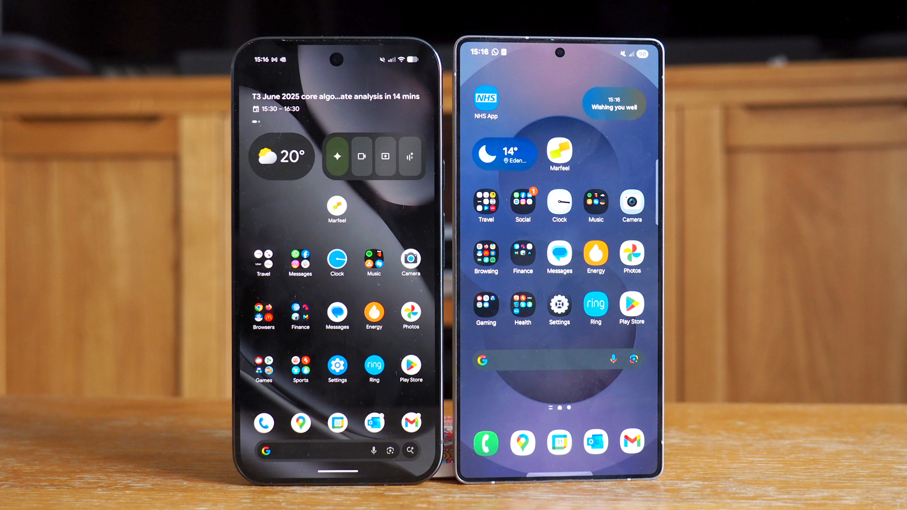
It's not hard to see why the brand is pushing for this. If you've ever tried to make use of a theme on an Android handset, you'll know it's not a particularly satisfying experience.
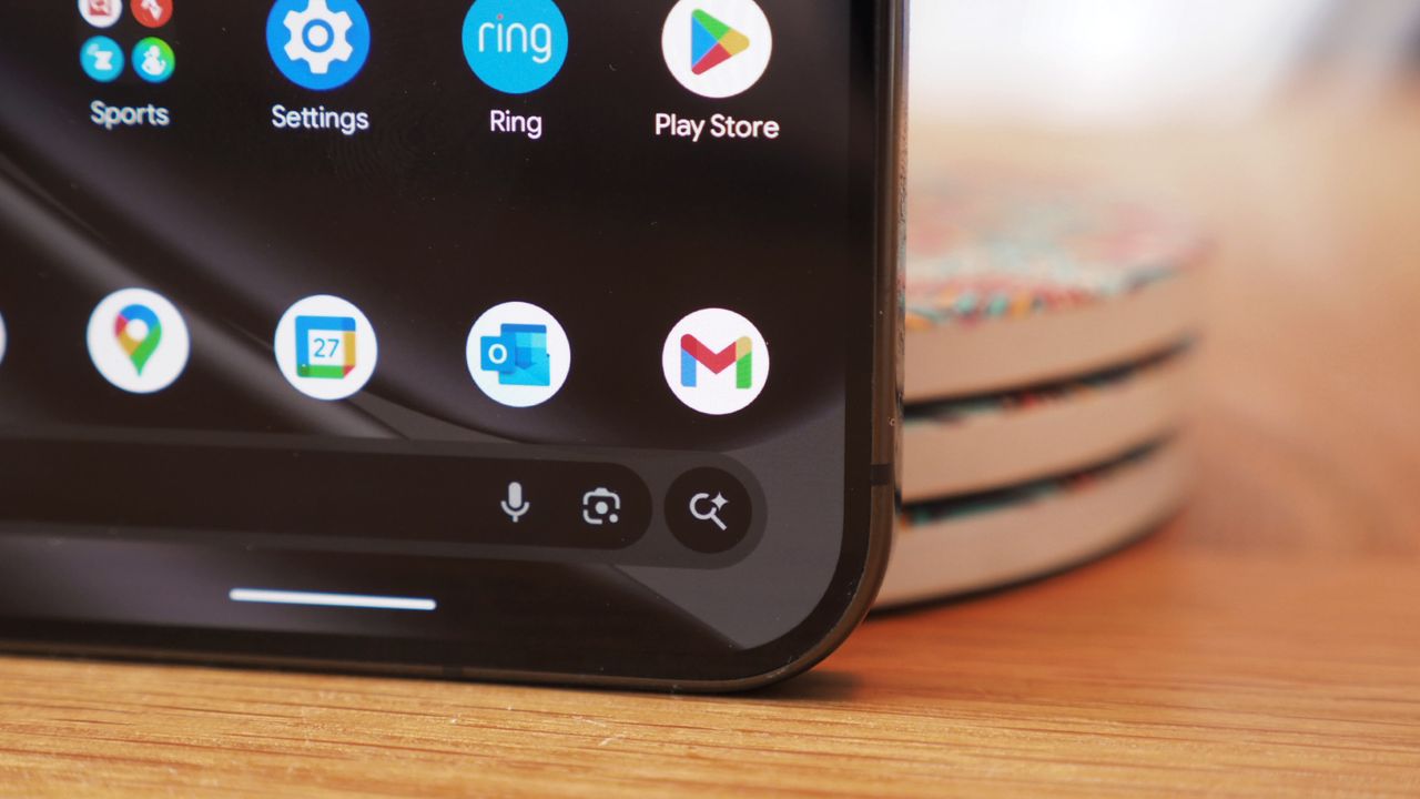
While some app icons update neatly, others stay stubbornly attached to their full colour default. That leaves users with a bit of a naff experience, where only some of the device gets themed. It's pretty poor, and it's clearly something which Google wants to improve upon.
It also ties into the recent announcement from the brand, which will automatically generate themed icons by applying a colour filtering algorithm to app icons. That will render them in a monochromatic style, to match the theme chosen by the user.
If nothing else, it should make the process of personalising your handset a lot simpler. We'll be keeping a close eye on things in the coming weeks, to see how big of an improvement there is.