For me, the success of a well-designed space often comes down to one simple secret: pattern combinations. Over the past year, I’ve noticed a real shift in interiors, with designers embracing bolder, more unexpected pattern pairings – so I, of course, wanted to know how they're doing it.
As designer Lauren Gilberthorpe points out, 'There is a growing confidence in how designers are mixing patterns, with an emphasis on contrast and character rather than strict coordination. The aim is to create something that feels both refined and expressive, where each element has its place but still allows for a sense of spontaneity.'
Whether it’s stripes and florals, or plaid on plaid, the right pattern trends can transform a space from bland to inspiring. With that in mind, I asked interior designers for the pattern pairings they're loving right now – and how to make them work in your own home.
The New Pattern Pairings Designers Love
'Layering patterns like a designer always begins with a base pattern, something that captures the spirit of the space,' explains designer Kailee Blalock from House of Hive Design Co. 'Once that anchor is chosen, we pull its colors to build a family of supporting patterns. We’ll often mix scale (a large floral with a micro stripe) or shift texture (a crisp linen next to a wool plaid).'
'Whenever we’re unsure, we order samples and lay them all out together, texture, color, pattern, because nothing replaces seeing how materials actually talk to each other,' she advises.
Mixing and clashing patterns might feel intimidating at first, but designers are proving it can be fun, expressive, and surprisingly easy. And there’s a pairing for every interior design style. Here’s how the pros are doing it.
1. Stripes and Florals
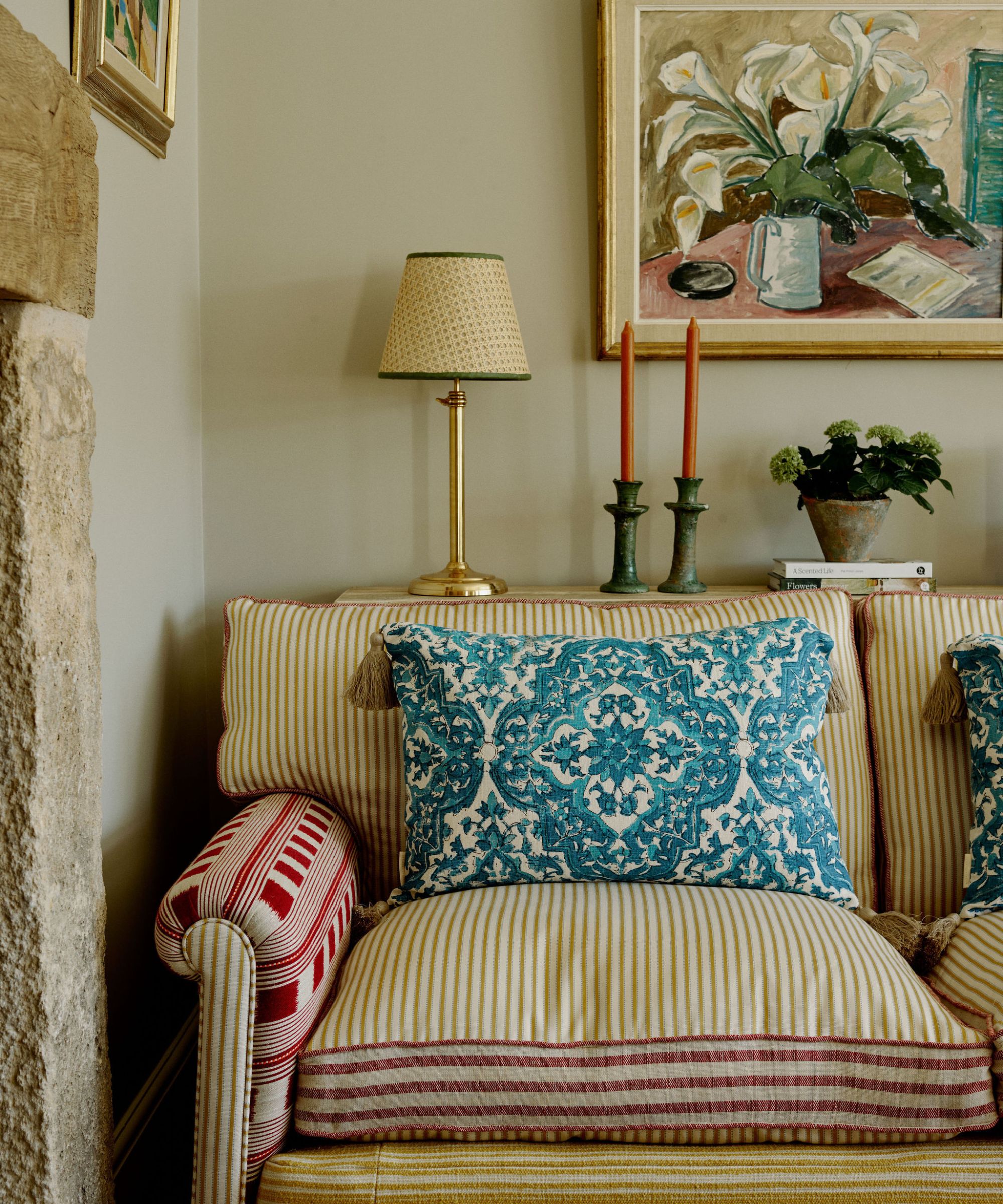
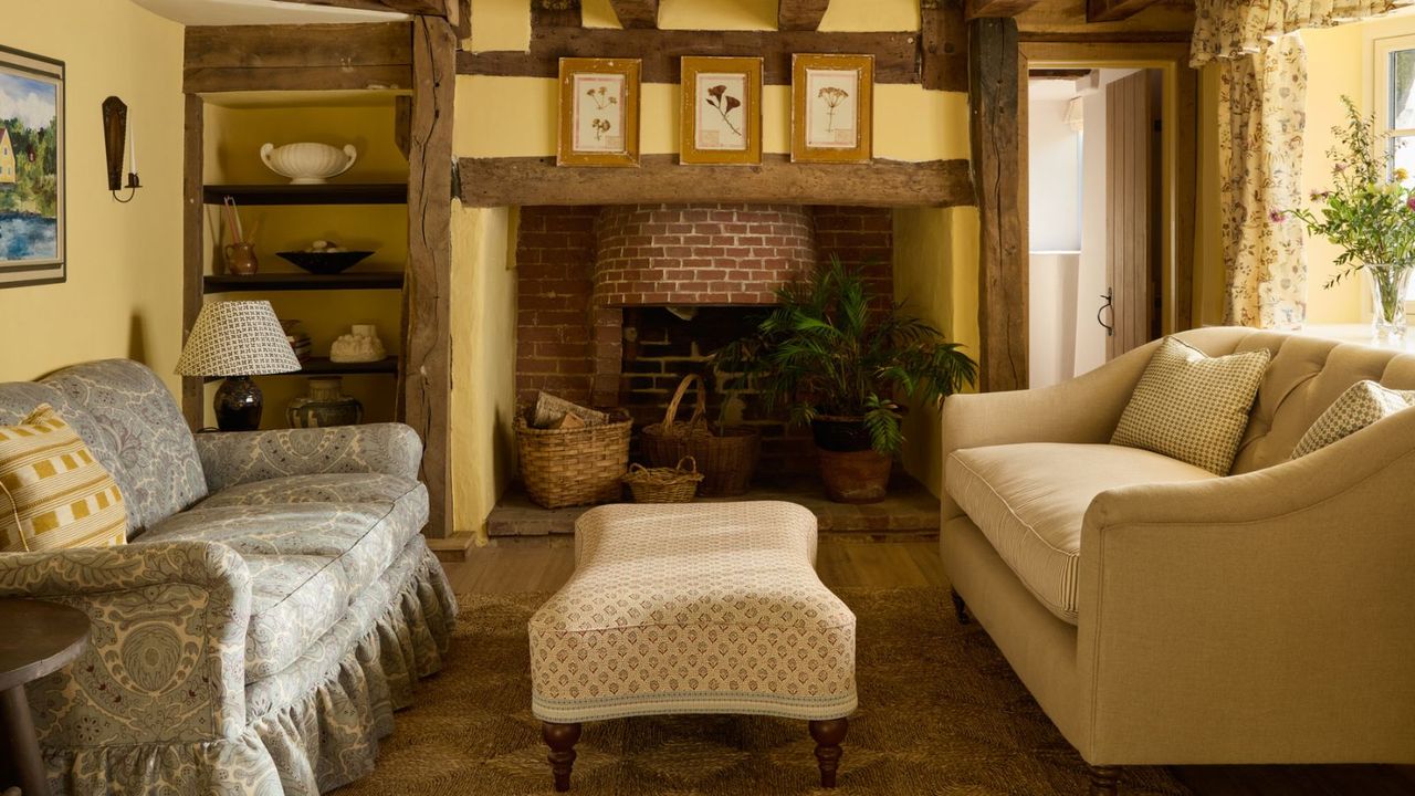
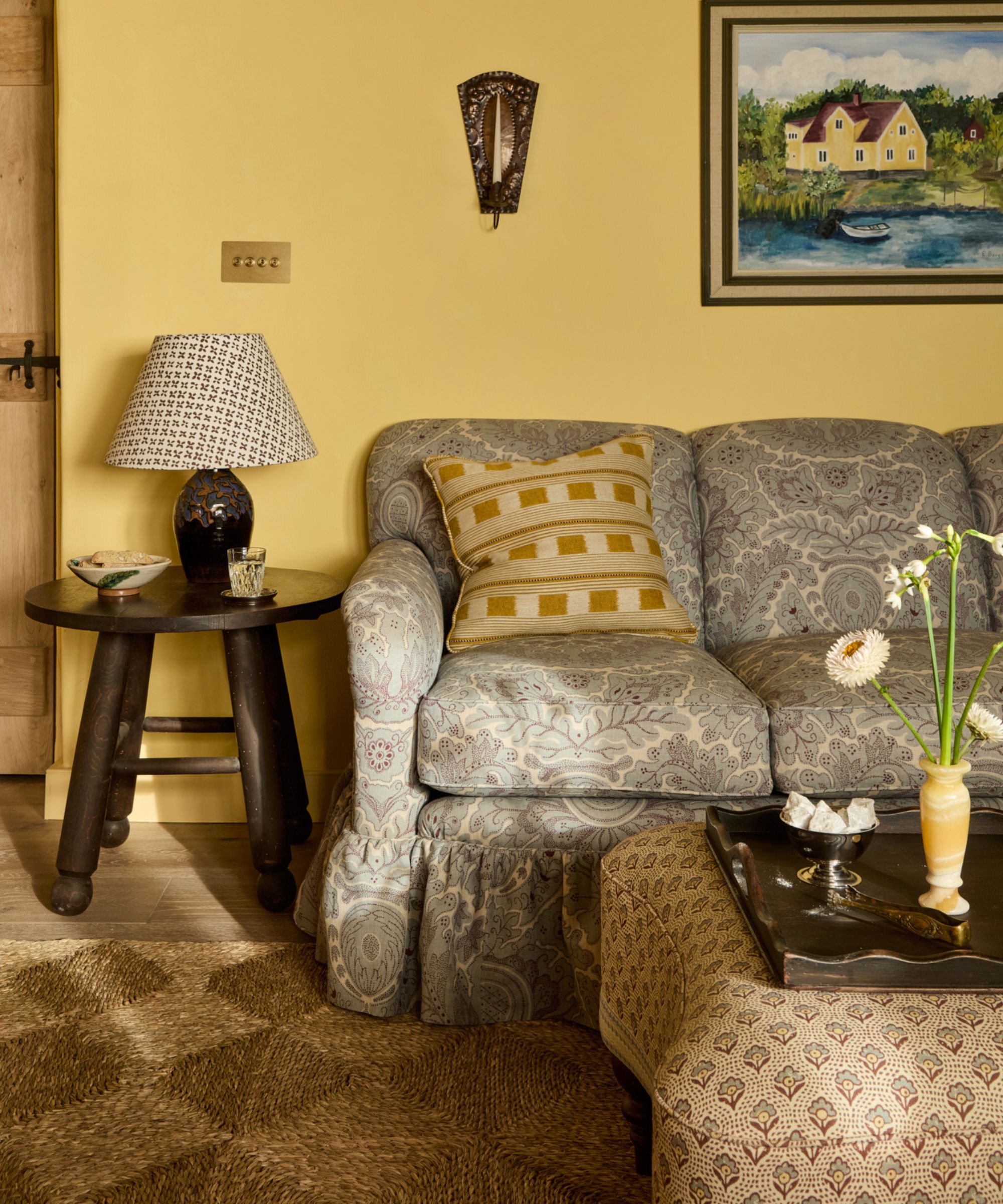
From speaking with designers, it is clear that pairing stripes and florals comes out on top. It's a classic combination that balances structure and softness with ease.
'I am loving bold, unexpected pattern combinations right now! It’s absolutely my dream, like a large-scale floral with a tight geometric stripe,' says Michelle Murphy, of DEMI RYAN. 'When paired thoughtfully, opposites make each other stronger. I often keep one pattern grounded in a neutral palette and let the other bring in color or whimsy. Even mixing two different stripes can feel fresh if the scales vary!'
'I’m loving the balance of organic and structured patterns: a botanical print beside a tight geometric, or a painterly textile layered with a micro-check,' agrees Franky Rousell, founder of Jolie. 'It’s that tension between softness and precision that gives a room life.'
Subtle approaches are equally as effective.
Mindy Kelson O’Connor says she has been pairing 'Tight stripes with large-scale vintage floral patterns. I've been using a lot of warm neutral brown/russet color striped patterns, as well as distinguished blues and greens in tailored crisp arrangements, but slightly stepped back tones, and pairing them with fanciful large florals with a lot of color variety, pulling some thread of continuity, whether in color or tone between them.'
Alternatively, designer Rachel Sloane suggests pairing a floral pattern with polka dot. 'I just wallpapered a hallway with a print that feels polka-dash (not dot), and I’m tempted to do a floral runner, or even framed floral prints hung on the wallpaper. The change in scale feels dramatic, and the polka dot adds a touch of whimsy and airiness to a floral moment.'
Ruffles and florals are a match made in heaven. The natural calico material of this design lends a subtle vintage tone that pairs beautifully with the hand-painted florals for a whimsical accent piece.
Bold and chocolate yet totally a neutral, this deep brown striped rug has been handmade of natural fibers for an easy yet elevated look. Pair it with plenty of floral and gingham prints in your pillows and drapes.
To mix and match floral scales, pair a tiny floral with something bolder like this Annika pillow cover by Shea McGee. Its super soft wool and silk blend gives it a luxurious feel, while the navy tones feel rich for fall.
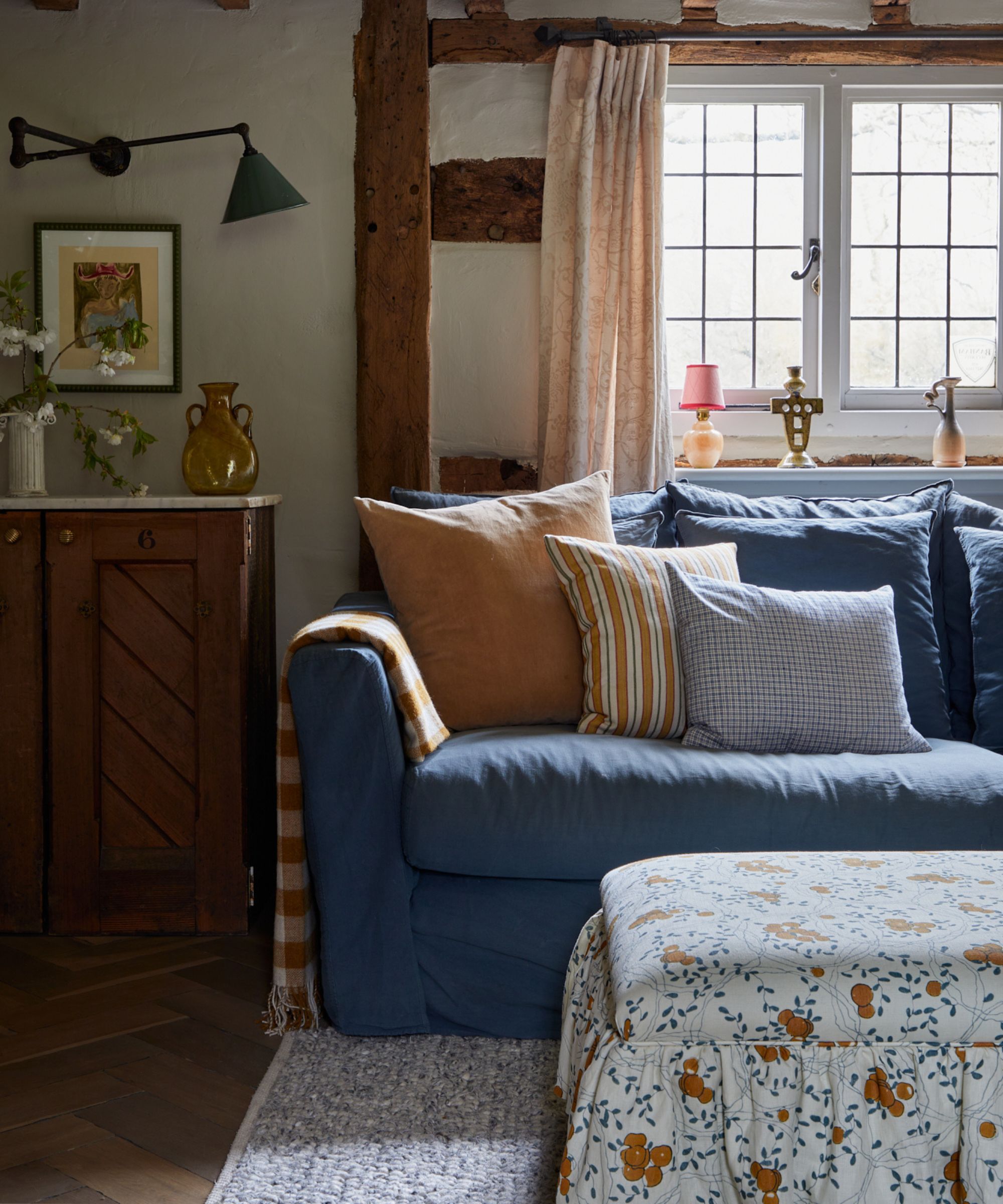
2. Plaids, Tartan, and Checks
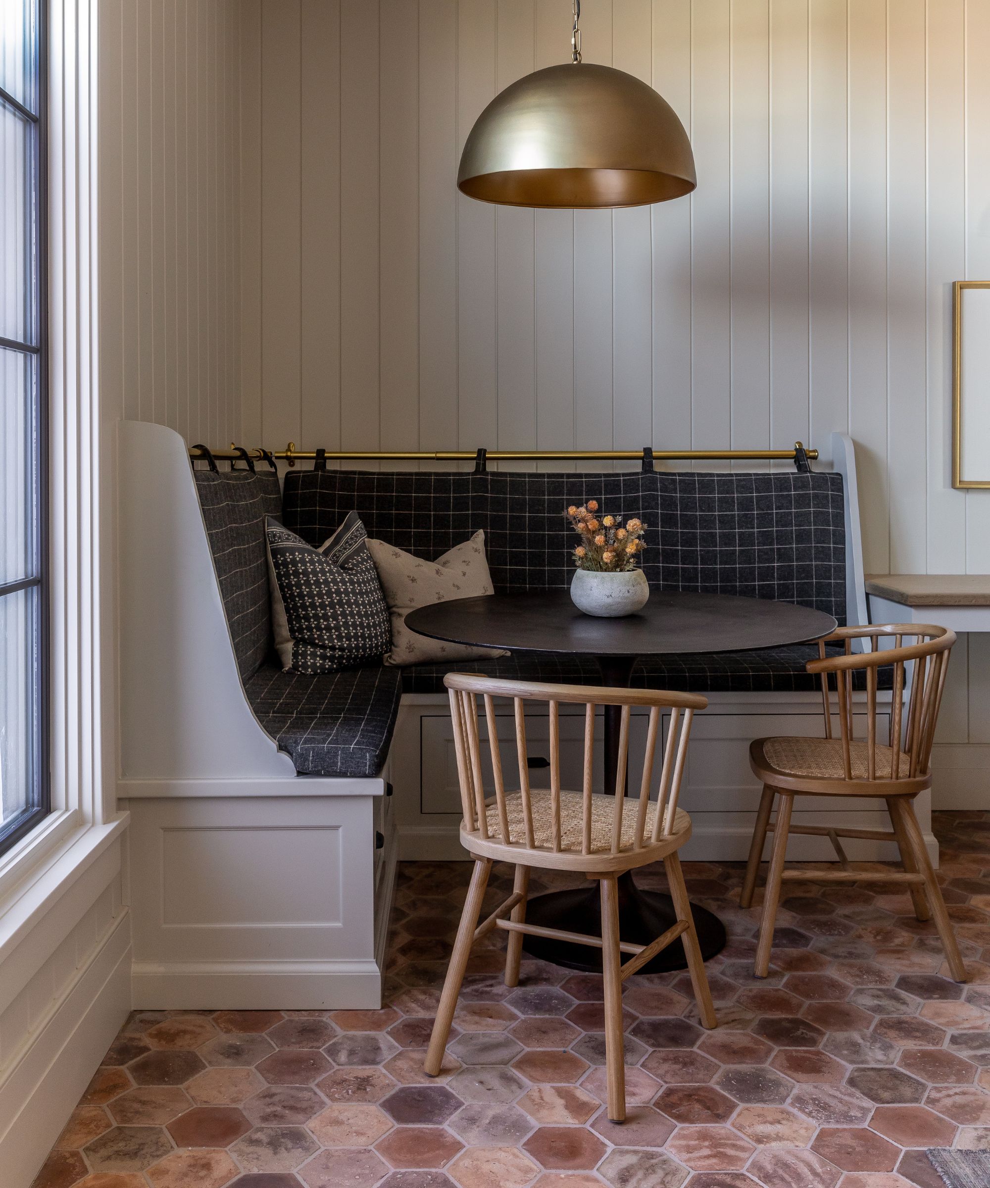
Plaids, tartans, and checks are enduring classics that have found a fresh feel through thoughtful pairing and layering.
While designers haven't suggested an exact science to this combination, Kailee Blalock highlights some of her favorite combinations, including 'Preppy tartan and ticking stripe, houndstooth and herringbone, and folk embroidery with a windowpane check.'
Color is key to keeping these structured prints from feeling rigid. Amy Lee McArdle of Amy Young Designs says: 'For me, patterns should whisper, not shout out at you. A subtle plaid next to a quiet stripe, or tone-on-tone geometric wallpaper paired with solid velvets. Keep the palette grounded – camel, espresso, bone, and olive – then let one accent, like cognac leather or smoky teal, anchor the room.'
Sophie Salata, head of brand at Vinterior, shares her best advice on making them feel cohesive. 'Clashing patterns which somehow work together, the key here is to embrace color, be confident in your choices, and moodboard first so you don’t get a shock when things come together at the end.'
A timeless, neutral, and versatile piece, this light brown gingham shade can be switched out in the fall to add some extra charm to your living room or bedroom lighting that feels extra cozy.
Made in India using a soft linen-cotton blend, this folk-inspired floral pillow cover is embroidered with climbing vines and medallion flowers in a soft red, pink, and blue palette that works lovely with richer tones.
This cozy yet breathable and lightweight chenille throw blanket has been designed in a classic buffalo plaid that works just about any time of year. It'll add an extra soft layer to your sofa vignette and introduce a subtle new print.
3. Geometrics and Stripes
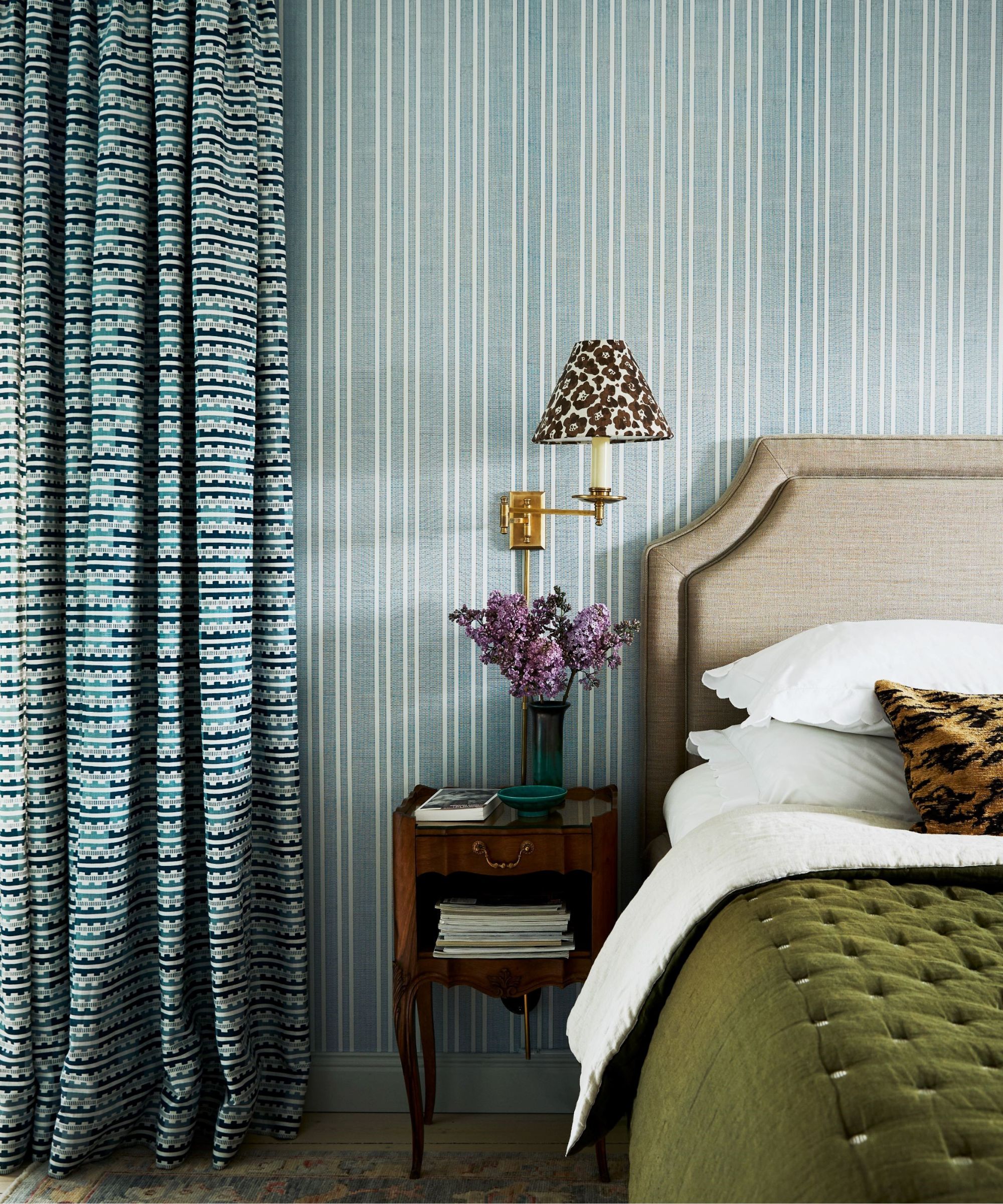
Geometric patterns are often associated with precision and symmetry, but designers are pushing them in unexpected directions, mixing structured motifs with artisanal, cultural, or playful prints.
Lauren Gilberthorpe says: 'A favourite pairing at the moment is checkerboard with stripe. The geometry of the two patterns works beautifully together, creating a clean, symmetrical look that feels confident and considered.'
'We’re also seeing a lot of gingham and stripes – especially in smaller, softer scales,' agrees Ali Henrie of Ali Henrie Design.
'For something a little more playful, I enjoy mixing squiggle with a wider stripe,' Lauren continues. 'The combination introduces visual tension and a lively contrast, creating an effect that feels deliberate and modern.'
Lumbar pillow are rising in popularity, and the Frieda from Joon Loloi is up the top of the wish list. It brings some handcrafted flair to an accent chair, thanks to its 100% cotton hand-stitched details that add texture and depth.
While they look super heavy and luxurious, these Anthropologie velvet striped drapes actually provide a cozy light-filtering ambiance. The unexpected color combination is just the cherry on top too.
Made using Schumacher's chevron print, this plush velvet pillow features a subtle ombre accented by delicate zig-zag stripes that brings dimension to a couch or banquette with paired with stripes and checks.
4. Botanicals and Animal Print
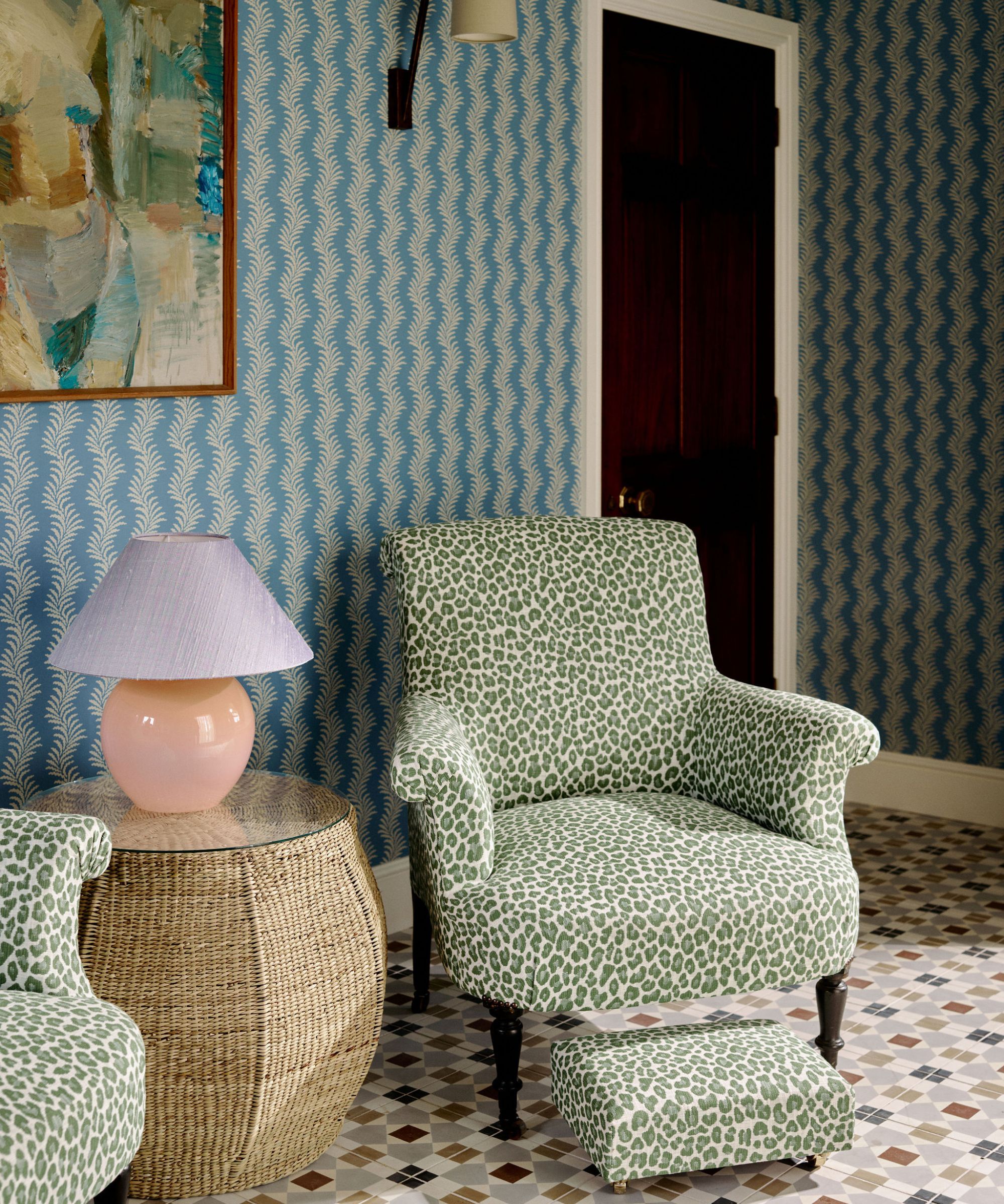
Botanical and nature-inspired patterns are a perennial favorite, offering a sense of calm, freshness, and a subtle connection to the outdoors. And designers are keen to point out that mixing these patterns with structured prints can be particularly effective.
'Lately we've been mixing country patterns, think folksy florals and lots of plaid, with animal print. It creates a cool edginess,' says Jeanne Barber, founder of Camden Grace Interiors.
And Lauren agrees: 'Animal print and botanical motifs are very fun and offer a nod to the great outdoors. Whilst quite strikingly different, both can work well when used together in a color palette that balances each element.'
'Geometrics and florals are an obvious pairing and work together harmoniously both in scale and color,' Birdie Fortescue adds as an alternative. 'They can be used in a classic, restrained way, or you can be more adventurous and playful with the proportions and tones to make more of a statement.'
A hallmark print of Reverie, Sarah Sherman Samuel's fall collection for Lulu and Georgia, the Garden Walk botanical pattern has been designed to feel deep, characterful, and richly detailed.
Take a walk on the wild side with this designer-approved Tigris print rug. Designed to represent a bold take on timeless animal print, its been reimagined in a more subtle colorway to work in contemporary and traditional spaces.
Try your hand at pattern drenching and introduce this bolster cushion that perfectly coordinates with the Garden Walk wallpaper. Also available in a soft blue, and across many different items, you can create a really cocooning scheme with this print.
A final tip? 'I love using multiple patterns together, but there needs to be a hierarchy amongst them to maintain balance,' Birdie Fortescue explains. 'Your hero is the largest, most important print which should be allowed to take centre stage. Add in mid-scale pieces such as geometrics and smaller florals, which pay homage to your hero! Lastly, combine with a few small-scale ditsy prints, checks, and plains to layer and add interest. Throughout the scheme, make sure there is a balance of color, focusing on two main tones with pops of another to link in other elements in a room, such as artwork or a rug.'