It is a common misconception (and crime) in interior design that designing a luxurious home means having to stick to a bland, boring beige palette. But your space is often left feeling flat and a little soulless.
So what is the antithesis to personality-lacking minimalism? Enter the colorful quiet luxury trend.
'This new take on the quiet luxury trend is all about using color with depth and discretion,' says designer Kati Curtis, who first coined the term for this interior design trend. 'It’s where rich palettes, global influences, and handcrafted details unfold in spaces that feel intimate, emotionally intelligent, and timeless.'
Far from being loud or overtly trend-driven, this new approach is centered around subtle richness – layering sophisticated tones into high-quality materials for a look that’s both timeless and full of character. If you're looking for what's replacing quiet luxury in 2025, you're in the right place.
What is 'colorful quiet luxury'?
'In today’s landscape, where minimalism feels generic and maximalism can be overwhelming, this concept offers a more soulful middle path,' adds Kati. 'It’s not about ostentation, but about intentional layering – where a deeply saturated wall might ground a room with contrast, or a handwoven textile whispers a story passed down through generations. It’s about elegance with personality; vibrancy with balance and harmony,' she explains.
So rather than simply throwing in a trend-driven color pop or other low cost updates to make your home look more expensive – instead the palette here should feel curated, timeless, and chosen with intention.
It’s less about moving in the direction of loud luxury, and more about mood, adding warmth and nuance to a room without overwhelming the senses.
Designers are embracing this more soulful approach to luxury and are moving away from the idea that luxury has to mean neutral – and it’s easy to see why.
'Where classic quiet luxury found its roots in minimalism, colorful quiet luxury leans into meaning. For years, quiet luxury spoke in hushed tones – cashmere neutrals, stonewashed linens, creamy plaster walls, and the reassuring palette of oatmeal and fog. It was elegance at a whisper: understated, earthy, imperceptibly expensive. But lately, a new interpretation is taking hold, one that adds color back into the conversation, without ever raising its voice,' adds designer Nina Lichtenstein.
'Examples include saffron velvet in a room of textural whites or a deep aubergine accent ceiling in an otherwise restrained space. The hues are rich, refined, and curated,' she adds.
If that feels like an interior design style that resonates with you, here are a few tips for bringing a more colorful take on quiet luxury into your own space.
How to embrace colorful quiet luxury in your home
1. Build on your palette of neutrals
The key is to start by decorating with neutrals in familiar, calming tones like warm whites, soft taupes, and natural wood, then slowly build upon them with rich colors. This layered approach allows for a space that still feels serene and minimalist, but with added visual interest and depth.
'Colorful quiet luxury is all about restraint – it’s the art of using color with purpose rather than excess,' says designer Laura Hammett. 'In our projects, we often build from a palette of warm, calming neutrals and then introduce subtle color through undertones – such as a blush-toned taupe, a soft plaster pink, or warm beiges that shift gently in the light. These shades bring a sense of personality and warmth, but they’re never overpowering.'
If you already have a neutral base, think about introducing color through textiles, art, or painted woodwork to enrich your palette without losing the calmness that beige paints bring to a space.
'It’s a more nuanced approach to color that feels elevated, considered, and timeless. Paired with rich textures, layered lighting, and natural materials, even the gentlest hues can become a statement in their own right. That, to me, is the essence of quiet luxury – colors that don’t need to shout to be noticed.'
2. Pick colors that resonate
While neutral tones remain central to the quiet luxury aesthetic, if you're looking for what makes a home look expensive, designers stress the importance of color that speaks to you and your home.
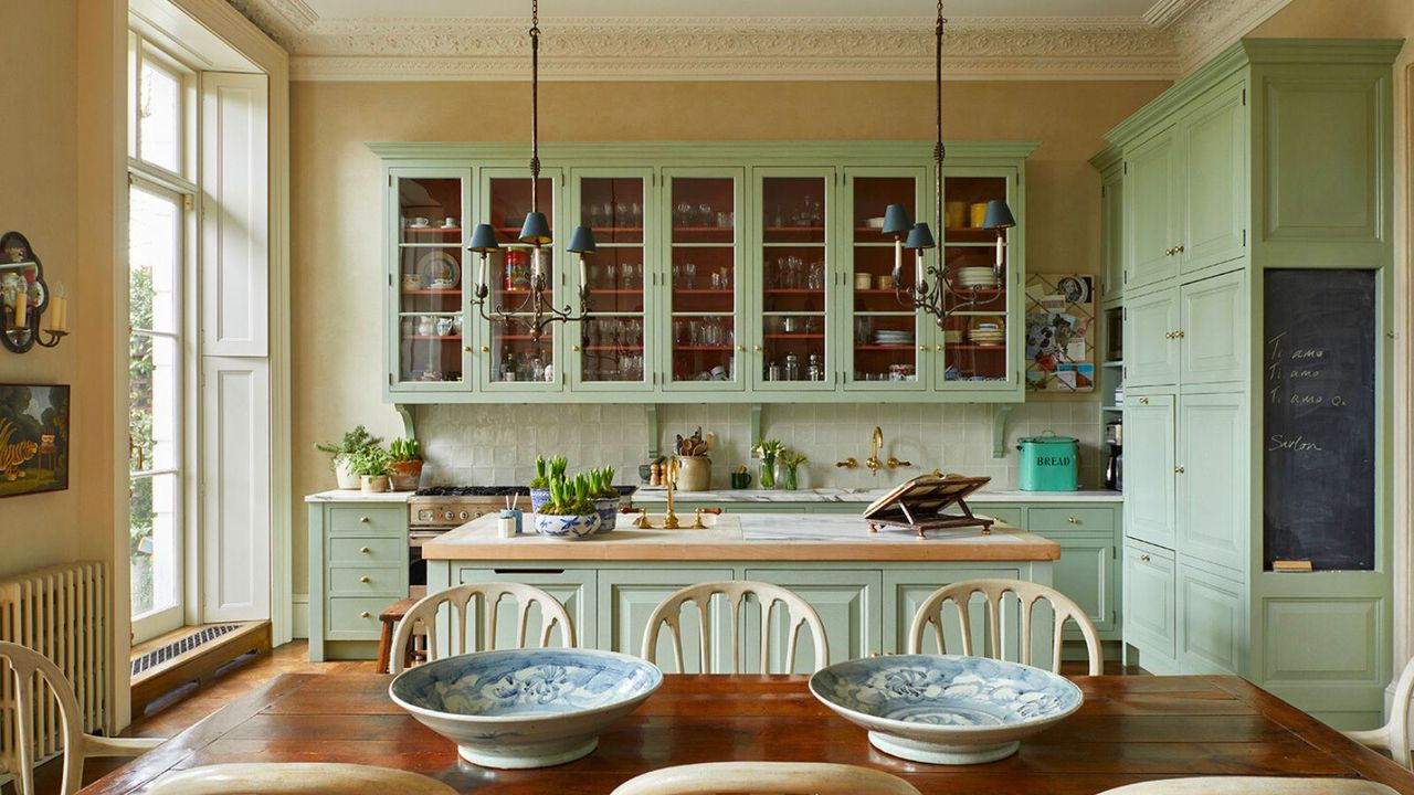
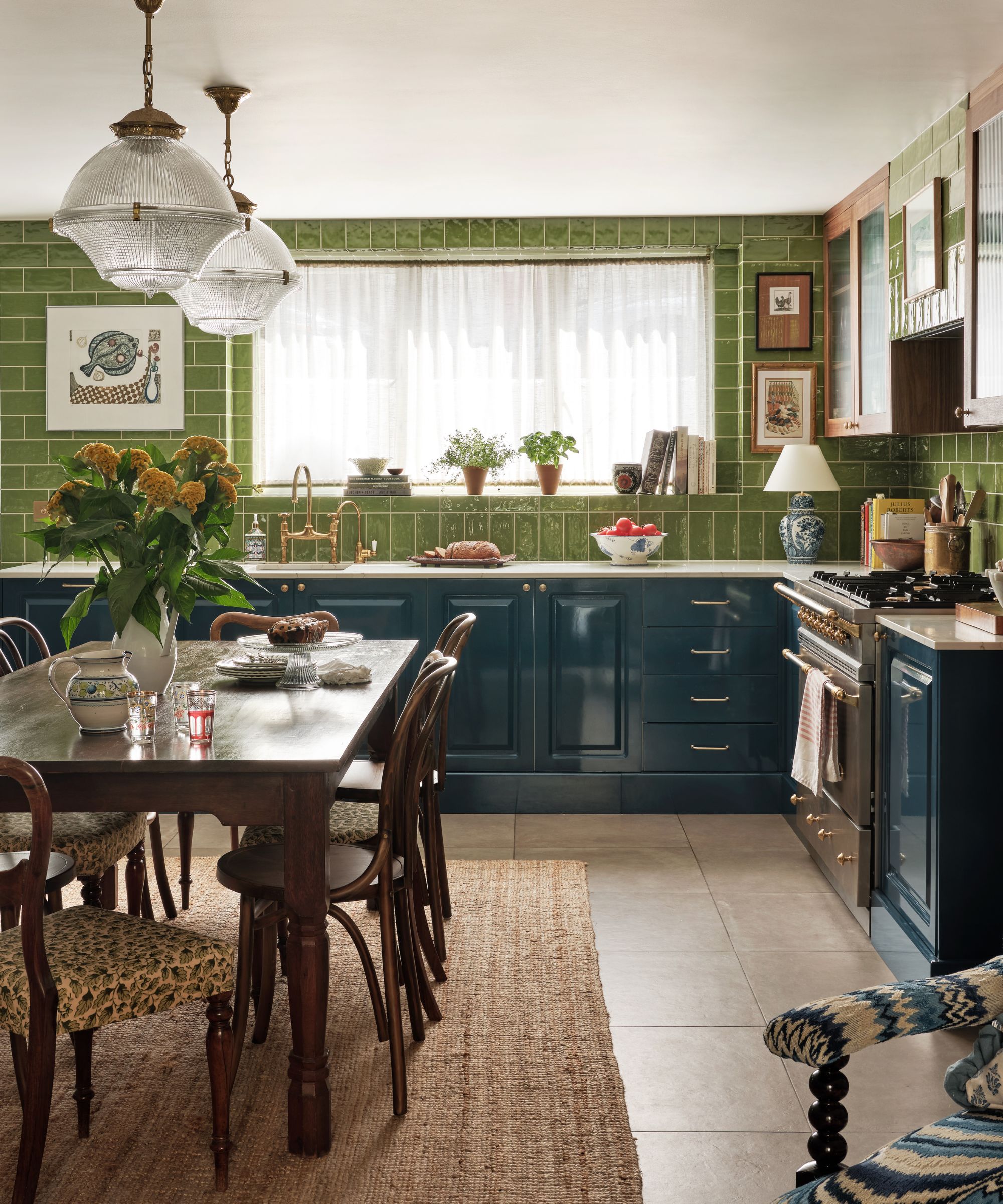
'Design with neutrals that respond to place, not just trends,' says designer Rebecca Hughes, who designed this blue and green kitchen seen above. 'Neutrals don’t have to mean pale or minimal, it’s about how color reflects the unique character of each home. In my own home, I love soft and earthy neutrals with an injection of rich, moody hues like chocolate and oxblood.'
'Our projects are always shaped by the setting,' she adds. 'We’re currently working on a property in the country, and nearly every room incorporates green or brown tones that reflect the leafy landscape. It’s about resonance as much as refinement.'
'All colors have psychological meaning, so choose a color that’s appropriate to the room you are intending to decorate,' adds Patrick O'Donnell, brand ambassador at Farrow & Ball. Choosing hues that speak to a home’s natural light, materials, and geography helps create a palette that feels both elevated and authentic.
3. Prioritize luxury
While the palette may be more expressive than traditional quiet luxury, the key lies not in how much color is used, but in how considered every element is. Prioritizing craftsmanship, texture, and expensive-looking materials ensures that even bold choices feel grounded and elegant rather than overstated.
'The colors for quiet luxury are often misunderstood as purely neutral, but in reality, it’s about material integrity and refinement,' explains Kailee Blalock from House of Hive Design Co. 'When bringing in color, it’s rarely through loud prints but rather through elevated materials and fabrics that inherently feel luxurious.'
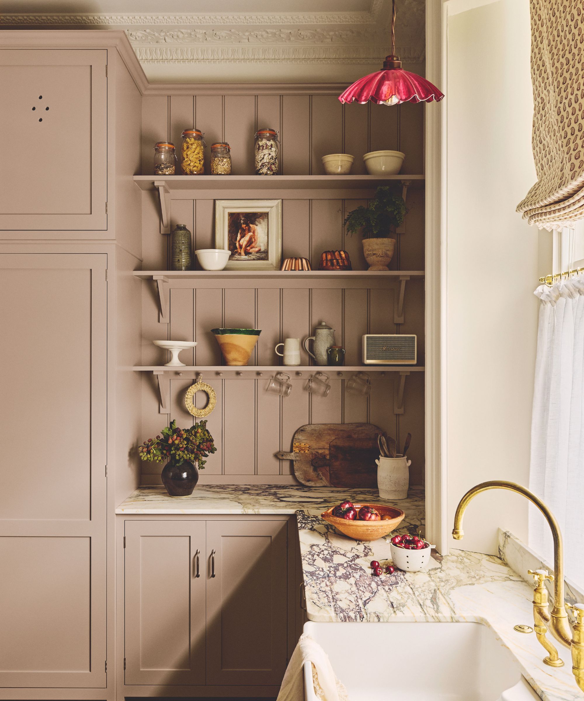
'Colored materials like furniture in moss green or deep navy, lacquered finishes in earthy reds or charcoals, and subtle colored marble accents are ways to add color while maintaining quiet elegance. Even seemingly simple additions, like a pale celadon silk wallpaper or a deep aubergine velvet cushion, feel elevated because of the craftsmanship and natural richness of the materials themselves,' she adds.
It’s about investing in the right things, like natural stone, handmade ceramics, beautifully upholstered pieces, and letting those choices speak for themselves. Color just becomes another layer of that luxury when it’s applied with intention.
Shop the colorful quiet luxury look
Marble remains the epitome of luxury, whether you love color or neutrals. These oxblood red marble bookends from Shea's McGee & Co. will add just the right pop of color to your shelf styling.
Embrace the lacquer trend with this scalloped round coffee table tray made by Addison Ross. It is made from solid wood and coated with 20 coats of high-gloss for a truly reflective shine.
You can't get more sophisticated than a velvet throw pillow, and this mossy green bolster pillow is a great way to introduce some earthy color, while the contrast piped edge adds a polished feel.
Designed in collaboration with renowned designers Pierce & Ward, this vintage-inspired accent chair is finished in a golden upholstery with curved, warm walnut arms and legs for a truly statement finish.
Made in Sydney, Australia, exclusively for Net-A-Porter, Dinosaur Designs' marble-effect resin bowl is seen here in a unique blood orange hue that will certainly add some vibrancy to your space.
Artwork is a great way to introduce color to your walls if you're not feeling too confident with paint choices. The abstract nature of this piece brings a sense of movement with muted, retro colors.
Luxury doesn’t have to be loud to make a lasting impression. 'While the materials remain rich (marble, wood, silk, velvet), the shift is in how they’re paired. The palette is still low-key, the luxury is still quiet. But the emotion is elevated with color,' adds Nina. If you're looking for further room color ideas, check out our roundup of the top color trends for this year and beyond.