January is relatively miserable, provided you're in the northern hemisphere. For cycling fans though it means that the WorldTour peloton is now showcasing new tech, new bikes, and most importantly for this article, new kit. The jerseys of the world's pro cycling teams are now all out there in the wild, and we've done our usual mass office vote to bring you the definitive rankings.
There are some big changes, some unusual colour palettes, and new sponsor decals to shoehorn into already crowded visual spaces. While others may claim to bring you an official kit ranking, none offer what I'm bringing you: Scathing comments from my mother.
She is a regular cyclist, but doesn't pay much attention to racing beyond the Tour de France, so it's about as objective a viewpoint as you're ever likely to get. Keep reading to see who ranked where, which teams have moved up and down, and which jersey my mum thinks "looks like a urine sample".
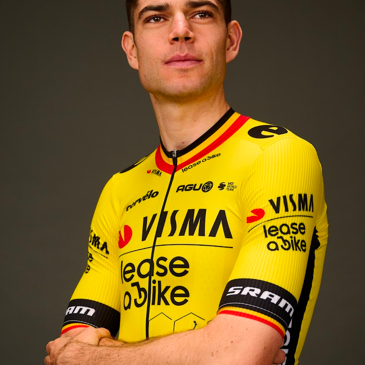
30: Visma–Lease a Bike (Men's and Women's)
Rock bottom, but an improvement on last year to my mind. The honeycomb motif is a neat touch, but I think it's a stretch to expect the team's super domestiques to ditch the team radios and communicate in a series of short dance segments...
Mum: Lease a bike is a very good idea... especially as I've chipped mine and I'm terribly upset about it. Would everybody have the Belgian bits?
Will: No, only former Belgian champions.
Mum: OK. I still think they need to choose a different yellow.
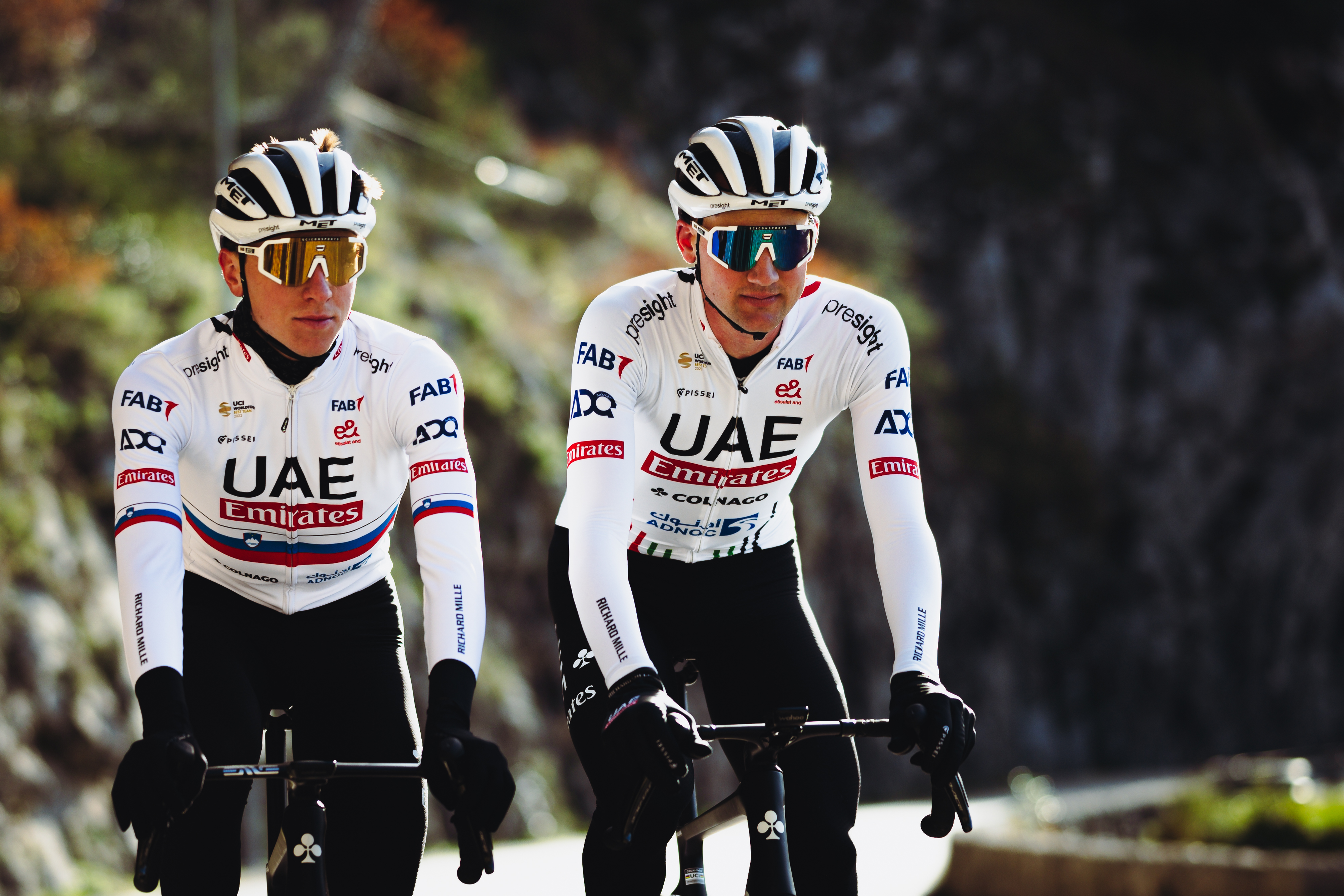
29: UAE Team Emirates
One of my favourites, and last year's kit was also one of my favourites. It's simple, it's classy, it's got a tonne of sponsor logos, and anyone wearing it is going to look more tanned. It took a while for Mum to ponder this one, but I think she actually quite liked it. Not so much my colleagues, though...
Mum: I don't understand what that stuff coming up the tummy is.
Will: I like that one!
Mum: It is clear, but it would almost be better if it didn't have those lines at the front that looked like two hands doing this*.
Will: That's gonna be hard to come across in the text...
Then, after a pause...
Mum: I know it sounds daft, but if that material is a nice dense white rather than a flimsy one it would look good. It depends on the colour of the shorts. What they should do is give their team red shorts.
There you have it folks, we need red shorts in the peloton.
* It looked like some sort of gang sign to be honest, but I think she just meant it looks like hands.
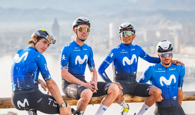
28: Movistar (Men's and Women's)
Movistar have a pretty tried and tested formula at this point. Black shorts, blue jersey, big white 'M'. Like many teams they've tried to modernise by adding a bit more graphic intrigue to the transition between jersey and shorts. It's fine by me, not my favourite but I think deserving of a top-10 spot. Mum didn't really like how freshly back-on-the-team Colombian, Nairo Quintana was sitting though.
Mum: There's a bit too much manspreading going on there... and why are they all wearing sunglasses?
Will: They're in Spain (probably). It's sunny.
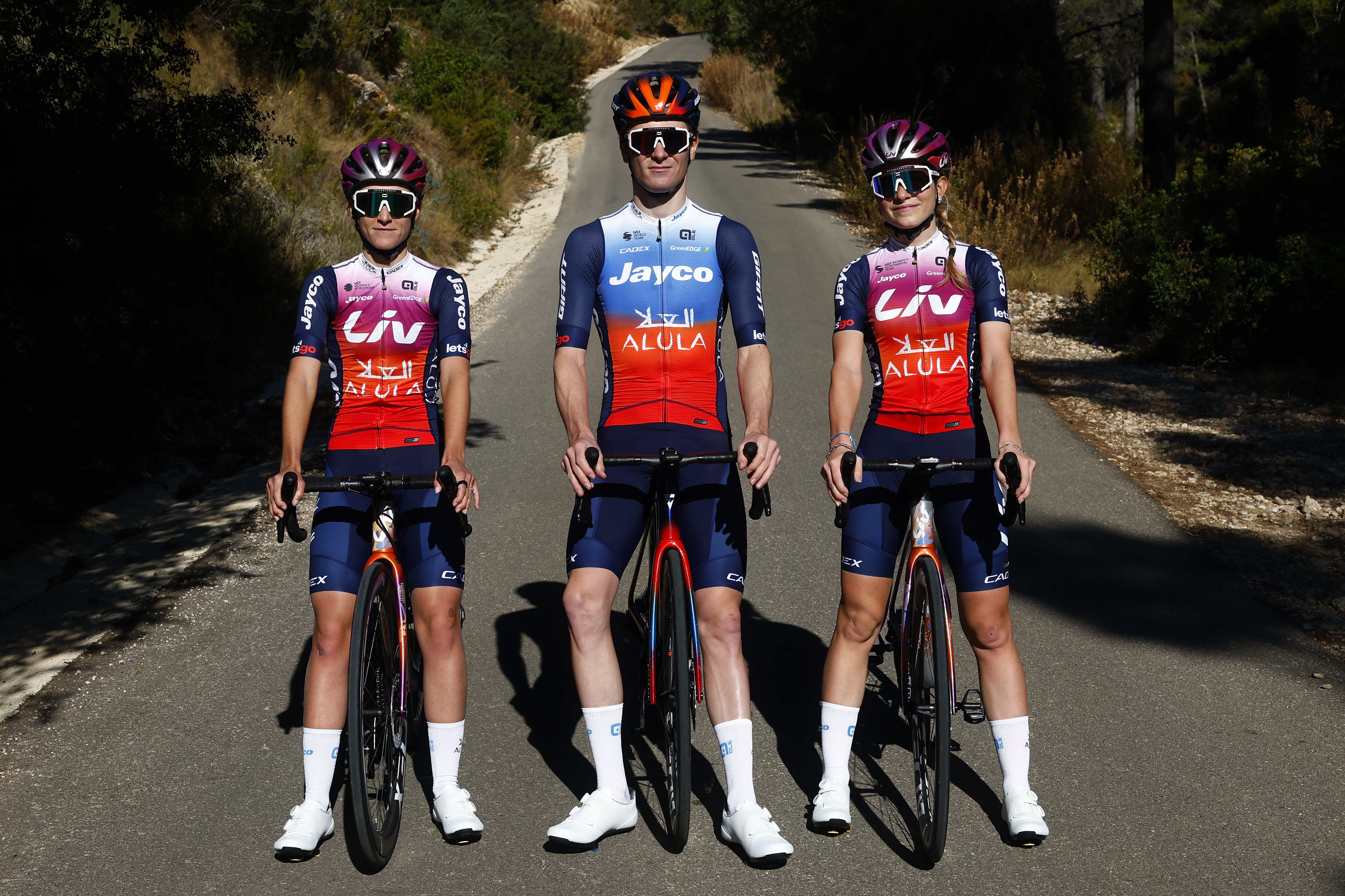
27: Jayco AlUla
This is my second least favourite. How it wasn't second last is a travesty. I guess there's no accounting for taste...
Mum: Absolutely not. Absolutely not. They need to get a colour wheel out. If they're going to do a fade, you don't don't fade that red into the blue. Oh dear. No.
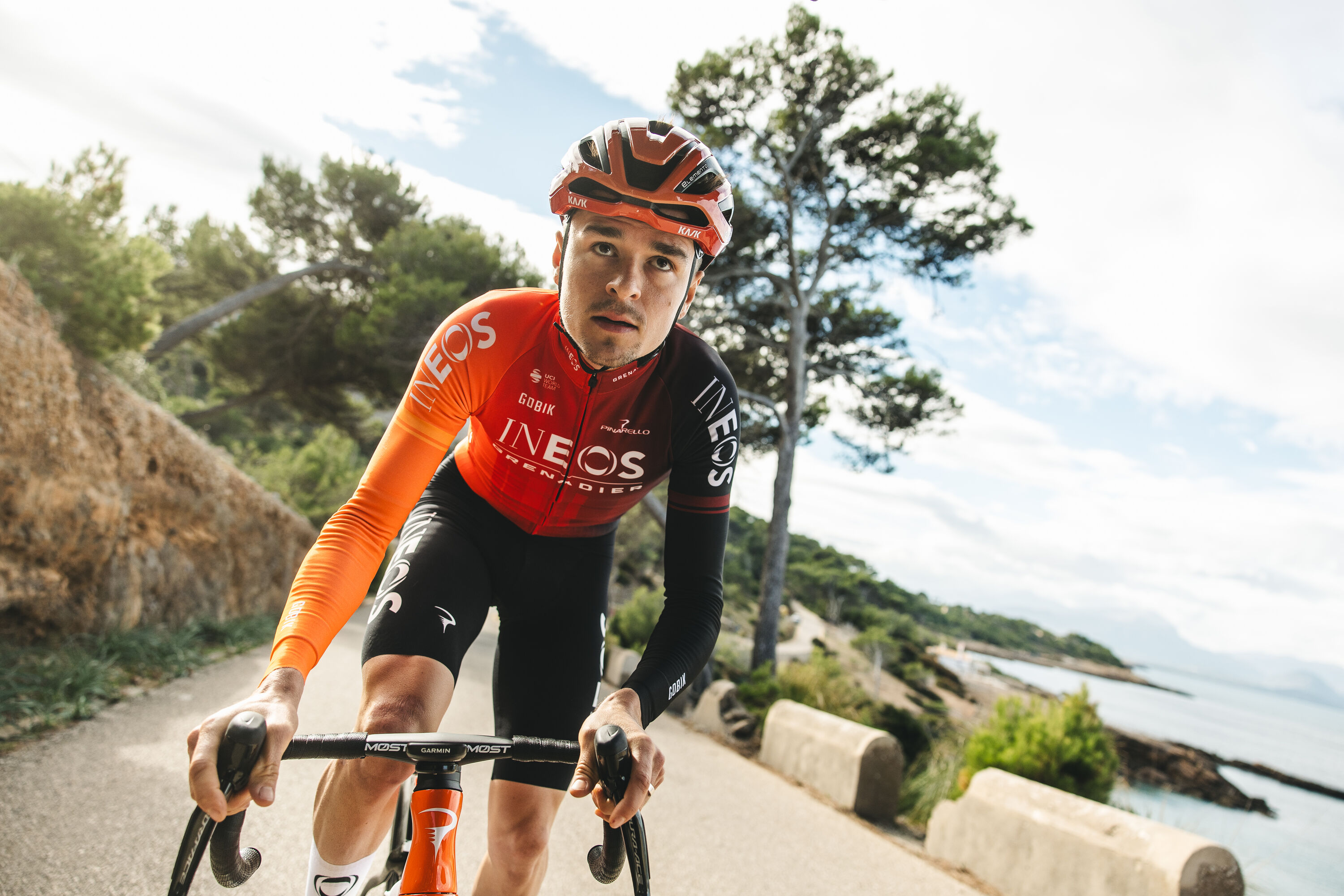
26: Ineos Grenadiers
Another of Mum's top favourites, but I think it's because she fancies our boy Geraint. Personally. I'm indifferent, but I am glad there's now some differentiation between the Ineos and the Bahrain kits.
Mum: Now that's quite striking. I like it. Yeah. I like the one arm being one colour and the one arm being the other colour. And I'm a big fan of orange.
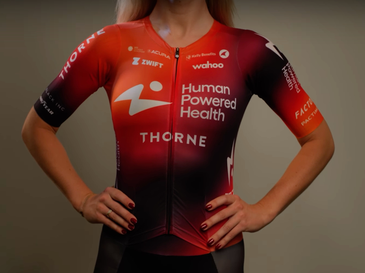
25: Human Powered Health
Human Powered Health is a simple affair, one that Mum struggled to picture in a team context, despite my best efforts.
Mum: What would it look like in a team?
Will: Like that, but imagine eight of them.. or seven.
Mum: It's not offensive. You can see it if you were a sponsor. You definitely get that it's doing its job. Isn't it? doing its job? Its job. Yeah, it's doing its job.
It is, clearly, doing its job, but not with enough panache to place any higher.
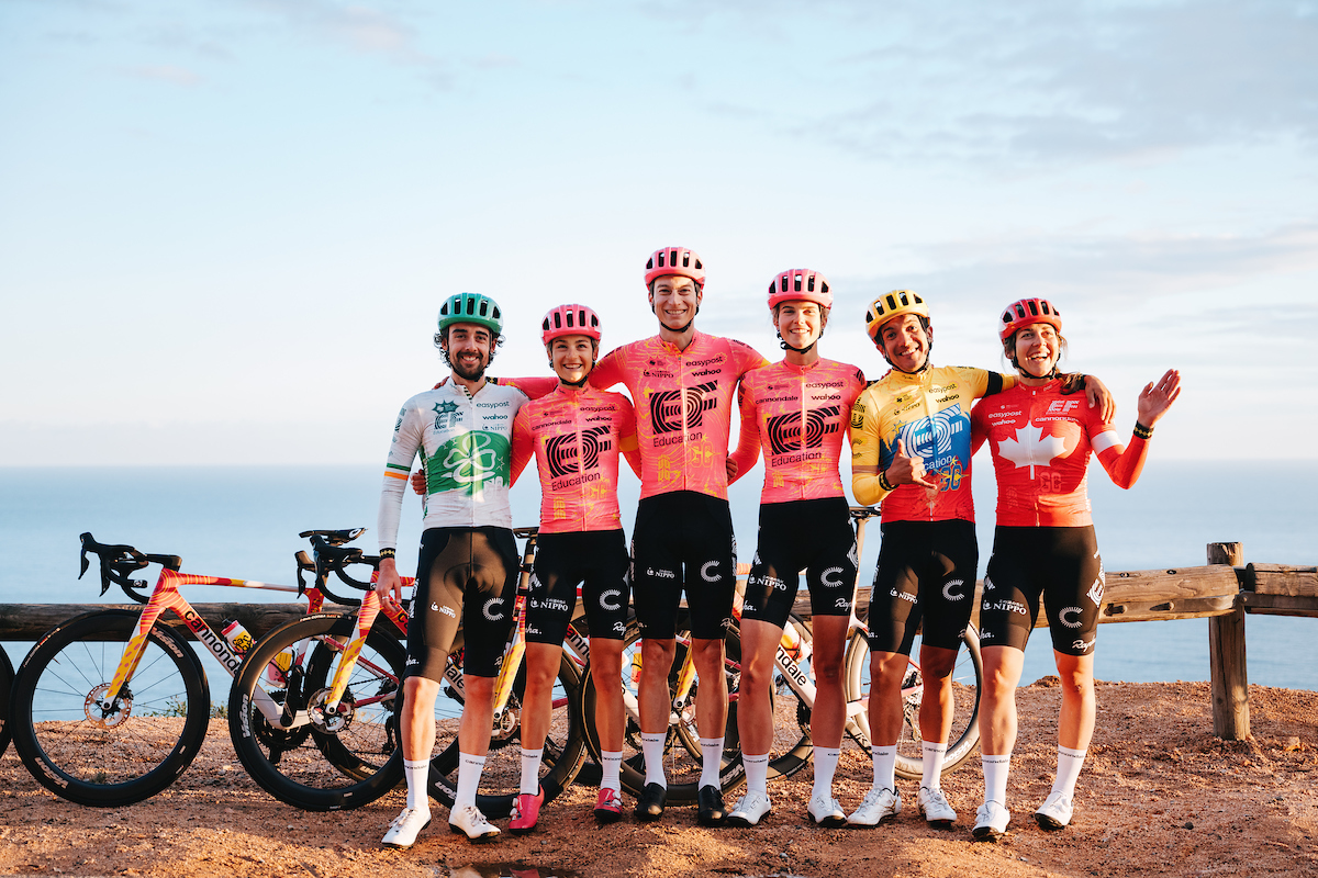
24: EF Education-EasyPost
I prefer last year's kit. more simple, more 'slowly depleting highlighter'. It gave me fond flashbacks to the weeks before my exams where I'd highlight everything in the hope that adding more pink would make me remember things better... Given that I trained as a geologist and now I'm a cycling journo I'll let you come to your own conclusions as to how well that went for me.
Mum: Get rid of the yellow! Get rid of the yellow! Make the Rapha strike bigger because people know what the Rapha stripe is and then put the Rapha in black. Get rid of the yellow!
Get rid of the yellow, then, I think is what she was getting at.
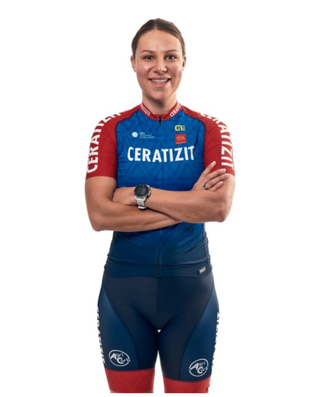
23: Ceratizit-WNT
This isn't the one for me, but in an incredible against the odds turn up for the books... this was mum's joint-favourite!
Mum: Look at the diamond patterns in there. They're mirroring the A's and the T's. Somebody's thought quite a lot about that one!
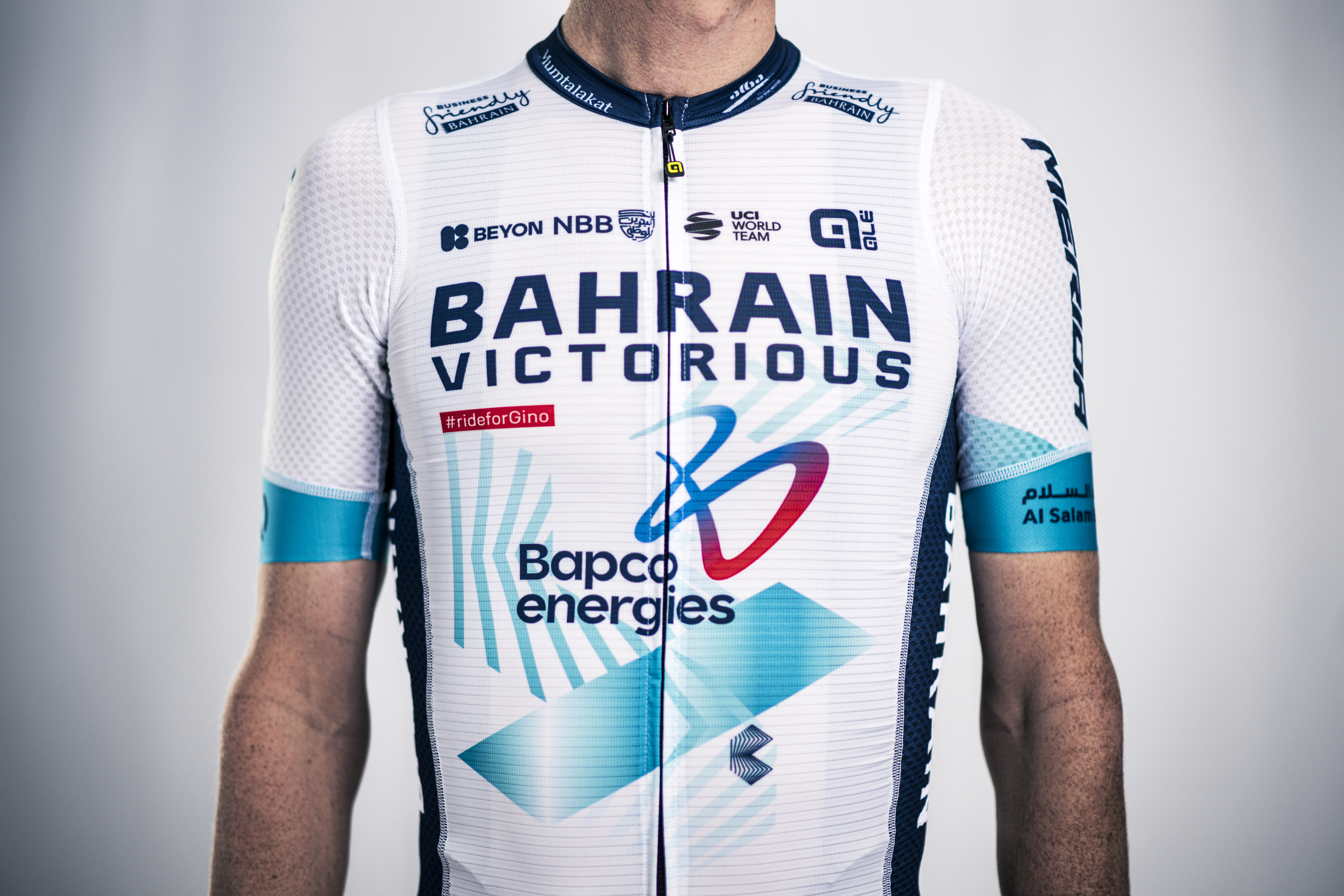
22: Bahrain Victorious
This is clearly the lesser of the two mostly white, Middle-East-nation-backed team kits. I'm just not a turquoise fan I'm afraid. Sadly, again, I'm not in step with my colleagues.
Mum: This is all this technical stuff (by which she means heavily vented fabrics), which is all very clever, but it makes it look really messy. I know you've got Bapco Energies who are obviously very proud of themselves... I'm sure it's lovely to cycle in, but the material is not nice.
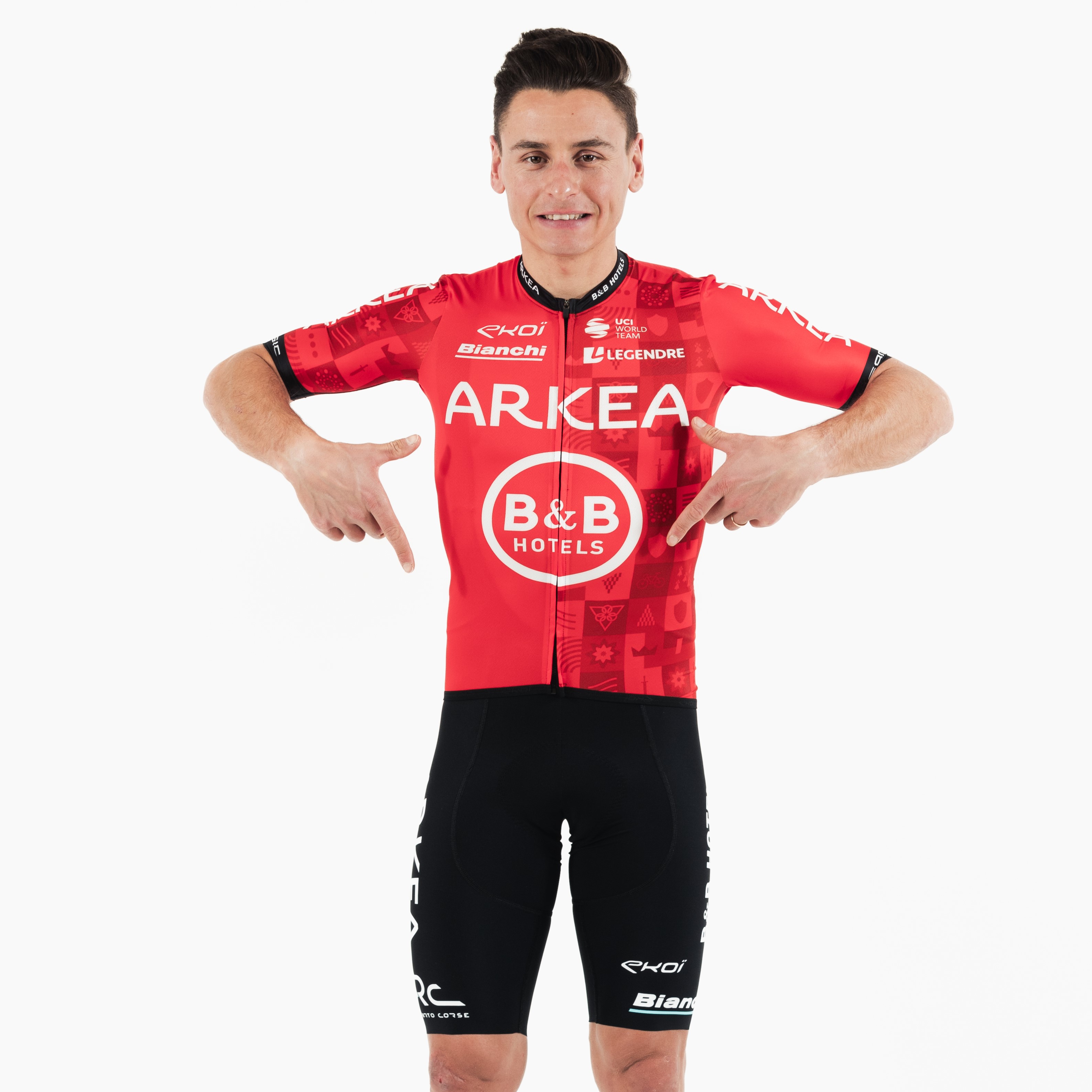
21: Arkea-B&B Hotels
Arkea is in a similar, but slightly neatened version of last year's kit, with a more prominent pattern on the left side of the jersey. Gone, fortunately, is the flashes of Bianchi Celeste, which was one of the worst colour pairings in cycling in recent years.
Mum: That's nice. That's a clear red. That's lovely. That's lovely. I'd wear that.
Clearly trying to blag herself a free jersey from a rival team after being let down by Cofidis...
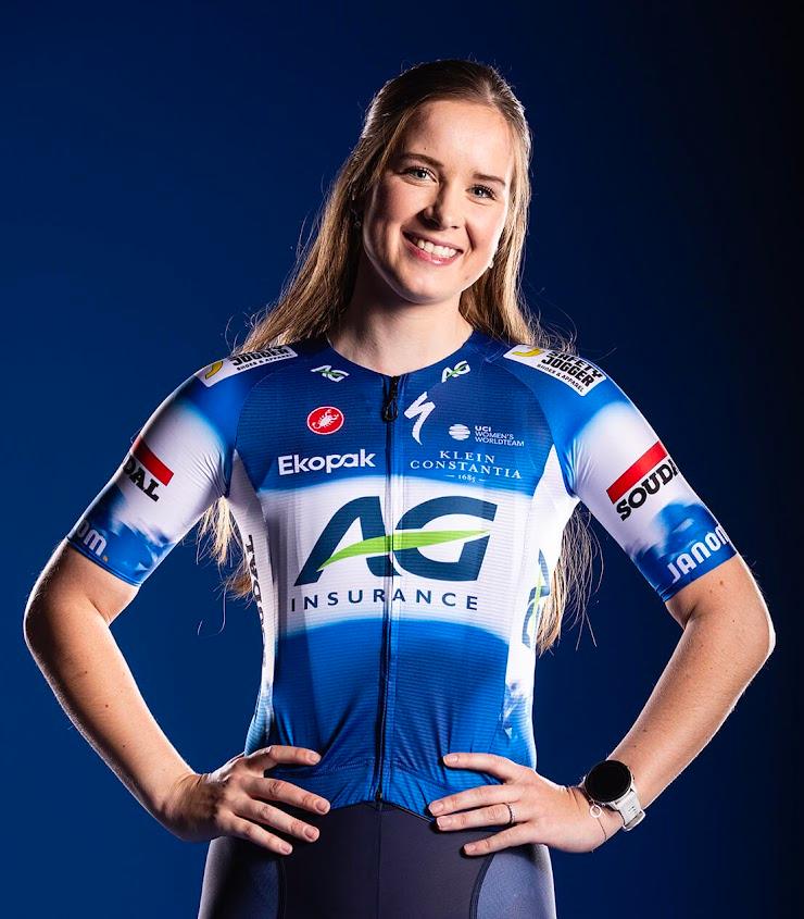
20. AG Insurance-Soudal
Personally, I don't mind this, but I'm a fan of Euro-style sponsor soup jerseys. With a paltry average score of just 2/5 this one proved relatively unpopular with the Cyclingnews staff, and my mum, too.
Mum: Oh poor girl... Oh dear. I think she's smiling through the pain there. I'm trying to think of something positive to say.
Will: Do your best!
Mum: It's got a lobster* on it?
*It's worth noting at this point that my mum is a big fan of Castelli kit, but cannot be convinced that the scorpion logo isn't actually a lobster.
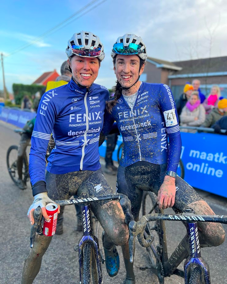
19: Fenix-Deceuninck
Again, a kit I'm not necessarily blown away by but I don't think it's all that hideous. My colleagues disagree, which is beginning to make me feel like I might just have terrible taste...
Mum: Looks like something you'd pick up in the middle of Lidl. Maybe that's too cruel? I like the stripes across the middle, so I'm going to take back the Lidl comment. If it had a little more detail in it I'd give it more.

18: Soudal-QuickStep
Another classic in my eyes, but still sadly languishing in the bottom half.
Mum: God help us, what have they done this time?! I'm not sure about the Safety Jogger on the on the shoulders - They could have put that somewhere else.
Will: I suspect Safety Jogger paid to have it there, in fairness...
Mum: No. And why have they got 'Napoleon' on the arms? They're a Belgian team, aren't they? Napoleon is French!
Will: I think it's a betting company, Mum. I don't think the team is sponsored by Napoleon himself...
17: Liv-AlUla-Jayco
In a rare moment of agreement, neither Mum nor I were fans of this one, and we both concluded that it was worse than the Jayco AlUla kit.
Mum: They've made that worse. I don't know how that's worse but it's dreadful. And I ride a Liv bike!
Will: It's so bad it would make you upset to ride a Liv bike?
Mum: Well no not quite because my bike is lovely... but I would not put that on.
Will: Isn't that the colour of your bike at the top?
Mum: No. My bike is 'dynamic bronze'.
Plus points to Liv there for creating a memorable colour name!
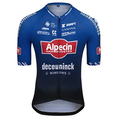
16: Alpecin-Deceuninck
Undefeated hardest-to-spell sponsor of the year for several years on the bounce now, Alpecin remains a standout favourite for me. Classy, uncluttered, symmetrical. This is a jersey that'll age well.
Mum: I'd take out 'hair booster' for a start. Everybody knows what Alpecin is!
While slightly critical, I think that's probably a win for Alpecin as a sponsor as much as anything else.

15: Uno-X Mobility
Personally, I'm a big fan of this. It's modern, it's block colours, and it has a slight Early Learning Centre vibe. It seems I'm being labelled as a thoughtless, toxic bloke however because both my mother and my partner both take issue with the fact the logos sit far too prominently on the chest.
Mum: They have GOT to sort this 'Uno-X' thing out, these guys. They need to have the logo on the shoulder, not the boobs. I reckon they've done it deliberately!
Will: You think this is an act of toxic masculinity?
Mum: I do, I really do. In fact, having the Norwegian flag across your chest like that is much better than having 'Uno' on one side and 'X' on the other.
Will: They can't all be Norwegian champion...
Mum: No.
Freya, my partner, from another room: It's designed for men!!
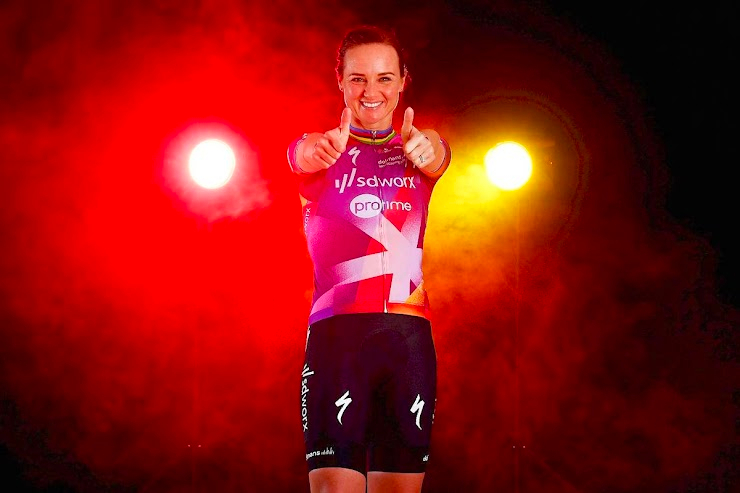
14: SD Worx
Big team, top half placing - it's the ever-winning SD Worx. A big hit with the staff, and quite a hit with the parental contingent too.
Mum: she's looking very happy with yourself, but, um, no, well, it's quite dramatic. You could stand on a podium in that, couldn't you?
Will: They do, quite regularly.
Mum: I'm not understanding what the big cross thing is.
Will: It's a design flair, perhaps.
Mum: Also, you don't see so much purple on the road. I'm not a big fan of purple but I think in a combination with a bit of red there... That's not bad.
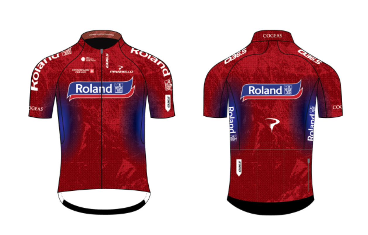
13: Roland
One sponsor is a weird vibe. Cycling teams need two, at least. That's not the worst of it though...
Mum: Oh, that's they look like they've got sweaty armpits.
She's not wrong, to be fair.
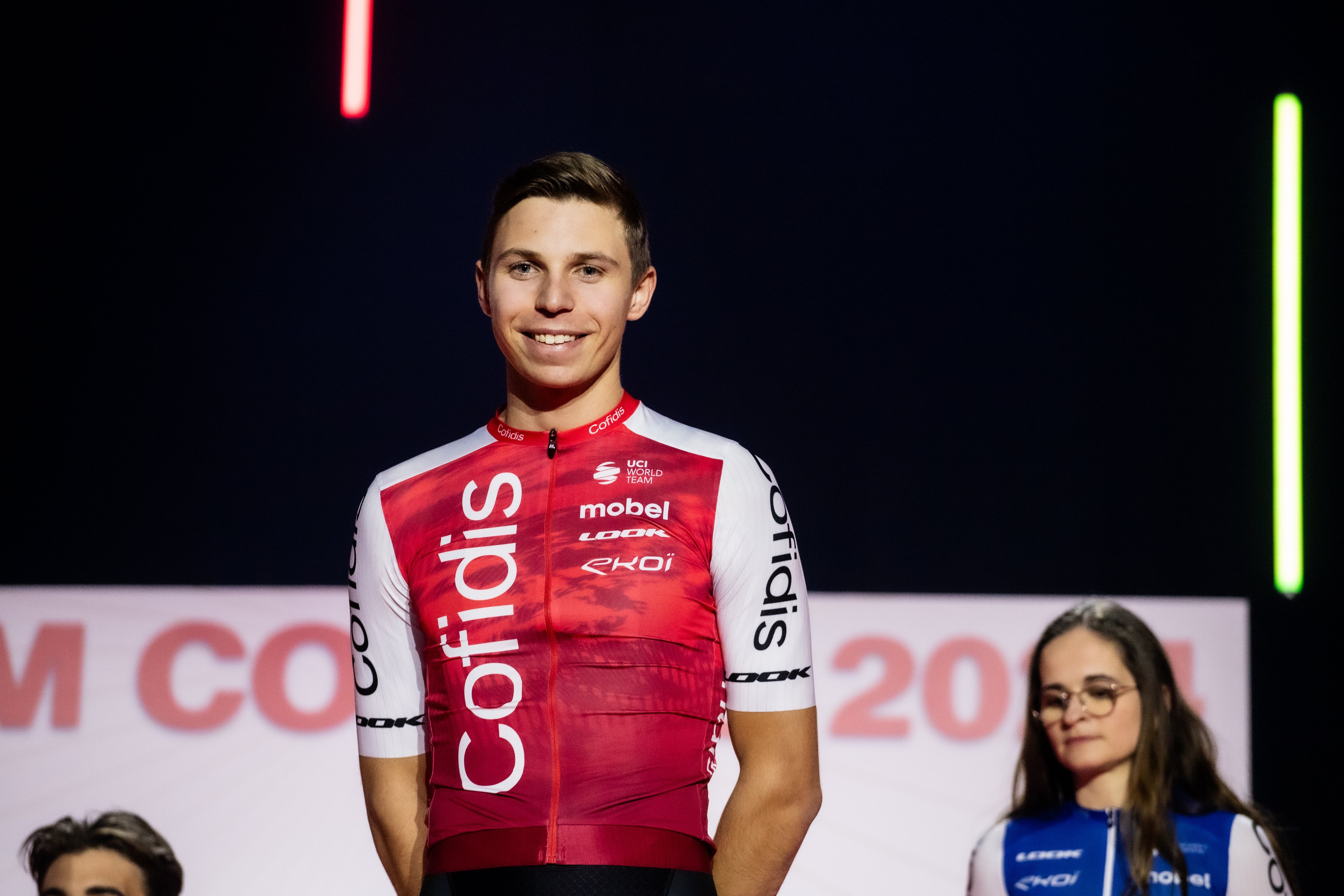
12: Cofidis
Cofidis get a provisional zero points because this is a dictatorship. Last year my mum bigged them up and they promised to send her a jersey. No jersey ever materialised, so what sort of son would I be if I didn't use my platform to try and blag my mum a freebie?
Mum: Oh that's nice isn't it?!
Will: I'm giving it a zero.
Mum: Why?
Will: They promised you a jersey!
Mum: They did promise me a jersey. I haven't got the jersey. And I tell you what I don't like about it. Is all this sort of fading thing? The swirls? Yeah, it looks like somebody's not washed it properly.
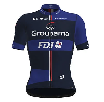
11: Groupama-FDJ
The FDJ jersey remains more or less the same, and last year was our overall winner. Like a hugely tiresome Christmas number one about sausage rolls it's tumbled down the rankings as the new year begins. It's still a winner in my eyes, even if it's no longer going to be adorning everyone's favourite Frenchman, Thibaut Pinot.
Mum: That's very nice. I like to see what they've done with the seams. They've got a nice red highlight down the middle. That's lovely. And I don't know how many sponsors they have, but it's not completely covered. And also I like the alternate sleeve thingy.
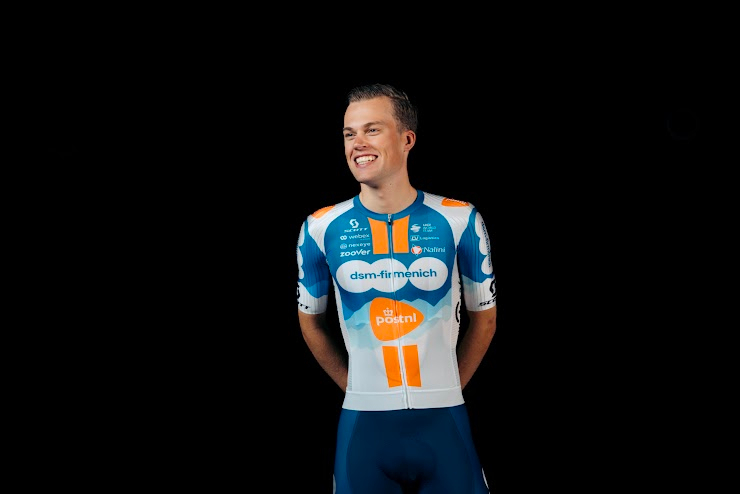
10: DSM-Firmenich-PostNL (Men's and Women's)
Initially, I really disliked this one, and it has slightly grown on me. It was another one that polarised the office, but the people who adored it clearly outnumbered the haters by a sizeable margin. It was, amazingly, one of Mum's top picks.
Mum: I think that's lovely. It's the orange like I said before. We've got rid of the Brown from AG2R so we need something orange, and it works with the teal. And also the double strike down the front...
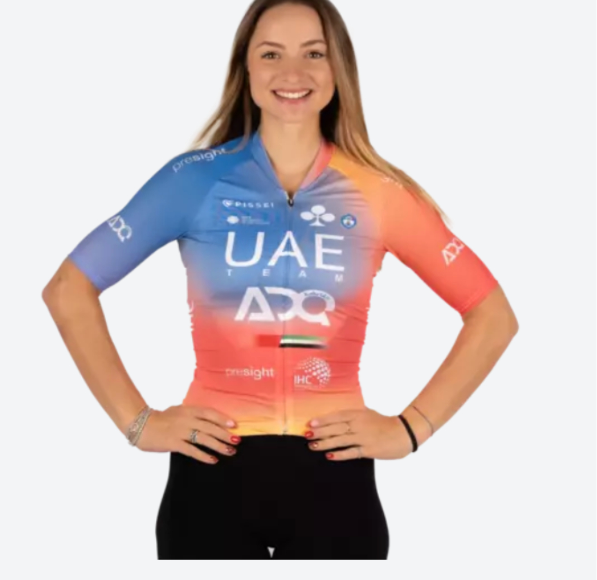
9: UAE Team ADQ
No real change from last year for a kit that I quite liked.
Mum: It's got that yellow again! I don't understand why people have to put that shade of yellow on.
At this point my partner came in and suggested that bonus points be given for the quality of the nail varnish, derailing the conversation but allowing Mum time to rethink her position...
Mum: I'm coming round to this one because it's actually quite pretty and somebody has thought about this.
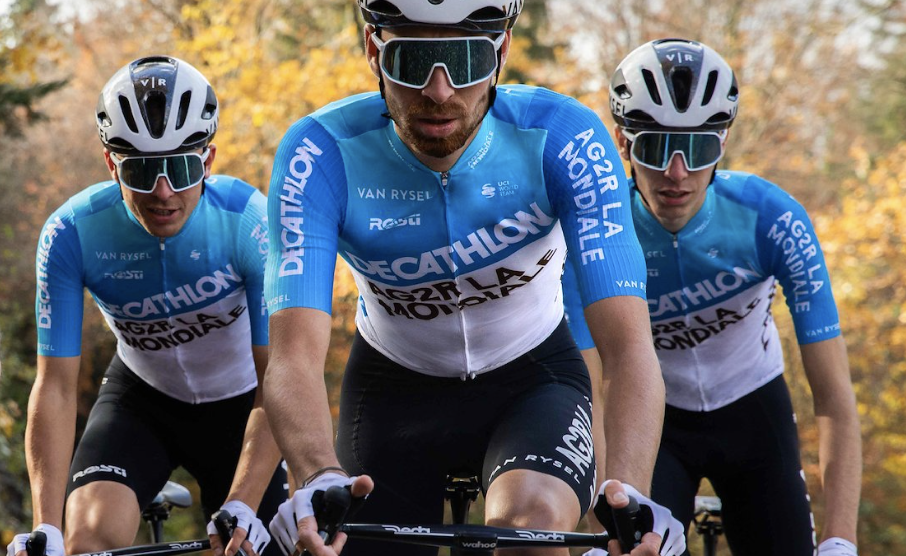
8: Decathlon AG2R
Yeah, that's alright, that! I mean I'm as sad as the next person about the loss of brown shorts, but I guess time marches on regardless. It's clear, neat, almost retro. If the top half was horizontal I think it would be a future old-school classic.
Mum: I like it because it's clear, but I am disappointed about the lack of brown. Brown, as I have said before*, is a very underrated colour.
*For context, Mum is currently making herself some brown trousers.
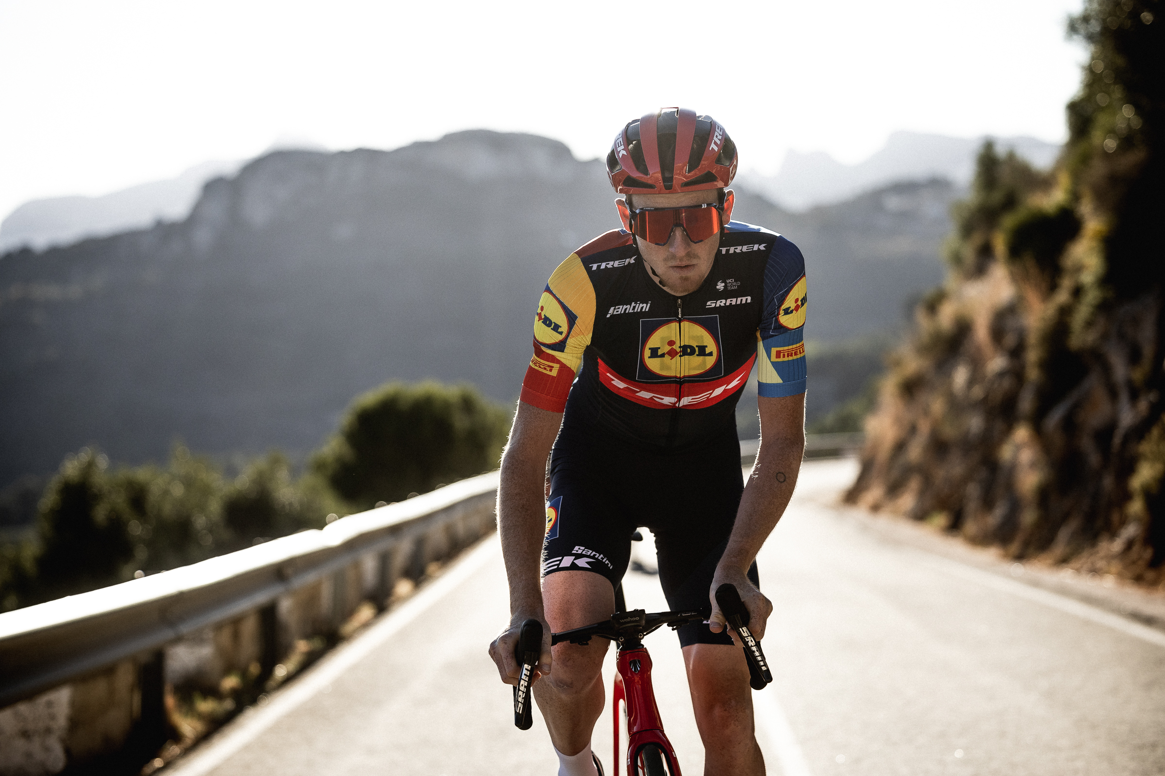
7: Lidl-Trek (Men's and Women's)
One of my favourites, so I'm pleased to see my tastes are finally aligning with my colleagues. A great mix of juvenile colours, and a euro-supermarket sponsor, exactly as a cycling jersey should be. All it needs now is a special 'middle aisle' edition for the Tour de France, each jersey sporting a different special offer item on the back, and we're golden.
Mum: Ooh, now that IS quite nice. It's clear, it's concise, it's got dense colours, it's neat. I like it. Give 'em red shorts! They'd look fab!
That's another team for red shorts!
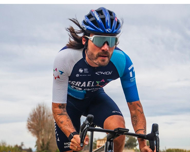
6: Israel-Premier Tech (ProTeam)
Israel PremierTech is a pretty classy number, not all that different (if at all?) from last season.
Mum: You can't see most of it so you don't know who they are.
If nothing else this highlights the importance of clear marketing photography if you're to capture the imagination of recently retired passing cycling fans.
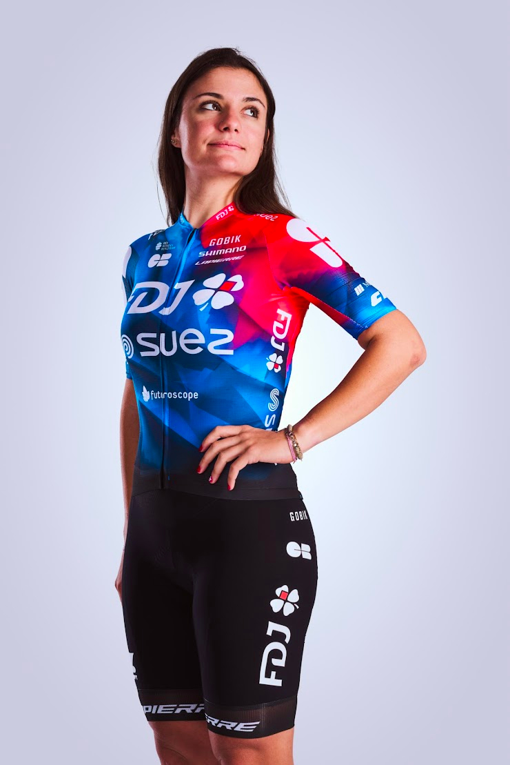
5: FDJ-SUEZ
Another high placing for the French team. Last year they got docked points because Suez, a refuse management company, kept messing up Mum's bin collection. It's been a year and she's definitely over it...
Mum: If I was a professional cyclist and I was put in that that would be great. It is still such a shame that Suez is...
Will: Have they sorted your bins out yet?
Mum: No. But that's okay. I'm over that now. I'm okay.
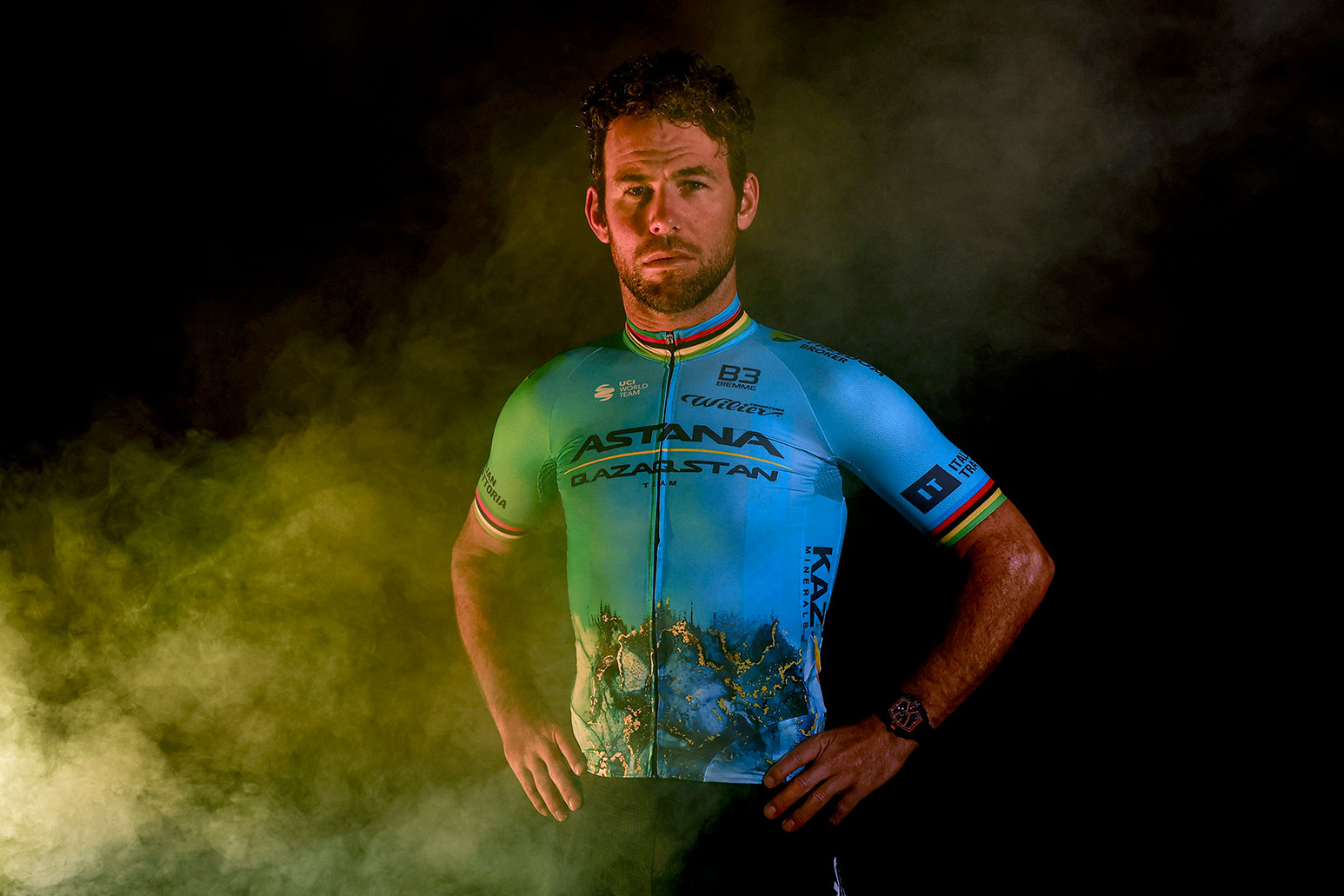
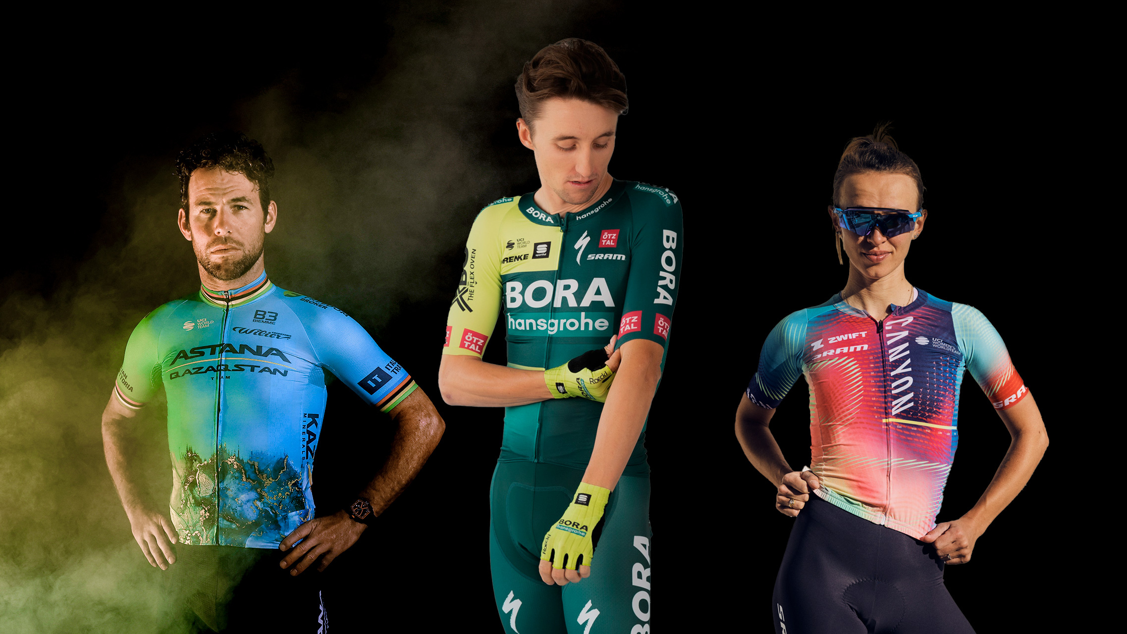
4: Astana Qazaqstan
A real polariser in the office. People either loved it or hated it. Personally, as a former geologist who used to hunt for gold seams, I'm all for a lycra homage to my old profession, inaccurate though it is. Mum wasn't quite so sure, sadly.
Mum: Oh Christ. What's with the fire stuff? I know it's a land of fire and volcanoes and stuff...
Will: No, this is an homage to the rich gold mines of Kazakhstan.
Mum: Well, it doesn't do anything for them, does it? Yeah, I mean, if they were gold seams, why didn't they highlight the seams in gold?
Will: I think that might be too nuanced.
Mum: Instead, what you've got is somebody that looks like they've got Jackson Pollock on their tummy.
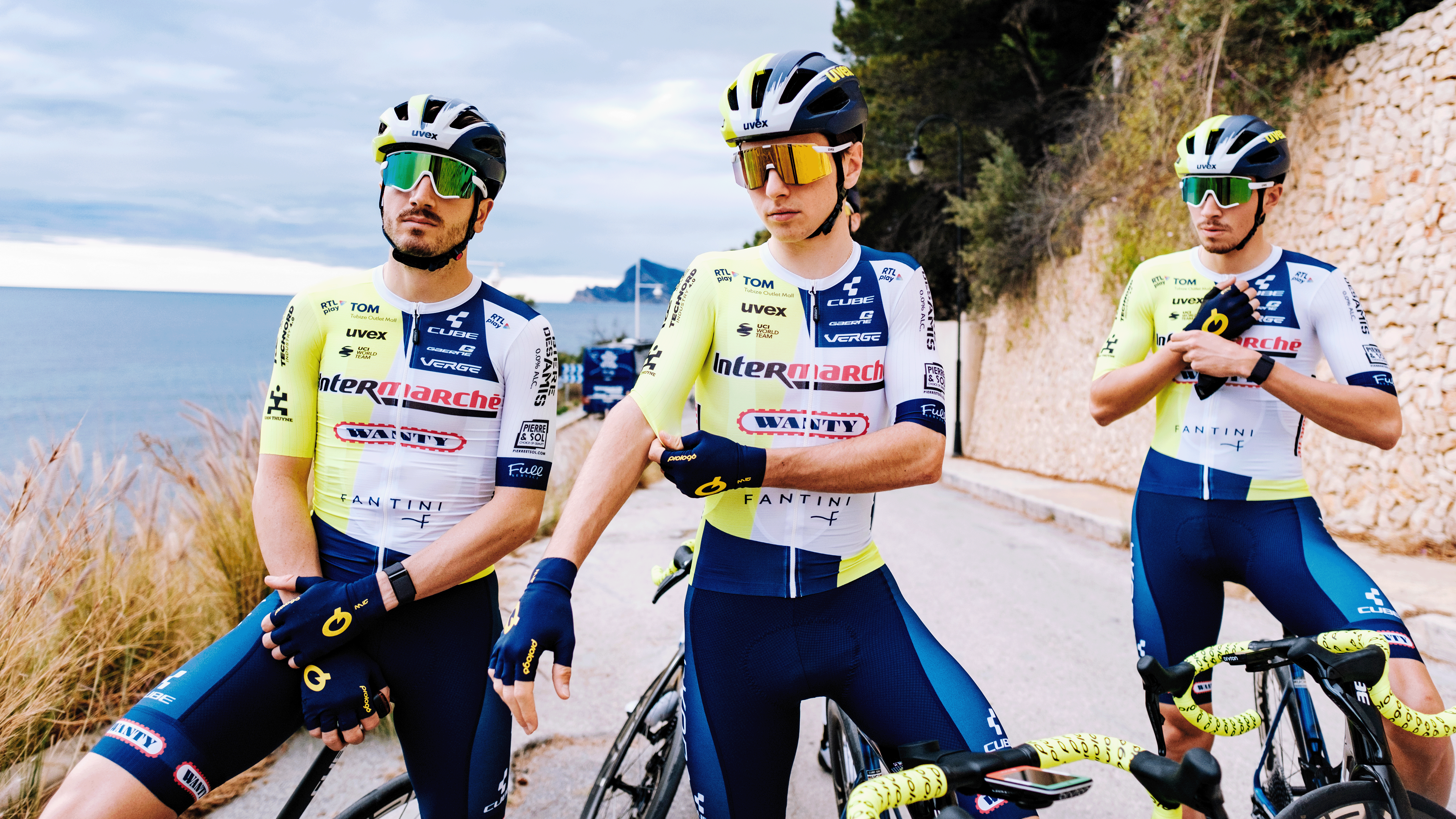
3: Intermarché-Wanty
Last year this team was near the bottom, and I was the sole voice in favour of bright, euro jersey heaven. This year everyone has changed their tunes... Just saying, I was a fan before it was cool, ok?
Will: That's my favourite one!
Mum: No!
Will: It's got everything; it's got a supermarket, it's got gambling, it's got loads of sponsors...
Mum: To me it looks like "wanted" because his arms are closed. It's that colour of yellow... it looks like it looks like a urine sample!
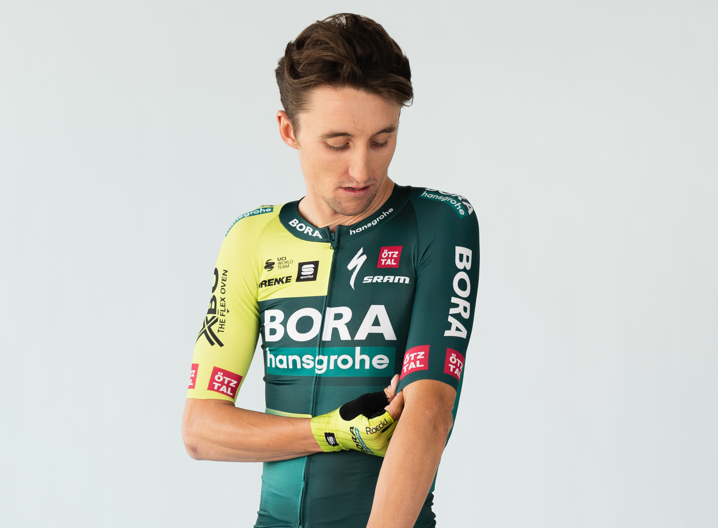
2: Bora-Hansgrohe
I really like this kit, but annoyingly, a cycling meme account suggested that it's reminiscent of Cif oven cleaning cream, and I absolutely cannot unsee it. I suppose if your main sponsor is a producer of kitchen stuff, it kind of makes sense on a subliminal level...
Will: Nice bottle of Cif cream?
Mum: It's Cif! They needed a stronger yellow. Wrong yellow... Wrong yellow.
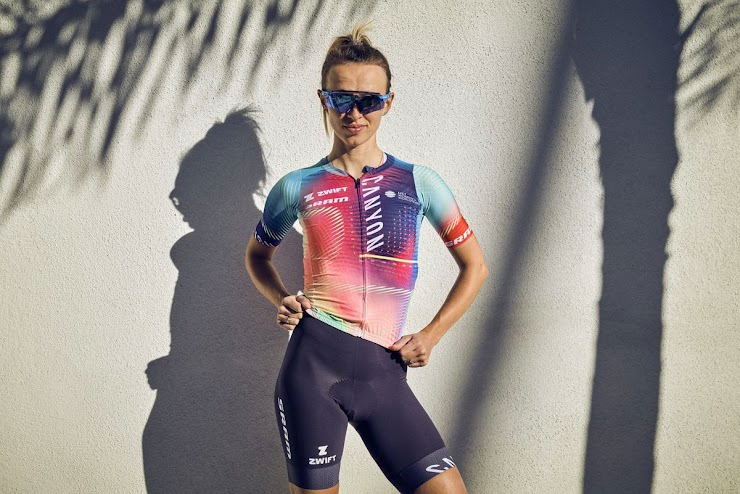
1: Canyon-SRAM
It was never in doubt really, was it? It's clearly the best, everyone at the office loved it, I love it, mum loved it, Freya loved it. It's ace. Hands down the best.
Mum: I like that one. That's nice. That's really nice. You would wear that if you were in the south of France. If you're in the south of France. You would wear that. I wouldn't wear that in Cornwall.
I'm not sure if this was a comment on Cornish weather, or attitudes to heavily patterned jerseys.