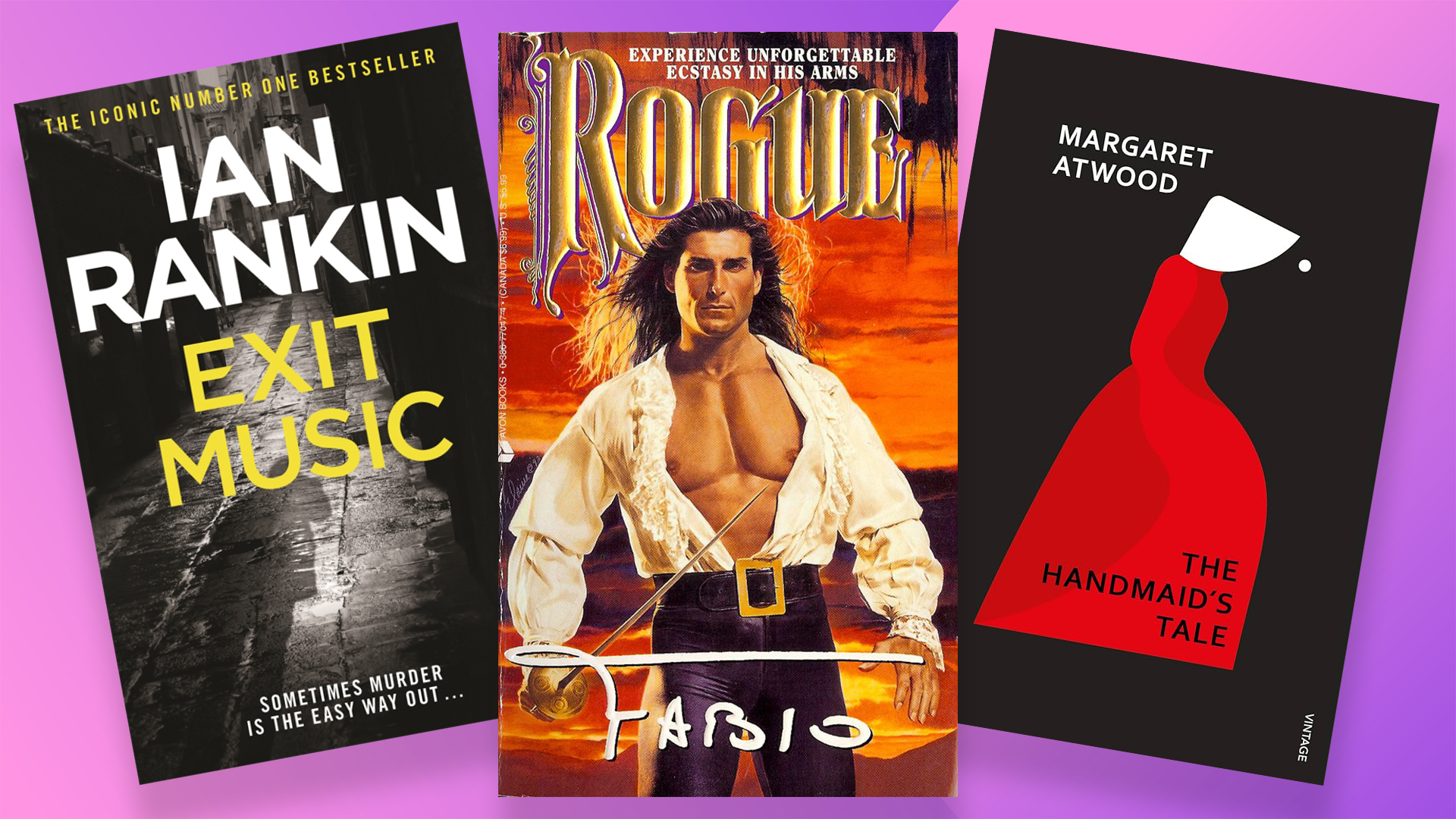
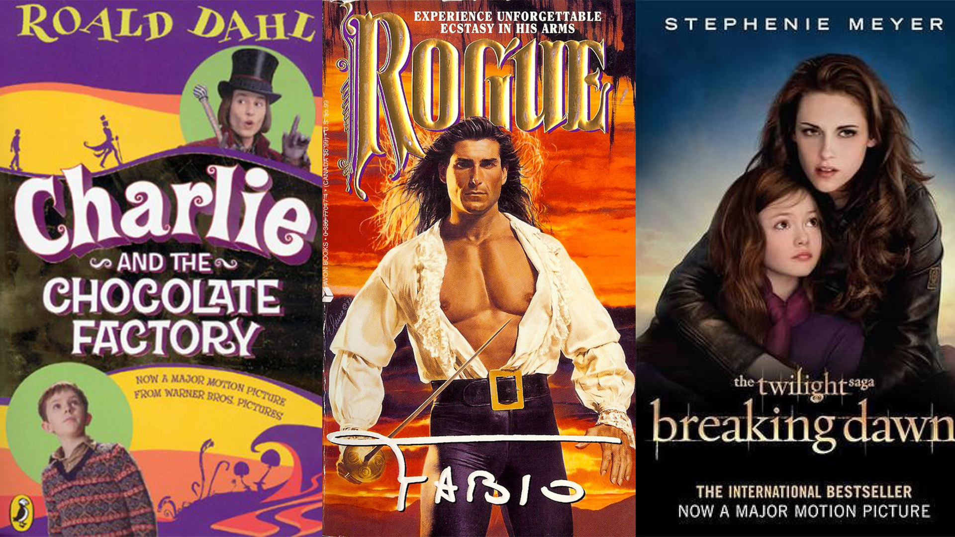
As an ex-literature student, book cover snobbery is (unfortunately) ingrained in me. There's something about a quasi-historical novel with a shirtless, rippling-abbed man that makes me physically recoil – but I'm here to reform. As creatives, it's natural that we judge a book by its cover, but there comes a point where book snobbery can hold us back from the simple pleasures of reading.
Designing a contemporary book cover can be difficult as trends are constantly cycling in and out of relevance. It seems book covers are getting increasingly formulaic thanks to movie adaptations, minimalist design trends and genre conventions, creating a generic design plague in bookshops across the globe. Some designs are timeless, some are fleeting and some will always be schlocky but without being too sickly, it's what's inside that counts.
What makes a 'good' cover?
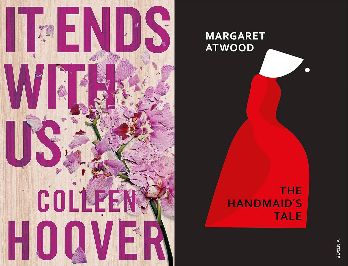
I'd argue that the idea of a 'good' book cover is somewhat of a myth. There are obvious examples of beautiful book cover design (think Normal People or Margaret Atwood's The Handmaid's Tale) but ultimately a good design fits its brief. The truth is that some literature can be harmed by an overdesigned cover, promising something beyond the words' intentions.
A prime example is the work of Collen Hoover. You've likely seen a copy of 'It Ends With Us' in your local bookshop and maybe you've felt somewhat indifferent to the smashed pink orchids and blocky typography. The tepid palatability of Colleen's novels might be subject to elitist literary backlash, but at its core, it's a cover designed for commercial appeal. And commercially appeal it did, winning the top spot on the Sunday Times bestseller list.
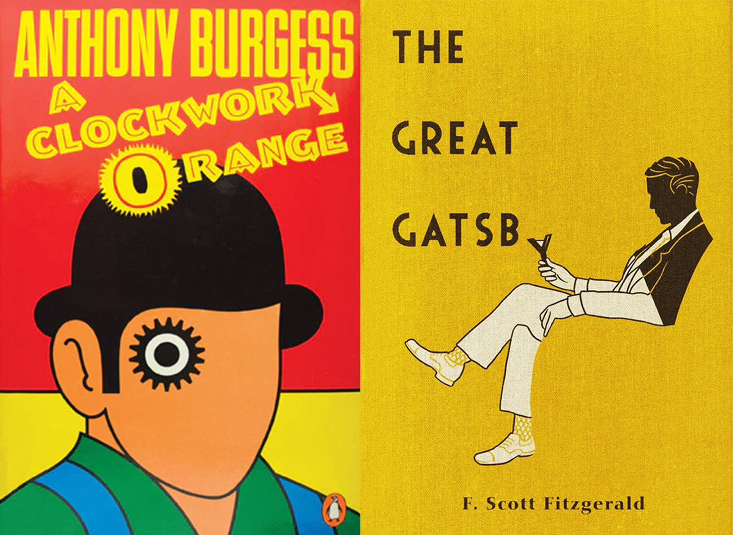
Overcoming the design ick
Venturing outside the comfort zone of beautiful design inherently enriches your reading. Yes, you might not look as cool on the morning commute but you also run the risk of missing out on your next favourite novel. I'll be the first to admit that I sometimes turn my nose up at a book cover with a real person plastered on it or an author name that's double the size of the title, but it's not just new books that are subject to bad design – your classics can fall victim too.
Amidst the plague of endless book-to-movie adaptations, often upcoming features will be subject to the dreaded film/TV adaptation cover. However, I implore you not to be disheartened by a fake sticker that says "coming soon to Netflix" – it's not the black spot of book design. Even classics like Fahrenheit 451 and Charlie and the Chocolate Factory have been tarnished by 'bad' covers, but that shouldn't be enough to disregard them entirely.
Film adapted Fahrenheit 451 book cover"
Breaking the genre design funk
Curating a collection of stunning literature is undoubtedly rewarding and this isn't me arguing against aesthetically pleasing design. Yet, while there are plenty of beautiful books around, book cover design seems to be in a bit of a funk – isolated into separate factions that rarely stray from their genre design cues.
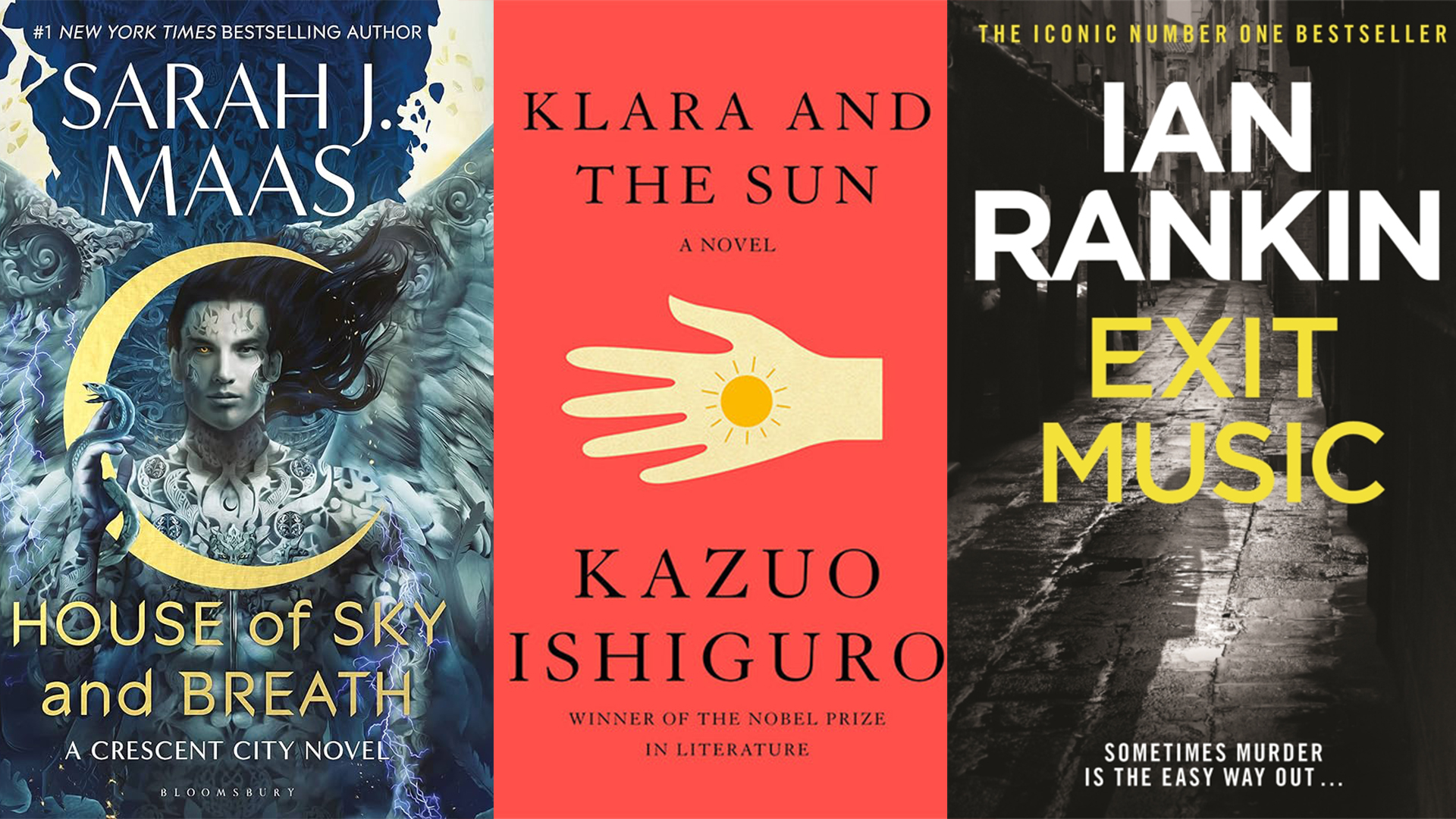
Fantasy book covers are typically maximalist and ornate, high-brow romance is stylishly graphic and illustrative, and I could probably spot an Ian Rankin crime novel from a mile away. While I don't think these genre design signifiers will die out anytime soon, they trap readers in a genre loop, making book cover design stale and formulaic.
In a way, book cover design snobbery is a result of these rigid genre design features. If you can break away from the design tropes you typically gravitate towards, there's an entire world of genres to discover. From an ex book snob, it's worth thinking twice before you judge a book by its cover.
If you're after more stunning book design, take a look at our interview with children's book illustrator Flavia Z Drago. For more of the classics, take a look at this ingenious Animal Farm book cover with a creepy hidden detail.