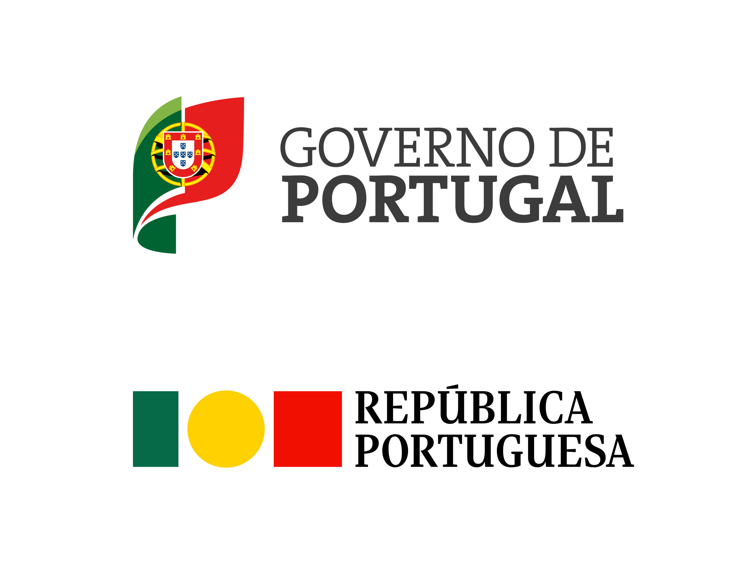
We're strong advocates for the importance of logo design, but we have to wonder if it should be a national government's top priority when taking office. Alas, one of the first measures announced by Portugal's new prime minister Luís Montenegro is to reverse the government's supposedly 'woke' logo redesign of last year, adding yet another layer of controversy to the saga.
Sure, some people disliked Eduardo Aires's short-lived design for various reasons. For some, it was too simplistic, taking the minimalist logo trend too far. For others, it was an affront to tradition because it dropped longstanding national symbols. Some may have misunderstood the purpose of the design and believed it to be replacing the national flag. And some just thought a logo redesign of any kind was a waste of public money. The latter argument is certainly the case now, considering that the logo's being withdrawn after less than a year.
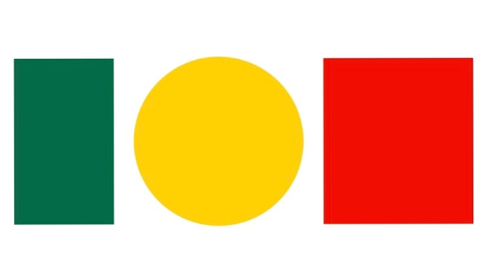
Eduardo Aires's Portugal logo was clear, clean and, yes, minimalist. It communicated the identity of Portugal's government through abstract shapes and colours based on those of the national flag while imposing its authority with a serif font.
The design decisions could be questioned: the yellow circle is more prominent than the colour in the Portuguese flag, and the amount of white space made some people think of Mexico. But the logo provoked disproportionate responses that went beyond a dislike of the design and became bound up in a culture war. We're all for critiquing logo designs, but death threats? It's time to put things into perspective. Aires was hired with a specific brief, and he delivered.
It's true that the logo was intended to be more “inclusive, plural and secular” (the heraldic insignia on Portugal's flag depicts symbols referencing victory over the Moors and colonial expansion), but there's nothing inherently 'woke' about it. Like many logo redesigns, the decision to simplify was as much about making the logo work better in digital uses. And, crucially, this is not Portugal's national flag, it's the government logo. These are two different things, just as government and country are too different things. They don't necessarily need to share any design elements at all.
Aries, who won awards for his work on the rebranding of his home city of Porto back in 2014, thinks the backlash is less to do with design and more to do with politics becoming polarised. He told The Guardian his design had been used as a “projectile weapon” ahead of last month's general election, which saw the Social Democratic Party's center-right alliance oust the Socialist Party.
So it is that the new conservative government made it its number one priority to reverse the implementation of Aries' logo and go back to the old one, no doubt racking up yet more costs in the process and attracting mockery in the process. "The world evolves, Portugal doesn't," one person wrote on X.
O mundo evolui, Portugal não pic.twitter.com/ACHXFcinuQApril 2, 2024
The Guardian drew parallels with the recent controversy over the colours of the flag in Nike's Euro 2024 England shirts. It seems a resurgence in nationalist politics is leading to an increasing politicisation of national symbols, and creative uses of the shapes and colours that might barely have raised an eyebrow a few years ago are generating reactionary responses among noisy portions of the public. We have to hope it doesn't start to limit designers' creativity and get in the way of the objective of communication.