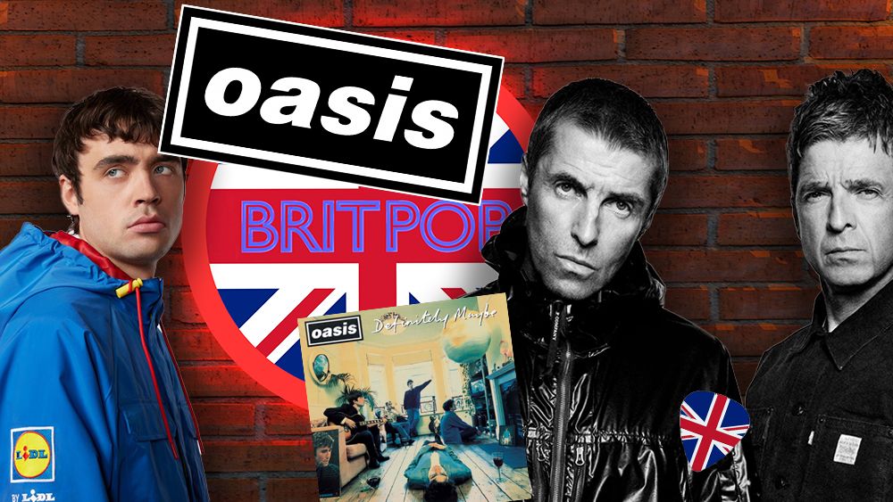
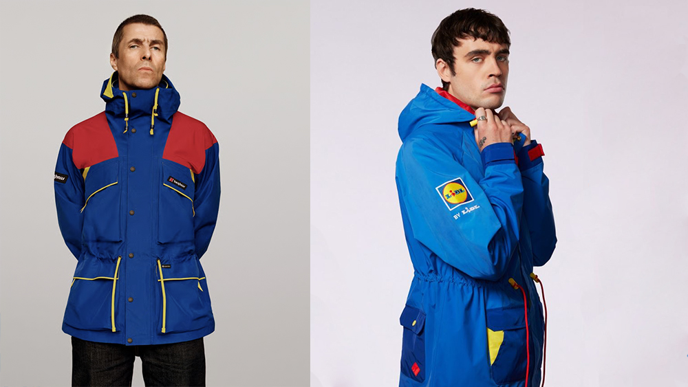
The fact that the supermarket chain Lidl can sell out an Oasis-inspired coat sporting its own logo and brand colours is testament to the legacy of the Manchester band on British culture, including branding and graphic design. Lidl's jacket could have been any parka adapted to the supermarket's branding, but even if you hadn't seen Liam Gallagher's stint modelling for Berghaus last year, it would be clear who the inspiration was.
Thirty years ago, Oasis shook up the UK music and fashion scene with their nonchalant swagger and distinctive mix of 1960s mod revival and casual working-class style, capturing the spirit of the Britpop movement. With the sold-out Oasis reunion tour now in full swing (and expected to net half a billion dollars), how has the band continued to capture the public's mind? From one of the best band logos to their own personality, here are five secrets to what makes the Oasis brand so iconic.
01. Simple, iconic design
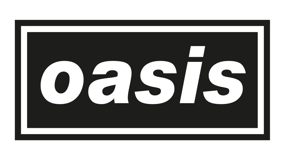
In the golden era of Britpop, Oasis had a strong visual identity that might have appeared simple but was carefully considered. Designer Brian Cannon and his company Microdot oversaw all visual design up until 1998, creating a record of iconic record covers as well as the classic Oasis logo.
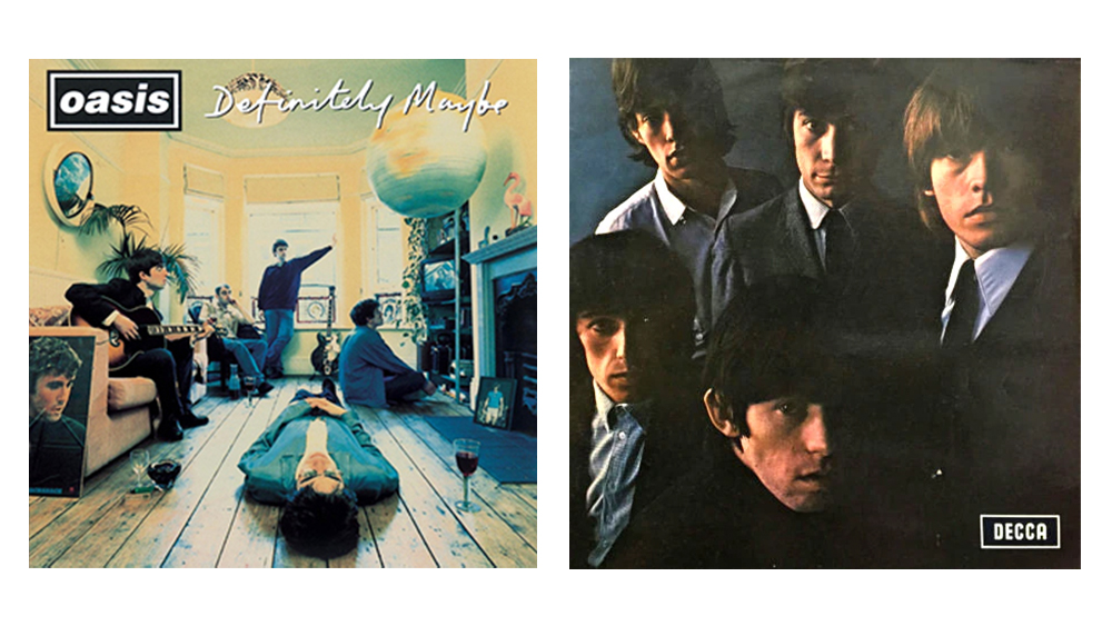
Designed in 1993 before the band took off, the logo was inspired by the Decca Records mark on the Rolling Stones' second album but with a bolder, rounded italic type in the simple black box with a white frame. It was bold and effective and fit perfectly with the band's mix of arrogance and retro style.
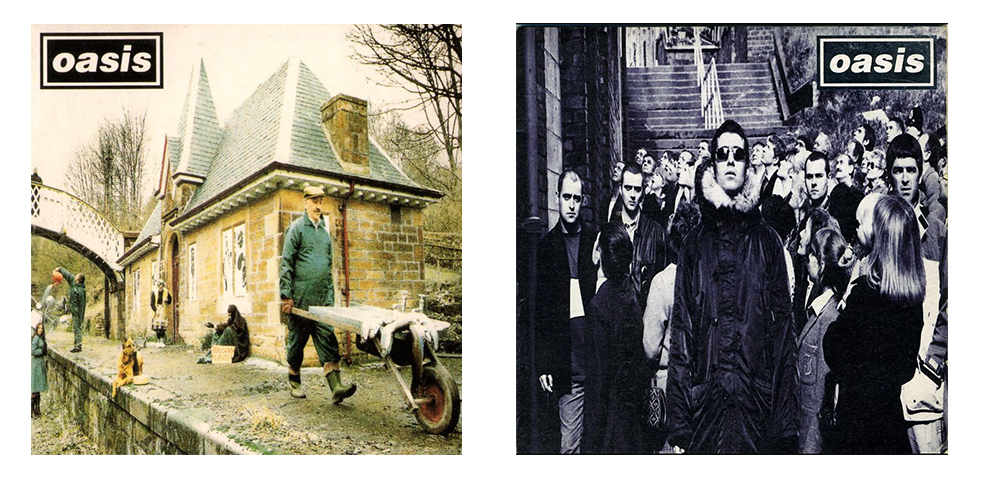
The bold statement looked perfect on Cannon's record covers, which were sometimes minimalist, sometimes with a touch of absurdist surrealism that recalled the '60s and '70s. Live Forever featured a a picture of John Lennon’s childhood home as a reference to the song's title. Some Might Say depicted the song’s lyrics in a surreal scene, complete with the “sink is full of fishes”.
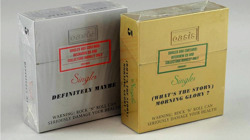
Sparks of design genius included putting the limited-edition singles collection released in 1994 in boxes styled like Benson & Hedges cigarette packets as a nod to the band's working class roots and fondness for cigarettes and alcohol.
02. Nostalgia sells
Part of the success of the Oasis reunion tour is the nineties nostalgia that was already in full swing. And nostalgia is something that Oasis have always tapped into. As a reaction to American grunge and to the electronic music that was on the rise in Europe, Oasis (and Britpop as a movement) looked back to the distinctly British rock music of the 1960s and early 1970s.
That nostalgia was reflected visually too in the band's use of mod revival fashion, psychedelia and Adidas Samba and Gazelle trainers. As a 90s teenager, it led me to imagine a simpler and more optimistic past. I remember shops even selling second-hand flares alongside Ben Sherman shirts while retro sofas and velvet and paisley were all the rage.
03. Reclaiming the flag
Oasis arrived at a moment of newfound British optimism that culminated around the election of Tony Blair in 1997. This was something that had been in short supply since the early '90s recession, perhaps even since the late '70s.
The British flag had become associated with extremism and skinheads, but Britpop reclaimed it and even made it cool. Suddenly, union flag pillows and upholstery wasn't a sign that you were in the National Front, and 'Cool Britannia' was more than just a Ben & Jerry’s ice cream flavour.
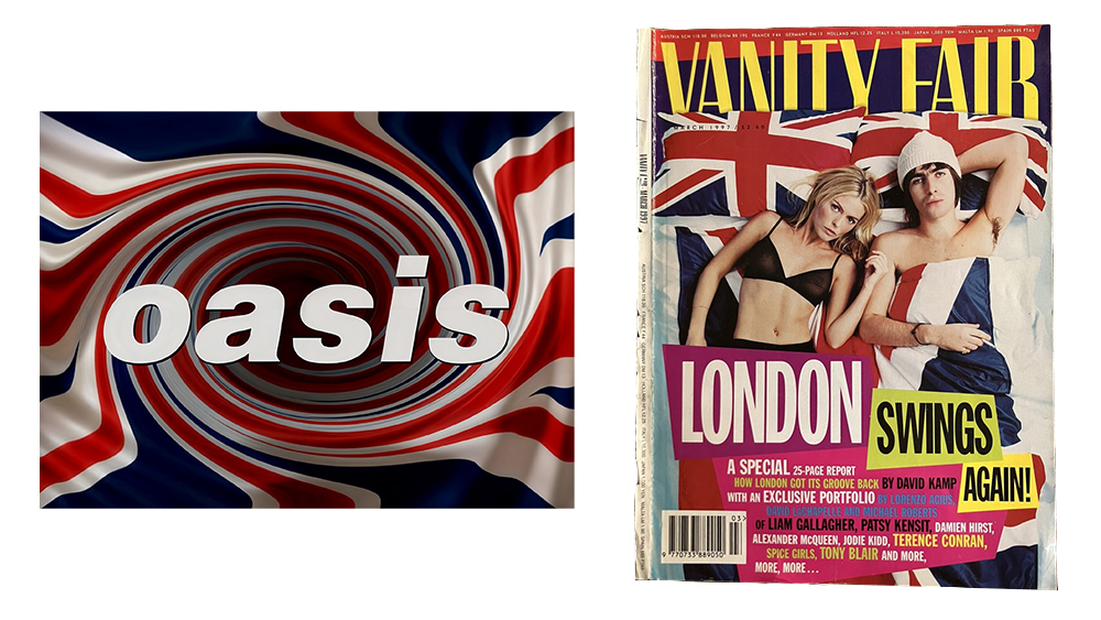
Oasis's arrival at this time was partly accidental, but they played a role in creating the spirit of the time. Tony French of Liverpool band the Real People used Quark Express to distort the British flag into a psychedelic swirl for the cover of an early demo tape, and Noel Gallagher had his Epiphone Sheraton painted with the flag.
Vanity Fair's 'London Swing's Again' cover featuring Liam Gallagher and Patsy Kensit from March 1997 captured the Britpop colour palette: the colours of the flag adorned with electric yellow and magenta accents.
04. Personality as brand
A brand is something less tangible than visuals and sounds alone. It's a personality, and this is something the Gallagher brothers had gallons of. Liam became the archetype of the '90s lad as portrayed by magazines like Loaded, FHM and Maxim, and the band's straight-talking Manchester swagger, fast lifestyle and regular bust ups meant they were never out of the media spotlight.
Oasis were spontaneous, chaotic. Some of this might have been more calculated than what it seemed. Liam's admitted that he began wearing zipped up parkas or Berghaus jackets on stage because they made him "look cool". They may have exaggerated parts of their personalities to create their brand, but it was this more than anything else that created a cultural and emotional impact that keeps people loyal to the brand 30 years on.