Whether you're an avid or casual social media user, there's a high chance that you've come across those oversized blob-like characters on your journey through the World Wide Web. This inoffensive illustrative style, often referred to as 'Corporate Memphis', has quickly become the quintessential art style for any brand wishing to appear modern and playful, but in recent years it's fallen out of favour for its formulaic and uninspired design.
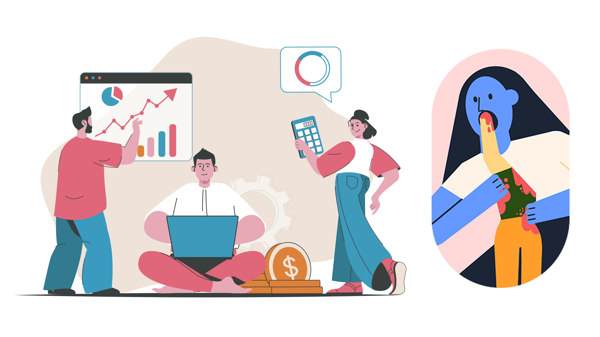
The flat 2D illustrations often feature humanoid characters with exaggerated ligaments and minuscule heads, drawn in a basic geometric style. It's an adaptable and transferable design trend that's invaded tech marketing, migrating to the wider world of advertising, regarded as a sort of cheat code to a relatable and fun brand image.
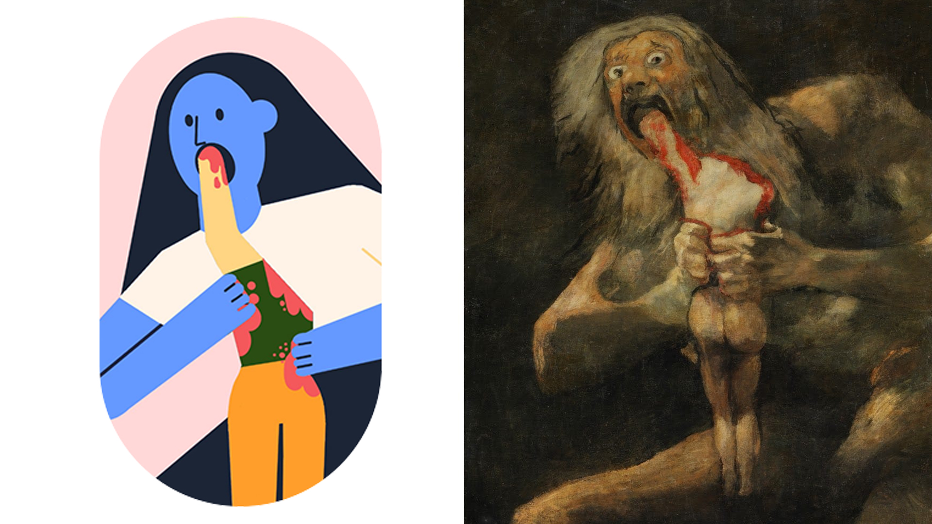
The global grip that Corporate Memphis has on brands has led to an oversaturation of jolly, extreme-appendaged characters that, to me, have become a signifier of desperate soulless pandering. But where did this design plague come from, and how did it develop its soulless reputation? If you want to create more inspiring designs, check out our collection of the best graphic design books)
The origin of Corporate Memphis
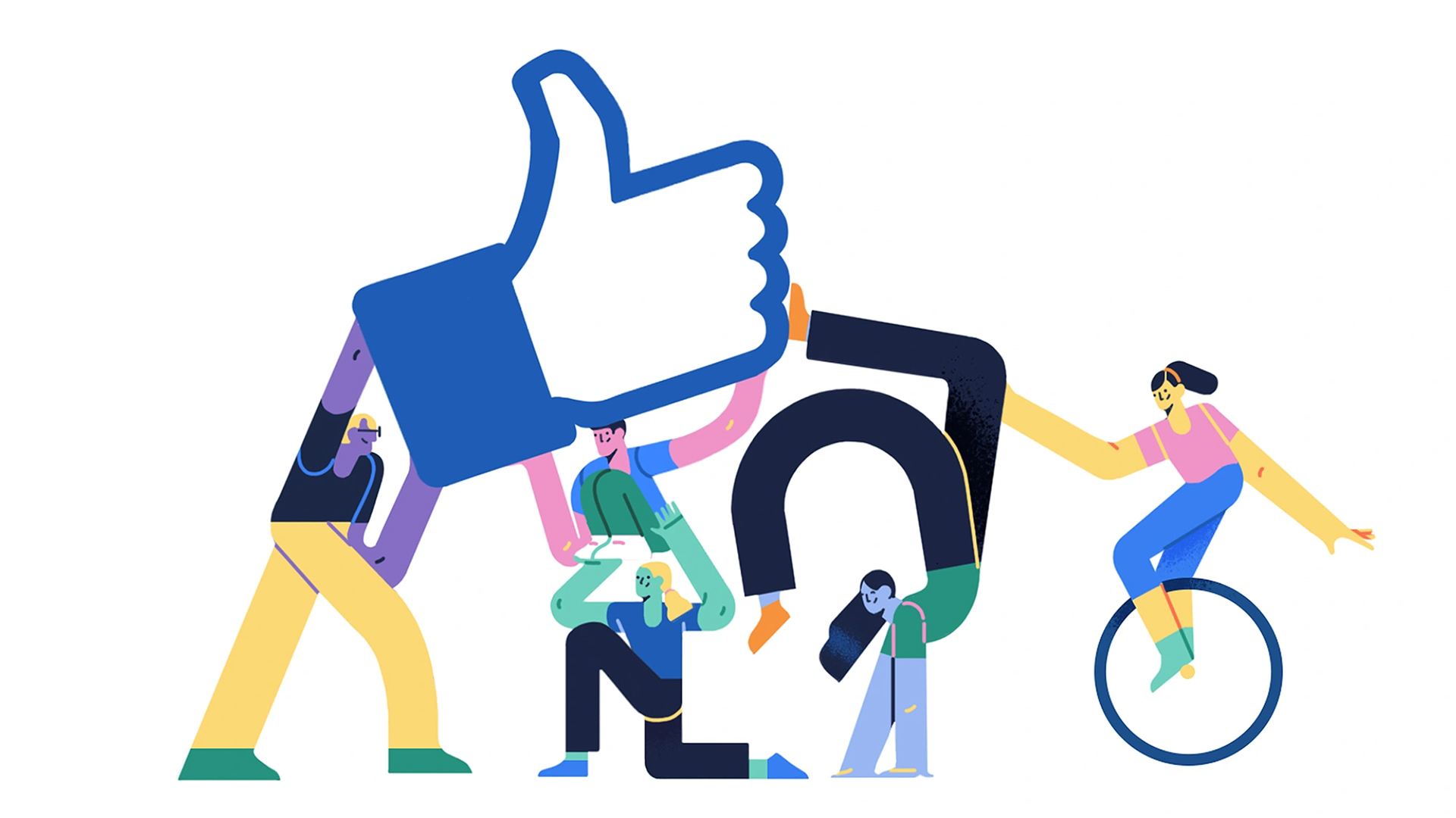
While the design's origins are uncertain, it's widely regarded that Corporate Memphis originated on Facebook (as all great things do). Launching in 2017, the style (originally called 'Alegria') was created by media agency Buck, who created a custom animation and illustration ecosystem designed specifically for Facebook.
In its heyday the style was a resounding success, positioning Facebook as a frontrunner in modern design. Favoured for its simplistic graphic appearance, it seemed the perfect fit to signal to users that Facebook was a cool and modern social media platform, despite its reputation as a fan favourite among bored baby boomers.
Suffering from success, Facebook's Alegria was so popular that countless brands aimed to replicate the style – and it was fairly easy to do so. With its minimalist detail, basic colour palette and transferable identity, Alegria underwent its great transformation from innovative modern design to oversaturated soulless Corporate Memphis.
i hate corporate memphis all my homies hate corporate memphis pic.twitter.com/7QeGv06Tw8April 10, 2023
The style traits of Corporate Memphis

It's widely believed that the migration to Corporate Memphis' flat 2D style, was a response to the decline in skeuomorphism – a design trait that uses bevelling and shadows to create a 3D appearance. The modern internet dweller didn't want realism anymore, and minimalism and modernism worked hand in hand.
The flat appearance of Corporate Memphis lends to its easy recreation, requiring less technical capability than skeuomorphic design. With little to no dynamic shading, bold geometric character design and adaptable skin tones that represent a diverse audience, it could be copied and pasted to fit whatever marketing scheme required – modern enough to feel fresh, but indistinct enough to be universal.
corporate memphis is getting stale, time for corporate art nouveauOctober 29, 2023
The demise of Corporate Memphis
In 2023, Corporate Memphis has become a victim of its corporate namesake, becoming oversaturated to the point of self-cannibalisation. A signifier of lifeless corporate pandering, Corporate Memphis tells us nothing about the brand itself – other than it still thinks outdated millennial minimalism is 'hip'. Its greatest strength is its biggest weakness – Corporate Memphis can be moulded to represent everyone, yet speaks to no one.
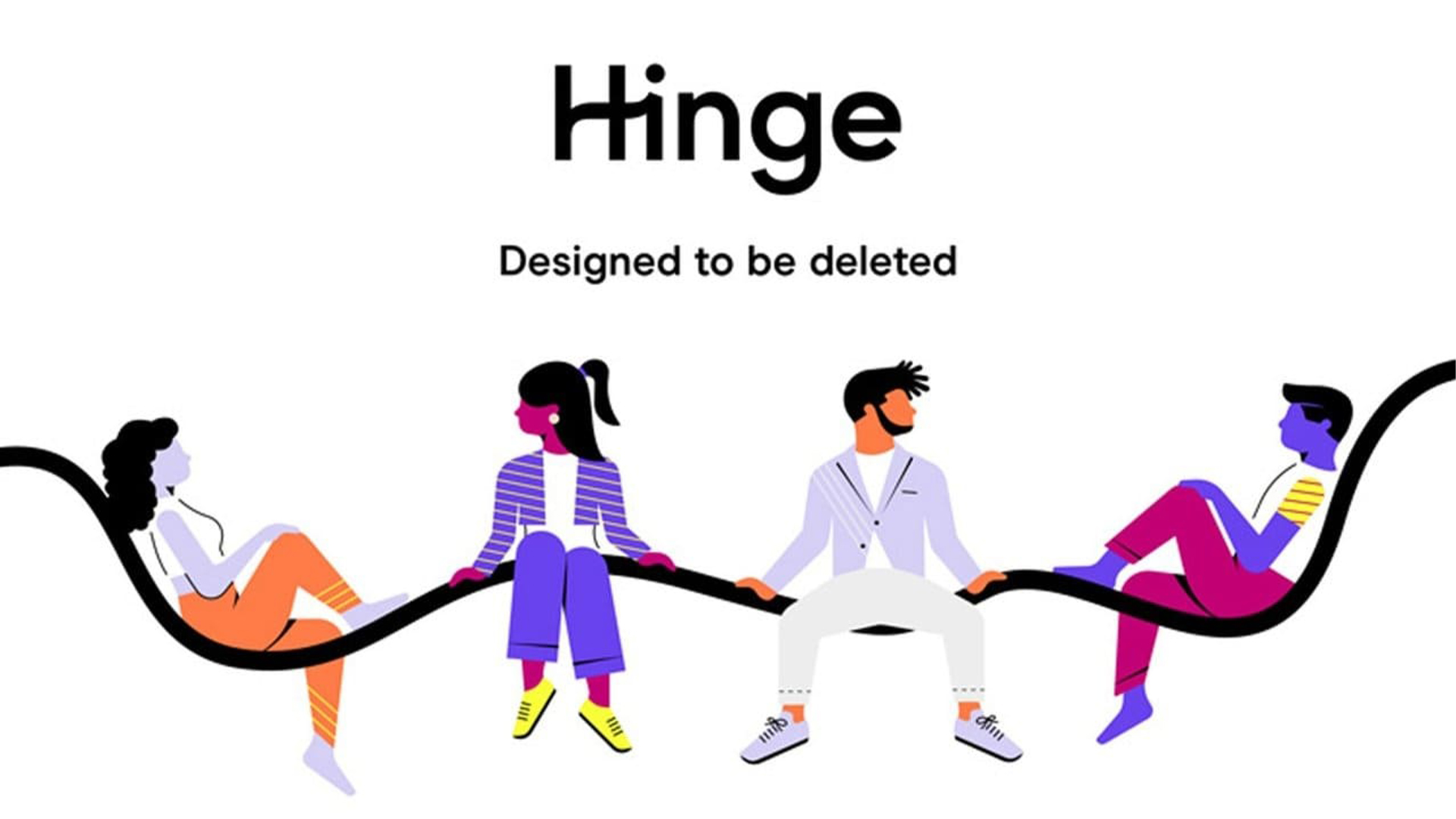
As we look into the future, it seems that the invasion of the large-limbed pastel people may finally be ceasing, as brands such as Netflix reject the outdated style. Corporate Memphis has become so infamous that it's now used as a form of parody, rather than a trendy brand identity. With trend cycles rapidly renewing it's clear that there's no comfortable place to settle in design, but for now, I'm glad to see Corporate Memphis laid to rest.
While modern branding seems to have drastically improved from its corporate past, sometimes brands can get tied up in trying to appear cool and contemporary, like Patreon's rebrand which gave me serious modern design fatigue.