Hello, I'm Loso, Visual Design Director of The News Lens Media Group. As we redesigned the logo for the 10th anniversary of The News Lens (TNL), there were many reflections that made the process a valuable experience. In this article, we will share the thinking the design.
Why do we need a new logo?
We developed the logo everyone is familiar with today in 2013. It represents the pulse of the world and changes in society. As a new internet media company, we believed that our responsibility was to "keep people’s finger on the pulse." For 10 years, the ECG, as shown on our logo, fluctuated from beat to beat as the world underwent drastic changes. We are now approaching the technological singularity against the backdrop of wars. We are also pursuing truth while being cautious about conspiracy theories. Communicating an idea is like finding a way with a map which is full of information but without any direction. We believe we must do our best to create a path that leads the public to the next destination. Here, we present our manifesto for the next decade.
How do we navigate the options?
"How to stand steadfast in the midst of turmoil?" This was the million dollar question when we drafted the manifesto. Initially, the design team listed several keywords that aligned with our future direction, highlighting our history and values like diverse perspectives, inclusiveness, and generational intersectionality, as a starting point to explore and expand the boundaries of possibilities. For each keyword, we developed numerous narratives, and in each proposal meeting, we brainstormed and reflected upon these ideas, constantly balancing between imagination and execution, and a consensus became increasingly clear.

In the dense sketch marks, we came up with four main directions:
- Trust and information literacy
- Focus on diversity and inclusivity
- Perspectives and intersections of opinions
- The process of media literacy that extends outward
Each logo had the potential to blossom, but ultimately, we chose a design that better aligned with the brand’s direction in terms of its concept and application and put our full effort into nurturing it.

Beyond the horizon, between ideas

We as a media company show not only how events happen but the impact "beyond" these events and the connections "between" these impacts. This is what TNL hopes to bring to the audience, and it is the core value that the brand has always been following: “Stimulate your thoughts with diverse perspectives and broaden your horizons with different voices.” What we wanted to declare is that TNL is no longer just a news media outlet but a multi-dimensional, multi-media platform that explores the true face of the world with readers. In the gray area beyond public view, we hope to be the illuminating light, and in the distance between opposing ideas, the bridge. We are not just a news camera; ideally, TNL represents those hard-to-reach places and moments of positive influence.
“Beyond the horizon, between ideas.” That’s where TNL is.
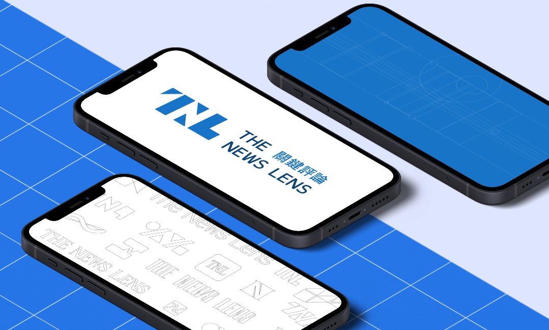
How do we design a new logo?
With the Rubin face–vase illusion, gestalt psychology, and the technique of negative space in mind, we designed a logo that requires the viewer's thinking to complete its meaning – the existence of a media platform also has a lot to do with the reader's participation. We tried to hide the most familiar “N” in between “T” and “L,” using a large area of color blocks to construct the letter’s shape. The triangle combines a strong geometric sense and modern touch, and is an element from the refraction lens in a kaleidoscope, symbolizing that we have always embraced diversity and believed that things can be seen in colorful and exciting ways from different angles.

The color blue has always represented TNL, and it’s a significant part of our memory. For this 10th anniversary redesign, we thought about what kind of color blue is and what it says.
At first, the blue was used to create a sense of “novelty” and “technological modesty” for a nascent internet media firm freeing itself from the heavy burden of traditional media. However, ten years have passed. We hoped that the feeling our brand gave people could be a natural and introverted one. Therefore, we decided to make the color more stable, using two shades of blue, which represent the ever-changing face of the sea. The key point is to “accommodate all possibilities.”


How do we design new fonts for the new standard of standard characters?
Visual designer Jing Xu is responsible for the design of the standard characters. Before redesigning the font after setting the tone for the logo, we first discussed the problems of the old logo. The two main issues are as follows:
- The length of the full version of the logo is too long, which means more space and whitespace need to be sacrificed in small-scale applications to maintain recognizability. This also means that there are some limitations in terms of usability.
- The gray level of the current Chinese font is relatively high, and the middle is relatively compact, which can cause identification problems in small-scale applications.

With the aim of addressing the above problems, the design team adjusted the font details to give the overall text design a modern and elegant feel. As the main logo is used in both Chinese and English, and the Logo-mark itself is a visually heavy block of color, the team spent a lot of time testing and adjusting the balance of the entire logo. They cross-checked the impact of each detail adjustment on the overall feel and invited team members from different departments to conduct tests. Through this process, the team ended up with the standard font most appropriate for the new logo.

In addition to the standard fonts for the basic blue application scenarios, the standard fonts for pure black and pure white were also adjusted in detail. White, an expansive color, might make the characters look thicker, so in the application of black background and white font, the design team refined the entire logo to make its visual perception consistent with the basic blue font thickness. The opposite should be done in the white background and black font version.

Let's meet at the destination.

We hope you share our vision for the future and appreciate the effort we put into refining our design. A decade may just be a milestone for a brand, but for our colleagues and readers who have grown with us, it could mean going from an intern to a new parent. To all of our partners at TNL, it’s both a friend and a child. We understand its infinite potential and immense energy and have witnessed many significant moments in the world with its presence. We don’t know what the next decade holds, but we are sure that people who believe “diverse perspectives bring progress to society” will continue to grow. We hope that we can go there together for a better world.
We look forward to seeing you there.