Hello, I'm Loso, Visual Design Director of The News Lens Media Group. As we redesigned the logo for the 10th anniversary of The News Lens (TNL), there were many reflections that made the process a valuable experience. In this article, we will share the thinking the design.
Why do we need a new logo?
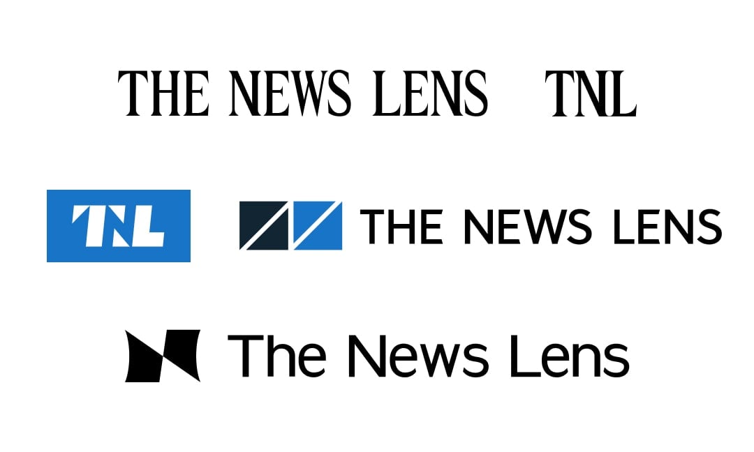
We developed the logo everyone is familiar with today in 2013. It represents the pulse of the world and changes in society. As a new internet media company, we believed that our responsibility was to "keep people’s finger on the pulse." For 10 years, the ECG, as shown on our logo, fluctuated from beat to beat as the world underwent drastic changes. We are now approaching the technological singularity against the backdrop of wars. We are also pursuing truth while being cautious about conspiracy theories. Communicating an idea is like finding a way with a map which is full of information but without any direction. We believe we must do our best to create a path that leads the public to the next destination. Here, we present our manifesto for the next decade.
How do we navigate the options?
"How to stand steadfast in the midst of turmoil?" This was the million dollar question when we drafted the manifesto. Initially, the design team listed several keywords that aligned with our future direction, highlighting our history and values like diverse perspectives, inclusiveness, and generational intersectionality, as a starting point to explore and expand the boundaries of possibilities. For each keyword, we developed numerous narratives, and in each proposal meeting, we brainstormed and reflected upon these ideas, constantly balancing between imagination and execution, and a consensus became increasingly clear.
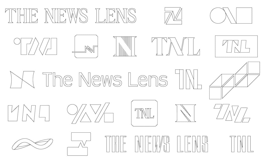
In the dense sketch marks, we came up with four main directions:
- Trust and information literacy
- Focus on diversity and inclusivity
- Perspectives and intersections of opinions
- The process of media literacy that extends outward
Each logo had the potential to blossom, but ultimately, we chose a design that better aligned with the brand’s direction in terms of its concept and application and put our full effort into nurturing it.
Beyond the horizon, between ideas
We as a media company show not only how events happen but the impact "beyond" these events and the connections "between" these impacts. This is what TNL hopes to bring to the audience, and it is the core value that the brand has always been following: “Stimulate your thoughts with diverse perspectives and broaden your horizons with different voices.” What we wanted to declare is that TNL is no longer just a news media outlet but a multi-dimensional, multi-media platform that explores the true face of the world with readers.