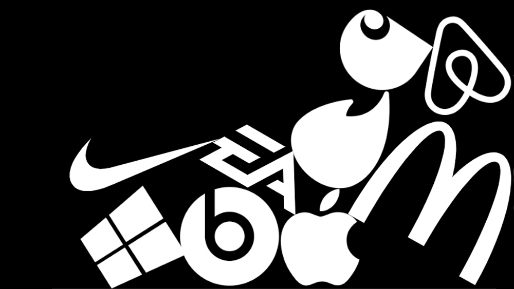
Logo design is often considered one of the most important elements of branding, and a key rule is that a logo needs to be distinctive. But a new report suggests that many of them are falling short.
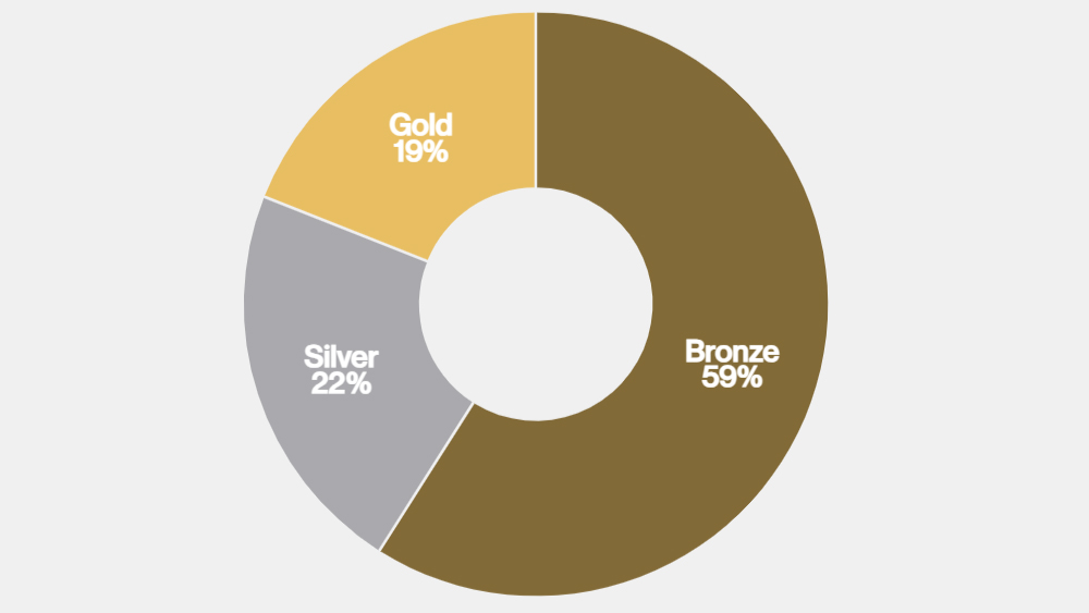
The market research firm Ipsos and the branding agency Jones Knowles Ritchie (JKR) questioned more than 26,000 people about 5,046 assets belonging to 523 brands. They awarded bronze, silver or gold grades for brand uniqueness according to the responses, and surprisingly only 19 per cent of logos reached the gold standard (see our pick of the best logos for some examples).
The Be Distinctive report starts out with a big number. It says that by 2025 companies around the world will be spending $4.7 trillion a year on marketing. With that in mind, its authors wanted to evaluate where that cash going and how much of it leads to effective branding.
It asked people to rate logos, slogans, mascots, colour and products to assess how 'distinctive' they are. It defines distinctiveness as more than mere difference, but a "strategic substance with signature style" that constitutes a "weapon for growth". The authors' belief is that the greater the distinctiveness, the more a brand will be noticed, recognised and chosen.
Only 19 per cent of the logos analysed hit the gold standard and 22 per cent silver. "Over time, logos have become the single most powerful trigger for ‘get it at a glance’ branding. They’re highly effective, even crucial components of distinctiveness, potentially worth investing in before anything else. Which is why it’s so troubling that so few of them are reaching the gold standard," the report says.
Recommendations for distinctive logo design
We've pulled out a few recommendations from the report that offer suggestions for how logo designs can achieve that elusive distinctiveness.
Prioritise shape

The report notes that wordmarks are much more than just words and that "people read shapes not characters". It provides the example of the smile formed by the arrow that travels from the A to Z in the Amazon logo, noting that it not only makes the logo more memorable but also buys an extra second in the mind of the viewer by "throwing a ball for the audience to catch". "Every time they do, the brand gets lodged further and further into their subconsciousness".
Simplify but don't de-brand
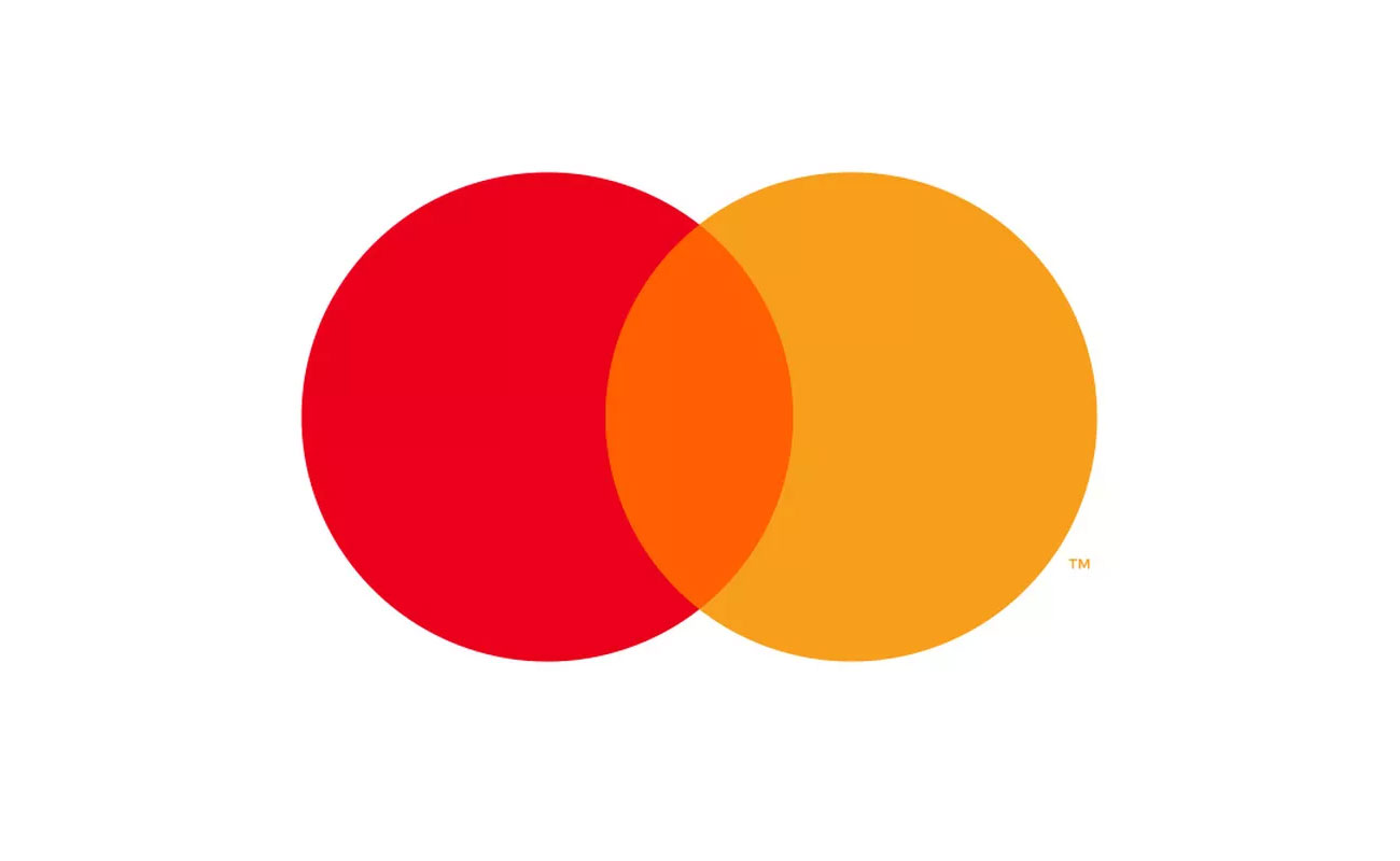
The report inevitably recognises the ongoing trend towards the simplification of logos due to a combination of fashion, 'pixel-pressure' from mobile-first branding and the maturation of once playful brands that now aim to appeal to a broader audience. But it warns against considering this trend to be 'de-branding'. Rather, the objective should be to make the brand even clearer. It gives the example of Mastercard, whose switch to a textless logo actually strengthened its use of its distinctive mark.
But we wary of following fashion
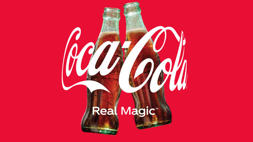
The report cites the Coca-Cola logo as an example of the importance of "not trend-chasing reinvention". It says that rather than reinvent itself, the Coca-Cola logo has adapted to changing times, with the example of how the script changed to a 'hug'.
Personality before trends
The report argues that the main difference between a name and a logo is that a name tells people your identity while a logo shows your personality. It warns that following fashion can be a hindrance here because it's tempting to go for the colours and font style that's in vogue, leading to cookie-cutter designs that lack personality.
It says distinctiveness is usually best achieved through abstraction to create a design that's less likely to be ripped off. However, it recognises that some of the best 21st century logos, such as that of Whatsapp, have had success by intentionally contradicting this approach with fairly obvious designs that are chosen in order to 'own' a symbol before anyone else does.
Sustained activation
The report argues that the key to a distinctive logo is "not just the craft that goes into it, it's what you do with it," arguing that a sustained commitment to activation over time is "what separates the 'meh' from amazing. However, it warns of the need to find the right balance between reduction and expansion to stay distinctive.
For more tips, see our guide to how to design a logo.