Last month, HBO Max revealed what would swiftly become one of the most roasted rebrands of the year. With the dropping of the 'HBO', the service is now simply Max – a move many have described as a (less successful) version of Facebook famously dropping the 'The'. And now another aspect of the new identity is coming under fire.
Today's the day that HBO Max has become, simply, Max. Unveiled by Warner Bros in April, the platform now combines the offerings of Discovery+ and the original HBO Max. And users are not only mourning the loss of the HBO name (and the prestige it signifies), but also the purple brand colour. Because now, like seemingly every other streaming platform, Max is blue. (Looking for design inspiration? Check out the best logos of all time.)
why are all the streaming services blue now pic.twitter.com/p9MHJ7BIr3May 22, 2023
now why did they get rid of the purple, like why are all of these streaming services blue https://t.co/rMW8Dnpn02April 13, 2023
At least the new MAX app chose blue to differentiate itself from every other streaming app… pic.twitter.com/YqY7ycN0lVMay 23, 2023
we need to start a dialogue pic.twitter.com/yF1JuE6YvLApril 12, 2023
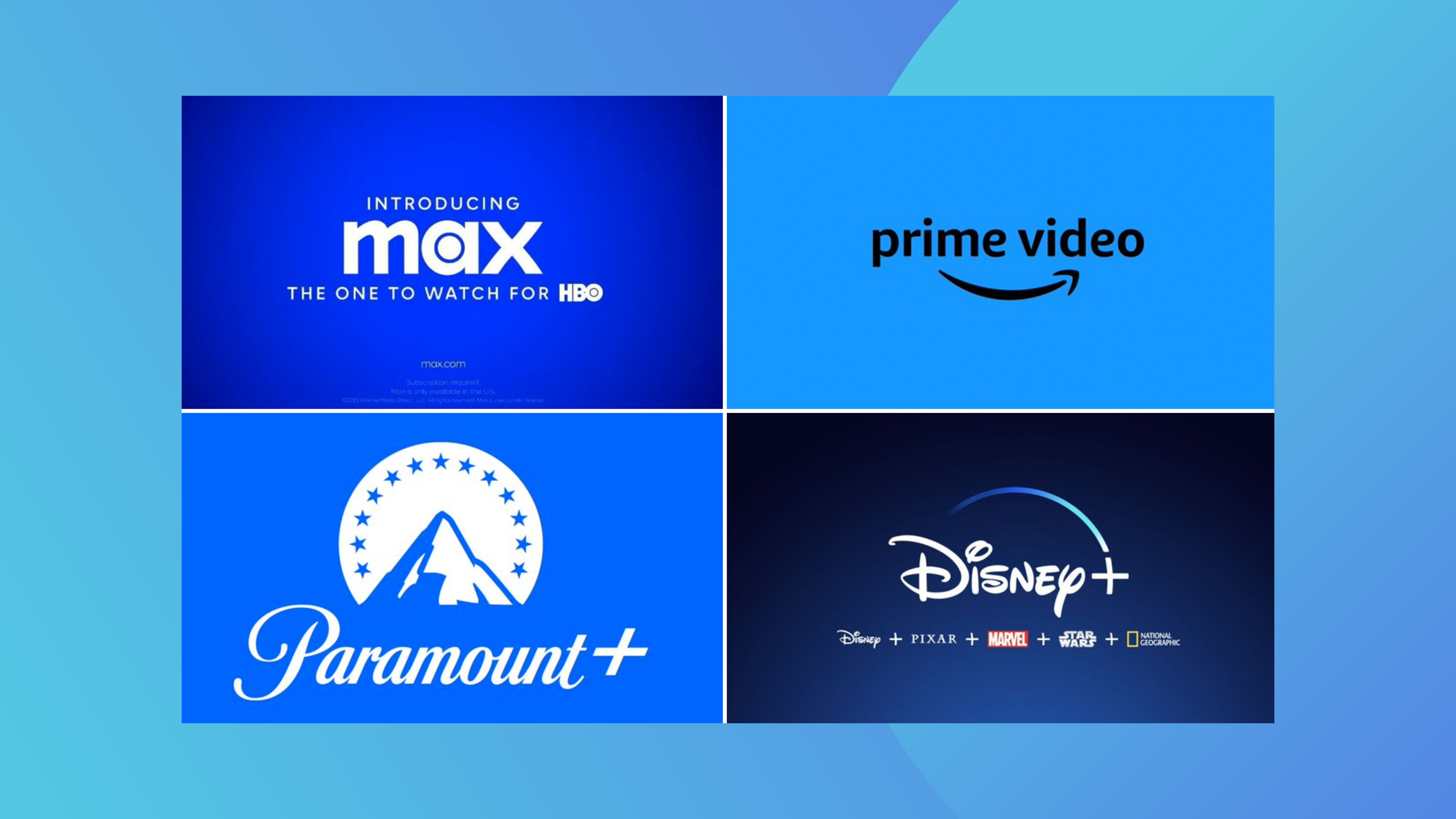
Perhaps in an attempt to differentiate themselves from Netflix, the likes of Max, Disney+ Prime Video and Paramount+ are all a similar shade of blue. It's all well and good standing out from the competition, except when the rest of the competition has the exact the same idea. How long until Netflix decides to go blue too?
And it's not only the somewhat dull visual homogeny that's troubling users. Similar branding means similar app icons – and that's a recipe for confusion on smartphone homescreens. Just like those bafflingly similar Google Workspace logos, all of those blue icons to tend to blend together.
Perhaps part of the problem is that blue is hardly a colour that screams entertainment. There's something formal and somewhat clinical about it – indeed, as Imagibrand says, "the colour is highly associated with responsibility and is therefore regarded as representing reliability. For good reason, the insurance industry has widely embraced this colour to represent their brand."
Indeed, it's clear that we're very much not looking at the most popular rebrand of 2023. But hey, at least the Max logo itself is pretty inoffensive – and legible, unlike the new Kia logo.