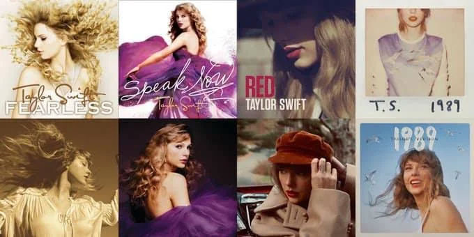
It's here! The day Swifties everywhere have been waiting for. Almost everyone is convinced that Reputation (Taylor's Version) is going to be announced at the American Music Awards. With Taylor's signature Easter eggs seemingly everywhere, we've even had a Reputation track teaser in The final episodes of The Handmaids Tale (above). Yes, I'm excited for the music but also seriously intrigued by how the album artwork will turn out. Taylor's Version album covers have so far been clever iterations of the artwork that came before, using styling and colour palettes to carefully create upgraded and updated pieces that retain strong links to the original.
I assume the Reputation artwork will be based on the same concept but from a branding perspective, how Taylor chooses to present this album's design is more fascinating than ever before. I think the clues for what we might see are hidden in these other redesigns – particularly 1989.
Given her diverse era designs are up there with the best rebrands ever to Swifties, all eyes are on the rebranding of this iconic phase in Taylor's career.
Can't wait for Reputation? See this cool Taylor Swift optical illusion art – it's ultra satisfying to watch.
Reputation was released at a time of transformation for Taylor, she had been maligned by the media, attacked by the Kardashian-Wests and had been out of the public eye for a year. The album's sound, and its artwork, represented rebellion – moving to a place of IDGAF. The artwork was punchy, had a newspaper aesthetic, and Taylor is heavily styled in what can only be described as 'badass'. Her music had shifted from country to pop and onto something edgier, and her personal brand had gained harder edges and more attitude.
But Taylor is in a very different place now. Her brand has ballooned into a global powerhouse, she's confident, settled, sure of herself and has nothing to prove. It's a very different type of transformation, which could be reflected in the album's visual identity.
So what does this mean for the album artwork, if we look at clues found in the other redesigns? Most of the new artwork shows only slight variations in composition, with Taylor facing the opposite direction in most – but with similar personal styling, colour palettes and overall design style – so why should this be any different?
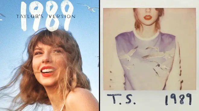
Only the 1989 album artwork redesign is markedly different, hinting at what could happen with Reputation given it represented another period of musical, brand and personal transformation. While the original is muted in colour, only shows half of Taylor's unsmiling face and is confined to the styling and shape of a Polaroid, Taylor's Version is a vibrant blue, shows a naturally styled Taylor in full frame against a limitless sky, and feels carefree. The birds are also translated from being detail on Taylor's sweatshirt to flying high in the sky. Symbolism, indeed.
Comparisons of 1989 vs 1989 (Taylor's Version) have commented on how the newer, Grammy-Award winning sound feels more confident, more "natural", and shows how Taylor has grown into her sound and as an artist. The design reflects this transformation. The redesign feels like someone who is sweetly nostalgic about a time in their life, but who has moved on vs someone still gripped by the intensity of the events.
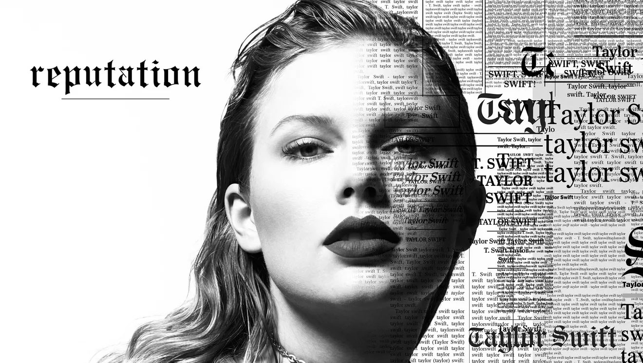
I think the Reputation (Taylor's Version) artwork will follow a similar pattern. The original shows her in black and white, tightly styled with newspaper print surrounding her and even blurring over half of her face, her styling is tough but slick, almost tightly wound. I could see the redesigned artwork being bolder and freer in a similar way to 1989, with Taylor bursting out with unrestrained styling.
Though I suspect the colour palette will remain black and white, I could imagine a full colour version – to further drive the transformation home. Just as 1989 saw the bird motif used differently, the newspaper print could become the background, with Taylor's image laid on top of it but not encroached by it (I don't need to spell out why), and the shadow on Taylor's face will also be ditched.
In a similar way to 1989, the original album is intensely 'in' the moment, almost held back by it – and the redesign will include the benefit of emotional distance, which could bring a whole new vibe to the hint of rebellion.
So there you have it, my deep dive into how I think the Reputation album will look and why, whenever it may be released. Though if it's not on Monday I'll eat my red lipstick.
Want more at the intersection of design and music? Read about how Paula Scher influenced one of The Beatles most iconic album covers here.