'Just Do it' is one of the best-known brand taglines around. It's been serving Nike since 1988, and it's just as recognisable as its swoosh logo, one of the most famous textless logos. Many would say it didn't need any other intervention, which has left people perplexed as to why Nike appears to have jumped on a recent typography trend.
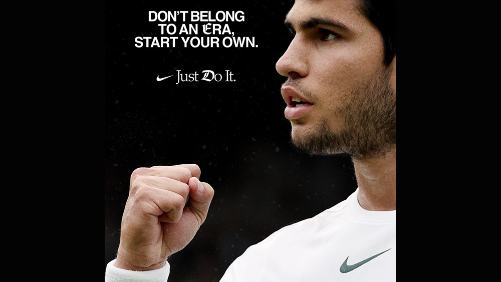
People have been commenting on social media to ask why the brand placed a couple of apparently random gothic Blackadder-style letters on a post featuring Spanish tennis star and current men's singles number one Carlos Alcaraz. But it's not the one advert. Nike has been changing up the 'D' in several recent adverts.
Dos anyone know if this is a real #Nike ad? The poor grammar and odd/poor typography make me think otherwise (and if anyone know what the gothic E and D are about, please explain - thanks!): pic.twitter.com/Ldtui1s4NiJuly 17, 2023
Adaptive logos are having a bit of a moment right now. It's something that MTV logo did so well back in the 1980s, and the LA28 Olympic Games logo has resurrected the concept with a design that can take on infinite interventions, including, controversially, from the games' sponsors.
Nike appears to be taking up this idea and running with it, not on its logo, but with the 'D' in its 'Just Do it' tagline. But people are confused (and not just because of the incorrect punctuation). "What’s with the random Blackletter E and D? Totally unnecessary and adds nothing," Studio Koto CEO and founder James Greenfield commented on Twitter about the recent advert featuring Alcaraz. Some people even wondered if the design was a real Nike advert or an amateur proposal.
The choice of an 'old-fashioned' font in this particular piece is presumably intended to draw attention to the world 'era', the idea that Alcaraz is marking the start of a new period in tennis following the dominance of the likes of Federer for two decades. Some have even suggested that the E and D are references to Federer’s F logo and Djokovic’s D logo respectively, although the link seems tenuous.
D is Novak e E is Federer logo pic.twitter.com/PHDk9G1hnSJuly 17, 2023
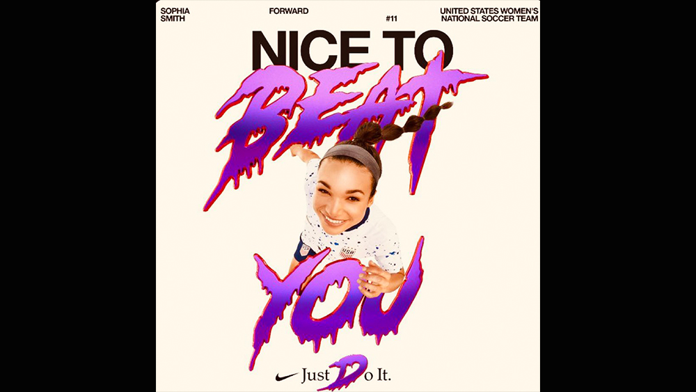
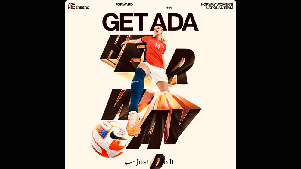
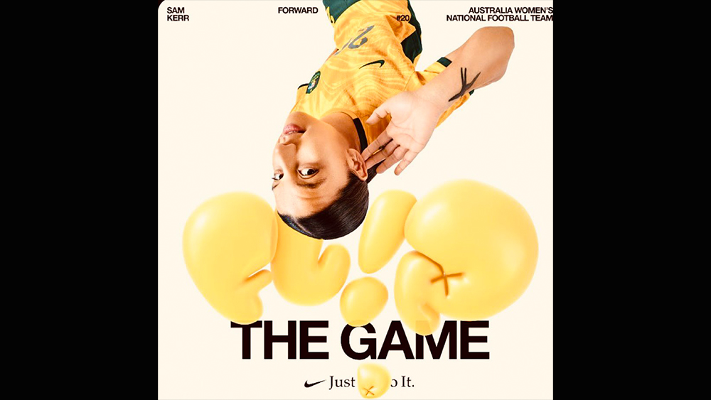
A more likely theory is that Nike is trying to tap into Gen Z's penchant for using messy mixes of typography and special font generators for social media: 80's/90's exuberance taken further. Nike's 'What the Football' advert created for the FIFA Women's World Cup (see below) features several versions of the 'D' in its close, and graphics for the campaign feature a clash of clean sans serif overlaid with colourful dripping graffiti and inflated fonts.
"Perfectly aligned with online typographic trends ATM. A mish-mash of styles for absolutely no reason whatsoever," one person commented on Twitter. The Alcaraz application feels confusing and poorly executed but the broader use of mixed fonts to reject the minimalist trend of recent years doesn't feel entirely out of place for a brand that's long been as much about streetwear and youth culture as it has sport. If you're looking to mix up typography in your own work, see our pick of the best free fonts and the best font pairings.