What might Apple's iWatch look like? - in pictures
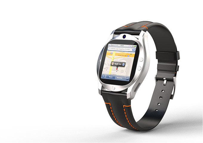
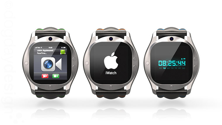
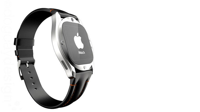
Anders Kjellberg's design takes a normal watch and smooshes a square iPhone (or iPad) display into it. Apart from the fact thay you'd never be able to read anything on that map without putting it an inch from your face - somewhat spoiling the idea of a 'watch' - there are too many buttons (four!) plus what looks like a front-facing camera, Dick Tracy-style. (All it needs for that is an aerial.) And Apple would never go with that orange strap stitchingPhotograph: Dogday Design/Anders KjellbergAnders Kjellberg's design, continued, shows how the icons would be too small to touch (though you might control them with your voice - OK). As for the old-style digital display on the right - the 1980s called and they want their watch backPhotograph: Anders Kjellberg/Dogday designAnders Kjellberg's design. Still doesn't look like what you'd expect from this sidePhotograph: Dogday Design/Anders Kjellberg
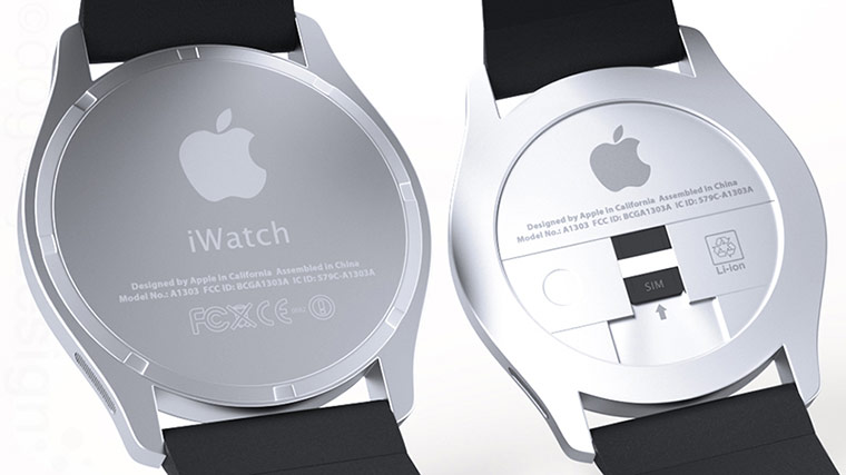
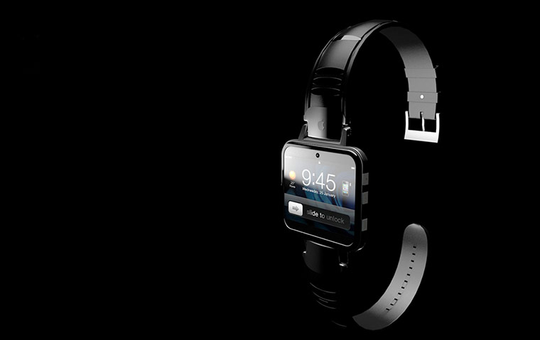
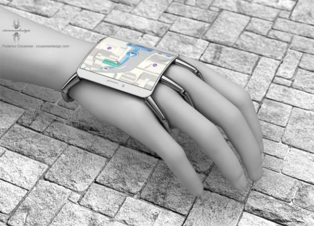
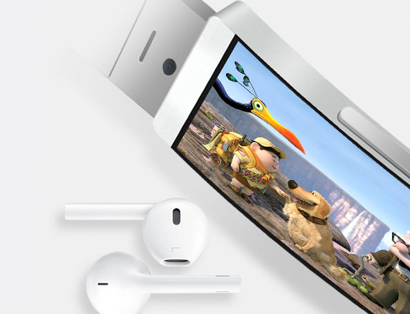
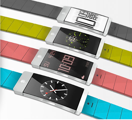
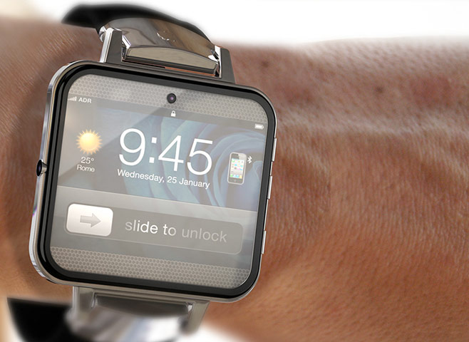
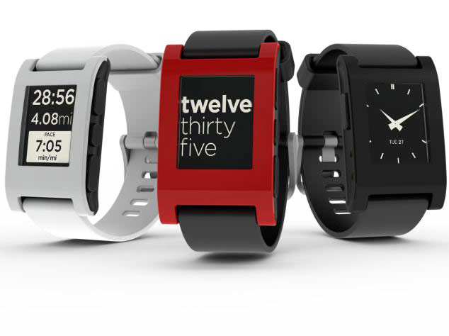
Anders Kjellberg's design goes all the way round to the back, with room for a nano-sim. Trust us – this is not how it will workPhotograph: Dogday Design/Anders KjellbergAntonio DeRosa's sleek design for the iWatch has a square shape (a nightmare for app designers, who have been working on 4:3 or 16:9 for iPads and iPhones for years). It's a bit unlikely that anyone would 'slide to unlock' a watch (even one that shows the time) because the idea of the iWatch should be that it's a conduit directly to your phone. Too many buttons on the side, too fiddly to get right (it's a watch, not a music player). Still, a nice strapPhotograph: Antonio DeRosaFederico Ciccarese's design. We apologise if you have arachnophobia, as this looks as though a robotic spider has grasped this (strangely lifeless) hand. Curved glass (likely), edge-to-edge (likely too), no visible buttons (very likely), clearly driven by touch (ditto), but the weirdest fastening scheme ever which if you think about it wouldn't work for women – and an iWatch has to appeal to both sexes. Bonus points though for finding the largest and most flat area that's generally exposed on the body. But apart from anything, you'd never be able to type with it onPhotograph: CiccareseDesign/Federico CiccaresePavel Simeonov's design looks similar to an iPhone on a strap. (The white things beside it are iPhone earbuds, for scale.) The aspect ratio of the watch looks roughly right, but shows up the problem that amateur designers run into with this concept: to watch a film or clip on a watch shaped like this, you'd either have to lie your arm vertically on the table, or just take it off. Any iWatch probably won't be for watching things, ironically enough. Single button? That looks good. The strap looks futuristic too - another plusPhotograph: Pavel SimeonovPavel Simeonov's iWatch design comes in a variety of bright colours, and in this form looks rather like the Pebble smartwatch (which connects via Bluetooth to Android phones or iPhones). Changeable straps would certainly be a good idea for an iWatch; this looks too like a shrunken and slightly curved iPhone, though - and not enough like a device in its own right. Still, arrayed like this, it looks like the closest yet to what you'd expect. Which may well mean it's miles from what's actually being worked onPhotograph: Pavel SimeonovThis concept was designed by Antonio DeRosa, and has the 'slide to unlock' meme (won't happen; too fussy) and seems to think it would be a phone as well (incredibly unlikely), though possibly it's just relaying a connected iPhone's signal strength. The graphic shows an iPhone with a Bluetooth symbol, suggesting that this is being thought of as a connector to that phone - which does seem likely. Three buttons (on the right hand side) is about three too many, while the headphone jack on the left is bizarre - unless it's for rechargingPhotograph: Antonio DeRosaThe Pebble Watch is already in existence as a new generation of smart watches, and being shipped worldwide right now after its Kickstarter project was a runaway success. Even so it has taken the team there more than a year to get to a finished product. Notice the simplicity compared to the previous 'iWatch' concepts: a couple of buttons, no 'slide to unlock' or similar, clear and large text with no surfeit of information. And now imagine that the Pebble is just their first iteration – and that Apple will have designers who could make these look clunky working on the same problem. Now imagine an iWatch...Photograph: Pebble Watch
Sign up to read this article
Read news from 100’s of titles, curated specifically for you.