In the world of branding, the choice of typography can either elevate a message or water it down. Fonts are not just about aesthetics; they carry emotion, tone, and clarity. Among the many typefaces used across industries, Avenir stands out as a modern classic. With its clean lines, balanced geometry, and timeless appeal, Avenir has become a favorite among designers and brands alike.
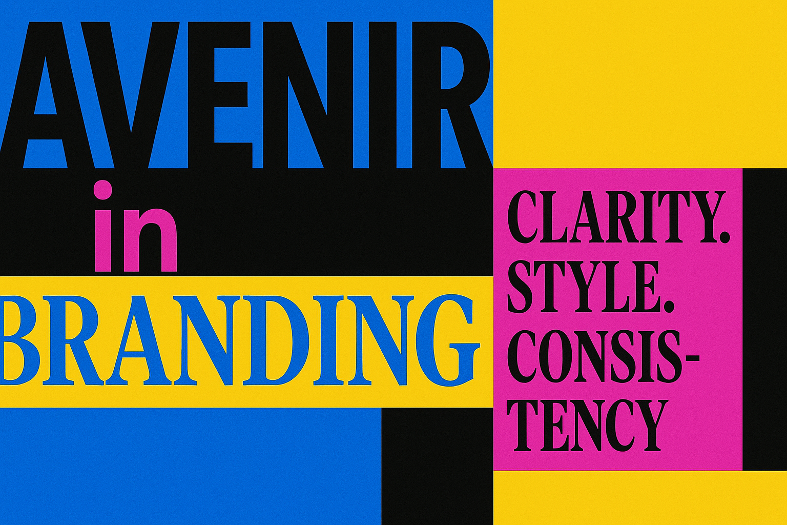
Created by Adrian Frutiger in 1988, Avenir was designed to be a harmonious blend of the geometric sans-serif tradition with humanistic nuances. This careful balance is what gives Avenir its unique voice. It feels modern yet warm, professional yet approachable. And that makes it perfect for brand identities looking to leave a lasting impression.
Now, let’s explore the reasons why Avenir is often considered the ideal typeface in branding.
1. Clean and Modern Aesthetic
Avenir has a clean and geometric structure that feels fresh and modern. The straight lines and balanced curves help maintain a sense of order and precision. This makes it ideal for companies aiming to project a sleek and professional image.
Brands in tech, finance, and health industries often turn to Avenir for its contemporary appeal. It communicates innovation and trust without being too flashy.
2. Trusted by Industry Leaders
Avenir is used by many well-known brands and institutions. Apple previously used Avenir for Maps and Watch interfaces. Toyota uses it across various communication materials. This kind of trust from global brands speaks volumes.
One of the most downloaded resources remains the free Avenir font, especially among modern designers. It’s often a go-to for freelancers, startups, and even students working on design projects.
You can explore this font to understand why it continues to stand out in minimalist branding. It’s widely available and often used in mockups, wireframes, and initial branding drafts.
3. Excellent Readability
One of Avenir's strongest traits is its readability across all sizes and formats. Its consistent spacing and proportionate letterforms ensure clarity on both large signage and small mobile screens.
In branding, where messages must be quickly understood, Avenir performs exceptionally well. It doesn’t distract or confuse, making it ideal for headlines, taglines, and even body text in brand materials.
4. Emotional Neutrality
Avenir has a subtle charm. It doesn’t carry strong emotional baggage, which allows it to adapt to different brand personalities. Whether a brand wants to appear friendly, serious, luxurious, or minimal, Avenir can match the mood.
This neutrality is a strength because it makes Avenir flexible across different branding elements from websites to packaging.
5. Timelessness in Design
Unlike many famous fonts that go out of style quickly, Avenir has a timeless quality. It was designed with the future in mind ("Avenir" means "future" in French), and it has aged gracefully.
Using Avenir in branding helps a company avoid the risk of looking outdated. It provides long-term value and ensures consistency over the years.
6. Wide Typeface Family
Avenir offers a rich family of weights and styles from Light to Black, from Roman to Oblique. This allows brands to maintain visual consistency while still having enough variation to express different tones.
For example, a brand can use Avenir Black for bold headlines and Avenir Light for subtle body text. The consistency across styles strengthens brand recognition.
7. Geometric Harmony
The font blends geometric structure with humanist touches. Its letterforms are carefully drawn to maintain balance without being too mechanical.
This makes Avenir feel natural and easy on the eyes. The font’s round "o" and slightly curved tail on the "y" add a friendly character, which helps build trust in branding.
8. Easy to Pair with Other Fonts
Avenir pairs well with many other typefaces. It works beautifully with serif fonts for editorial design or with monospaced fonts in tech branding. This pairing capability enhances its flexibility in various brand systems.
Good pairing options might include Avenir with Georgia for elegance or with Roboto for a modern, digital feel. You can also refer to official Avenir pairing recommendations from typewolf, a trusted source for font families and guidelines.
9. Ideal for Minimalist Branding
Minimalism is a major trend in branding. Companies want to communicate more with less. Avenir’s clarity and simplicity make it the perfect fit.
Its ability to communicate a message cleanly without any visual noise aligns perfectly with minimalist design principles. This is why startups and luxury brands often adopt it.
10. Strong Digital Presence
In today’s world, brands must shine on digital platforms. Avenir performs excellently on websites, mobile apps, and digital ads. Its sharp rendering on screens and adaptability in responsive design make it a smart choice for digital-first brands.
It loads well, scales smoothly, and maintains legibility key factors for UI and UX design success.
Conclusions
Choosing the right typeface can make or break your brand identity. Avenir stands out not just because it looks good, but because it works hard behind the scenes, improving readability, supporting brand tone, and staying relevant year after year.
Whether you’re a designer, marketer, or business owner, Avenir is worth exploring. It’s a future-ready font that delivers results without overwhelming your message.
With its blend of form, function, and flexibility, Avenir truly is the ideal typeface in branding.