Friction is an exciting word, isn’t it? It evokes a sense of reaction – of something dynamic, of an idea or object that is going to change how we feel or think. It’s the motion in an oyster that turns a grain of sand into a pearl, the momentum that can cause two dull twigs to create a spark. And in interiors, it’s that extra dash of secret sauce that sets a room aesthetically alight.
The design trend, recently coined friction-maxxing, has never been more relevant. Today’s most compelling interiors thrive on tension, and every decor trend of the moment, from the use of antiques to surprising lacquered surfaces, is about creating unique, characterful, and deeply personal spaces. Spaces that don’t look like everywhere else, where there is a decorative twist that ignites the imagination.
‘I’m all for contrast, because it’s what makes design more exciting,’ says the international designer Martin Brudnizki, whose projects include Soho Beach House Miami. ‘When everything matches, you can’t really see anything – it all just blurs together. A little bit of tension, or friction, creates a break and draws you in – something unexpected but intriguing. It’s more layered and interesting – even more energizing – to decorate this way.’
Friction-maxxing relies on intentional contrast, but that doesn’t mean you should just throw a lot of assorted oddities into a room and call it a day. There is a subtlety required to get the balance just right – and here’s how to do it.
What Is Friction-Maxxing?
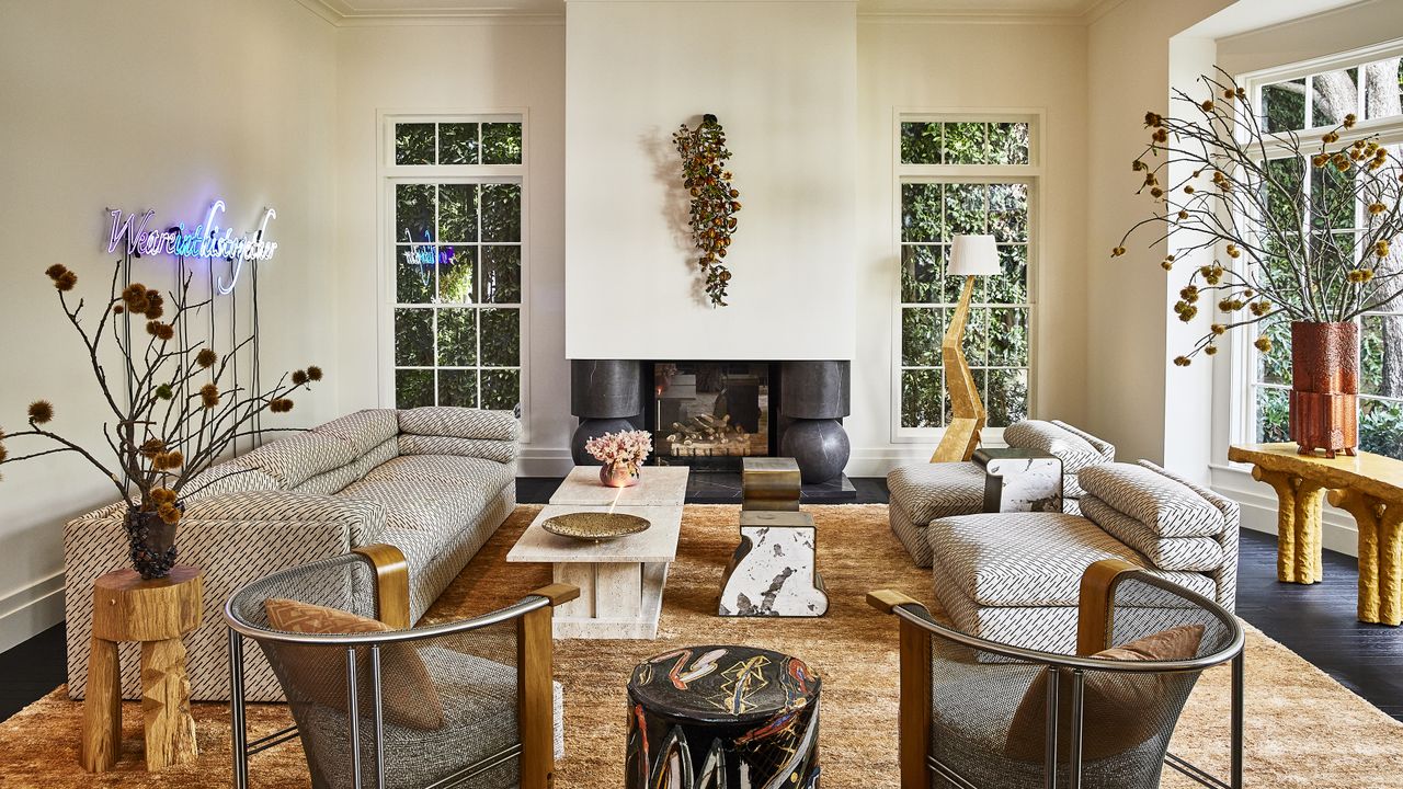
Friction-maxxing refers to deliberately juxtaposing contrasting design elements to create visual interest and energy. It’s the blend of an antique vase next to a brand-new lamp, a smooth chrome candlestick on top of a beaten, weathered, rustic table, a decoratively ornate chandelier in a pared-back, lime-washed minimalist space.
‘Good design is about the tension in a room, and how different elements work together to achieve the right energy,’ says the designer Kelly Wearstler. ‘I love to sift through vintage stores for hours, find unusual pieces that no one else has, and then place them next to something slick, contemporary, and new. I adore putting a softly textured fabric against a hard edge. That tension creates a moment of excitement – it catches your eye and gets the imagination going.’
As Kelly mentions, one of the most trend-forward ways to friction-max right now is to decorate with vintage – contemporary designers have never favored antiques quite as much as they do now. ‘They bring so much character to a home,’ says the designer Molly Kidd, whose supremely current schemes feature a minimum ratio of 50 percent antiques. ‘In fact, vintage pieces are the soul of many of our projects. When paired with a thoughtful mix of modern pieces, they create an interesting dynamic – there is a bit of tension between old and new. Or you could call it friction. If everything were the same, it would just feel flat,’ Molly adds. ‘I always like to have a juxtaposition – light next to dark, smooth next to rustic, modern next to vintage. It’s where the magic happens.’
How Designers Bring Friction-Maxxing Into Spaces
1. Mix Eras
Perhaps the easiest way to max out the friction is to play with different time periods.
As mentioned, Molly Kidd always includes at least 50 percent vintage pieces, but in some spaces it’s even more than that. ‘My lighting is usually about 80 percent vintage,’ she says. ‘When you place modern homewares next to antiques, you instantly get a sense of character – a feeling that the home is unique, even special. If a home looks like a showroom, with everything from the same place, there is no soul.’
If the 50 percent rule feels too much for your spaces, you can start smaller. A vintage vase from a flea market will sit beautifully on a modern coffee table; an antique lamp from eBay will illuminate even the dullest corner, adding the friction it so badly needs.
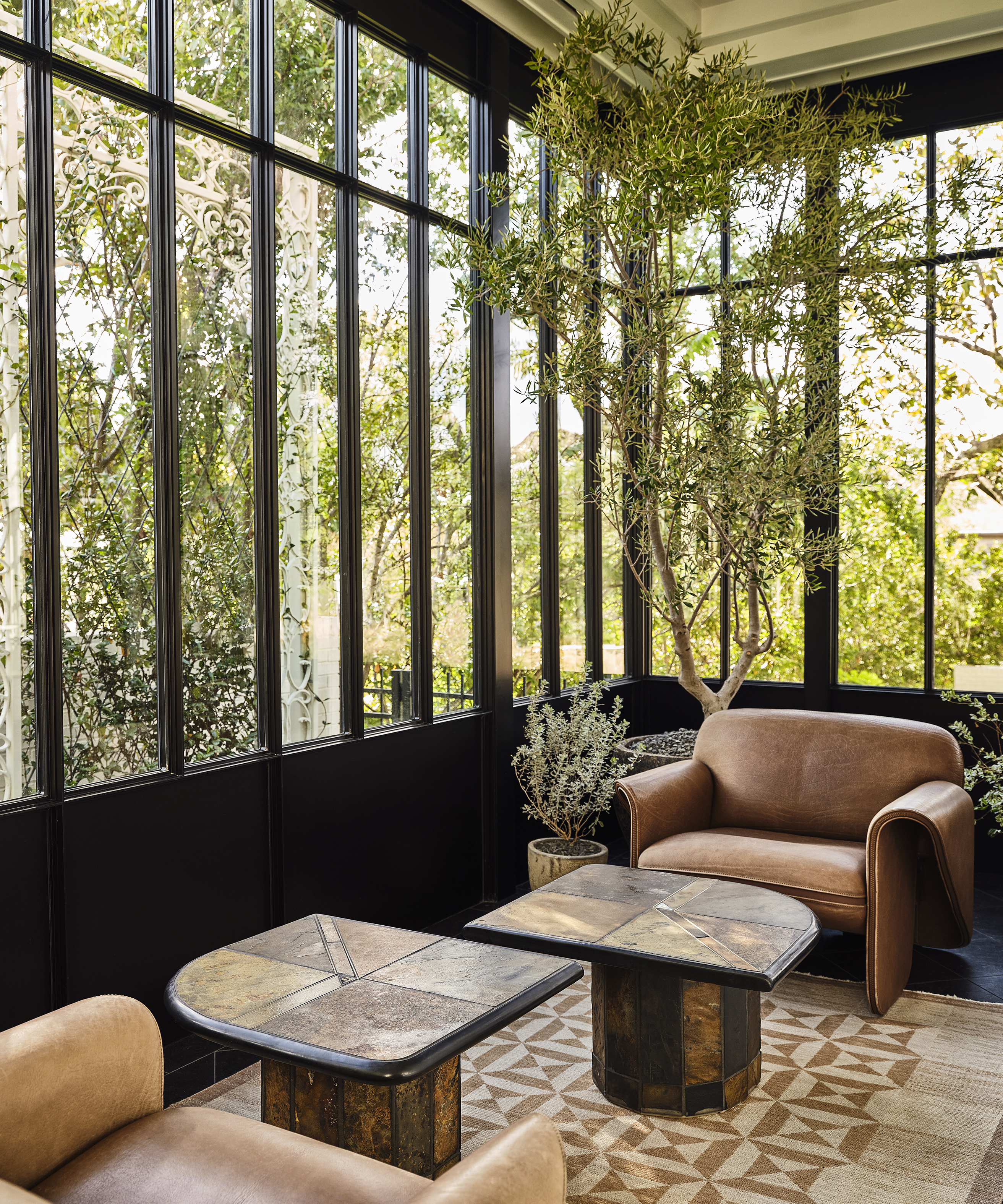
2. Contrast Materials
Another friction-maxxing method is to mix materials – placing smooth surfaces next to rough edges, or matte finishes alongside high-shine ones.
‘When approaching any project, I believe balance is one of the most essential principles of design,’ says the designer Katie Harbison. ‘Too much of any one element can overpower a space, but the right combination creates far more interest. Over time, I’ve found myself returning to three enduring materials – linen, oak, and stone – each with its own distinct character, yet all united by a sense of natural beauty and timeless appeal.’
These three materials have very different qualities – linen is tactile, oak is textured, and stone is smooth – but together they create a pleasing contrast that is far more interesting than if every element were the same.
3. Play with Scale and Shape
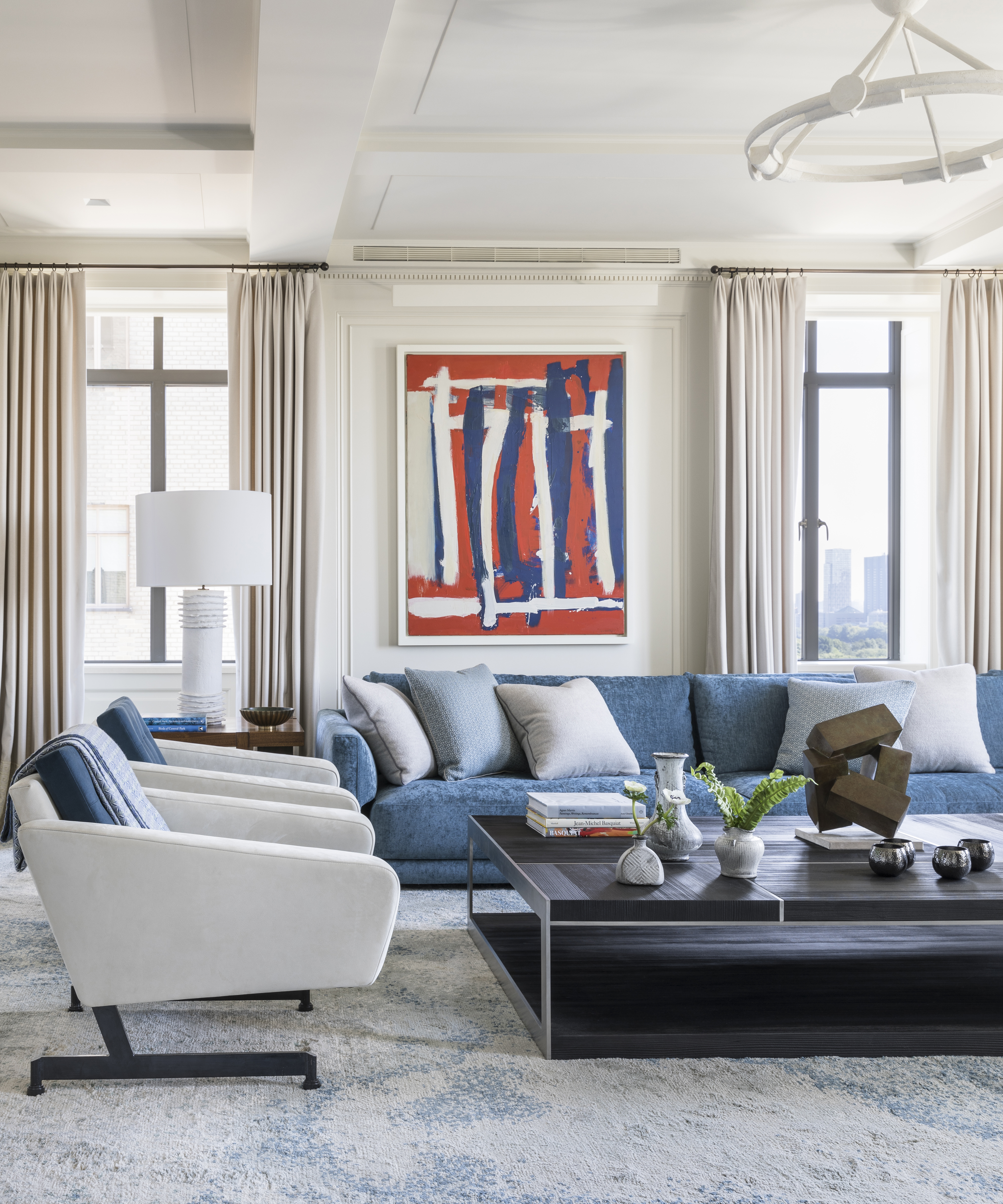
Unexpected proportions can create tension and draw the eye – there’s something compelling about a piece that is deliberately oversized, or, conversely, smaller than the room might suggest. This could be an oversized light fixture hanging in a traditional room, or low, modern furniture in an ornate space – not out of place, but a little daring, a little surprising, like a spark of friction.
‘No one wants a room where everything is big,’ says the designer Victoria Hagan. ‘Negative space is defined by ensuring there is a mix of scales. Just because a room has height doesn’t mean you have to fill it.’ That friction between ceiling height and more restrained furniture is what makes a space feel considered – and ultimately, more interesting.
4. Combine Refined and Relaxed
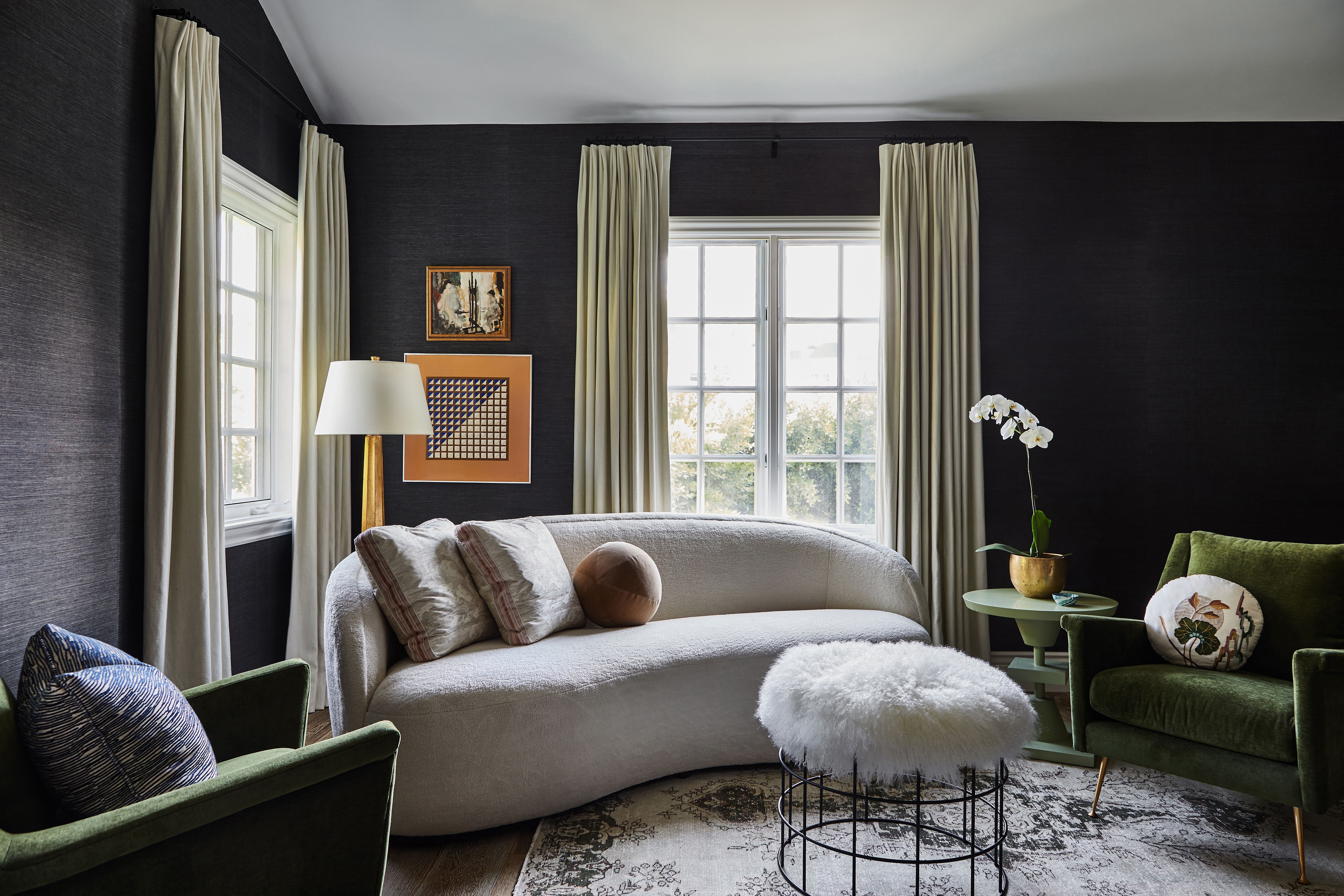
There used to be two styles of design – formal (or traditional) and relaxed (or contemporary). Now, designers have realized that the end result is far more engaging when the two are mixed – that the friction between tailored upholstery and relaxed slipcovers, or gallery-style art displays in cozy living rooms, creates a far more compelling way to decorate.
‘This mix is what I call the collar-flick moment,’ says the designer Simone Haag. ‘You know when you have an outfit and it all looks great, but you flick up the collar and suddenly it changes everything? You can do the same in a room – introduce an unexpected extra element and suddenly have a whole new energy.’ She often places a sculptural chair (refined) next to a slouchy sofa you can’t wait to sink into (relaxed). And that combination, in all its friction-maxxing glory, is decorative dynamite.
Shop for Some Friction
Texture is always going to create friction, and this large vase is the perfect way to add it to any space from a entryway console to a kitchen countertop.
This is the collar flick moment Simone Haag mentions. Take something that should be simple, and give something unexpected.
Add some quirky shapes to any surface with this sculptural candle holder. Play with scale and proportion and pair it with a short chunky wooden candle holder.
Tiny art is a trend in its own right, but it's perfect for adding something unexpected to your home. It feels wrong but looks so right.
The ‘unexpected red’ theory is a great example of friction-maxxing – adding a hit of a bold shade to an otherwise neutral room. This switch cover is a playful way to introduce both color and shape to a space.
Simone also notes that the key to this look is creating rooms that feel both refined and relaxed. A chic throw blanket draped over a playfully patterned or shapely armchair is a perfect example of friction-maxxing.
Love beautiful design ideas, expert advice, and inspiring decor trends? Sign up for our newsletter and get the latest features delivered straight to your inbox.