USA International Trade Administration, Public Domain via Wikimedia Commons; Canva
In late 2001, toward the end of the collapse of the tech bubble, famed value investor Warren Buffet debuted a new metric that he claimed was "probably the best single measure of where valuations stand at any given moment." This new tool was dubbed the Buffet Indicator, and it is still used by many to get a sense of whether the American stock market is generally overvalued or undervalued at any given time.
What Is the Buffet Indicator (Market Cap-to-GDP Ratio)?
The Buffet Indicator is a metric that expresses the total value of the American stock market as a percentage of the country’s GDP. In other words, it is the ratio of the total value (market capitalization) of all U.S. stocks to the country’s total annual economic output.
Sometimes referred to as the market cap-to-GDP ratio, the Buffet Indicator is essentially the same as a price-to-sales ratio, but instead of comparing a single company’s share price to its annual sales, it compares a country’s entire stock market to that country’s aggregate annual output (essentially the total value of all sales of goods and services).
The purpose of the indicator is to express the degree to which the stock market as a whole may be undervalued or overvalued.
How Is the Buffet Indicator Calculated?
The Buffet indicator is calculated by dividing the value of the U.S. equity market by the country’s gross domestic product. For the total value of the stock market, the market cap of the Wilshire 5000 (a stock index that includes every U.S.-based equity that trades publicly on a major exchange) is typically used.
The calculation yields a decimal-format value that is most often expressed as a percentage (e.g., a reading of 1.23 would be expressed as 123%).
Buffet Indicator Formula
Buffet Indicator = Market Cap of Wilshire 5000 / GDP
U.S. Bureau of Economic Analysis; Wilshire Associates via St. Louis FRED
How Does the Buffet Metric Work?
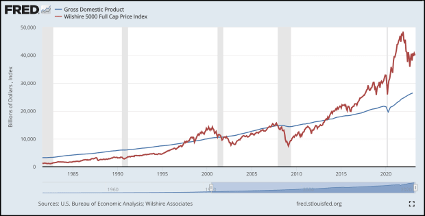
Historically, GDP goes up relatively steadily over time in the absence of any major economic phenomena (e.g., the onset of the COVID-19 pandemic in early 2020). The stock market, in contrast, is historically volatile, and while it also tends to go up over time, it rarely does so smoothly. Instead, it bounces up and down to extreme highs and lows, leaving its true intrinsic value somewhat of a mystery.
The graph above includes GDP (blue line) and the market cap of the Wilshire 5000 (red line). While the line representing GDP is fairly smooth, the line representing the Wilshire is far choppier, reflective of the volatile nature of the stock market at large. The Buffet Indicator (see graph below) uses both of these datasets to produce values that can be compared to historical averages to determine whether the market is likely to be under or overvalued, and to what degree.
How to Interpret the Buffet Indicator
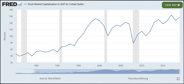
The most informative way to interpret the indicator is to compare its current value to its historical trend line (this could be a moving average or an exponential regression line).
Using this method, readings that are within 1 standard deviation above or below the trend line could indicate slight over or undervaluation; readings between 1 and 2 standard deviations above or below the trend line could indicate moderate over or undervaluation; and readings that are 2+ standard deviations above or below the trend line could indicate severe over or undervaluation.
Current Market Valuation maintains a page with up-to-date Buffet Indicator data, including graphs that show the metric’s historical trend line and also include lines to represent multiple standard deviations in either direction, making for easy visual comparison.
How Can Investors Use the Buffet Indicator?
The Buffet Indicator may be particularly useful to relatively passive investors who prefer to buy index funds rather than actively trade individual stocks.
An investor of this sort could begin periodically buying shares of a total market index fund (ideally using dollar-cost averaging to minimize the effects of short-term volatility) whenever the indicator is more than one standard deviation below its historical trend line. Similarly, they could periodically sell fixed amounts whenever the metric is more than one standard deviation above the historical trendline.
This sort of strategy could be successful over the course of many years, but it likely wouldn’t be beneficial to investors or traders with shorter time horizons.
What Are the Limitations of the Buffet Indicator?
In some cases, 100% (rather than the historical trend line, whose value changes over time) is used as a benchmark for interpreting the Buffet Indicator.
Using this method, any reading over 100% would indicate an overvalued market, with higher values being reflective of more extreme overvaluation. Similarly, readings below 100% would indicate an undervalued stock market, with lower values reflecting more extreme undervaluation.
This method, though, assumes that in a perfectly valued stock market, total market value should equal GDP. This assumption is flawed, however, as stock prices are thought to be reflective of the underlying businesses’ future valuations and cash flows, while GDP, which is usually considered either a lagging or coincident indicator, is reflective of economic output that has already occurred.
Another limitation of the model, even when interpreted correctly, is that it ignores the effects prevailing interest rates have on stock prices. Higher interest rate environments often lead investors to move money out of riskier assets like equities and into interest-paying securities like bonds. Additionally, most public companies rely to some degree on debt to finance their operations, and higher interest rates mean higher debt payments, which can eat into profits, further affecting stock prices.